Each Monday, staff writers Kevin Melrose and Steve Sunu discuss their five favorite covers from the previous Wednesday's new comic releases, selecting from among them CBR's Cover of the Week.
Keep reading for Kevin and Steve's favorites from the week of May 7, and then discuss your choices in the CBR forums.

"Batwing" #31, by Dan Panosian (DC Comics)
There's so much to like about this Dan Panosian cover, from the beautiful architectural details to the way the artist so masterfully uses the building to draw the reader's eyes up the image to Batwing. But I particularly enjoy the contrast between the antique woodcut-like approach to the artwork and the bold, modern field of yellow in the background. -- Kevin Melrose

"Fairest" #26, by Adam Hughes (Vertigo)
As a fan of public transportation and Adam Hughes' work, I heartily approve of his cover for "Fairest" #26. The light from the train blots out some of the piece, just as it would were the reader actually in front of the train. But my favorite element is the coloring and layout of the logo, which echoes the colored symbols one might find on the New York City subway system. -- Steve Sunu

"Iron Fist: The Living Weapon" #2, by J.G. Jones (Marvel)
With "The Immortal Iron Fist," artist David Aja put his distinctive visual stamp on the character, depicting a leaner Danny Rand who more closely resembled a ballet dancer than the more traditional superhero. But for his variant cover, J.G. Jones gives us an Iron Fist with a physique akin to that of a classic Hollywood action star or an old-school professional wrestler; it's an interesting choice that falls somewhere between the more traditional and more contemporary takes on the character. Jones, as usual, pays a lot of attention to detail, carefully rendering the folds of the character's pants and the skin and muscle of his torso. He also masterfully employs color, creating a ghostly, gray-wash Iron Fist accented by his yellow belt, mask and glowing hands. -- Kevin Melrose

"Original Sin" #1, by Skottie Young (Marvel)
Every time Skottie Young creates a variant featuring his kid-ified take on the Marvel Universe, I'm awed by the level of innovation he puts into it. Take, for example, his most recent cover, for "Original Sin" #1. Not only does it feature his impeccable linework, it's also pretty funny, not necessarily because of the core concept -- Deadpool finds the Watcher's eyes -- but because of the reactions of the other characters to li'l Wade's actions: Iceman projectile-vomits so hard, he's lifted off the ground, and the Hulk has an expression that perfectly combines confused and grossed out. -- Steve Sunu

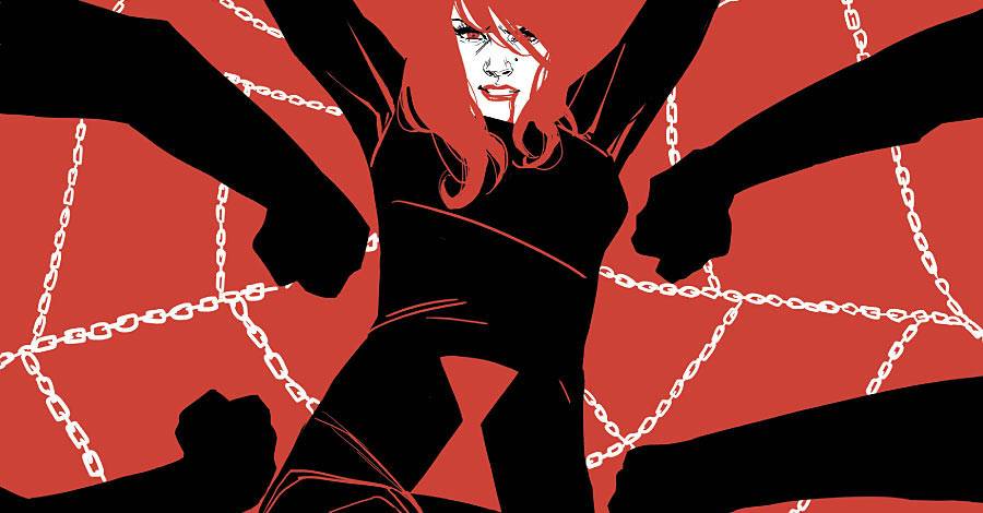
COVER OF THE WEEK: "Black Widow" #6, by Phil Noto (Marvel)
Marvel has been particularly good of late matching the right artist with the right title, as the combination of Phil Noto and "Black Widow" so perfectly illustrates. Given the name of this feature, I'll leave his interiors for someone else to discuss and instead focus solely on the cover for Issue 6: It's clever and lovely, with the artist using just two colors to depict Natasha caught in a web made of chains and menaced by the fists of unseen assailants. Notice how Black Widow's black costume, complete with the hourglass of her namesake, combines with the arms of her attackers to give the impression of an actual (if enormous) spider. -- Kevin Melrose