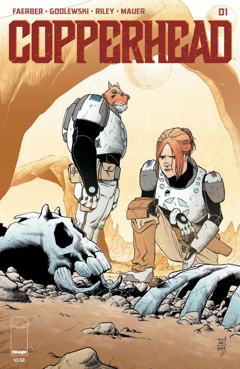
There's literally a new sheriff in town in "Copperhead" #1 and she's got a lot to learn. Jay Faerber and Scott Godlewski deliver a rock solid first issue that hits all the necessary plot beats and provides enough characterization to learn who each character is. Ron Riley creates breathtaking landscapes through inspired palette choices. This is a world that doesn't feel like it's being created in front of us so much as one that existed that we've simply discovered.
An undisclosed incident has forced career sheriff Clara Bronson and her son Zeke to Copperhead, a backwater mining town in need of her services. Brash and stubborn, she immediately rubs her new deputy Budroxifinicus the wrong way, not to mention the locals and possibly the mysterious rich man who quietly pulls the strings of the town. Faerber describes the book as "Deadwood" in space and that's an apt comparison. Bronson isreminiscentof Seth Bullock in both skill and pig-headedness. Her need for authority borders on self-righteousnessand is a trait that could run afoul of her simultaneous desire to do the right thing as an example for her son. Budroxifinicus, or Boo, is a quiet hulking presence throughout, offering blue-collar commentary on the practice of outsourcing jobs and the classic white person tactic of interrupting and overriding local customs and relationships. The dynamic between the pair is immediately strong and feels like it can easily sustain a series. The local color is seen briefly and used for both comedic and dramatic effect. They serve more as props to the overarching plot but ones that effectively showcase our leads and how they fit in to this town. Faerber is really on top of his game here.
Godlewski and Riley team up for some amazing imagery. The art is reminiscent of late 80s European comics with better use of negative space. There is great detail in each panel and a lot of emotion in the blocking of the characters. He uses the desolation of the town to quality effect, never cramping the outdoor scenes while filling interior shots with detail. You can almost hear an Ennio Morricone soundtrack but produced by Giorgio Moroder. The layouts know just when to pull wide and when to get close to create tension and show thelonelinessthat is hinted at through Bronson's wordsand facial tics. It's all beautiful work but Riley's colorssteal the show. Solid flats fill the foreground and provide our characters with life, while the backgrounds and environment all look sandblasted and weathered, creating a different visual texture between the two that adds depth and makes the town its own character.
Though the plot itself is basic, the characters themselves are interesting enough to come back for a second issue. It doesn't seem like there will be easy choices to make in this story andFaerber sets up our hero as someone who may get in her own way. Watching her learnwhat she thinks is best for the town versus what actually is best will make for good reading. The art team is just getting started and if they're this locked in during the first issue then who knows how much better they'll get once they hit their stride. Go buy this book.

