
Recently I had to take a look at The Dark Knight Strikes Again and it surprised me. It looked pretty good, had some funny, energetic treatments of old characters and an engaging story arc. I particularly enjoyed the variety of techniques used in the coloring, which heavily supplemented the mood and dynamism of the book.
In 2001 The Dark Knight Strikes Again (or DK2, the sequel to The Dark Knight Returns) came out. At the time I gave it a perfunctory reading, found it terrible and forgot all about it. In retrospect I can see that the problem was almost entirely because I was expecting a follow up to the The Dark Knight Returns. I thought I would see something similar in style, tone and life-alteringness, which is not a word and also, it turns out, not a reasonable expectation.

In 1986 The Dark Knight Returns changed our expectations of comic books and in doing so it became more than just a comic book, which meant that it did more than any sequel ever could. It wasn't just a clever take on an established character either, it looked good, The Dark Knight Returns was current, scathing and aimed at an entirely new audience. Lynn Varley’s elegant painted colors added a new technique to superhero comic book art, and her moody, atmospheric tones washed over the book, setting the scene for the gritty tale. It all came together to form a groundbreaking work an effect which was impossible to duplicate.
Ostensibly set only three years after the events of The Dark Knight Returns, The Dark Knight Strikes Again was actually 15 years later and it shows. Miller and Varley’s styles had both evolved over the intervening years and so had the techniques commonly used in comic books. While at the time it seemed like an uncomfortable departure from The Dark Knight Returns, in a different context now it makes a lot more visual sense.

When it came out the things which made it feel jarring and different from its predecessors, now seems as prescient and caustic as The Dark Knight Returns did. While Miller’s personal political beliefs appear to be starkly divisive, this monochromatic view is appropriate when applied to an aging Batman. The bitter, jaded commentary he presents us with in the world of DK2 are an entertaining commentary on where we were headed when it came out, and (as it turns out) were reasonably prescient about the way our media is presented today.

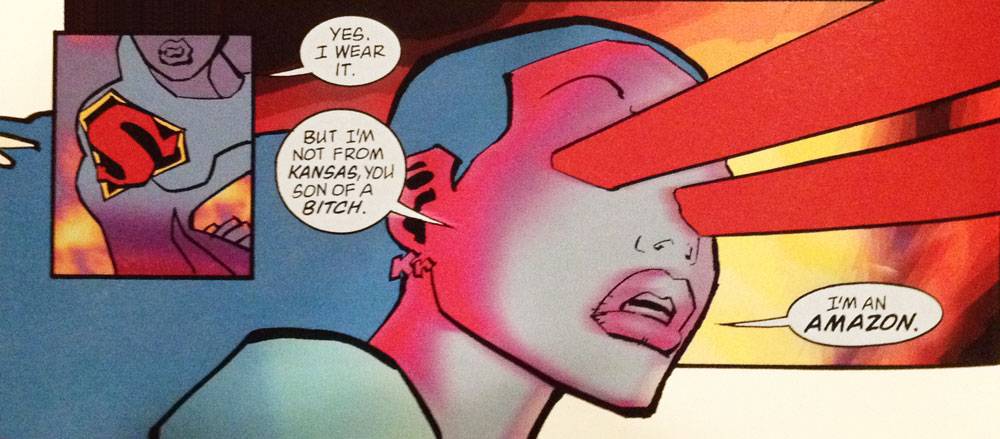
Moving away from the problem of how its predecessor spoiled its reception, another odd facet of DK2 is the standout shots. You know, those big, splashy, full-page images which are meant to really stand out? Well in DK2 they aren’t that great, they’re a little overblown and clunky, a bit too aware of how great they’re meant to be. That’s alright though, because there are plenty of impressive, high-impact, powerful images which don’t seem to have been intended for starring roles. There are panels which leap out, they set the tone and create a powerful story. They aren’t always the images we’re meant to be stopped in our tracks by, but they do a hell of a lot of heavy lifting, and it’s up to us to pay attention to those instead of those big, fancy, full-page poster images.
Miller’s more aggressive, broader strokes (both in story and art) have a gorgeous, irreverent energy I couldn’t see 13 years ago. Meanwhile Varley’s use of digital coloring which seemed uncomfortable in 2001 is now so commonly used in comic books as to be mundane. Once that shock is gone, Varley’s skillful take on the tools is unique and vibrant. What was strange when it first came out, now seems urgent and bold and it could be that the biggest problem DK2 had was an association to a preceding book it had very little in common with and no hope of overshadowing. It tried to be epic, soaring and rebellious and it sort of is, but not in the same way that The Dark Knight Returns was and that made it hard to appreciate, at first. Today it stands better alone and is deserving of a second look as a powerful superhero tale.