Regular readers might have noticed I haven’t written a column in a few weeks. I’ve had issues with a long term illness which is causing me more pain than usual and while I am trying a new treatment, it hasn’t yet begun to help. This means that I’m probably not going to be able to return to writing a weekly column right away, an annoying hindrance but for now I’ll try to write as often as possible.
The frustrating part of being unable to write every week is that I’ve had lots of things I wanted to tell you about and I’ve probably forgotten half of them by now... Pain makes me a bit slower to communicate, and I’m having to focus all the energy that I do have on visual design work (which is oddly easier for me than writing, more of a distraction from pain for some reason). Here’s a little rundown and some peeks of the comic book design work that I've been able to work on during this unplanned writing sabbatical.
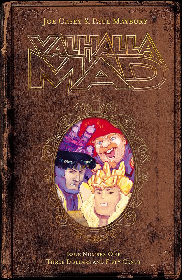
Recently I finished up the cover designs for the new series Valhalla Mad, (from Image Comics, by Joe Casey and Paul Maybury), for which I’ve created antique-looking leather bound book covers with ornate patterns to showcase artist Paul Maybury’s paintings. It was fun to play with eras, creating a different pattern for each book, as if they were remnants throughout human history and culture from our encounters with the gods of the story.
Valhalla Mad will be in stores on May 20th, 2015.
I’m always working on the ongoing monthly series Sex, (from Image Comics, by Joe Casey and Piotr Kowalski), which is increasingly fun for me because I’m playing more with color and exploring new layout directions (see the pic at top). I also created my third cover for the collected volume and that is tremendously enjoyable because I'm able to create art which (very broadly) attempts to evoke the inner journey of the protagonist.
Sex, Book Three: Broken Toys will be out in two weeks on March 25th.
At the moment I’m designing the collection of the science fiction comic book, Ballistic, (published by Black Mask Studios, by Adam Egypt Mortimer and Darick Roberston). For the cover my idea was about reducing the concept to its most basic elements, so I created a little icon-algebra illustration in the middle of a large body of negative space, to contrast with Robertson’s insanely detailed art work of the city. I offered many options, but we settled on this (the most elegant and understated of the designs). For me it works because instead of even trying to compete with the kick-in-the-face impact of the action inside the book, it gives a broader overview of the story.
Ballistic ought to be going to print pretty soon.
That's all the new design work that I can share, everything else will have to wait until another column. Meanwhile I'll be getting on with staying sane in the face of these irritating physical obstacles and I hope you all can too!

