I've written a good deal at Robot 6 and elsewhere about comic-book cover art and design, but, unfortunately (for me at least), not so much in recent months. I hope "Comics, Covered" will remedy that, as each Saturday I select the six best covers -- the most striking, the most successfully executed, the most intriguing -- to grace the shelves that week.
This week's list is filled with three comics from Marvel, one from Image, one from DC's Wildstorm imprint and one that's technically not a comic at all.
To find out what made the cut, read on.
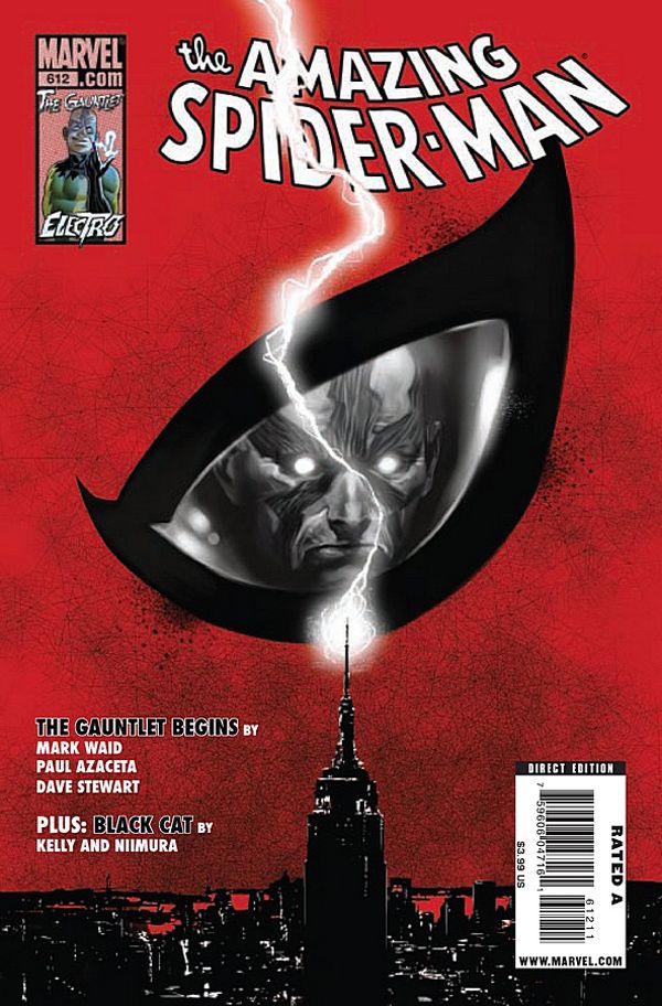
Spider-Man Loves Mary Jane aside, I'm not sure I could tell you when I last bought a Spider-Man comic, or even which one it was. But Marko Djurdjevic's stunning cover for The Amazing Spider-Man #612 would call to me from the store shelf; I'd be compelled to buy it. The close-up of Spider-Man's mask doubles as an ominous blood-red sky, disrupted by a lightning bolt striking the Empire State Building. Even without the logo in the upper-left corner or the reflection in the mask's eye we know the story involves the classic supervillain Electro, whom I presume has become more deadly since ditching the goofy mask.
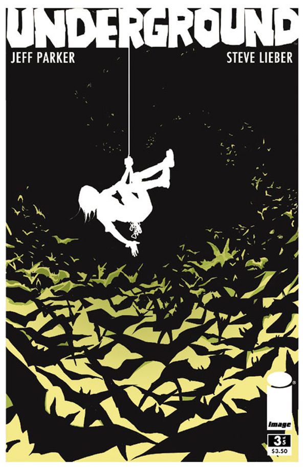
For the covers of Underground, the Image Comics miniseries set in and around a cave in Kentucky, artist Steve Lieber smartly has been toying with negative space. But it's not until this third issue that he's really nailed it, using a mass of flying bats to form a background against which he sets the silhouette of protagonist Wesley Fischer. I also like that not all of the bats are in black, providing another layer of detail.
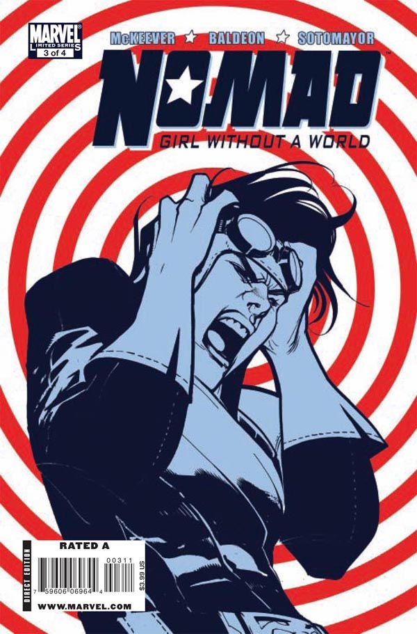
Artist Rafael Albuquerque set out limiting himself to the colors of the American flag for this unlikely miniseries about the female Bucky from Marvel's mid-'90s Heroes Reborn experiment. Like Steve Lieber with Underground, I think Albuquerque finally hits upon the right combination of composition, color and subject in the third issue: There's drama, white space, and a pop-art element that can be viewed as a reference both to Captain America's shield and to Jim Steranko's legendary cover for Nick Fury, Agent of SHIELD #4. (Oh, okay, the red circles could just be a simple target, or comic-book shorthand for a telepathic attack. But I like my idea better.)
I find it difficult not to smile whenever I see Lilli Carre's art, even when it's for an adaptation of Hans Christian Andersen's depressing Christmas-themed fairy tale The Fir-Tree. There's something about her illustrations that reminds me of children's books from the 1940s and '50s -- the ones my grandmother shared with me when I was young. I love Carre's use of elongated, rubbery arms and her choice of this delightfully macabre scene for the cover (Andersen's story is told from the perspective of the little fir-tree, so his felling signals the beginning of his slow demise).
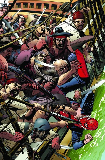
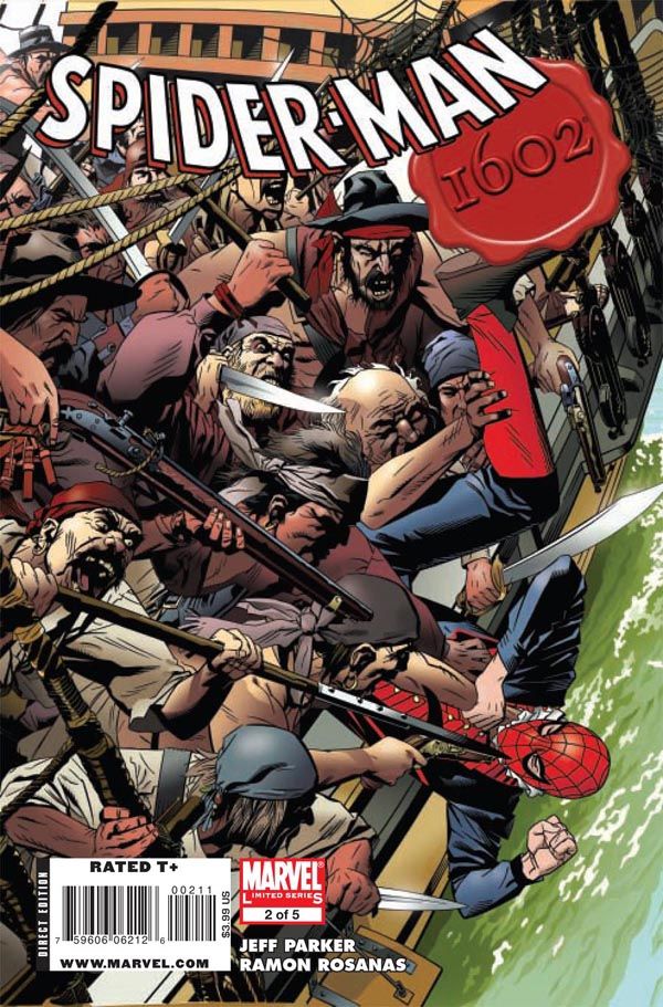
Michael Golden crams (by my count) 20 figures into this illustration, giving the cover a sense of excitement and urgency. The artist masterfully drives the reader's eye to the lower-right corner, where young Peter Parquagh, at the mercy of these ruthless pirates, dangles precariously close to the water. I also like how the logo blends the familiar Spider-Man font and the "1602" wax seal.
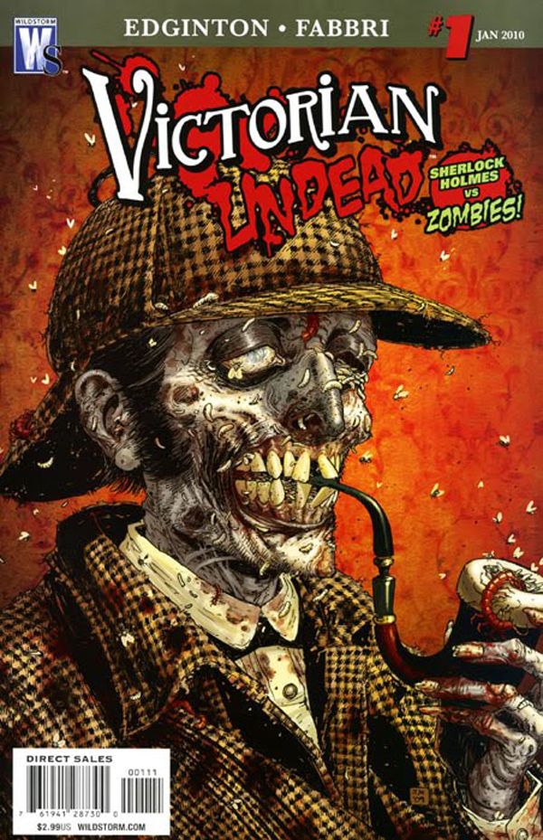
Say what you will about the popularity of zombie fiction and the recent spate of genre mash-ups, but you can't deny that Tony Moore can draw the heck out of the undead. What's more, he can convey the high concept: With the deerstalker, the cloak and the pipe, there's little doubt that we're looking at the cheerful corpse of Sherlock Holmes. Unfortunately, however, someone at Wildstorm apparently wasn't content to allow the illustration to sell the first issue of Victorian Undead. So a Victorian-style font is paired with cliche horror scrawl and topped with blood splatter. And if that weren't enough, we're hit over the head with a B-movie poster burst shouting "Sherlock Holmes vs Zombies!"
It's a shame, too, because all of that clutter obscures the lovely period wallpaper and works against a wry and, despite all of the maggots and worms, understated illustration: Our decaying detective, seemingly oblivious to his state, could easily be sitting for a portrait. It might've been nice for the cover designer to have played it straight with the cover dress, avoiding the stereotypical horror trappings altogether. (In a case of perfect timing, Colleen AF Venable just addressed Victorian-inspired design on the First Second blog.)


