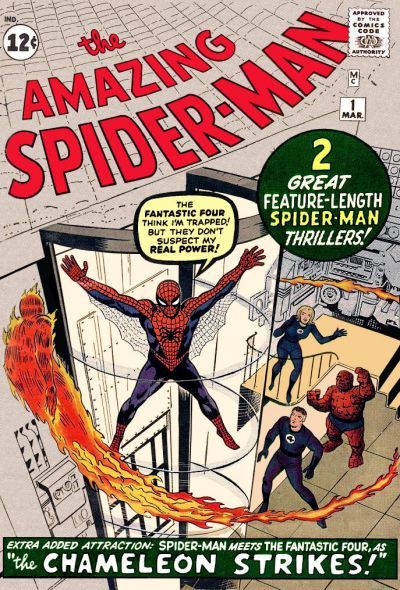
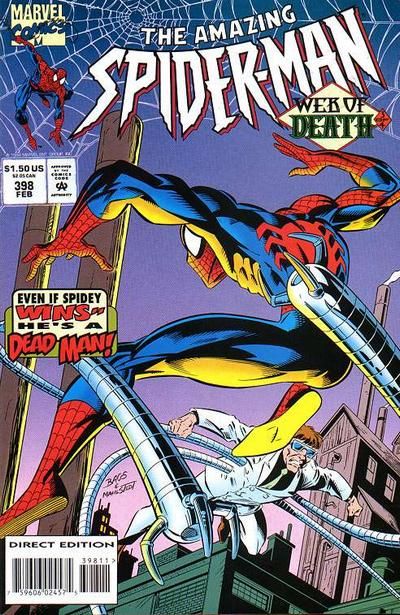
All December long, I will be doing daily installments of Comic Theme Time. Comic Theme Time is a twist on the idea of a "Top Five" list. Instead of me stating a topic and then listing my top five choices in that topic, I'm giving you the topic and letting you go wild with examples that you think fit the theme.
Today's topic is "What do you think was the worst logo change on a long-running series?"
Read on to see what I'm looking for specifically, along with some examples to get you started...
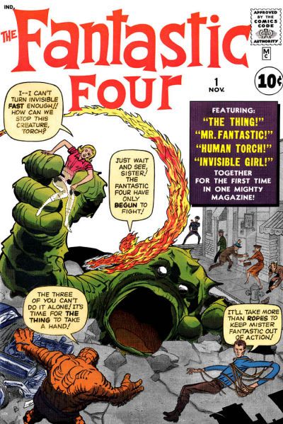
Right from the get-go, the Fantastic Four had one of the all-time great logos...
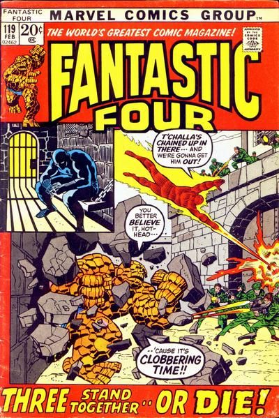
So why, for nearly ONE HUNDRED issues, did they go with inferior logos?
Let's hear what you think about long-running series and their logos!
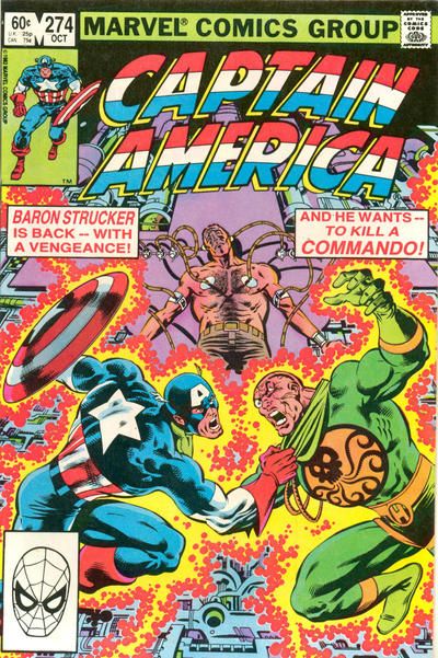
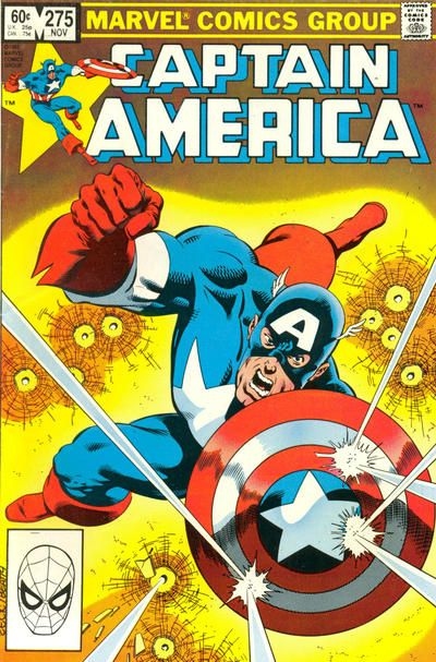
Do you like Captain America with the American flag motif worked into the logo?
Or do you like the block letters (which is what the book began with back in 1941)?
Do you like the traditional logo Spider-Man used for years?
Or did you like the spider-like logo they used for a time in the 1990s?

