The countdown continues!
Here are the next five artists that you voted as your favorites of all-time (out of roughly 1,008 ballots cast, with 10 points for first place votes, 9 points for second place votes, etc.).
35. Jim Starlin – 275 points (1 first place vote)
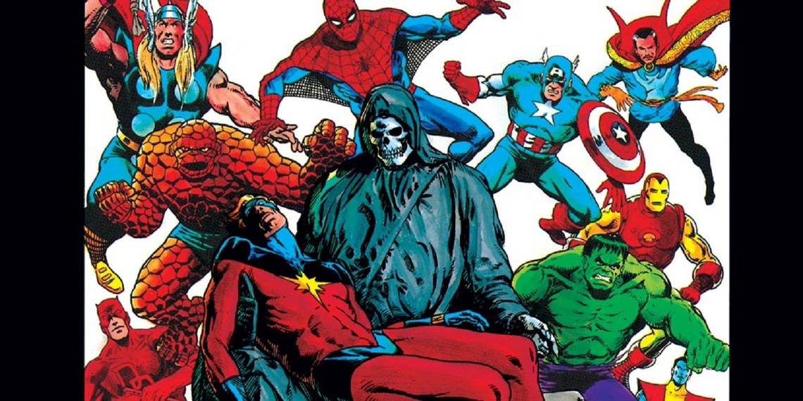
After Jim Starlin served in the Navy during the Vietnam War, he returned to the States and most likely due to what he went through during the war, he became fascinated with the human mind. In one of the many interviews he did about Thanos' creation during the lead-up to Avengers: Infinity War, Starlin noted, "Thanos came to me while I was taking a psychology class in college after coming out of the service; the ol’ Than[at]os/Eros concept. I had him sort of roughed out before I ever started working at Marvel. When editor Roy Thomas asked me to do a fill-in Iron Man, I decided to add him to the mix. I showed some character sketches I had of the character to Roy, he asked if I could perhaps bulk up Thanos some and then let me run with it. Mike Friedrich then dialogued the issue. As time went on, Thanos just sort of grew organically on his own. Not sure where his loving Death came from. At the time I was recently out of the service and rather messed up. Hard to remember what was going through my head back then."
That became a key aspect of Starlin's early comic book art once he was able to get some freedom to do his own stories. In his early work, Starlin was mostly a competent superhero artist working in the Jack Kirby style of art. However, once Marvel began to give him some freedom on first the Captain Marvel series and then the Warlock character (first as a feature in Strange Tales and then it his own solo book), Warlock essentially created the look for Marvel's "cosmic" books from this point forward and so much of what we know think of as Marvel "cosmic" clearly comes down to Starlin's view of the mind. Check out this sequence from the battle between Warlock and his evil future self, the Magus, with Thanos along for the ride...


See how much of that art style is an attempt to externalize the inner workings of the mind?
Starlin ended up having as much of an influence on the future depiction of Marvel's cosmic stories as Jack Kirby did.
Later on, Starlin began to do painted work and he did some of the most gorgeous work of his career during this time, like the first Dreadstar graphic novel...


Starlin, though, slowly transitioned into a full-time writer during the 1980s and outside of the occasional series here and there, he hasn't worked as an artist with any regularity in well over two decades.
34. Tim Sale – 282 points (5 first place votes)
The fascinating thing about Tim Sale is how long it took for the mainstream comic book companies to snatch him up. He spent most of the 1980s working in independent comic books, and it wasn't like one of those things where his early work was a lot worse than his later stuff. Sale's run on Thieves' World for Starblaze Graphics showed a lot of the same talents that he would later use on his more famous Batman work. He has always been someone who has known how to use negative space to his advantage.
It wasn't until he had a run on Grendel, though, that Sale's dynamic and silhouette-dripped art style really garnered attention from the mainstream. He got a gig drawing a Challengers of the Unknown miniseries for DC Comics and it just so happened that this miniseries was the first comic book work for the writer of the series, a popular screenwriter named Jeph Loeb. The connection between Loeb and Sale led to the creators getting together a few years later to do a special Batman one-shot to celebrate Halloween. It was well-received, so they came back to do another one for the next Halloween. Then they did a third one the following year. They had built up such a strong sense of momentum that the pair then decided to do a year-long maxiseries called The Long Halloween, set around the time of Frank Miller and David Mazzucchelli's Batman: Year One.
This series showed off the highlights of Sale's skills as an artist. He uses silhouettes and shadows and negative space as well as any artist in the industry but he also chooses these incredibly distinct page layouts for his action sequences, like this bit between Batman and Catwoman in the first issue of The Long Halloween...


Sale is famous for his larger than life depictions of comic book characters. Sale is all about the feel for the character rather than any sort of formulistic expression of the human anatomy. This is especially obvious when he draws characters like the Joker, Two-Face and Superman, where he goes into almost absurd levels with their body designs. It is all part of his attempt to get across how these characters APPEAR to others, rather than any sort of specific "Oh, well, Superman is six feet tall and 220 pounds" or whatever.


It's a highly effective exaggerated style. Loeb and Sale took their talents to Marvel Comics, as well, where they began a series of color-coded comic book miniseries spotlighting the past of some major Marvel heroes, like Daredevil: Yellow, Spider-Man: Blue, Hulk: Grey and Captain America: White (that last one was finished well after the others).
Most recently, Sale has generally kept to stunning cover work.
33. Stuart Immonen – 287 points (12 first place votes)
Likely one of the reasons that Stuart Immonen has become such an amazingly eclectic artist is the fact that he grew up with a particularly eclectic variety of comic books as his influences. In an interview with Sequential Tart around 2000, Immonen noted as particular influences, "Stan Drake's work on The Heart of Juliet Jones daily strip, and his Kelly Green graphic novels. Andrew Loomis and his contemporaries, Pruett Carter, John Whitcombe. AL Williamson, Wally Wood, Alex Raymond, Herge, Alex Toth, John Byrne, Bill Siekewicz, Katsuhiro Otomo, Masamune Shirow, Jerry Ordway, Rodolfo Damaggio." As you might imagine, those are all over the place in terms of styles and approaches, but I think one key attribute that is present in all of those artists' work is also something that has always been a hallmark of Immonen's comic book art, which has been a strong sense of storytelling. Immonen has always been a guy who lays a story out with beautifully consistent sequentials.
Early in his comic book career, Immonen had a bit more of a classical superhero style, one that still evolved a good deal from his time on the Legion of Super-Heroes...

until the end of his stint on Superman (where he eventually became a writer and artist on the series)...

What has always impressed me the most about Immonen is his constant evolution as an artist. Take his classic Nextwave series with Warren Ellis. Immonen adopted more of a cartoon sheen to his work for this series, but it was a cartoon sheen that also came with an extreme dedication to precision in the artwork. Like watch the engine on the car explode when it is punched...


Talk about dedication! However, Immonen does not use the Nextwave style on all of his work, of course. He adapts his style to fit the work that he is doing. When he did the Fear Itself crossover event for Marvel, he went for more of an epic feel to his pencils and when he did Amazing Spider-Man recently with Dan Slott, he had a slightly more traditional take that evoked his excellent run on Ultimate Spider-Man with Brian Michael Bendis. Slott's last storyline, in particular, relied heavily on having an artist who could tackle some intense emotional expressions and Immonen is all about that, as well.
Page 2: [valnet-url-page page=2 paginated=0 text='See #32-31!']
32. Wallace Wood – 294 points (3 first place votes)
Wallace Wood was a bit of a comic book savant, in that there really wasn't a genre or art style that Wood could not excel at. He was a brilliant caricaturist, but at the same time could draw the most realistic looking characters that you could see. Wood came of age at a period where comic books were doing a number of different genres, so his skills were well served for that era. He helped to convince EC Comics to get into science fiction comics and he drew some of the most brilliant science fiction covers of the era (later, Wood would then draw the Mars Attack trading card set for Topps, which would become one of the most iconic trading card sets of all-time - think of how big Mars Attacks is as a concept and note that it all came just from a card set that Wood came up with).
As noted, Wood could excel in any number of genres, which includes superhero comics. He gave working for Marvel Comics a shot in the mid-1960s, but ultimately stopped working for the company as he did not like the fact that Marvel artists had to come up with the plot to their comics without getting paid extra as plotters. Still, during his short stint at Marvel (which Stan Lee hyped up like crazy, as Lee was a huge fan of Wood's work), Wood redesigned Daredevil (giving him his classic red costume) and drew one of the all-time great superhero fight stories in Daredevil #7...


Wood is also famous for his "22 Panels That Always Work" piece, which is a guide to comic book artists on how to break up what would be an otherwise monotonous series of talking head panels. Wood's outsider status sadly never led him to the super stardom that his skills deserved and after suffering from some health issues (which included the loss of vision in one of his eyes), he took his own life in 1981 when he was just 54 years old.
31. Marc Silvestri – 311 points (2 first place votes)
Marc Silvestri first broke into comics working for First and DC Comics in the early 1980s. He moved over to Marvel Comics and worked on Web of Spider-Man for an acclaimed run with writer David Michelinie and inker Kyle Baker.
By the time Marc Silvestri graduated to becoming the regular artist on Uncanny X-Men, the X-Books were, well, "the X-Books," which was not the case for when either John Byrne or Paul Smith took over. This was not just a comic book, this was a FRANCHISE, and Silvestri was being given a chance to draw the main book of the franchise.
Silvestri used a different style back then then the one he would develop working for Image in the early 90s. On Uncanny (where he was mostly inked by Dan Green), his art was a great deal more experimental, it seemed almost reminiscent of the work Mazzucchelli was doing on Daredevil around the same time.
This was the time when the Fall of Mutants occurred, and the world thought that the X-Men were dead, but instead, they went and lived in Australia for awhile. Then Inferno happened, and then the X-Men broke up and there was a long storyline where the group slowly got back together. By this time, Silvestri had left the book to begin a popular run on Wolverine with Larry Hama.


He then helped co-found Image Comics with his series, Cyberforce. Silvestri debuted a new art style around this time that he has mostly stuck with in the decades since. It's not dramatically different from his earlier work, of course, but he definitely went for a tighter feel with his art than his looser stuff from before.


While serving as the head of his studio at Image Comics, Top Cow Studios, Silvestri still also occasionally does major comic book projects, like the end of Grant Morrison's New X-Men run, some other X-Men one-shots and a brief run on Incredible Hulk with Jason Aaron. He has also returned to Cyberforce a number of times in recent years.