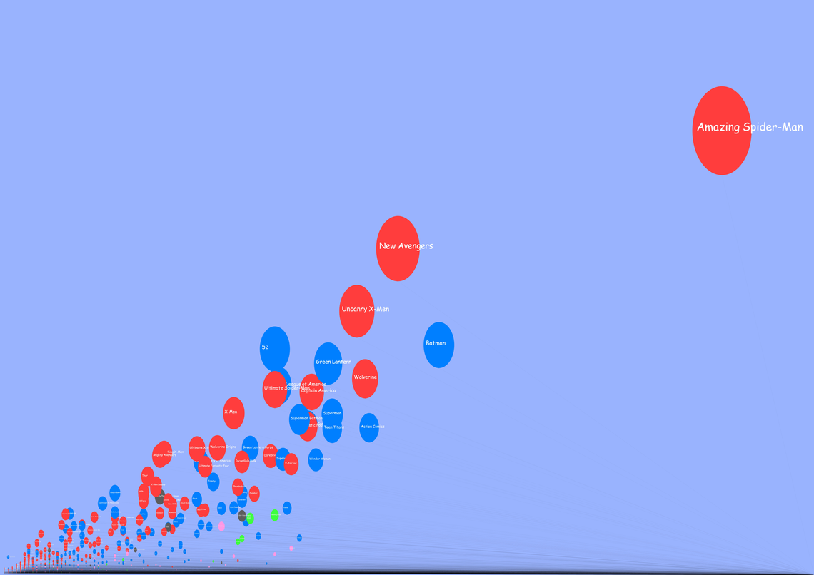
As part of a college class, Chris O'Halloran created a data visualisation of comic book sales figures from January 2005 to December 2010 (of North America sales). He did so with colored balloons on a large graph.
The bigger the balloon and the higher it floats represents how many issues in total that title sold over the time.
The further away from the left hand side of the image the balloon is, the more issues it had released.
Color indicates publisher.
Red = Marvel
Blue = DC
Green = Image
Grey = Dark Horse
Pink = Everybody else
Read on to see the chart!
This is a nearly 6,000 pixel file, so it is VERY big...

However, you can check out Chris' blog here where you can try to upload the full-sized file - it is GIGANTIC, so be forewarned!
Interesting stuff, Chris, thanks for sharing!!