There was a time when cosplay was our only chance at seeing real-world incarnations of our favorite comic book/cartoon characters. We dreamed of seeing a real car transform into a towering robot, or to see our favorite superhero so close you could see the texture on their costume. Recently, Hollywood has caught on to the fact that geek properties are amazing, but animation had already beaten them to it. It can be argued that animation has a better toolbox to be able to bring our favorite franchises to life, but the thrill of seeing them in the real world is too big to ignore.
RELATED: The 15 Most Offensive Superhero Cartoons (That You Still Love)
Who didn’t get goosebumps watching the first Spider-Man films? Or seeing Iron Man take flight in that first trailer? Or finally seeing a living and breathing Wonder Woman step in to fix the mess men had made? But sometimes, movies mess it up. They’re rushed out to cash in, to be the “next big thing” and the franchise as a whole suffers. And sometimes, a franchise should stay in animation, where it’s allowed to be as intricate, meticulous or downright weird as possible. So settle down, take a breath and join us as we take a look at 15 characters that, honestly, look way better animated.
15 BATMAN

We’re sorry to say this, but it’s our strong opinion that no live-action incarnation of the Batman can ever truly get it right. Sure, they can definitely get close. The DCEU costume is doing a bunch of things right for example. But in terms of the type of pure, iconic shots of Batman we’re used to seeing regularly in the comics, live-action can’t compete with animation.
It doesn’t help that we’ve had so many fantastic designs from DC’s animated films and, of course, the lauded Batman: The Animated Series. Think about it. Animation gave us what many people say is the definitive on-screen version of Bats, while Hollywood gave us plates of body armor disguised as a costume and nipples on the Batsuit. Thanks for playing, Hollywood, but you lose. You lose.
14 SPAWN

While we’re holding out hope for the oft-discussed Spawn reboot to come to fruition, the only live-action incarnation of everyone’s favorite Hellspawn came from the unfortunate 1997 film. Spawn lacked the expressiveness and twisted quality that made him so distinctive, instead wearing what looked like a bunch of old meat sewn together and sprayed black with a cape he’d stolen from Dr. Strange. It gets worse in comparison with the HBO cartoon.
Storming through like “hold my beer”, it absolutely nailed Spawn in all the ways the movie did not. Deep shadows, a firmer sense of character design and, above all, Spawn’s signature cape all coalesced to make the cartoon look like the comics had leapt off the page and onto the screen. We can only hope that the big screen reboot takes notes from the cartoon. If not, there’ll be hell to pay. Get it? Hell? No?
13 TEENAGE MUTANT NINJA TURTLES

A lot of us have a nostalgic attachment to the original Teenage Mutant Ninja Turtles movies. Trust us, we understand. Comic book movies were rare at the time and we’d take whatever we could get. But we need to face the truth, regardless of the pain it will bring. The costumes absolutely sucked. The Turtles all had weird, foamy faces and dead eyes; they look like boneless forms of pizza obsessed flesh.
Animation, on the other hand, brings the reptilian martial-artists to life in so many different, but equally fantastic, ways. Fun or fearsome, angular or smooth, there’s an animated Turtle to fit your taste. You could maybe chalk the difference in design quality down to age; after all, the original movies were released in the early '90s. But we would counter with four words: Michael Bay’s Ninja Turtles. Making them more realistic didn’t help, Michael. Not at all.
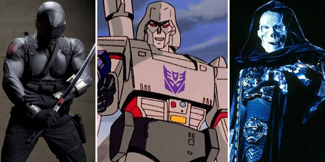
12 MEGATRON

Megatron is a funny inclusion in this list, because we can’t in good conscience call the animated Megatron well designed. Sorry Transformers fans. It’s blocky and sparse, the only real distinguishing points being some splashes of purple. However, cartoon Megatron looks like a renaissance painting compared to the version we got in the movies. Movie Megatron is a giant clump of indistinguishable metal. It’s a confusingly plain design that makes it really difficult to spot him in the movie’s copious fight scenes.
The cartoon might look cheap, but you could always tell who was who. Megatron should be an attention-grabbing presence. He’s a (literally) larger than life villain. His design needs to match that. Instead, the movies have us asking “Um, is that Megatron?” instead of shouting “Oh crap, Megatron!” While the cartoon might look cheap, the design is miles better than the “unpainted figurine” look in the movies.
11 IRON FIST

We’re going to get straight to the point here: why doesn’t Iron Fist have a costume in the MCU? Costumes go hand in hand with superheroics, but after waiting a season for Daredevil to get his duds and having Jessica and Luke abandon them entirely, fans were hoping for Danny Rand to rock up in full Iron Fist regalia to balance things out. Instead we got a Danny who was in sore need of a haircut and good scrub.
We get it, the classic design is super dated. But when the animated side of Marvel gives us multiple different modern takes on the Iron Fist costume it’s kind of hard to take that excuse seriously. Make no mistake, Marvel. We want Iron Fist in a costume. It more than makes sense now post-Defenders. Hey, nab some artists from the cartoons! They’ll show you how it’s done.
10 DOCTOR MINDBENDER

Doctor Mindbender’s design is sheer, joyous lunacy. We struggle to guess what was going through the designer’s heads when they were making the GI Joe cartoon. Featuring a large cape, thigh high boots and a metal shoulder pad/chest chains/codpiece combo, his entire look is very FetLife. Hell, there wasn’t even a guarantee that he would have anything else on!
Unfortunately, GI Joe: Rise of the Cobra chose to reduce one of the great figures in modern media to a mere cameo, including none of the fantastically weird costume from the cartoon. We would have absolutely loved to see Doctor Mindbender in all his S&M glory on the big screen, with no explanation at all. If you want an example of everything that people love about GI Joe distilled down to one character, look no further than Doctor Mindbender. Just don’t judge him by the movie. He’s better than that.
9 KILLER CROC

Killer Croc has a (incoming pun alert) killer design. A giant human/crocodile hybrid? Sign us up immediately. His design is so striking that Croc’s become a staple in Batman adaptations, scoring appearances in most animated shows, a bunch of animated movies and a recurring major role in the Arkham series of video games.
With so much precedent to learn and take inspiration from, you have to wonder how the Suicide Squad movie managed to mess it up so badly. This Croc just looked like a large human being with bad eczema. Okay, maybe not quite like that, but the point stands that it was a fairly lazy interpretation of a character that is supposed to be a towering reptilian mass. Killer Croc fans, we feel your pain.
8 VENOM

It shouldn’t be hard to get Venom’s look right. The original design is so strong, so iconic, that really all you have to do is make it. Well, you’d think. Thanks to Spider-Man 3, we now know that it is more than possible to screw up Venom’s design. Technically, the designs ticks all of the boxes for a successful adaptation, but something about it just feels off.
Venom might be one of the rare comic book characters that would definitively benefit from a CGI costume (yes, this is subtle Green Lantern shade). Venom should look organic and malleable, more of a melding of human and alien than just a human wearing a suit. Hopefully Sony studies Spider-Man 3 to take notes on what to avoid when bringing Venom to the big screen.
7 SKELETOR

How is it possible to get Skeletor wrong? He’s literally just a blue dude with a skull for a face! Despite this, the Masters of the Universe movie managed to make Skeletor creepy in the wrong way. Inexplicably giving him a mask that accentuates highlights a very human set of eyes, alongside a weird cape and what looks like a metal studded scarf, Skeletor ended up looking like a generic Dungeons and Dragons baddie. And the less said about the codpiece, the better.
The hokey designs and general cheesiness is part of the appeal and charm of He-Man and the Masters of the Universe but, instead of leaning in to it, the movie made the too common mistake of being ashamed of the source material. We ended up with a Skeletor that looked like another company's attempt at avoiding copyright issues.
6 HARLEY QUINN

Harley’s a character who’s had a lot of distinct designs over the years. Her original, timeless design carried over from Batman: The Animated Series into the comics and served her well for years. The Arkham series of video games gave Harley a grittier update to the design that was (slightly) more believable in a real-world context. With such a well-defined hook, she’s a really easy character to design for.
So why do live-action properties keep messing it up?! Obviously there’s the contentious costume from the Suicide Squad movie, which really only serves to reduce Harley to eye-candy. And then there’s the design from the short-lived Birds of Prey TV show. It’s like the designers took inspiration from her jester look but fell asleep halfway through designing it. But hey, at least it’s actually tied to her character. Suicide Squad, we’re looking at you.
5 ZARTAN

Unlike some other characters (looking at you, Shipwreck), Zartan’s costume would translate well to the big screen. All you need is some body armour and a hood. So why in the name of all that is holy was he just a dude in a suit? It makes zero sense. This is a movie based on a franchise renowned for its hokeyness; where was the line for them?! Cobra Commander, screechy voice and all, was apparently okay, but a man in a hood and some combat armor was too far?
We struggle to understand why the movie didn’t lean into the craziness that is GI Joe. If fans wanted a “real world” take on the franchise, they could watch any of the countless movies already released about counter terrorism squads. Admittedly, Zartan was the least of the movie’s troubles. But when you sell us GI Joe, we want GI Joe.
4 SWAMP THING

There’s not a lot of design elements to get wrong with Swamp Thing. Big green guy, covered in moss and tree roots with a distinctive face. Easy, right? His myriad cartoon appearances would certainly reinforce that thought. From all-ages TV shows to mature animated features, Swamp Thing has always been able to fit into whatever style is required while still retaining the key parts of his look. So why does he turn into a complete and utter mess in live-action?
Swinging wildly from “oddly smooth green man” to “corporeal contents of an unblocked toilet”, there seems to be some kind of curse that prevents ‘ol Swampy from looking like, well, Swamp Thing, when they try to realise him. With Swamp Thing set to be a member of the team in the upcoming Justice League Dark, let’s hope the curse can finally be broken.
3 MR. FREEZE

Batman: The Animated Series put Mr. Freeze on the map. Victor Fries languished in literal comic book Limbo before B:TAS reinvented the character as a tragic, tortured scientist. It was so successful that they brought him back to the comics with pretty much the same backstory and origin as the cartoon. Rocketed in popularity, so much so that he was chosen to join the elite club of Batman villains to grace the big screen. Big mistake.
The feature film version, portrayed bewilderingly by Arnold Schwarzenegger, looked like a Cylon on some sort of robotic steroids. Worst of all is the helmet that is supposed to regulate his body temperature, but also has a totally open face. It’s so inefficient it hurts. Luckily, Batman and Robin broke the trend of “adaptation influence” with Mr. Freeze, and the silly chrome football player look was left to rust.
2 AEON FLUX

Aeon Flux is one of the most egregious examples of adapting a property for its name alone. The MTV cartoon was known for its distinctive visual style and complex storylines focusing on philosophy, sex and gender. The movie threw Charlize Theron in some spandex, had her do some yoga moves and wrapped it up in a generic sci-fi bow. The “leather and straps” aesthetic was key to the cartoon’s exploration of adult themes; for the movie to hint at it with straps on Theron’s chest angered fans, as well as creator Peter Chung.
Yes, the cartoon is eccentric. The costumes are essentially wear for specific "activities". But that’s Aeon Flux. Ultimately, the ridiculous change in Aeon’s costume was the tip of the iceberg that was the fan’s distaste. If you want to experience Aeon Flux, watch the cartoon. If you want an interesting sci-fi movie starring Charlize Theron, watch Prometheus.
1 SNAKE EYES

Snake Eyes, from a design point of view, is really just a ninja with some metal on his mask. And some pouches. Okay, a lot of pouches. So when a GI Joe movie was announced, people were pretty confident that they would see Snake Eyes fully realized in front of their eyes. The result wasn’t quite as “fully realized” as it was thrown together.
Oddly, they actually pulled the top half off. The helmet’s great, the material of the torso looks like the cartoon and comics to a tee, but apparently the budget ran out halfway through because Movie Snake Eyes is running around in cargo pants. Why?! The difference in textures is really jarring and stands out like a sore thumb. There’s no reason that an elite ninja should be running around in pants that look like they’re sold in the same store as paintball guns.
Which of these cartoon designs do you find the best? Let us know in the comments!