Each week, staff writers Kevin Melrose and Steve Sunu discuss their five favorite covers from the previous Wednesday's new comic releases, selecting from among them CBR's Cover of the Week. With the end of 2012, it's time to look back over this year's best covers for the year's top 15 Covers of the Year, which included work from Paolo Rivera, Darwyn Cooke, Dave Johnson, Fiona Staples and many more.
Keep reading for Kevin and Steve's favorites for the year and then discuss your choices in the CBR Forums.

Reteaming with "Northlanders" writer Brian Wood, cover artist Massimo Carnevale establishes from the get-go that this isn't the Conan we're accustomed to from decades' worth of comic stories: The brawny, brutish warrior has given way to the brash, young upstart. As Carnevale demonstrated with "Northlanders," and "Y: The Last Man" before that, he's an expert painter with a mastery of light and color, presenting a determined Cimmerian bathed in golds and reds, glowing against the murky backdrop of the ship and its crew. -- Kevin Melrose
While Rafael Grampa's variant cover is certainly unusual in that it doesn't feature the name of the comic (particularly bold, given that it's the first issue), the image is undeniably beautiful, if maybe a little disconcerting. The details and colors on the massive -- wait, there's the title! -- jellyfish are simply stunning, and its juxtaposition with the man on the boat lends the creature a staggering sense of scale. As usual, Grampa delivers. -- Kevin Melrose
Jock brings to a close the five-year-run of the acclaimed crime series by Jason Aaron and R.M. Guera with a callback to the very first issue, published in March 2007. That debut image featured a defiant Dashiell Bad Horse wearing a traditional headdress, his chin jutted out and nunchaku dangling from around his neck. Fast-forward 59 issues and we have a somewhat-softer Dashiell, with an angry child on his shoulders; it's that child who now grips the protagonist's weapon, signaling perhaps the same rage, the same problems, in a new generation. The secondary images have also changed, most notably a sign for the Gina Bad Horse Community Center replacing the billboard for Red Crow's casino. The covers combine to create the perfect bookends for the series. -- Kevin Melrose
I confess that when I initially saw this arresting Sean Phillips cover for his new collaboration with Ed Brubaker, I mistook the nearly matching swaths of red on either side of the woman's head for enormous flowers in her hair. So mesmerizing -- so alluring -- are her smoky gray eyes, set into a pale face marred only by ruby lipstick, that all of the other elements take a back seat. As such, when I stared at a larger version of the image and realized the background contained not large orchids but book-end demons baring their teeth in sinister grins, the effect was that much more chilling. -- Kevin Melrose
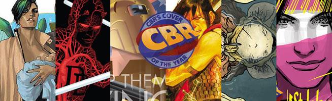
Never mind the controversy over the depiction of breastfeeding, Fiona Staples wonderfully captures the characters for this debut cover to her new fantasy adventure series with Brian K. Vaughan: They're protective and, yes, alien parents, nurturing their child in one hand, and protecting her in the other. The image also evokes classic sci-fi imagery -- I'm thinking specifically of the original "Star Wars" poster -- without being a tiresome homage. -- Kevin Melrose
From "Y: The Last Man" to "Wonder Woman" to "52," J.G. Jones' covers seldom disappoint. So why should "Before Watchmen: Comedian" be any different? For this issue of the prequel, set during the Vietnam War, Jones gives us a wonderful shot of the Comedian casually wading through water in the jungle, trailed by -- here's the terrific part -- a pool of blood shaped like Vietnam. It's clever and effective. -- Kevin Melrose
If Yuko Shimizu has ever created a just "so-so" cover for "The Unwritten," I've yet to see it (she won a silver medal, shown here, from the Society of Illustrators for the cover of Issue 43). For this issue, in which Tom Taylor pays a visit to the god Hades, Shimizu creates a breathtaking vision of the Greek underworld, from the golden-haired harpy (far more beautiful than the ones inside) to the identically colored lake of fire. I also like the glowing, reverse-silhouette effect used for Tom and his companions, shown in the boat they commandeered from Charon. -- Kevin Melrose
David Petersen's wraparound cover is simply gorgeous, with all of the elements, from the design to the color, working together to creator a memorable image. While the image of a dead Em floating in the water would be powerful on its own, Petersen ups the ante with the fine details on the petals, and the single black feather clutched in the mouse's paw. Such emotion and such skilled line work and coloring makes this image an easy choice for one of the top 2012 covers. -- Steve Sunu
Matthew Southworth's cover is absolutely gorgeous in its simplicity. The reflection of the street signs is a clever way to depict Dex Perios in a car, as Southworth barely makes the steering wheel visible, but he also gives another major clue in the form of the rear-view mirror reflection on Dex's face. Design aside, the half-smile on Dex's face as she drives is pitch-perfect for the character and makes it seem -- rightly so -- that she knows much more than the reader. -- Steve Sunu
Jock is certainly no stranger to CBR's "Cover of the Week" or Robot 6's covers of the year before that, and here's a prime example of why: His variant cover for "Hit-Girl" #3 is exploding with energy and violence; it's brutal, despite the lack of secondary characters. Our pint-sized vigilante kicks the book's logo -- I'm a huge fan of logos that interact with the illustration -- which shatters like the teeth of some hapless criminal, a comparison strengthened by the spray of blood that follows the path of Hit-Girl's leg. -- Kevin Melrose
Archery enthusiasts often scrutinize the appearance of the bow in film, television and comics, as those depictions frequently are terribly inaccurate (or so I'm told, again and again). The form is all wrong, the arrow is held on the wrong side, etc. It's for that reason I find David Aja's cover for "Hawkeye" #2 so funny, and so terrific. He faces all of those criticisms head-on, showing Clint Barton in a page ripped from an archery handbook, paying special attention to form and arrow release. Of course, that opens the door for someone to tell Aja that he got something wrong. -- Kevin Melrose
For the latest miniseries starring Mike Mignola's 1930s pulp vigilante, Dave Johnson (no relation to our hero) draws inspiration from the movie posters of the era, depicting Lobster Johnson as an almost-alien threat, looming over the mobster with his titular "burning hand" (for those who don't know, he burns his lobster-claw symbol into the foreheads of the criminals he kills). I like most everything about this cover, but particularly Johnson's restrained color choices -- the combination of stark black and white, grainy grays and gold splashes. -- Kevin Melrose
In a pitch-perfect homage to 1940s war bonds posters, Darwyn Cooke nails what makes the Rocketeer so incredible. Presenting the reader is the type of image you could easily see gracing storefronts and alleyways during World War II, Cooke gets everything right, from the simple and angular shape of the Rocketeer to the solid colors to the familiar slogan "Keep Them Flying." Cooke's cover is one of the best examples of a thematic and iconic image that both keeps in step with the sensibilities of the book it's wrapped around while standing on its own as a damn fine piece of art. -- Steve Sunu
Skottie Young has been doing some really cute work on the baby variants for Marvel NOW!, but it's easy to say his cover for "All-New X-Men" #1 is his best yet. Young's signature style is always a pleasure, and he brings the same dedication to detail that he does to Marvel's "Oz" adaptations -- but this is far funnier. At first glance, it seems to be just the four original X-Men with a broken Iceman in the center, but a closer examination reveals Wolverine's shadow looming over the babified first class as they exhibit guilty looks on their faces, attempting to shift the blame of "Who Broke Baby Iceman" to one another. Not only is it Young's best variant so far, it's one of the standout covers of the year. -- Steve Sunu
Paolo Rivera's covers for Marvel's relaunched "Daredevil" have been consistently breathtaking, delivering wildly imaginative interpretations of the blind hero's enhanced senses. This image for Issue 18 is, of course, no exception, as Rivera allows the reader to peer into the circulatory system of the Man Without Fear. In far too many instances, a book's logo will mar an otherwise stunning cover illustration, but here the treatment actually enhances the image, as blood appears slosh within the letters; it's easy to imagine the sound of blood throbbing in Matt Murdock's ears as his heart rate quickens. -- Kevin Melrose