Franchise fever isn't quite as intense as it used to be in Hollywood. Still one of the biggest trends appears to be taking popular names or brands and trying to shove them into something new. While this trend is relatively new for movies and regular television show, it’s been happening for decades in cartoons. Cartoons, mostly because they don’t have to worry about their actors growing old or even getting all the talent together under one roof, have been allowed to revive and reboot themselves ad nauseam. It’s almost strange if a popular cartoon property doesn’t have at least one redesign or new take during its time in the public eye.
Most cartoon reboots try to keep a similar style to what preceded them. Yet on a few occasion, the redesigns have gone way off the reservation. This is especially true recently. If there’s a new cartoon based on an old property, it can almost be guaranteed it won’t look anything like the old one. This list isn’t a condemnation of the new looks for old cartoon characters. In fact, some of the new looks from the old classic characters have proven to be even better, or at the very least more popular, than the original. It is interesting, though, how much certain classic cartoon characters have changed since the first appearance and all the backlash (or sometimes all the praise) that these massive changes endure. If there's one thing we've all learned throughout the years, it's that diehard fans don't like change, especially if it's not how they imagined the characters they've grown up loving.
20 TEEN TITANS

It’s true that The Teen Titans originally appeared in the pages of DC Comics. However for many fans, especially younger ones, the Cartoon Network series that ran from 2003 to 2006 was their first exposure to the superheroes. The original Teen Titans is also why its reboot and redesign, Teen Titans Go! has been received so badly from fans.
Teen Titans Go! reunites the original main voice cast of Teen Titans but for a series that’s radically different in tone and look. Instead of the anime-esque style of the original series, Teen Titans Go! has much of a chibi and childish look. This matches the series’ tone which is very goofy. It’s a far cry from what people remember of Teen Titans.
19 SAMURAI JACK

The style of Samurai Jack hasn’t changed much. Samurai Jack has an intriguing style that’s full of sharp angles and contrasting colors that’s unique to its executive producer and creator, Genndy Tartakovsky. The original series, which ran for four seasons, and its revival, a final fifth season, have the same overall style. It’s just the character of Jack who went through a huge transformation.
For the fifth season, Jack was given a beard and a much more savage appearance, reflecting the character’s own desperation. Even more striking though was that Samurai Jack’s finale season did away with the series' kid-friendly approach to violence. Jack was really a samurai for the final season, with all the great volume of blood that implied.
18 DUCKTALES

The difference between the Ducktales revival and the original series isn’t as jarring as some other reboots. Yet Huey, Dewey, Louie and, of course, Scrooge do look a little bit different than they did in the late '80s and early '90s cartoon.
The change isn’t as shocking because it’s in line with other Disney proprieties. Still the famous ducks have a little bit rounder of heads in the currently running revival. Those heads are also a lot bigger, at least compared to their bodies -- it’s overall more of fluid and smoother style. Ducktales is a beloved series but the animation and movement were always a little rough. This has been removed in the reboot.
17 THE FLINTSTONES

The Flintstones haven’t been rebooted (unless you count the '90s live-action movies) quite yet. The classic version of The Flintstones is still the most popular look, at least in the realm of movies and TV. However, in 2016, DC Comics decided to take The Flintstones and give them all-new and hyper-realistic look.
Fred Flintstone was no longer a blocky goblin but a full-grown (and very muscular) man. The reason for the new look wasn’t just to do something weird but to take all the goofy conventions of the original cartoon and apply to something akin to real life. DC’s The Flintstones only ran for 12 issues but it was far more compelling and amazing than you’d think. The Flintstones do, strangely, work in the real world.
16 WACKY RACES

The Flintstones weren’t the only classic cartoon that DC thought they’d revamp with a comic. There was a whole initative where DC Comics took Hanna-Barbera cartoons and rebooted them for a limited comic series. One of the most insane, in a delight way, was Wacky Raceland.
The original Wacky Races was a late '60s cartoon that was basically Mario Kart with Hanna-Barbera characters. It was a racing series where cartoon characters tried to reach the finish line first in a car and used various (wacky) means to get ahead. DC rebranded Wacky Races, named it Wacky Raceland and put into a post-apocalyptic Mad Max world. The Wacky part doesn’t make a whole lot of sense but the sheer insanity of everything makes up for it.
15 SCOOBY-DOO

The same initiative that created Wacky Raceland and DC’s The Flintstones was also applied to Scooby-Doo. The Scooby Gang got their own hyper realistic makeover with Scooby Apocalypse, which put the gang in the literal apocalypse. While that is the strangest Scooby redesign, it’s not the most recent. Be Cool, Scooby Doo ran from 2015 to 2018.
As opposed to Scooby-Doo! Mystery Incorporated, which was more of an update of the classic style, Be Cool, Scooby-Doo completely changed the look of the characters. Everyone was given long legs, blocky torsos and very round, expressive eyes. The humor also changed with Fred becoming a control freak, Scooby becoming much quick witted and Shaggy going from someone who's totally out of it to Marx brother.
14 ALVIN AND THE CHIPMUNKS

In a lot of ways, the redesign of Alvin and the Chipmunks has supplanted the original design. The CGI movies which began 2007 and spawned four sequels (all with ridiculous punny names) have become the dominant look of the Chipmunks. Alvin smirking with a hoodie and/or sunglasses is what most people think of when contemplating the Chipmunks.
However, in the '80s Alvin and the gang looked much different. The original Chipmunks were much more wholesome and simple. The only thing the CGI movies really took from those designs were the main color scheme with Alvin wearing red, Simon in blue and Theodore in green.
13 BEN 10

The original Ben 10 began in 2005. It ran for several seasons and spawned several spin-offs. All of which had a very simple, amine-lite style. Ben 10 wouldn’t be what anyone would call mature, but Ben looked more like a teenager than a small child. In 2016 though Ben 10 was revived, and everything was made to look a whole lot cutesier.
The new Ben 10, which has run for three seasons and running, doesn’t have nearly as many sharp lines or angles. Everything is rounded, soft and just overall simple. It’s strange as the tone really hasn’t changed from one Ben 10 to the other but the intent is clearly for the new series to appeal to a younger audience.
12 THE GRINCH

The live-action Jim Carrey starring The Grinch is the stuff of nightmares and not just because it takes 15-minute cartoon Christmas special and balloons it out to almost two hours. Yet there’s another Grinch coming that takes the green meanie even further away from his classic style.
In 2018 a CGI Grinch movie will hit big screens. Unlike the original special where The Grinch was intentionally and even endearing rough-looking, the new CGI Grinch is weirdly fluffy. There’s something a lot more adorable and lot less curmudgeonly about the new Grinch. It’s not necessarily a problem but it is a difference.
11 TRANSFORMERS
A lot of things can be said about the Michael Bay Transformers movies, some of those things are bad and some of comments are just OK (none of them are good). Yet the one thing that can be said of the new Transformers is that like look nothing like the old Transformers. The original Transformers were a product of their time -- the cartoon was blocky, cheaply animated and created with almost the sole purpose to drive toy sales. There’s not a single thing about Transformers that looked realistic.
Yet with the Michael Bay movies, the Transformers have been made to appear very mechanical and technical. The series might not make any sense but there’s an effort to make Transformers look like real machines ... as they tear each other apart.
10 WINNIE THE POOH

The new Winnie the Pooh is a more of a revival than a total redesign. Yet the Pooh that’ll appear in 2018’s Christopher Robin is a whole lot different than the Pooh that many kids grew up with in Disney movies.
Christopher Robin’s Winnie the Pooh is based on the real-life teddy bear that was owned by the son of author A.A. Milne. Milne used the bear and his son, who was named Christopher Robin, to write the first Pooh stories. These stories would later be adapted by Disney starting with 1966’s Winnie the Pooh and the Honey Tree. It just doesn’t seem right to have Pooh not be in cartoon form but it makes more sense than some of Disney’s other recent live-action adaptations.
9 MY LITTLE PONY

The success of My Little Pony is rather staggering. The franchise began with a 1986 movie based on the Hasbro toy line and eventually spun off into a cartoon that lasted a little over a year. In the movie and the series, the eponymous ponies looked a lot like the toys but they were also incredibly ugly. The original My Little Pony was blocky, poorly animated and just drab.
In 2010, My Little Pony was rebooted with My Little Pony: Friendship Is Magic and it began a phenomenon. The new My Little Pony is still running and there’s no sign of stopping. With its bouncy and colorful style, it has, thankfully, wiped away all memory of the original.
8 HARLEY QUINN

Harley Quinn has been claimed by comics and supehero fans but she didn’t start out that way. She was created and originated as a cartoon as a part of Batman: The Animated Series. Harley’s original purpose was to give The Joker a more recognizable henchmen and she quickly grew in popularity.
There was nothing “skimpy” about the original Harley Quinn design. She wore a skintight suit, but Batman: The Animated Series was designed very much with kids in mind. Yet since Harley has joined the comics and beyond, she’s been made to wear skimpier and skimpier outfits. It does fit her character but there’s few things visually connection the original Harley and the DCEU version.
7 DUMBO

Disney won’t rest until every one of its classic cartoon movies is reimagined for live-action. Dumbo, which is set to release in 2019, won’t be the last but it is the latest. It also, understandably, completely changes Dumbo’s look from his original Disney style. Considering 2019’s Dumbo is being directed by Tim Burton, the giant eared elephant could look a lot different. Burton, probably by Disney’s decree, fought against his more “gothier” instincts.
Dumbo just looks like a tiny elephant, albeit one with gigantic ears and too large eyes. Yet the realism is quite a contrast with the original, especially in the face. Cartoon Dumbo, like most Disney animals, has a very expressive face. Live-action Dumbo shows slightly more emotion than the average elephant.
6 JEM

This might be the most radical and most useless change of the bunch. Jem originally came into people’s lives as a quasi-superhero cartoon. Jessica Benton was a normal music company owner, but she could transform into a rock singer alter ego Jem. She was “truly outrageous.”
In 2015 that bonkers and very '80s concept was taken and turned into something incredibly boring. 2015’s Jem and the Holograms was a low budget, paint-by-numbers film of a young girl getting chewed up by the vicious music industry. There was no secret identity or no outlandish action scenes. Jem and the Holograms was about a YouTube musician realizing that Hollywood was just too crazy for her.
5 THE MAGIC SCHOOL BUS

The original Magic School Bus ran from 1994 to 1997. It chronicled the adventures of Miss Frizzle, the best or most neglectful (depending on your perspective) grade school teacher who took her class on several unbelievable adventure aboard her magic school bus. In 2017, Netflix revived the series in The Magic School Bus Rides Again and everything changed.
Miss Frizzle was replaced by her sister, the other Miss Frizzle, and the kids got all-new looks. The Magic School Bus Rides Again is certainly more expensive looking that the original but some of the uniqueness, especially when it comes to the kids’ designs, is lost in the revival. Every kid has nearly the same face with different coloring.
4 G.I. JOE

The original G.I. Joe, like a lot of cartoons on this list, was some poorly animated content. The TV series which began in 1985 doesn't hold up well, at all. It was poorly acted, only slightly better animated and overall just kind of a mess. Yet there’s still something lovable how the first G.I. Joe. The most recent live-action adaption was anything but charming.
G.I. Joe: The Rise of Cobra and its sequel took the Transformers formula and applied directly to the G.I. Joe franchise. It was gritty, full of explosions and meant to be taken very, very seriously. No one did, because it was terrible, but it was nothing like the campy (but unfortunate looking) cartoons.
3 ASH KETCHUM

For nearly 20 years Ash Ketchum of Pokémon has looked the same. No matter how many new generations of Pokémon are introduced Ash stays constant. He’s a 10-year old who's forever terrible at training Pokémon.
In the most recent iteration of the anime though, Pokémon finally changed Ash up. In adapting the Sun and Moon generation, Ash was given an all-new and much more younger appearance. He’s still recognizably Ash, from his scratchy voice if nothing else, but Ash looks off. Ash's eyes are further apart, his nose basically non-existent and he’s overall just smaller. Ash isn’t just staying the same age -- he might be de-aging now.
2 TEENAGE MUTANT TURTLES

We aren’t talking about the Michael Bay produced Turtle movies. While that movie's sequel, Out of the Shadows, was fine enough, nothing will ever be OK about the way the Turtles were redesigned for 2014’s TMNT. Yet the live-action Turtles aren’t the most recent redesign.
Rise of the Teenage Mutant Turtles, which will premiere in late 2018, is shaping up to be the biggest departure from the original Turtles yet. For the first time the Turtles aren’t just differentiated by their colors. Raphael is now gigantic, Donatello much skinnier, Leonardo has strange stripes over his body and Mikey, well Mikey still looks like Mikey. Rise of the Teenage Mutant Turtles could be amazing. It definitely looks interesting, but it just doesn’t look much like the classic Turtles.
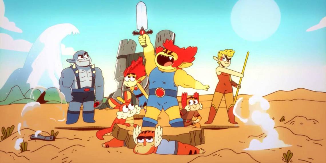
1 THUNDERCATS

Thundercats is the newest, and therefore probably the most controversial, cartoon redesign. In May, Cartoon Network revealed their Thundercats revival, Thundercats Roar. The easiest way to describe Roar is it takes Thundercats and applies the Steven Universe style to them. The bottom line though is that the new, adorable Thundercats are nothing like the '80s original.
Yet that’s probably for the best as the original Thundercats was a little too common and homogeneous with every cartoon surrounding it. Thundercats didn't have anything its own. Thundercats doesn’t look like the first cartoon but it at least looks unique and fun.