Whether you’re a die-hard comics nerd or you don’t know Thor from Thing, chances are you’ll still be able to spot the "comics font" from miles away. A new video by Phil Edwards at Vox explains why this "font" is so recognizable -- and also why it’s not a "font."
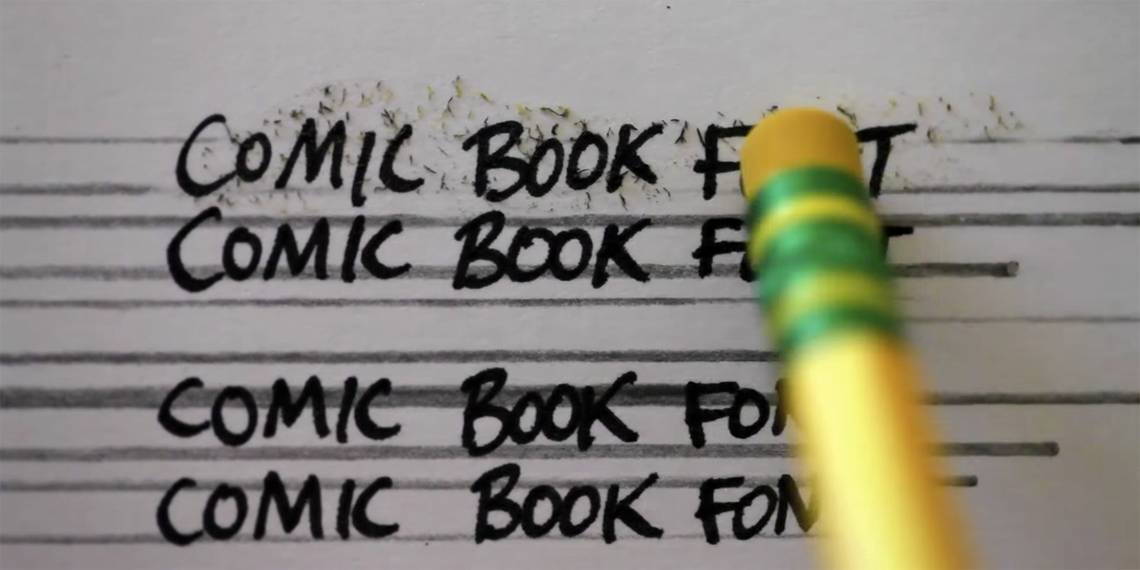
The well-crafted 8-minute video traces the history of comics lettering from its Golden Age to today. The reason for the relatively "standard" style of comics lettering comes from the size of the Ames Guide (a device used by letterers to maintain a consistent size of letters on the page) and also the quality of the paper. Until relatively recently, the quality of comics paper was little better than pulp, which meant that the standard newspaper style of lettering simply couldn’t work as the ink would run and the page would become a blotchy, illegible mess.
Aside from the quality of the materials, the "industry standard" style had to be maintained because of the conveyor belt system of comics production. Comics artists and writers were expected to churn out work at an alarming rate in early years and there was rarely a designated ‘letterer’ in the office. This meant that different people -- often just the ones with the best handwriting, as the video points out -- had to jump in to complete lettering jobs or fix typos, so they all had to be on board with a similar style to maintain consistency in the books.
The video also traces the evolution of comics lettering into the 21st Century. Initially all lettering was done by hand -- and often still is by masters such as Todd Klein -- but companies such as Comicraft and Blambot now have a huge library of expertly rendered letters on the databases. This doesn’t mean that the art has died out in any way, though. As the video shows, there are nuances in the styles of the great letterers, who often design their own fonts for digital use. Todd Klein -- who’s lettered the greats like "Sandman," "Swamp Thing" and "Promethea" -- has a distinct ‘R’ you can recognize in all of his work. The same goes for legendary comics artist Dave Gibbons whose ‘G’ is iconic among letterers and keen-eyed fans alike.
The video goes a long way towards giving a well-deserved voice to what’s often referred to as the Silent Art of comics and it’ll help you appreciate the pages you hold in your hand even more.