As a franchise, X-Men will always hold a special place in the hearts of fans. Its growing popularity in the '80s and '90s made it one of the first comics many of us ever read. Later, the first X-Men movie helped to usher in the era of modern superhero cinema. These movies were the Avengers movies before we had Avengers movies, showing how awesome it was to see multiple superheroes onscreen at once. The bottom line? We would never have the hotness of the MCU if the X-Men movies didn’t first show us the way.
RELATED: Snikt In The Bud: 15 Ways Fox Ruined Wolverine For Diehard Fans
However, translating these colorful characters to the big screen was not an easy task. Like many good superheroes, the X-Men are often defined by their villains, and the X-Men movies have brought quite a few of these villains to life. Some of the big screen designs were a major improvement, making goofy comic designs into intimidating and realistic clothing. Other times, though, the costume department really phoned it in (we’re looking at you, X-Men 3). Want to know who was hot and who was not? You don’t need to head down to the mall and ask Jubilee…just check out our handy guide to 8 X-Men Villains That Look Better On-Screen (And 7 That Really Don’t)!
15 BETTER: MAGNETO

Magneto is one of the most iconic Marvel villains, and he is the X-Men's signature foe. While there have been attempts over the years to streamline his look, the Magneto of the comics has typically retained his terrible original look: a gaudy red and purple ensemble complete with an unwieldy cape and what might be the world's ugliest helmet.
Magneto has always looked better on-screen. Sir Ian McKellen's Magneto typically sported a darkened and more simplified version of his costume. Michael Fassbender's Magneto has a final costume closer to the look of the comics, but with more muted colors. However, recent X-Men movies often portray him without the helmet, and sometimes out of his supervillain costume altogether. When you've got an actor that looks like Fassbender, can you really blame them?
14 WORSE: JUGGERNAUT

The original Juggernaut costume makes a big, bold statement. The colors evoke the red gem that powers him while the helmet dehumanizes him. Juggernaut isn't a man so much as an unstoppable force. After seeing him trounce our favorite heroes time and again, Juggernaut’s costume is one we associate with raw power.
He gets a live-action makeover for X-Men 3, and it's really horrific. The helmet shows too much of his face and looks like a bootleg of Magneto's helmet. The rest of his costume makes him look like a reject from a Mad Max movie. The costume exposes too many weak areas, and it highlights the fact that he lacks the power of a mystical gem. Unless you like his leather daddy chic, we think the comic design is far superior.
13 BETTER: MYSTIQUE

The Mystique of the comics has always had a weird design. In Marvel's defense, having her be as naked as she looks in the movies would have likely had comic censors up in arms. However, the costume we do get is bizarre: the white clothing looks bland and uninspired, while the weird skull on her forehead makes her look more like a voodoo doll than a real character. And the giant go-go boots just make the whole thing look absurd.
The on-screen Mystique has been portrayed several different ways, and all of them are a major improvement over the comics. Her default look is to be completely nude, which helps highlight her ability to use her body as a weapon, And in X-Men: Apocalypse, she spends most of her time in a human form -- and Jennifer Lawrence is pretty damn easy on the eyes!
12 WORSE: DARK PHOENIX

In many ways, Dark Phoenix is the most powerful X-Men villain. Her comics appearances match her fiery temper, and she usually sports bold golden and maroon colors. Such an appearance really sells the idea that she is fire and rebirth incarnate, and we can immediately tell why these colors struck fear into the hearts of the X-Men. Ultimately, this is far better than her live-action counterpart.
In X-Men 3, this look is translated to "red dress." And...that's it! While Famke Janssen can definitely rock a red dress, she ends up spending most of the movie looking like an angry girlfriend instead of a universe-threatening cosmic force. When your cosmic Big Bad looks like their entire costume was fished off the clearance rack, you know you’ve got a bad design.
11 BETTER: EMMA FROST

For years, the White Queen of the comics has represented the absurdity of Hellfire Club fashion. However, her style, which is basically "adult club meets Victorian era," is completely absurd. And while the comic lampshades this a bit by emphasizing that she uses her body as a weapon, it’s difficult to take the overt objectification very seriously.
When the character was brought to life in X-Men: First Class, they kept her revealing nature while making everything more realistic. We get a token scene where she is scantily-clad, but she's mostly in a sleek white suit that lets her be a threat without being a bad joke for adults. This is much better, letting us focus on her character and her powers without spending the whole movie ogling her assets.
10 WORSE: SABRETOOTH

Sabretooth is one of those comics designs that sounds terrible on paper. The design notes may as well have read "copycat Wolverine outfit, but with more fur." However, this ends up accentuating his fierce and feral face. Taken altogether, his comic appearance does everything it is meant to: it evokes comparisons to Wolverine while presenting Sabretooth as a savage and uncontrollable animal force.
However, it's not a look that easily translates to the screen. In the first X-Men movie, Tyler Mane plays the role, and he's basically playing himself: he spends the whole movie looking like a confused wrestler who simply wandered onstage. The Wolverine comparison is also lost due to Wolverine himself favoring black leather in the movie. Finally, the savage face of the comics has been replaced by bad teeth and a stupefied stare. If you want your Sabretooth fix, stick to your back issues!
9 BETTER: WILLIAM STRYKER

The William Stryker of the comics is not a very intimidating guy. As many internet humorists have noted, the scariest thing about him is his uncanny resemblance to Mike Pence. For readers of X-Men comics, “guy in a suit” is just not very scary at all. However, the movie Stryker is a force to be reckoned with.
The X-Men movies changed Stryker from a religious zealot to a military mastermind. He now looks genuinely dangerous, and he serves as a powerful symbol of government persecution of mutants. He also makes for a worthwhile foe for Wolverine. In both the past and the future, the cinematic Stryker has become the X-Men's most persistent threat. The fact that he has survived so many encounters with characters like Wolverine showcases just how strong this new Stryker really is.
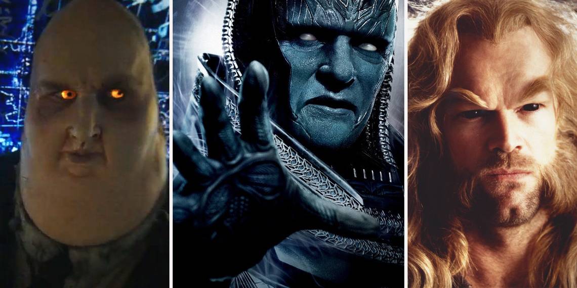
8 WORSE: APOCALYPSE

Apocalypse is another character that was destined to make for a difficult on-screen portrayal. The comics character is a straight up science-fiction monster -- he can change his size and shapeshift into anything he needs to kill his enemies. His simplified armor helps to accentuate inhuman features such as his freaky zipper lips, making him truly frightening to look at.
The movie version of Apocalypse goes in the wrong direction by making his costume overly ornate and his face overly simplistic. Thus, we end up getting distracted by weird details (such as why he has robot dreadlocks). The character’s face itself seems like little more than blue makeup and colored lenses. For fans, this is very distracting, and it makes it difficult to focus on Apocalypse without thinking this is just Poe Dameron’s Halloween costume.
7 BETTER: LADY DEATHSTRIKE

If we're being honest, the comic Lady Deathstrike is a pretty terrible design. She looks like someone in need of a nail-trimmer threw together a Renaissance Fair costume out of a thrift shop. The fleshy appearance of those nails also looks nothing short of gross, and it pulls her hobo couture costume together in all the wrong ways. Fortunately, the movie version is a big improvement.
This was during a period of time where every other movie's costume designer liked The Matrix way, way too much. This is why the colorful X-Men costumes of the comics became black leather in the first movies. For Lady Deathstrike, this was a huge upgrade: her outfit makes her look frightening and sleek and highlights her scary metallic claws. Her look is perfect for how she is portrayed: as a nearly-unstoppable and inhuman killing machine.
6 WORSE: ARCHANGEL

Archangel, like Apocalypse, is difficult to bring to the big screen. This is only fitting, as Archangel (the techno-organic modification of the X-Man Angel) is the creation of Apocalypse. The comics character looks like something off a metal album: freaky blue skin, loud purple tights, and metal wings that shoot shrapnel shards of death at his opponents.
Compared to this, the version we get in X-Men: Apocalypse is a huge letdown. The cool blue face is replaced by a handful of tasteful black lines. The loud purple is replaced with yet another round of generic black armor. And while his wings look neat, we don’t really get to see them in action as much as fans would like. Going off his movie design, it looks like Apocalypse should have left this one in the oven a little longer.
5 BETTER: SEBASTIAN SHAW

Like the White Queen, Sebastian Shaw's fashion choices are held back by his membership in the Hellfire Club. In the comics, he alternates between looking like a Victorian fop (dig that ascot) or a shirtless pro-wrestler. To Shaw’s credit, he’s often able to pull off each look reasonably well, but it’s tough to take such a throwback design very seriously. Fortunately, Kevin Bacon makes this silly character look good.
The upgrade was simple: the cinematic Shaw simply wears period-appropriate suits rather than old-timey finery. This makes him look formal and menacing, and also underscores the Hellfire Club's successful integration into mainstream society. He blends right in as a respectable businessman, with many never understanding his true power before it is too late. In this way, he is also the perfect representation of humanity’s fears of mutants: a charming and powerful threat hidden among them.
4 WORSE: REAVERS

The Reavers were always going to be a big screen disappointment. This is because the comics versions are straight out of a cyberpunk fever dream: characters have guns and rocket launchers built into their arms, tank treads for legs, and pretty much any other weaponized cyborg ideas you could dream up. They ended up being worthy foes for Wolverine, who would tear through them only to see them be rebuilt time and time again.
In Logan, the Reavers we get are generic. The closest thing we get to “awesome cyborg” is the fact that everyone has a robotic hand. Visually, this is very disappointing, and it’s difficult for fans to not imagine the awesome onscreen cyborgs that we could have had. Everyone looks like nothing more than a glorified grunt, and that’s all we get onscreen.
3 BETTER: THE SHADOW KING

The Shadow King has taken many forms in Marvel Comics over the years. His powerful telepathic abilities have given him frightening forms within the Astral Plane and allow him to possess people. His default form, though, as a comically fat man wearing sunglasses and a fez, is just silly-looking.
In the Legion series on FX, the character gets a huge makeover. He can still possess people, but his default form is "The Devil With the Yellow Eyes." In this nightmarish form, he stalks the mind of David Haller, and there's a decent chance he'll pop up in your nightmares after watching the show. Much of the series examines what is real and what is only in David’s head, and the otherworldly horror of this design is well-suited to the distorted reality of the show.
2 WORSE: PYRO

The comic book Pyro must go to the same clothing boutiques as Dark Phoenix. Like her, he sports a red and gold costume that is meant to evoke the very same flames that he uses as weapons. Combined with a fire-spewing backpack, we can see that this is a character who has fully embraced fire as his personal aesthetic.
The movie version of Pyro is disappointing on every level. What we get is an angry, black-clad fire starter who has the ability to change the fire he generates. His "costume" is basically just "angry kid," which is a serious downgrade from his colorful comic costume. While this is a very cool power, it doesn’t make his movie design look any less lame: his onscreen incarnation looks like he’d be more at home in a Lifetime movie about troubled teens or school shootings than he is fighting the X-Men!
1 BETTER: TOAD

Toad has had a few different looks in the X-Men comics over the years. These include costumes with garish combinations of green, orange, and purple. Throw in a tongue lolling out and thick black glasses and you get one of the world's ugliest mutants, and he’s little more than a sidekick.
In the first X-Men movie, his design is simplified and improved. The dark outfit of the film is an improvement over the ugly comic colors, and the closest thing to goofy glasses is his eyewear when he welds. Finally, he only brings the tongue out during combat. Most of the time, he looks like a passable Star Trek extra, and for a character with such an awful original design, “generic green guy” is a big improvement!
Got an X-Men villain we overlooked? Or do you want to defend a terrible design decision? Be sure to tell us in the comments!