When it comes to superheroes, few things stand out like their costume choices. Characters maintain the same costume for decades because creatives recognize how the design has become so near and dear to the fans. When costumes are changed, it often leads to quite a bit of dissent from long-time fans…and usually, just as much happiness when the outfit is inevitably changed back. It's for this reason that most of the time when superheroes make their way into cartoons, their costumes are just minor variations on whatever the most classic outfit is. The fewer waves made, the easier it'll be to sell the show.
Still, that’s certainly not the case with every cartoon. Sometimes animated series are eager to reinvent the wheel and create their own version of classic characters. When that happens, the results can be mixed. Over the years, some animated costumes have turned out even better than their comic counterparts and, just as often, they’ve crashed and failed miserably. It’s something of a toss-up, but when it’s done right it deserves to be celebrated…and when it’s done wrong we’ve got a wall of shame waiting. With that in mind, these are the 8 Animated Costumes That Are Better Than the Originals (and 7 That Are Worse).
15 BETTER: VIXEN

Witnessing the surge of popularity that Mari McCabe has experienced over the last few years isn’t the biggest surprise. She’s been featured prominently inside of the Justice League on and off for the better part of a decade, gradually growing in relevance. Plus the love triangle she had within the Justice League Unlimited cartoon between her, Hawkgirl, and John Stewart was often one of the most compelling parts of an already great show. So seeing her pop up not just on Arrow but attaining her own mini-series on CW Seed feels like less of a surprise and more of a “long time coming”.
Also a long time coming? The change to her outfit. The plunging V-Neck she’s been wearing for the last few decades being replaced by an outfit geared to the more athletic demands of superheroing is a welcome upgrade.
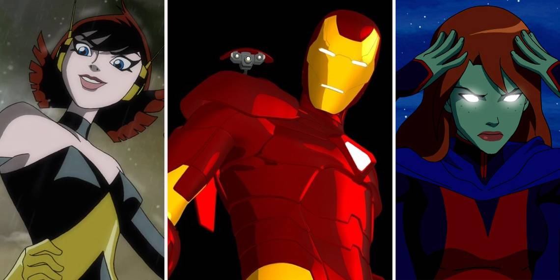
14 WORSE: IRON MAN (ARMORED ADVENTURES)

In 2008, Marvel decided to display their excellent abilities of cross marketing by giving Iron Man a show, taking advantage of the massive surge in popularity the character was enjoying thanks to his film. The cartoon aired just a few short months after the movie landed in theaters, and ran for roughly four years and 52 episodes, adapting quite a few legendary old and new Iron Man story arcs.
But while the story certainly delivered, the show’s…unique CGI art style left quite a bit to be desired. Taking one of the worst ideas from Iron Man’s history and turning him into a teen, his armor looked rather small and scrawny. At the same time, despite the use of computer animation the character’s armor lacked in the detail fans had grown used to after decades of watching the character’s suit grow in the comics.
13 BETTER: ARROWETTE (YOUNG JUSTICE)

Admittedly, this one’s a bit of a cheat since we haven’t actually seen Arrowette in action yet. We know she’s apart of Young Justice’s confirmed third season, “Outsiders”, but we know very little about her right now. Still, we do have her costume and this list is about aesthetics before anything else. Cissie King-Jones was a creation that came from Impulse #28, where she was pushed by her over eager mother into taking after her and becoming a superhero.
She wore a variation on her mother’s own costume, which seemed much more useful as a stage outfit than proper crime fighting. The costume lacks any sort of decent protection against harm and leaves several vital areas of her body exposed. Fortunately, the Young Justice variation of her costume fixes all of those problems, leaving her in an outfit that’s far better equipped for the rigors of “the nightlife”.
12 WORSE: THOR (AVENGERS ASSEMBLE)

For two seasons Marvel’s premiere Avengers cartoon was Avengers: Earth’s Mightiest Heroes. Developed by animation legend Christopher Yost, EHM was a very classically designed Avengers series that utilized a ton of old-school, Silver Age designs for most of its characters. Its successor Avengers Assemble, on the other hand, tried to incorporate as many modern versions of its characters as possible, with the intent of capitalizing off the designs native to the films. Generally, this worked out fairly well as there wasn’t too much of a difference between the classic and film versions of the characters.
But with Thor, his outfit shifted slightly -- moving the armor plates that lined the center of his chest out to the sides. It’s a small change, but it makes the plates look less like armor…and more like hilariously oversized buttons.
11 BETTER: STARFIRE (TEEN TITANS)

As an alien princess who’s spent the last several years on Earth as a member of various versions of the Teen Titans, Starfire’s always had a...”cavalier” approach to clothing. Honestly, for as much noise that got made during her reintroduction for DC’s New 52 line of comic books, it isn’t like her original outfit was all that much better. It’s really not until her DCYou ongoing that she started to wear something that could be interpreted as actual clothing...even if that clothing was only a tube top and hot pants.
It’s not surprise though that this outfit seems fairly inspired by the cartoon Starfire’s outfit from 2003, which was always considerably more subdued than what the Tamaranian was used to in the comics. The cartoon managed to display Star’s free spirit through her personality, which meant she was able to do her superheroing in more than just a bathing suit.
10 WORSE: FALCON (AVENGERS: UNITED THEY STAND)

If this cartoon doesn’t look familiar, then that’s not a surprise. In 1999, Fox witnessed the popularity of WB’s Batman Beyond cartoon and decided that was something they should attempt to emulate. The result was Avengers: United They Stand, a cartoon that was set roughly twenty-five years into Marvel’s future, and blended futuristic technology with then-modern appearances. The series was most notable for being an Avengers cartoon without Captain America, Iron Man, or Thor (as a result of licensing problems), and for giving all of the Avengers advanced suits of battle armor that they would take on in order to enhance their natural abilities.
Falcon’s design is generally fairly simple and impossible to mess up, which is why most of his costumes usually turn out quite well…but once someone decided to slap a bunch of armor on him this was a guaranteed stinker.
9 BETTER: HAWKMAN (YOUNG JUSTICE)

Hawkman’s outfit has always left much to be desired. Though it did kind of balance the scales in terms of guys wearing impractical costumes showing too much skin, it was always impractical. Running around displaying his bare-chest with only a pair of pants and the harness he needed for his wings, nothing about Hawkman’s outfit screamed alien from another world or reincarnated Egyptian king.
But then in comes Young Justice. The series was already known for redesigning the costumes of several heroes, both for the main teenaged heroes and for the Justice League as well. In nearly all cases, function ruled over form, and the redesigned Hawkman outfit adheres to this rule. Here, Carter Hall is appropriately covered in armor and clearly looks like he could be a member of an alien police force.
8 WORSE: BATMAN (SUPER FRIENDS)

This one’s a little unfair for a lot of reasons, but it certainly still counts if only for historical posterity. When the Super Friends first launched as a cartoon in the '60s, the creators weren’t exactly interested in making Batman anything close to a “Dark Knight”. The popularity of Adam West’s Batman television series was still firmly in everyone’s minds and cartoons were still thought of as a thing meant for children, and so the design we got for Batman was a much friendlier looking character than what we’re used to today.
It’s not just the outfit or the color scheme though, even though this suit does utilize lighter grays and blues. On the contrary, the comic book version of this very same outfit uses the same color scheme but still manages to make Batman into the imposing superhero we know and love.
7 BETTER: SUPERBOY (YOUNG JUSTICE)

This second version of Superboy was introduced in 1993’s Adventures of Superman #500. Unlike the original, this version of the character wasn’t simply “Clark Kent as a young teenager” but was in fact a clone of the actual Superman that awakened a bit too early. For a long time the character had his own, then-modern variation on the Superman outfit, but in the early '00s he switched into a T-shirt and jeans look that had become quite popular for the time.
Young Justice's Superboy emulates this look for a time, but eventually graduates into something distinctively less “bro-y”, instead choosing a longer-sleeved “S” shirt and some more professional looking work pants. It’s a tiny change, but one that works with the show’s continued evolution and improvement and makes Superboy look like he takes his job more seriously than his comic counterpart.
6 WORSE: CYCLOPS (X-MEN: EVOLUTION)

X-Men: Evolution is probably one of the few times Cyclops actually has a personality that isn’t “uptight jerk” outside of the comic books. The character was able to be defined by more than his relationship with Jean, he could take (and give) the occasional joke, and yet he still commanded respect as the de-facto field leader of the X-Men.
Great as his character development is on the show however, his actual costume? Awful. What makes the costume fall apart more than anything else is its attempt to stay too close to theme. He’s got a golden X on his chest and two massive shoulder plates that have a black “X” over a red background. Because he’s an “X-Man”. Get it? Ugh. Yeah, this outfit’s got nothing on the classic Jim Lee suit, or most of his other outfits.
5 BETTER: THE RAY (FREEDOM FIGHTERS: THE RAY)

If there’s any proof needed that superheroes are literally everywhere these days, it’s that in 2017 the CW decided to give The Ray a cartoon series on their online network CWSeed. Easily one of the lesser-known heroes in DC history, there’s been no fewer than four versions of The Ray created over the course of a near eighty year history. And they all have one thing in common: their costumes are usually terrible.
Fortunately, when Greg Berlanti and Marc Guggenheim brought the character to wider audiences in Freedom Fighters: The Ray, they gave the character’s outfit some much needed tweaks. They got rid of the awful white pants and the drum major-esque buttons on his coat in order to create a simpler design that contrasts perfectly with his powers.
4 WORSE: SUPERGIRL (JUSTICE LEAGUE UNLIMITED)

Supergirl has never been known for wearing the most practical costumes, but at least she looks good saving the world. Dressed in the same colors as that of her famou superhero, earth-saving cousin, Superman. Supergirl's costume has become almost as iconic as that of Clark Kent's, but the cartoon version of the Maid of Might decided to go with a look that most readers aren't huge fans of.
The Justice League Unlimited series went with the white shirt-wearing Kara for a time, and it's a look that a lot of fans weren't particularly fond of. Wearing white gloves like a doorman at an expensive hotel, the JLU look isn't one that we typically picture Supergirl in. Thank god the CW went with the classic look as opposed to this one.
3 BETTER: WASP (AVENGERS: EARTH'S MIGHTIEST HEROES)

Janet Van Dyne has been a part of the Marvel Universe nearly since the very beginning, first appearing in Stan Lee and Jack Kirby’s Tales to Astonish #44 in 1963. A veritable renaissance girl, she’s just as likely to be leading the Avengers into battle against Ultron as she is to be designing cutting edge fashion. As such, she’s known not as much for one costume as she is for multiple, as she uses her superhero outfits as another outlet of creativity, constantly creating new costumes for her work as the winsome Wasp.
Still, nothing quite compares to her costume from the 2011 Avengers’ cartoon, Avengers: Earth’s Mightiest Heroes. It’s a tiny variation on her '00s era outfit that shows off Janet’s spunky, energetic personality while still being just as fashionable as she’s always been known for.
2 WORSE: LEGION OF SUPER-HEROES

This is a particularly egregious example. In 2006, the futuristic Legion of Super-Heroes team finally managed to score a television series for themselves. Initially, they popped up in the Justice League Unlimited episode “Far from Home” as a sort of backdoor pilot, and the series was intended to be the next part of the then ever-growing DCAU. Unfortunately, around that time it was decided the DCAU would come to an end. Instead, much like The Batman and Teen Titans before it, it was decided this new Legion series would take place in a self-contained universe and have its own, unique art style.
This would’ve been fine, except the art style is absolutely hideous. Not a single character manages to elevate themselves above their source material, and viewers had seen nearly everyone in the show portrayed better elsewhere.
1 BETTER: MISS MARTIAN (YOUNG JUSTICE)

M’gann Morzz was a fairly new character when she was introduced as a core member of Young Justice’s cartoon, having only appeared not even ten years prior in Geoff Johns and Tony Daniel’s Teen Titans #37 in 2006. Her costume was meant to be a tribute to Martian Manhunter’s, matching his blue cape and signature red X with one of her own, and was likable enough that Young Justice has her wear a similar costume for the first season.
Still, by the second season M’gann ditches the skirt for a pair of pants and changes the white of her costume for black. It’s still an emulation of J’onn’s look, but it’s also a much cooler appearance for the character, and likely a way of indicating her role as more of a stealth-based member of the team.