The Marvel Cinematic Universe draws inspiration from decades worth of ideas, storylines, characters and inventions when exploring their next films. Marvel Studios have incorporated classic comic visuals into quick gimmicks or even into character defining moments. But because many of these characters have such iconic looks, they have to go through a rigorous design process before Marvel brings them to life. For some, there has to be a way that their costume makes sense in the 21st century. How do you make sure that Captain America’s costume isn’t just scales, boots and gloves? By turning it into a combat military uniform of course.
RELATED: 8 MCU Villains That Look Worse On Screen (And 7 That Look Way Better)
And sometimes there are some beautiful concept designs that are genuinely enthralling, but they just don’t make the cut for whatever reason. Although there are many designs that don’t see the light of day because they’re just not good enough for the MCU. Whether that’s because they’re not as instantly recognizable as characters, or it’s just the wrong vision for the film. We’ve dug through countless designs to show you what might have been possible for your favorite heroes and villains in a Marvel movie. Here are eight MCU characters that looked better as concept art, and seven that actually looked worse.
15 BETTER: HAWKEYE

Legendary archer and secret agent, Clint Barton had interest character arc during Avengers: Age of Ultron where it turned out he had a family that he was trying to keep secret. Surely a great way of keeping a personal life secret, would be to don a mask? We don’t just mean the traditional goofy pointed mask associated with Hawkeye, but the one from the Ultimates series by Mark Millar.
When Hawkeye came out of retirement during Captain America: Civil War, he was sporting a new purple and black costume. But the concept art took his outfit a step further, incorporating a face mask with goggles that look similar to Hawkeye in the Ultimates series. The mask works great in concealing his identity whilst also giving the archer a slick look.
14 WORSE: ROCKET

One of the breakout stars from Guardians of the Galaxy, was Rocket Raccoon. Voiced by Bradley Cooper, his sarcastic cynicism and dry humor struck a chord with fans across the world. His size didn’t fool us, he was a brutal killing machine that enjoyed hurting people -- but there was something lovable about the agile creature.
But the agile nature of Rocket might not have made it into the movie had this concept art been the basis for the character. He’s definitely a heavier character than the skinny killing machine that we’re used to. Plus, he looks very gruff and brutish with the way his armor grips his body. It’s still a cool design, but the final look for Rocket just seems to grab people. Yeah he’s kind of cute, but he’ll also shoot you in the face. This concept just looks like he’ll shoot you before you speak.
13 BETTER: ANT-MAN

Bringing characters like Scott Lang and Hank Pym to the big screen could be quite difficult given the powers of the suits they wear. But Marvel managed to pull it off quite well. The idea behind the costume in the films is that it’s a containment suit, the wearer has to be fully sealed in so that it can work. But what if Marvel chose to stay traditional?
This piece of work by Andy Park shows how the iconic Ant-Man helmet could have looked on screen. Many of the helmets in the comics leave Scott/Hank’s mouth free so that they can talk to their fellow heroes. This follows that same look, with a few different style choices, like the light up antennas for example. It would defeat the object of a containment suit though, so that’s why the design never made it into the film.
12 WORSE: ULTRON

With James Spader voicing the classic robotic villain, there was no way Marvel were just going to have him voice a robot without using motion capture. They needed to make full use out of Spader’s acting abilities, including a physical performance. So when it came to creating a design, they needed a villain with a moving face.
One of the potential designs we were given looks like Decepticon from Transformers, and not in a good way. Since Ultron was a highly intelligent piece of technology, why would he need spikes on his shoulders, elbows and his head? They’re more of a fashion statement than as an offensive weapon. Luckily, Marvel chose a different route than this gothic, spiky nightmare. Plus, with that facial expression, the AI looks very animalistic, the complete opposite of his cold and calculating personality.
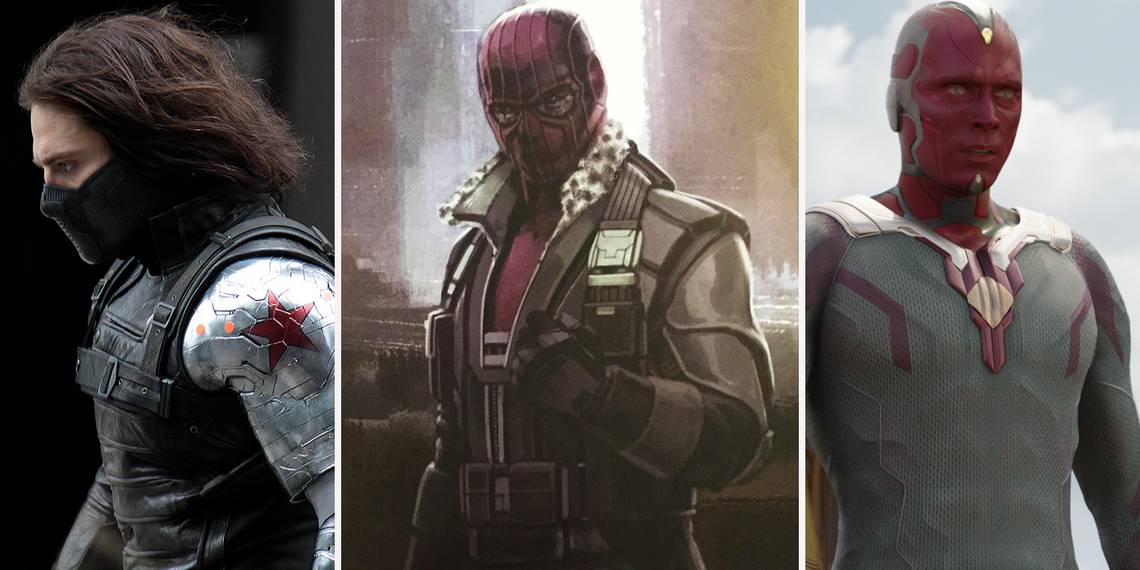
11 BETTER: THE WINTER SOLDIER

James Buchanan Barnes, aka The Winter Soldier, aka Bucky. As soon as he was hurled from the train during The First Avenger, fans wondered when he would turn up again. They didn’t have to wait long, as he was one of the main antagonists of The Winter Soldier. But when creating his signature look, Marvel went through several different designs.
Our favorite is this one by Josh Nizzi. Whilst the final arm they used in the film was quite slick and used metallic plates over the top of the limb, this version is more robust. It’s not quite as sleek, but it looks like it could definitely do some damage. We wouldn’t want to take a punch from that. What’s really cool, is the way that it’s built into the armor that Bucky’s wearing. The smaller Hydra logo is also a neat little addition.
10 WORSE: YELLOWJACKET

We have trouble with Yellowjacket as a character anyway, and it’s a problem that plagues many Marvel movies. They keep pitting their heroes against villains with the exact same powers or abilities as them. Yellowjacket is one of those villains, aside from the lazer cannons that is. But the final design does look very slick, it looks like an evolved version of the Ant-Man suit.
But the concept designs for the Yellowjacket suit look completely otherworldly. They don’t look like something born out of Cross Technologies, instead looking like a space suit built for the Nova Corps. The faceless domed helmet also looks undoubtedly creepy. It’s not a bad design whatsoever, but it wouldn’t have matched the tone of the Ant-Man film at all. We’ll stick with the yellow, black and gray suit we’re used to thanks.
9 BETTER: STAR-LORD

Once the Guardians of the Galaxy made their enigmatic debut into the Marvel Cinematic Universe, Star-Lord’s red leather rogue look really caught on. But his original style in the comic was slightly different, with a blue outfit. This concept by Andy Park plays into the space rogue style, whilst also honoring the classic costume.
The helmet has a similar design to the one we’re all familiar with Chris Pratt wearing, whilst it also covers the top of his head like the original. And the main body of his costume has plenty of straps and pieces of armor held together. It almost has a feel of some of the armor from the Destiny franchise. There isn’t much to connect with since he almost looks robotic here though. But it’s a costume we wish got the live action treatment.
8 WORSE: HULKBUSTER

When the Age of Ultron trailers first landed, the biggest selling point for fans was the inclusion of the Hulkbuster. It’s a suit that helps Iron Man combat the Hulk if he goes rogue. And seeing them go toe-to-toe was visually exhilarating. But this design would have made the fight tip in the balance of the Hulk very quickly.
Just from a logical perspective, wouldn’t the Hulk be able to pull Iron Man out of the Hulkbuster suit by his head? That would probably kill Tony Stark too. And with the three external arc reactors over the top of the silver suit, it looks quite villainous rather than heroic. Maybe that’s just because it doesn’t have the signature hotrod red paint job. This suit doesn’t look nearly as cool as the final Hulkbuster from the film.
7 BETTER: DOCTOR STRANGE

It may have been out for a while now, but Doctor Strange still proves to be one of the wildest movies in the Marvel Cinematic Universe. Once he travels to Kamar-Taj and begins his mystical journey, Stephen Strange is given blue robes to wear, before the Cloak of Levitation chooses to help him during a fight. But the original art for the Sorcerer Supreme would have given him a look that fits with the rest of the Avengers.
The blue robes are traded out for a smarter undercoat, with the Eye of Agamotto peeking over the top of the collar. The cloak of levitation also is a much sleeker design. The collar isn’t as large as the problematic one that kept getting in Strange’s face when he first wore it. It’s an interesting design, and the red accents that border the blue coat compliment the cloak brilliantly.
6 WORSE: THE VISION

Even though Marvel allowed a glimpse of The Vision to be seen in early trailers for Avengers: Age of Ultron, it was still great to see what he would finally look like in live-action. We’re just thankful that he doesn’t look like this previous design. The android was already pushing the boundaries of science fiction by being brought to life by an Infinity Stone, but he looks almost demonic in this drawing.
Maybe it’s the piercing red eyes, but The Vision looks very intimidating. Sure, he’s supposed to be an awe-inducing character. But he genuinely looks pretty scary like this. He looks more like the type of robot that goes insane and starts to murder everyone around it, rather than a superhero. Marvel definitely chose the right design for Paul Bettany.
5 BETTER: BLACK PANTHER

Now before we get into this one -- we’ve got a quick disclaimer. The MCU Black Panther looks fantastic in Civil War and in the trailer for his solo film, we’re not contesting that at all. But when we saw him in action during the third Captain America film, his suit didn’t wow us enough. Sure, it looked cool, but the technological advancements of Wakanda didn’t fully reveal themselves there, although it looks like they will in the solo movie.
This suit designed by Jerad S. Marantz shows off a sleek, almost biological take on the costume. A techno-organic suit that enhances T’Challa’s already heightened powers? Yes please. Then there’s the mask. He has a very intimidating look, not someone you’d like to meet in a dark jungle somewhere. This looks like a black-ops version of the usual suit, and we love it.
4 WORSE: FALCON

In Captain America: The Winter Soldier, the writers brought Sam Wilson into the fold with his wingsuit. He immediately became part of the team, and formed a lovable bromance with Steve. One of the best things about his wingsuit was that it didn’t need to be part of a whole costume, it could be worn over the top of any outfit. Jeans and a T-shirt? No problem.
This concept art gets completely in the way of that idea. Sam Wilson’s flight suit looks like something out of Halo rather than a semi-realistic take on a superhero. And whilst the wings are clearly designed to look like something from a jet, it comes across more like a Vulture suit. This suit just feels like too much. We prefer the Avengers suit Falcon was given.
3 BETTER: WHIPLASH

Iron Man 2 is still a controversial film that proves divisive among fans and critics. Many love it, many despise it. Many of the criticisms come from the film just pitting a man in a robotic suit against other robotic suits. There’s nothing to really challenge Tony in a big way. Whiplash (Mickey Rourke) is a big part of that. His suit just looks like an updated version of Iron Monger from the first film.
However, the original design of his suit followed the rest of the drones that Vanko had designed for Justin Hammer. The suit looked more militaristic than the final version we saw at the end of Iron Man 2. Added with a machine gun attached to his shoulder and this version of Vanko seems more of a hulking weapon.
2 WORSE: IRON MAN

When third Iron Man movie rolled around, Marvel didn’t think that Robert Downey Jr. would sign on for any more films as Tony Stark, so it was written in a way that could be a finale. This included a huge fight scene involving 40+ suits with individual purposes, it was a real treat for fans. It showed us what Tony had been planning for and what could’ve been used in future films.
But the concept design for this particular suit (Mark 40) looks awful. The pointed forehead arcing into the spinal part of the suit alongside the bulky shoulders just make for a really ugly design. Also, what’s the purpose of it? Is it specially designed for flight? Because that’s what the fins on the legs and the shoulders look like. We’re just not keen, sorry Tony.
1 BETTER: BARON ZEMO

When it was announced that Baron Zemo would be the villain plaguing the Avengers during Captain America: Civil War, fans wondered how the Russo Brothers would pull of the iconic purple hooded villain. After all, he’s not exactly the most realistic looking character in the Marvel universe. Eventually, he wasn’t given a costume, he was just ex-Sokovian Special Forces.
But this original concept art drawn by Andy Park shows off a faithful design to the villain. It redesigns his classic flowing purple hood into a purple balaclava that comes down into his suit. Plus, the black and white fur collar on his armored coat is a nice reinterpretation of the classic look. And although the Civil War version of Zemo didn’t need a costume to be formidable, it’s shame they didn’t utilize this look for the frosty finale set in Siberia.
Which character do you think translated to the big screen better? Let us know in the comments!