Superheroes and video games should be a match made in heaven. Colorful characters using cool powers to overcome obstacles and beat up bad guys is the elevator pitch for literally dozens of classic comics and video games alike. Despite this seemingly natural marriage, superhero video games have historically been pretty hit or miss. Between half-baked movie tie-ins, cash grabs and bad licensing deals, more often than not it seems superhero games simply miss the mark.
The same can also be said for the cover art. When you consider the rich source material they have to pull from, it's truly baffling how many superhero video games have ended up with bland, unappealing or straight up ugly covers. Especially in the days before the internet, a video game's cover was one of the few chances a game had to sell itself, and a surprising number of superhero games fail to do just that. Of course, they aren't all bad. Some publishers were smart enough to lean on decades of comic book art while others actually took the time to create visually compelling covers from their source material. Today, we've decided to pour through over 30 years of superhero video game covers to find 10 that we love and 10 we just can't stand.
20 BEST: BATMAN: RETURN OF THE JOKER

First up on our list is the cover of the 1991 platformer Batman: Return of the Joker. The game was originally developed by Sunsoft for the NES as a follow up to their previous take on the character, Batman: The Video Game. Sunsoft's first Batman game was a tie-in to the 1989 film, but with Return of the Joker, the team was able to tell their own story, which was more inspired by the comics.
Batman: The Video Game's cover made the low-effort move of taking the movie's poster and slapping "The Video Game" on it. With Return of the Joker, Sunsoft chose a bold image of the Joker with his trademark smile and bat symbols glowing yellow in his eyes. Unfortunately when the game was later ported to the Sega Genesis, they replaced the cover with a similar, but much less memorable image of Batman grabbing the Joker by the arm.
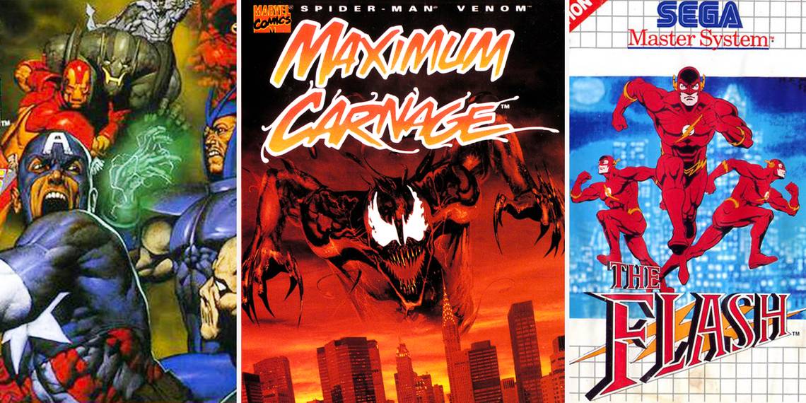
19 WORST: THE FLASH

Our next entry, The Flash, was developed by Probe Entertainment for the Sega Master System and released in 1993. From its launch the game had a serious uphill battle. For starters, the game was loosely based on the Flash show on CBS, but came out two years after the series had been cancelled.
By 1993, the Sega Master System had also stopped being supported in both Japan and the United States meaning the game only saw release in Europe. Perhaps the worst part of the package though was the game's cover. We get what they were going for, but having three different Flashes overlapping each other at full opacity simply isn't working. It looks less like the Flash is running at super speeds and more like there are just multiple Flashes running around.
18 BEST: THE INCREDIBLE HULK: ULTIMATE DESTRUCTION

Though it didn't leave a lasting impression on gamers the way some of our entries did, The Incredible Hulk: Ultimate Destruction was a critical darling upon release. The open world action game was developed by Radical Entertainment, the team behind the Prototype series, and released in 2005 on the PlayStation 2, Xbox and Gamecube.
The game was heavily influenced by the comics and even featured a story by Hulk writer Paul Jenkins and star voice talent like Ron Perlman, Richard Moll, and Neal McDonough who reprised his role of Bruce Banner from the 1996 Incredible Hulk cartoon. Ultimate Destruction was a real love letter to the character and the game's comic style cover conveyed that vibe perfectly. Where so many other games would have chosen a logo or a weird CGI rendering of the Hulk, Ultimate Destruction earns points for keeping things close to the character's roots.
17 WORST: AQUAMAN: BATTLE FOR ATLANTIS

Aquaman: Battle for Atlantis is a game almost as bad as its cover. The game was released in 2003 to coincide with the sixth volume of Aquaman, which had relaunched earlier that same year. However, the game's art direction was inspired by Peter David's run on the character where Aquaman rocked a beard, long hair and a hook for a hand.
Sounds like a pretty good pitch for a video game character right? Too bad you wouldn't know any of that by looking at the game's cover. Instead of showing a nice shot of Aquman using his cool hook hand to fight some goons, we get a close up on... his trident. Take away the text and this could literally be a cover for a Little Mermaid game. The silver lining here is that maybe the cover saved some poor kid from wasting their money this mess.
16 BEST: THE DEATH AND RETURN OF SUPERMAN

Our next pick is another killer cover from Sunsoft, The Death and Return of Superman. The beat 'em up was developed by Sunsoft and Blizzard Entertainment (yes that Blizzard), for the Super Nintendo and later the Sega Genesis. The game was a loose adaption of the Death of Superman storyline which had wrapped a little over a year earlier.
We've already been critical of other covers for only featuring a logo, but this one gets a pass for what should be obvious reasons. Superman's symbol is iconic and seeing a fist punch through it as it bleeds is a powerful image for anyone familiar with the Man of Steel. Sure they could have gone with an image of Superman facing off against Doomsday, but this is one example where less is truly more.
15 WORST: ULTIMATE ALLIANCE 2

We know this one is going to get us a lot of hate, but the Ultimate Alliance games do not have the most attractive art style. Regardless of how you feel about the games themselves, their character models have a bulky and lifeless look to them that extends all the way to Ultimate Alliance 2's cover.
Ultimate Alliance's cover worked so well because it used traditional comic gutters to break up character art that looked far more akin to something you might see in an actual comic book. For Ultimate Alliance 2, the creative team chose to use a weird shattered glass background with what was likely concept art for the game's soulless, beefy character models. Even with some of Marvel's most iconic characters (and Gambit) gracing the cover, this one feels like there's just something missing.
14 BEST: MARVEL VS. CAPCOM: CLASH OF SUPERHEROES

If you ever need an example of how to do a character collage for your superhero game's cover, Marvel vs. Capcom: Clash of Superheroes is pretty much the gold standard. The game's cover art was originally used for a promotional poster for the arcade release of MvC, but was later reused when the game was ported to PlayStation and Dreamcast.
We'll be the first to admit that the aspect ratio of CD cases wasn't the best for the art, but even the glimpses you get of these characters squaring up is a sight to behold. Strangely enough, the Japanese version of the Dreamcast port featured a similar cover with a smaller logo and better spacing that allowed you to see more of the game's fighters. Despite the distinct aesthetic differences between these two epic casts of characters, this image makes them look like a completely natural fit.
13 WORST: BATMAN & ROBIN

It isn't easy to market the video game tie-in to a bad movie. It's even harder when the cover looks like the one Probe Entertainment chose for the Batman & Robin video game. This game is just another in the long line of bad covers that fail to pull any sort of interesting or engaging imagery from their source material.
In a game starring the freaking Batman, the cover is nothing but a close up of George Clooney in costume. What is Batman even doing, taking a selfie? And what's going on with that font? The logo is identical to the one found in the film, but for some reason the color was changed from white to maroon despite the fact that it totally clashes with the rest of the cover.
12 BEST: THE UNCANNY X-MEN

Even though the in-game art left something to be desired, the box art for The Uncanny X-Men couldn't have been more on point. The 1989 NES title shared a name with the long-running comic series and its cover looked almost exactly like an issue of the book.
However, it was the little details that really set this one apart from other superhero video game covers. The note to players that warned it would take "all of your mutant powers to defeat Magneto" is reminiscent of the same kind of notes found on the cover of classic Marvel comics. The icing on the cake, though, is the Marvel tag with the X-Men's heads identical to the ones found on X-Men comic books at the time.
11 WORST: BATMAN: VENGEANCE

Batman: Vengeance had everything going for it. It was set sometime between the events of the groundbreaking Batman: The Animated Series and its sequel series The New Batman Adventures. It also starred most of those series' original voice cast, including Kevin Conroy, Mark Hamill and Arleen Sorkin. It was even developed by Ubisoft Montreal, the same team that would go on to create hits like Prince of Persia, Far Cry & Assassin's Creed.
Despite all of this positive momentum, the game was little more than a missed opportunity. The same can be said of the bland cover used for the PS2 and Gamecube versions of the game. The crazy thing is that the Xbox version of the game has a much better cover, specifically because it actually looks like a piece of Bruce Timm's designs from the show.
10 BEST: WOLVERINE: ADAMANTIUM RAGE

Next up on our list is the 1994 action platformer Wolverine: Adamantium Rage. The game was developed for both the Super Nintendo and the Sega Genesis, but the two versions of the game were noticeably different. This was due to the fact that both versions were developed separately from one another by different development teams.
The Genesis version was developed by Teeney Weeney Games and published by Acclaim Entertainment, while the SNES version was developed by Bits Studio and published by LJN. One thing the two games did have in common though was their awesome cover. It isn't quite as on the nose as the Uncanny X-Men cover, but take away the video game logos and Adamantium Rage looks exactly like the cover of a Wolverine trade.
9 WORST: X-MEN ORIGINS

More often than not, video game tie-ins were nothing more than thinly-veiled cash grabs aimed at parents and kids who didn't know any better. X-Men Origins: Wolverine was the rare exception to that rule. The game was developed by Raven Software, the team behind games like X-Men Legends, Marvel Ultimate Alliance and several entries in the Call of Duty franchise.
The game was applauded for its visceral hack and slash gameplay and the detailed representation of dismemberment by Wolverine's claws. Even though the game was loosely connected to the film, it featured an original plot by Raven's team, which also should have been the focus of the game's cover. Given the poor reception to the film, Origin's cover is an absolute disservice to the game Raven produced. Even though the game featured stellar voice work from Hugh Jackman, Activision would have been smart to distance the game from the film as much as possible.
8 BEST: BATMAN: ARKHAM CITY

Some readers may think it's a bit of a stretch to call a game from the last generation of video game consoles "classic," but for Batman: Arkham City we decided to make an exception. From a design and story perspective, no other superhero game can hold a candle to what Rocksteady achieved with the Arkham series.
Much like Vengeance, the series was applauded for its use of the original voice cast from Batman: The Animated Series. Unlike Vengeance, the Arkham series had fantastic art direction that extended to the game's covers. They each have their charms, but the stylish noir-influenced cover of Arkham City takes the cake. There were several versions of the cover produced for the various iterations of City, but each one shared the simple design aesthetic of a black and white shot of Batman with flashes of red used as an accent color.
7 WORST: X-MEN 2: CLONE WARS

When you're working with a team of characters like the X-Men it shouldn't be hard to put together a decent cover image. Take the X-Men you have featured in your game, put them together in a line up against a cool background and call it a day. After seeing how well this strategy worked on Uncanny X-Men, it's unbelievable what a poor job the team responsible for choosing the cover for X-Men 2: Clone Wars did.
Instead of placing the seven playable X-Men in a cool group pose, we got cut outs of Magneto, Wolverine and Gambit with this weird blue border. This wouldn't be so bad if any other design choice on the cover worked. For some reason, everything on the cover is squished together on the right side, which not only makes the image look crowded, but brings attention to the bland metallic background they slapped everything over.
6 BEST: SPIDER-MAN: RETURN OF THE SINISTER SIX

There is no shortage of Spider-Man games with awesome covers that imitate the art of the comics, but Spider-Man: Return of the Sinister Six is hard to beat. The cover is cool enough on its own, but eagle eyed fans will also notice it doubles as a fun Easter Egg.
The game was loosely based on The Amazing Spider-Man storyline of the same name, which took place on the pages of Amazing Spider-Man #334-339. If you take a look at the cover of Amazing Spider-Man #337 by writer David Michelinie and artists Erik J. Larsen, Terry Austin and Bob Sharen, you'll see the Sinister six laid out in exactly the same way. The game's cover is actually showing us issue #337's cover from the villain's perspective instead of Spidey's.
5 WORST: SUPERMAN 64

There is no superhero game quite as notorious as Superman 64. The game is unanimously considered one of the worst of all time, and for good reason. The controls are clunky, the game is littered with bugs and perhaps worst of all are the game's graphics. The low poly version of Superman himself doesn't look too bad when you consider that the game released in 1999 on the N64. However, the game's environments and the "Kryptonite fog" that covered every outdoor level of Metropolis made the game an absolute eyesore.
For some reason, when it came time to choose the game's box art, Titus Software decided the ugly green fog deserved a spot on their cover. It would have been so easy to place the awesome piece of Bruce Timm's art from Superman: The Animated Series against a shot of Metropolis, but instead they made the inexplicable decision to give the cover a green, sickly hue.
4 BEST: CAPTAIN AMERICA AND THE AVENGERS

Let's just come out and say it, the cover for the SNES/Gameboy version of Captain America and the Avengers is freaking epic. The original Arcade cabinet and the Sega ports of the game featured a more Silver Age inspired look, but the Avengers we see on the Nintendo ports look like they've seen some s***. Cap and friends look like they're ready to charge the front lines rather than star in a game aimed at children. Even the face of Iron Man's armor looks irreversibly damaged by the horrors of war.
On top of that, you have the Red Skull and his band of villains looking like a real force to be reckoned with. Even though he's buried in the top right corner underneath the smoke of battle, your eyes are immediately drawn Red Skull's piercing gaze.
3 WORST: SPIDER-MAN 2: ENTER ELECTRO

Spider-Man 2: Enter Electro was developed by Vicarious Visions, the team behind Marvel Ultimate Alliance 2 and more recently Crash Bandicoot N. Sane Trilogy, for the PlayStation and served as a sequel to Neversoft's beloved Spider-Man game. The original game's cover art wasn't the most groundbreaking thing we'd ever seen, but it certainly got the job done.
Enter Electro's cover on the other hand looks like it was made by a first year graphic design student. Showing Spidey swinging through New York with a lightning storm in the background is a solid choice for a game starring Electro. However, the effects added to the cover are just strange. Why does Spider-Man have a glow effect added to him? Why is there a small beacon of light coming out of his web shooter? And why in God's name are there THREE DIFFERENT FONTS in the game's logo?! The gradient on the "2" doesn't even match!
2 BEST: MAXIMUM CARNAGE

Speaking of Spider-Man covers, none is more iconic than the cover to Spider-Man and Venom: Maximum Carnage. Based on the comic book story arc of the same name, the game followed Spider-Man and Venom's efforts to team up and defeat Venom's offspring Carnage.
Releasing just a year after the event had ended, the cover made the wise decision to put Carnage front and center without snubbing Spidey and Venom. Maximum Carnage gets bonus points for the first print of both versions of the game coming packaged with red-colored cartridges to match the game's box. The cover is so iconic in fact that when Marvel reprinted the Maximum Carnage event in trade paperback form in the early 2000s, it chose this image of Carnage for the cover.
1 WORST: THE PUNISHER

For our last entry we have what is unquestionably the ugliest superhero video game cover of all time, Capcom's The Punisher. When the game originally released in arcades back in 1993, The Punisher was accompanied by a set of awesome promotional posters that repurposed art from the comics. The game went on to become a major success and is widely considered one of the best beat em ups of all time.
However, when Punisher was ported over to Sega consoles, it lost a little something in translation, and its cover was no exception. Just look at that monstrosity! Is that Frank Castle or an albino gorilla in a Punisher costume? We know this was the '90s, but it looks like his knees are ready to snap under the weight of his massive thighs. And that shirtless guy with the eye patch? That's supposed to be Nick Fury. Why didn't anyone stop this?