One could argue that Spider-Man has the best-designed super-suit in all of comics. His look has barely changed since his first appearance in 1962. The bold red-blue color scheme and web pattern have remained constant throughout the character's history. While the bulk of his look remains relatively unchanged, each artist has their own interpretation on its collective elements.
Though the classic look endures, Spider-Man has gone through many revamps since the '60s. The spider symbol itself seems to evolve more often than any other aspect of his suit. With that in mind, here's a look at the 10 best spider-suit symbol designs, ranked.
10 Parker Industries Suit

One of Spidey's more recent relaunches featured a more grown-up and technologically advanced version of the character. While this take on the wall-crawler isn't everyone's cup of tea, his spider logo is among the most interesting.
Unlike any other spider emblem, this one's legs stretch out in a circular direction, rather than the typical north/south orientation. It's one of the larger spider emblem designs as well, almost covering Spider-Man's entire chest. This version of the spider symbol would be higher up on this list if only it didn't have a glowing green effect.
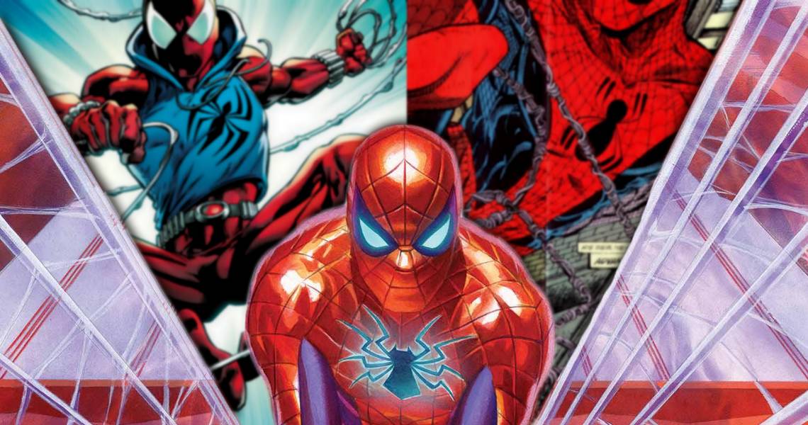
9 Spider-Man 2099

The Spider-Man of the future has a pretty intimidating look, and his spider symbol only adds to it. Although, to call it a spider symbol feels like a bit of a stretch, as it mostly just looks like a stylized skull.
Nonetheless, it's a neat design, if a little bit too busy. There are a lot of lines and various design elements going on in this symbol. It almost feels like three different spider emblems combined into one.
8 Scarlet Spider (Ben Riley)

The Scarlet Spider symbol gets points for innovation, as it's among the few spider symbols that isn't perfectly centered on his chest. The off-center placement compliments a more casual-looking spider-suit really well.
It's also one of the sharper-looking symbols, with pointed ends on every side. One of the few '90s super-suits that actually still looks cool today, and that's in part due to its spider symbol.
7 Todd McFarlane Design

Todd McFarlane's take on Spider-Man is one of the most influential interpretations of the character. Big eyes, spaghetti webbing, dynamics poses, all of which are qualities that can be attributed to Todd McFarlane's work on Spider-Man.
His version of the spider symbol is often overlooked. It provides a great sense of balance to the rest of McFarlane's Spider-Man. The round-edged Spider looks great on a sharp and bendy Spider-Man.
6 Superior Spider-Man

Now, this is one of the slickest spider-suits of all time. Appropriately enough, this slick suit comes with an equally slick spider symbol. This massive emblem spans across most of the Superior Spidey's torso, and it looks great.
The Superior version of the emblem has jagged, aggressive legs which jut outwards towards Spidey's sides. Equally aggressive are the emblem's fangs and pointed bottom. Not only is it an awesome design, but it also communicates that this isn't the same friendly neighborhood Spider-Man.
5 Raimi Spider-Man

This symbol is unforgettable, as it's part of what made the web-head a silver-screen icon. Upon closer inspection, it's clear that this is one of the most detailed spider symbols out there. Every line is meticulously designed with a perfect mix of soft curves and sharp edges.
This spider emblem also has a great sense of dimension, standing slightly elevated from the rest of the Raimi Spider-Man suit. Like the Superior suit, it also has hints of aggression with its little fangs and pointed tips.
4 MCU Spider-Man

The MCU Spider-Man symbol is both innovative and classic. It's entirely unique in its design, while also harkening back to the classics. This version of the symbol manages to feel new without being unfamiliar.
Part of what's great about the design is its simplicity. Looking at it closely, its center is a stylized silhouette of a man, with eight legs growing outward. Like the rest of the suit, from a distance, the symbol looks like the original design. But upon closer inspection, it's entirely unique.
3 John Romita Design

Steve Ditko may have invented the look, but John Romita perfected it. His take on the spider symbol has gone through a couple of variations, but for the most part, they retain the main elements that made it so iconic.
This symbol has that classic round center and skinny legs that everyone recognizes. It's essentially the default look of the spider symbol, and it never gets old. To this day, many artists maintain this spider emblem design, because it's just that good.
2 Symbiote Spider-Man

The symbiote Spider-Suit is one of the most radical super-suit redesigns of comics history, and it's managed to stand the test of time. Part of what contributed to its eternally cool design is the massive white Spider-Emblem that spans across symbiote Spidey's chest.
The symbol is especially iconic against the black suit, as the contrast of black and white makes it pop like nothing else. This emblem is large and aggressive, with sharp fangs and points lines throughout. Bonus points to this emblem as well for being the most spider-looking.
1 Mark Bagely Spider-Man

Though his work on Spider-Man began in the 1990s, his iconic artwork for Ultimate Spider-Man defined the look of Spider-Man for the 2000s. His Spider-Man is lanky but strong, and perfectly captures the look of a teenaged superhero.
His spider emblem has the best elements of all that came before. It has the rounded center that made early spider symbols iconic, with the sharp, slightly curved legs present on the Raimi spider symbol. This symbol is pleasing to the eye, slightly modern, and completely timeless.