They say that first impressions are everything, and this old adage most certainly applies to movies. When a film is introduced to the public, an onslaught of trailers, posters, and weird tie-in products (how does scented hand soap help promote this new superhero movie?) help the public to form an opinion. Thus, releasing a poster that best conveys the tone, feeling, and general plot of a movie is crucial, as many will use this poster to decide whether or not a film is worth their time. Traditionally, a film studio will dump oodles of money into the design of a poster for a "good" movie, while they might opt to not try quite as hard on a "bad" movie. But sometimes, something happens. Sometimes, even fantastic, beloved, certified fresh movies get terrible posters, while cinematic dumpster fires get a work of art.
A film's quality doesn't always determine the quality of the poster, but when a big budget, triple-A movie hits cinemas with a stinker of a poster, it can leave the public scratching their heads. Conversely, when an afterthought of a film gets a poster with eye-catching visuals and inspired design, it can sway the public on the movie. Over the years, there have been plenty of movies widely considered to be great that have received eye-searing, brain-meltingly bad posters, while movies that barely made a blip at the box office got posters worthy of hanging in a museum. It happens, and we're here to look back at them. Here are ten movie posters worse than the actual movie, nine that are better, and one truly puzzling poster.
20 WORSE: SLUMDOG MILLIONAIRE
Slumdog Millionaire chronicles a poor Indian youth as he manages to triumph on the popular game show Who Want To Be A Millionaire?, catapulting himself from a poor beggar to a millionaire before an enrapture audience. A feel good rags-to-riches film, Slumdog Millionaire was bright and optimistic. But you wouldn't have known it from the film's mess of a poster.
A jumble of colors, reviews, and a clumsily executed Who Wants To Be A Millionaire? reference, the poster is as garish as it is confusing. Just from looking at the poster, you might think Slumdog Millionaire is about a running woman, or maybe a crime drama set in a place with a lot of lights, hence the streaked colors? It's amazing Slumdog Millionaire managed to succeed with such an ugly poster.
19 WORSE: BLADE RUNNER 2049
Okay, picture this. You're making a sequel to one of the most influential sci-fi films of all time. What kind of poster would you make to announce the arrival of this highly anticipated film? Something that mirrors the poster of the original? Perhaps something understated and artsy, to reflect the tone of the film? Or maybe just a generic poster featuring your leads staring off into space? If you're Warner Bros. Pictures, turns out you'd opt for that last one.
You'd be hard pressed to find a more bland, uninspired poster than the poster for Denis Villeneuve's Blade Runner 2049. Barely hinting at the film's cyberpunk setting, the poster frames its leads on a split color background, shoehorning additional characters below. While the poster for Blade Runner has become iconic, the poster for Blade Runner 2049 barely warrants a second look, which is a huge disservice to the critically praised film it promotes.
18 WORSE: DANCES WITH WOLVES
Ah, Dances With Wolves. The classic tale of a stranger in a strange land, being taken in by the inhabitants of this strange land, before ultimately siding with the strangers to battle people from his home land. Or is that Avatar? Or are we thinking of Pocahontas? Well, in any case, Dances With Wolves is considered a classic of cinema, and would sweep the Academy Awards upon release. But you wouldn't know it from this dull-as-dishwater poster.
With a background that looks less like a Western epic and more like the cover of a lo-fi hip-hop bandcamp album, the poster prominently features star Kevin Costner's bored, disinterested face, seemingly caught in the middle of trying to remember if he left the stove on. Look, we know Dances With Wolves isn't the most exciting movie ever, but this is basically the poster equivalent to Ambien. Dances With Wolves definitely deserved a better poster.
17 WORSE: SPIDER-MAN: HOMECOMING
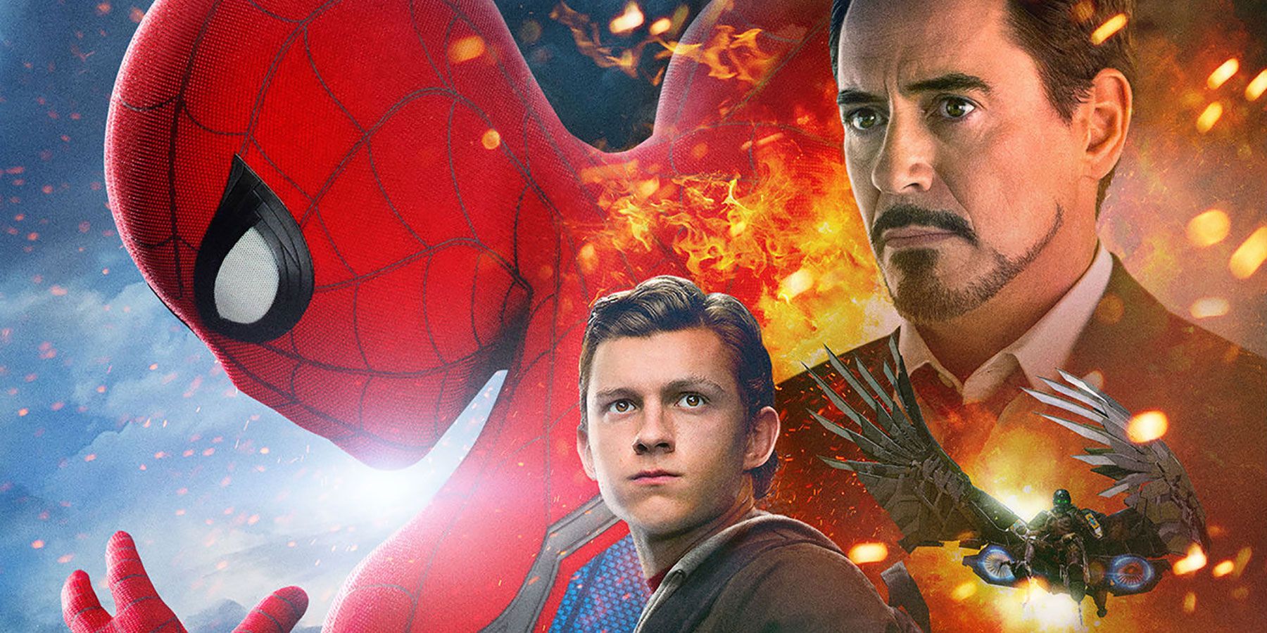
The arrival of Spider-Man in the Marvel Cinematic Universe was one of the biggest developments in superhero movies in years, and fans were beyond hyped for Spidey's first MCU movie. Sure, Spider-Man: Homecoming turned out great and assured fans that the Wall-Crawler was back in good hands with Marvel, but fans could be forgiven for getting worried when this ugly poster came out.
Marvel tends to favor the "hero in foreground, with ancillary characters standing around looking serious" style of poster design, but the Homecoming poster took this design trope to a ridiculous extreme. Looking less like a big Hollywood production and more like the cover of a bootleg Chinese DVD, the poster is poorly photoshopped and overly busy. Homecoming would eventually receive better posters, but this laughable poster was a poor representation for this beloved superhero flick.
16 WORSE: FIELD OF DREAMS
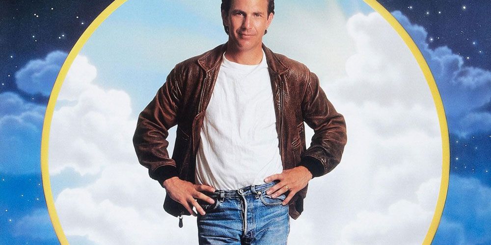
Just because a poster is recognizable, it doesn't mean its good. Case in point: Field Of Dreams. Yes, the poster for this beloved family sports drama may be instantly recognizable, and it may have inspired thousands of parodies and homages, but that doesn't mean this poster isn't resoundingly confusing and all-around bad.
Looking less like the poster of a major Hollywood picture and more like something you'd see airbrushed on the side of a van, the Field Of Dreams poster features a mish-mash of corn stalks, the baseball diamond, and a strange night sky/blue sky motif that has nothing to do with the film. Compound this with Kevin Costner seemingly caught in mid-Irish jig, and you've got a very bad poster for a very enjoyable film.
15 WORSE: THE KING'S SPEECH
Ah, The King's Speech! Who could forget this delightful rom-com, chronicling a love triangle between three prim-and-proper individuals? What's that? That's not what that movie is about at all? Well, the first poster for the film could have fooled me.
A powerful historical drama chronicling the trials and tribulations of King George VI as he struggles to overcome a stutter, The King's Speech was a critical and financial success. But the film's first poster, showing leads Colin Firth and Geoffrey Rush sandwiching a bemused Helena Bonham Carter, was less "sweeping historical drama" and more "Bridget Jones Diary," leading the poster to quickly be dropped in favor of a more fitting poster.
14 WORSE: GROSSE POINTE BLANK
Admittedly, a film about a disillusioned hitman attending his high school reunion and falling back in love with his high school sweetheart while evading a rival hitman is a bit difficult to market to the general public. But surely the marketing department could have come up with something better than a poster with so much red and yellow on it that it looks like Ronald McDonald threw up.
Grosse Pointe Blank is a bonafide '90s black comedy classic, with star John Cusack trading as many acidic barbs as he does bullets. While Grosse Pointe Blank performed well at the box office, the movie's poster didn't do it any favors, seemingly framing the film as a quirky romantic comedy. It's a busy, ugly, mess of a poster, and Grosse Pointe Blank definitely deserved better.
13 WORSE: BIG
Hey, it's beloved family comedy Big! The charming tale of a little boy being turned into a 30-year-old man by a wish-granting carnival fortune telling machine (we've all been there!), Big has become one of the most enduring hits of star Tom Hanks' career. But how to promote such a wacky movie? Why, it's easy: just take a picture of Tom Hanks kinda half-smiling and call it a day.
At least, that's what the advertising team for 20th Century Fox seemed to think. Instead of providing any sort of hint to the story, the poster just offers a zoomed in shot of Hank's mischievous mug, looking like he just remembered a great joke and he's waiting for you to finish your story so he can deliver it. It's a remarkably boring poster for remarkably not-boring film, and a comedy classic like Big certainly deserved something better.
12 WORSE: X-MEN: FIRST CLASS
When promoting a movie, it's important to use an element of mystery, building up characters to get viewers interested. Releasing posters with prominent characters hidden in shadow is a common poster tactic, and has been used to great effect numerous times. And then there's the X-Men: First Class character posters.
We understand wanting to build up the characters featured in this X-Men prequel/soft reboot, but doing so by superimposing the faces of the actors on the shadowy crotches of the characters probably wasn't the way to do it. Seeing James McAvoy's dramatic visage staring somberly from Professor X's nether regions isn't dramatic; it's hilarious. These odd posters may not have done X-Men: First Class any favors, but at least they gave the Internet unintentional comedy gold.
11 WORSE: THE SHINING
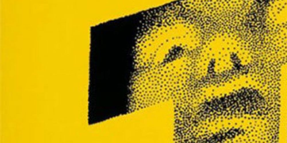
Oh, would you look at the time? It's argue-'o-clock. Yes, the poster for Stanley Kubrick's seminal horror film The Shining has become an instantly recognizable image of pop culture, and remains one of the most iconic images in horror. But even Jack Torrance's crazy butt could take one look at this poster and tell you: this thing is bad.
While the striking usage of yellow is commendable, it all falls apart with the face. Supposedly meant to be Danny Torrance, you'd be forgiven for thinking it's actually some sort of giant headed alien baby, caught mid-surprise when caught trying to sneak downstairs for a cookie. Face it: that face ruins the poster, and leaves us wondering why Kubrick didn't utilize another design for his iconic horror film.
10 BETTER: GODZILLA
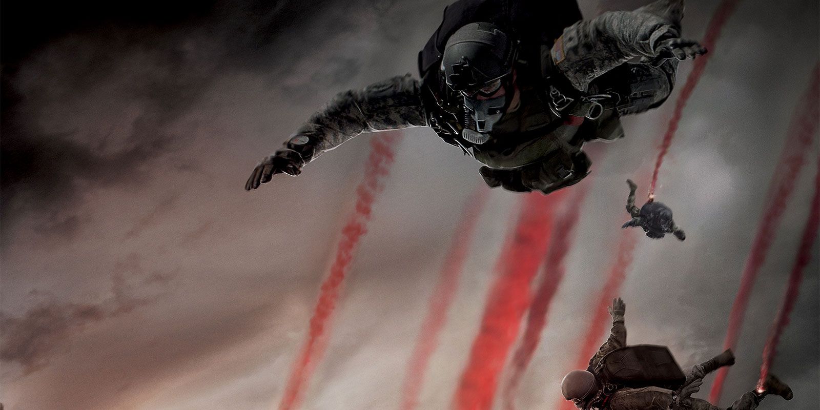
Nothing like starting a list with some controversy! While Gareth Edwards' Godzilla has its fans, this America re-imagining of the classic kaiju has plenty of detractors, who point to the movie's plodding plot, dull characters, and distinct lack of giant monster fights. Regardless of your stance, we can all agree that the Godzilla teaser poster is phenomenal.
Much like Edwards' film, this poster puts the emphasis on people, highlighting HALO jumping soldiers as they drop from a murky sky, framed by the King Of Monster's massive spikes. Visually striking without giving a concrete look at the titular monster, Godzilla poster perfectly balanced mystery and excitement, which is more than we can say for the film.
9 BETTER: SUPERMAN RETURNS
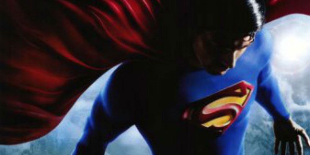
A good movie poster can cause you to stop in your tracks, in awe of the potential of the movie. This was exactly what the poster for Superman Returns did, highlighting a striking shot of Brandon Routh's Superman, floating high in the sky over America. It's a beautifully framed shot, perfectly encapsulating the hope of Superman. Shame the movie got nowhere close to capturing the feelings of this poster.
2006's Superman Returns sought to capture the inspirational feeling the 1978 Christopher Reeve-starring Superman, but flew right past "inspiring" and landed straight in "boring." Overly long and slow, Superman Returns drew mixed reviews, and became Routh's one and only outing as the Man Of Steel. While the poster hinted at potential, ultimately, the film failed to deliver on that promise.
8 BETTER: THE FAMILY THAT PREYS
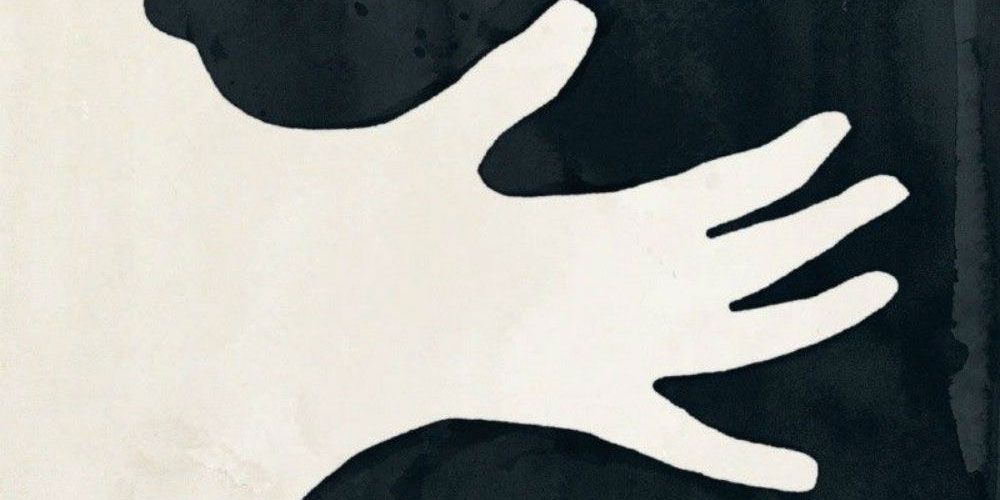
Writer/director Tyler Perry continues to crank out cookie cutter movies that make oodles of money at the box office, even if the posters accompanying these films are generic and boring. But it would appear an exception was made for the 2008 Perry film The Family That Preys, leading to a phenomenal poster.
Yet another Perry about people from different walks of life having to learn to work together, The Family That Preys is nothing to write home about, but this inspired poster makes creative use of negative space to craft a sense of menace and unease. It's an artful, eye-catching poster, and is almost enough to make you forget it's for a Tyler Perry movie.
7 BETTER: POSEIDON
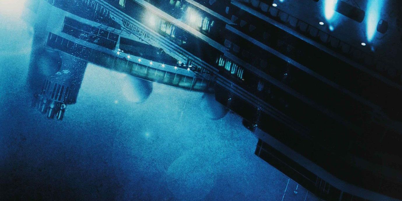
We're willing to bet that 95% of the planet has forgotten all about Poseidon, and we don't blame them. This by-the-numbers disaster film hit theaters with little fan fare, and would quickly slip into obscurity. But even the handful of people who saw this film in theaters (and likely hated it) would have to agree: this poster is great.
Chronicling the desperate fight for survival of travelers trapped on a sinking cruise liner, the marketing team for Poseidon managed to communicate the urgency and terror of the plot with a simple image: the titular boat, upside down, and completely submerged in water. It's understated and striking, which is more than we can say for the movie it's promoting.
6 BETTER: PULSE
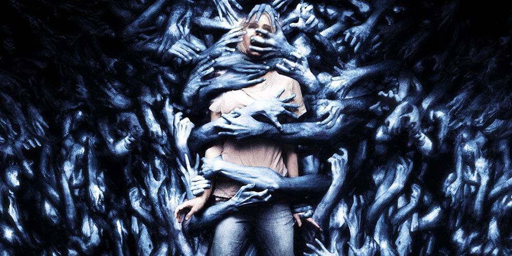
Remember Pulse? No? Even if you said yes, we guarantee you had to take a moment to think about it. Yes, Pulse was a blink-and-you'll-miss-it entry into the avalanche of English remakes of Japanese horror films that followed the release of The Ring, and was released to universally negative reviews. But despite this, Pulse was given a fantastic, truly eerie poster that punches way above the film's ho-hum pedigree.
Completely disregarding the film's plot about internet ghosts unlocked with a virus (yes, really), the poster for Pulse paints a horrifying picture, showing a spooked young woman lost in a sea of grasping grey arms. If Pulse was anywhere near as frightening as its poster, it could have been the scariest film of the decade. Unfortunately, it was still about internet ghosts, so even this fantastic poster couldn't save this garbage fire of a movie.
5 BETTER: THE SPIRIT
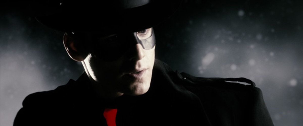
Hoo boy, The Spirit. To call The Spirit a mess would be an insult to messes. Serving as comic icon Frank Miller's one and only foray into directing, The Spirit is practically oozing with style, but with a laughable script and nonsensical plot, style was pretty much all The Spirit had going for it. But the early teaser poster for the film had fans excited, and it's easy to understand why, as it was like nothing else being displayed at theaters.
Dripping with dark, noir-ish color, framed with the striking red of the logo and the titular hero's tie, this was a poster that commanded attention. With a Sin City-esque tagline to boot, this seemed like a film destined to stand out. While the resulting cinematic train wreck bombed at the box office, you certainly can't say that the poster didn't deliver on the promise of unique style.
4 BETTER: AS ABOVE, SO BELOW
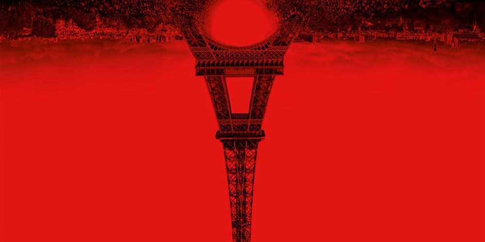
Okay, credit where credit is due: as far as forgettable found footage horror flicks go, As Above, So Below isn't the worst. Set in the winding catacombs of Paris, the film delivers some solid spooks, but it was always destined for the $5 DVD bargain bins. But horror fans expected big things from As Above, So Below when the film's striking poster was released.
Bathed in eye-searing red, the poster manages to stand out from your standard black, grey, and dark blue posters that populate movie theaters. With an inverted Eiffel Tower reaching into a yawning maw of nothingness, flanked by hundreds of skulls, it's the kind of image that can unnerve you for reasons you can't quite put your finger on. For such a forgettable horror flick, this sure was an unforgettable poster.
3 BETTER: PROMETHEUS
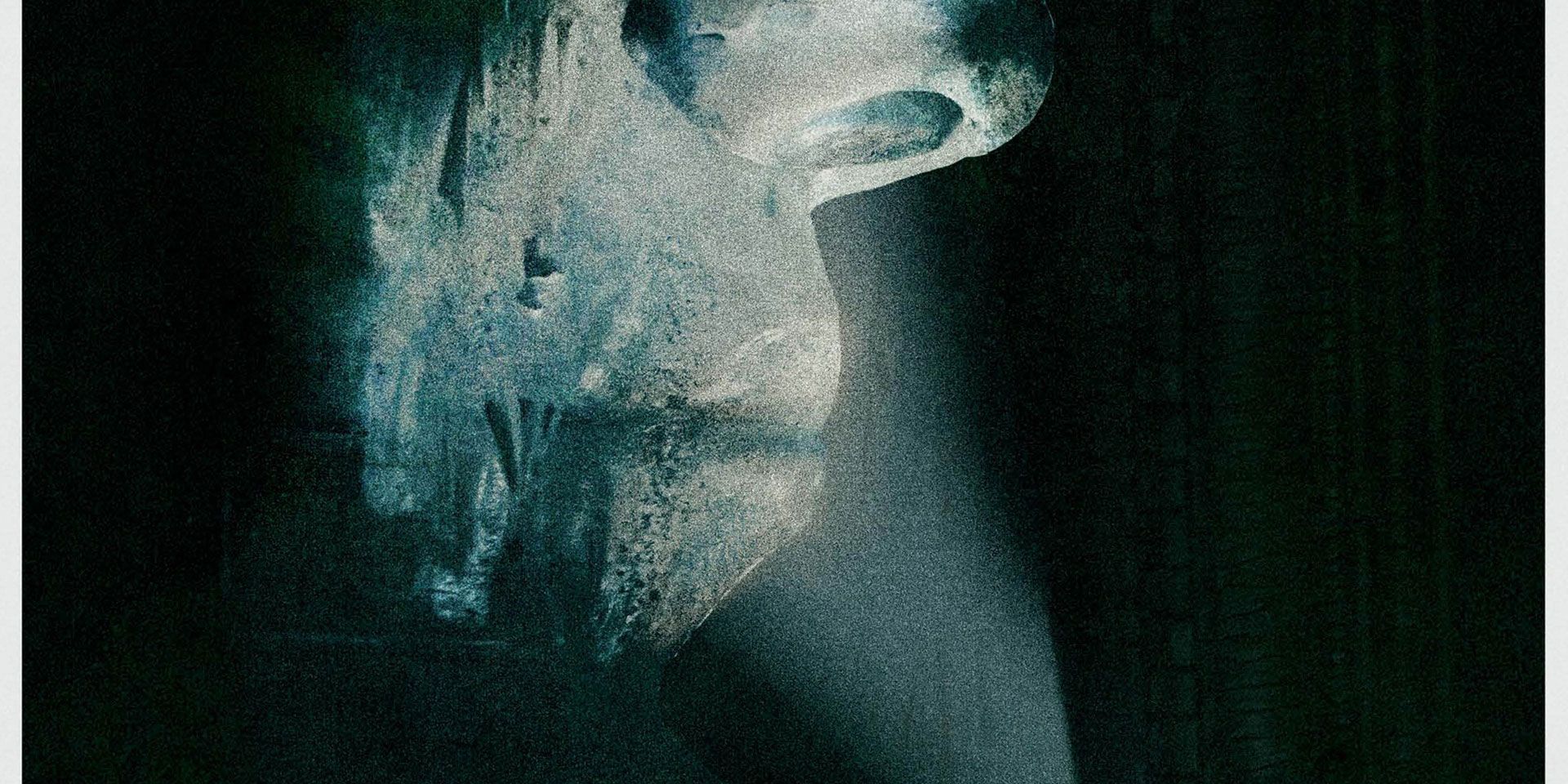
Ah, early 2012. Before Prometheus could hit theaters and thoroughly divide sci-fi fans on whether the film was an interesting examination on evolution and man's place in the universe or just a big dumpster fire filled with criminally stupid characters, genre fans everywhere were counting the days until the movie's release. Bolstered with impressive posters, it was easy to understand the excitement.
For the film's IMAX release, an understated, striking poster was released, showing a quiet, unnerving scene of Noomi Rapace shining a light on a massive, mysterious face. Expertly utilizing negative space to call attention to the difference in size between the character and the structure, the poster drew fans in while only leaving them with more questions. While fan reception on Prometheus may be mixed, we can all agree this poster is perfect.
2 BETTER: THE ROCKETEER
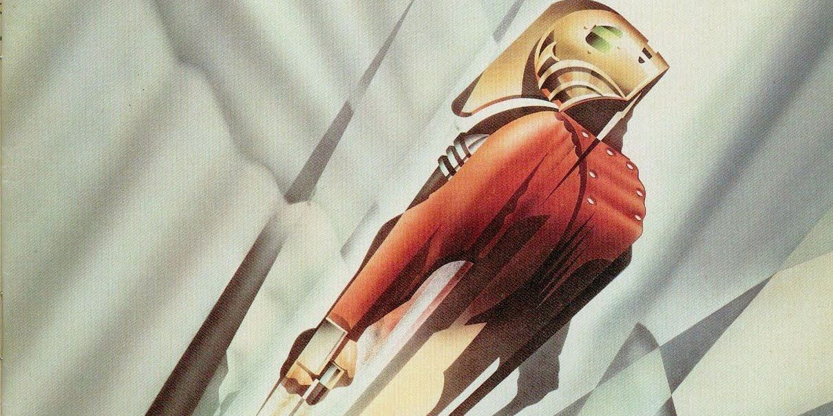
Rocketeer seemed like the kind of movie that could sell itself: a jet pack-clad Indian Jones-type fights Nazis in the 1930s, with plenty of stunts and explosions. Disney clearly felt the same way, as the House Of Mouse pumped tons of money into The Rocketeer, picturing the film as its next big franchise. Unfortunately, the film ultimately released to mixed reviews and lackluster numbers, causing Disney to abandon the property. But it's a good thing Disney initially put so much money into The Rocketeer, as it lead to this spectacular poster.
Long before Bioshock made Art Deco hip again, the marketing department behind The Rocketeer embraced this old school modernist art style, using bold geometric shapes and sharp, angular lines to propel the titular hero. Looking less like a poster and more like art you might see hanging at the Chicago World's Fair in the '20s, the poster was a refreshing breath of fresh air for cinematic advertising, even if the film it was promoting ultimately bombed.
1 PUZZLING: STAR WARS
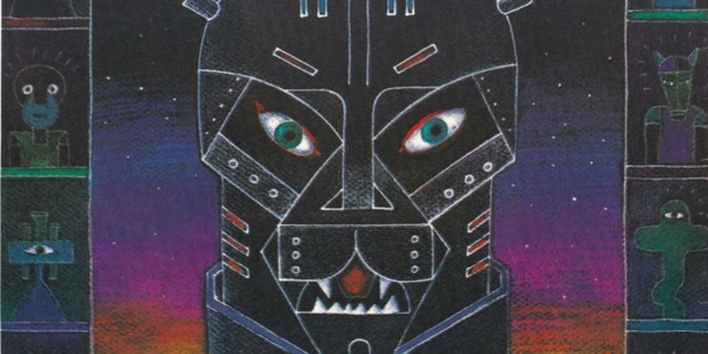
Questions. We got 'em, and this poster holds no answers to said questions. There was a time when films went overseas and subsequently received artistic posters that traditionally had no bearing on the plot of the film, but still managed to communicate the general concept. But this Russian poster for Star Wars doesn't even get within spitting distance of the general concept of the film, instead sailing past "general concept" and landing squarely in "completely bonkers insane."
If this poster were to believed, Darth Vader is part panther, possesses tiny lightsabers for hair, and inhabits a universe filled with cryptic Illuminati-style eye pyramids and surprised aliens drawn by children. A poster like this was presumably drawn by someone smoking a cigarette in a very long holder who had only the vaguest idea of what a Star War even was, making this one truly memorable, truly WTF poster.

