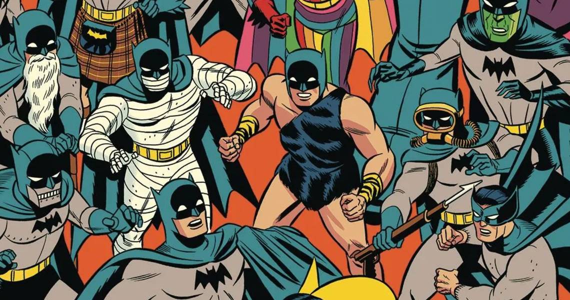
Easily one of the biggest superheroes in the world, Batman is instantly recognizable by just about everyone. His brooding nature is perfectly represented in the way he dresses in dark tones with a big cape and a cowl that hides most of his face. In place of eyes are two white slits, making the hero look almost inhuman. At least, that's how he usually looks.
In his 80 years, Batman has gone through a number of looks. Some of them, like the "Rainbow Batman," served a specific purpose and lasted just an issue, while other costumes would be around for years at a time. Most of the time, the Dark Knight looks very cool, but not every costume has worked as well as it should have. And some were just plain terrible.
10 Best: The Classic

Starting in 1940 and lasting until 1964, Batman sported a single look. Wearing a blue and great outfit with a yellow belt and a black bat-symbol on his chest, the hero gave up his Dark Knight style and became the Caped Crusader, smiling his way through adventures with his trusty sidekick Robin the Boy Wonder by his side.
This was the way classic artists like Dick Sprang drew Batman. He was barrel chested with a fatherly feel to him, and while his costume was still darker than most superheroes of the time, it was lighter than what had come before and would set the basic blueprints of Batman's look well into the 1980s.
9 Worst: New 52

Jim Lee is rightfully considered to be one of the great comic artists of his generation and one of the best of all time, but his costume creations tend to miss the mark. With the creation of the New 52 reboot, Lee redesigned just about every DC hero, and most of his designs gave the previously slick outfits of the heroes a lot more lines and a more militaristic feel.
But the thing with superheroes is that they aren't army guys. Batman may run around with crazy gadgets and fight a war on crime, but the more tactical his costume looks, the more it loses the point of the costume. Batman is supposed to generate fear in criminals, but if they know he's just wearing kevlar, he's far less creepy.
8 Best: The Capullo

With the start of the Rebirth era of DC, Batman artist Greg Capullo designed a new Batman costume that managed to pay respects to every classic version that came before it while adding a few modern touches. The cowl and outer-lining of the cape are pure black, but the inner lining of the cape is purple, paying homage to the purple gloves of the original Bob Kane design. The chest symbol has a yellow outline to it, serving as a reminder of the yellow oval that Batman sported for decades. The black and yellow belt mixed together the feel of the classic utility belt with the more militaristic pouches while still feeling very superhero appropriate. Sadly, this suit didn't last long.
7 Worst: Batman Inc.

There's nothing inherently wrong with the Batman Inc. look, it's just rather bland. It brought back the classic yellow oval around the symbol, which is nice, but it also encased it in a thick border, which makes it all too busy. The symbol itself was small, which tends to make it get lost in the action. In general, superheroes tend to look stronger when the symbol on their chest is bigger. The pants have odd seams running down the front of each leg, almost as if Alfred sewed two pairs of tights together. The crotch is very well protected, though.
6 Best: The Original

Without Bob Kane's original design, none of the others would exist. While there is some debate on who actually designed this outfit– with many believing writer Bill Finger had a lot of input into the look– one thing that is clear is that Batman's style was instantly based more in the film noir and pulp heroes of the time than it was in the emerging superhero scene that Jerry Siegel and Joe Shuster gave birth to with Superman.
The first Batman suit, sporting a black cowl and cape with a blue inner lining and a great suit instantly made it clear that the hero was a darker character. The purple gloves didn't last very long, but every other piece of this costume has continued to influence Batman 80 years later.
5 Worst: Zur-En-Arrh

Originally appearing way back in 1958's Batman #113 by France Herron and Dick Sprang, the Batman of Zur-En-Arrh was an alien who brought Batman to his planet to help him fight some giant robots and another race of aliens. On this planet the Earth Batman discovered that he had superpowers not unlike Superman.
Some 50 years later, writer Grant Morrison brought the Zur-En-Arrh concept back in Batman: R.I.P., revealing that it was actually a backup personality that Batman had created for himself in case he was ever mentally compromised. While Morrison crafted a great story out of all of this, the suit is still really ugly.
4 Best: The Oval

Debuting in 1964, a simple change to Batman's costume would become a mainstay for decades, and with good reason. The addition of the yellow oval under the bat-symbol on the hero's chest helped make his logo pop. While so many other superhero costumes like Flash and Green Lantern had figured this out long before, it took some time for Batman to catch up, but when he did it made a major difference.
The oval would carry over to the 1966 movie and TV series that starred Adam West as the Caped Crusader, and even last long enough to be used in the two Tim Burton Batman movies. Sadly, in the years that followed Batman Returns, the oval was removed.
3 Worst: None Blacker

Making its debut in 1995's Detective Comics #682 by Chuck Dixon and Graham Nolan, the "all black" Batman suit was the first time the Dark Knight lost the grey from his suit, as well as the outer underwear. While the new suit kept the yellow oval and the yellow belt, everything else was made to be pure black, feeding into the "Dark Knight" aspect of Batman. Overall, the look didn't work well, making it hard for Batman artists and colorists to make the character stand out on the page, and the costume was retired before long.
2 Best: Year One

Debuting in Frank Miller and David Mazzucchelli story Batman: Year One, this outfit has become the gold standard of Batman designs. The look is simple and clean, playing off the classic Golden Age look for the character, but replacing the blue with black and making the grey a tone darker. Miller would carry this design over to The Dark Knight Returns, and from there it would become one that every artist seemed to want to go back to.
During his time as the writer of Batman, Tom King had the Dark Knight return to his Year One suit as a way to show that the character was reconnecting to his roots after Catwoman left him standing at the altar. Batman continues to wear the Year One suit, but that could all change at any time.
1 Worst: Az-Bat

With his back broken by Bane, Bruce Wayne handed over the mantle of Batman to Jean-Paul Valley, aka Azrael. What followed was the worst redesign of the character that has ever been seen. Designed by Joe Quesada, the Az-Bat suit was a mix of heavy-looking armor and tights that screamed 1990s "extreme" comics. While it was clear that DC had no plans to keep this look for long, seeing it at all was hard for readers to deal with. It was, and continues to be, one of the least liked superhero costumes of all time.