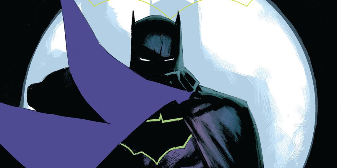
Batman is one of the most popular characters in comic history, meaning that a lot of different writers and artists took their shot at new interpretations of the character. While some have gone down in fame and glory, like Frank Miller's The Dark Knight Returns and the version seen in Batman: The Animated Series, these legendary iterations of the Caped Crusader aren't the only ones out there. Several times in comics, television and movies, there has been a version of Batman that didn't sit nearly as well with the fans. The biggest offense of these various Bat-Men was with their costumes. Sure, writers can have a compelling and well-written version of Bruce Wayne, but if that batsuit doesn't look good, then they've instantly alienated a good portion of their fanbase. Just think about how many great stories have been ignored because Batman's costume wasn't up to snuff.
Looking back at Batman's history, there were several times where a new costume was created that fans had less than kind things to say about. These designs, while some of them quite memorable, have gone down in infamy for a lot of the Bat-lovers. However, this article won't be focused on objectively bad Batman costumes. Instead, the focus is on 20 Batman costumes that even the hardcore fans didn't like. For this list, we are allowing any version of the Batsuit as portrayed in any section of the media that Batman has been in. Needless to say, poor Batsuit design is a constant among all mediums.
20 KNIGHTFALL

After Bane broke Batman's back, he needed a replacement to protect the streets of Gotham while he recovered. That's when he brought in Jean-Paul Valley, otherwise known as Azrael. Valley took up the offer and had his own version of the Batsuit to boot. Unfortunately, it was one of the worst-looking costumes in the history of the Dark Knight.
Not only were the colors all over the place, but the armored look with all the spikes seemed totally against everything that Batman stood for. The whole point of being Batman is to use the shadows to your advantage, but if you've got bright colors and a red visor, you're not hard to spot.
19 ZEBRA

There was a time when a villain named Zebra Man discovered that lines of energy could be channeled through his body for immense power. These lines turned his skin black and white, making him resemble a zebra. When Batman arrived to investigate, he too was exposed to this energy, which turned his costume and his skin black and white, becoming the Zebra Batman.
One glance at this costume, and you can see why it's on this list. Having one color across the entire character is jarring at best, and is a perfect example of how campy the older comics could be.
18 RAINBOW

Robin was being particularly heroic one day, saving a young girl from being hit by a car, harming his left elbow in the process. However, he did it as Dick Grayson and was plastered all over the news. Instructed to keep off of it, Dick had to be a little more careful while fighting crime too. Batman decided that people would be able to put two and two together if they saw Robin laying off of his elbow.
In order to keep the attention on him, Batman fought crime every day in a different-colored Batsuit, ending with the glorious rainbow Batman costume. Again, there's not much to say about it other than it's the Dark Knight dressed as a rainbow.
17 INJUSTICE: GODS AMONG US

Injustice: Gods Among Us is a great fighting game. Unfortunately, "great" isn't the adjective we'd use to describe a lot of the character designs. From Flash's awkward look to the unnecessary color changes to Superman, there were a few costumes that were less than desirable. One of the worst ones just so happened to be Batman's.
Going for a more armored look, there's something that feels fundamentally off about Batman's costume. Whether it's the fact that his chest seems to extend out too far or the fact that his face looks weird particularly around his mouth, it wasn't the best look for the Dark Knight. At least they added the New 52 costume.
16 BATMAN AND ROBIN

Batman and Robin was a sequel to Batman Forever and the last of the series of Batman films that started with Tim Burton's works. Unfortunately, it also happened to be one of the worst ones. Starring George Clooney as Batman, it was a campy, poorly-paced, poorly-acted, and downright painful attempt at re-imagining the Caped Crusader.
One of the worst offenses in the film was Batman's costume -- there were nipples on the suit. As if that weren't bad enough, the mask was so open in the front that it made Clooney's look odd. Then there was the silver re-design near the end of the film that made the whole outfit look even worse.
15 ADAM WEST

The '60s Batman TV series is a beloved classic, even today. Filled with purposely campy humor, a colorful cast of characters, and some of the most classic lines in pop culture, it was always destined to be remembered fondly. However, that's not to say the show was perfect. Among the flaws it had, one of the biggest ones was Adam West's costume.
Not only was it a drastic departure from how the Dark Knight looked in the comics, it was a downright awkward interpretation. Everything from the eyebrows on the mask to the goofy logo on his chest, there seemed to be no end to how ridiculous the costume could look.
14 1940 SERIAL

A lot of people will point to the Adam West TV show as the first live-action appearance of Batman. However, that couldn't be further from the truth. There was a serial created in the '40s that had the Caped Crusader. That said, not many people remember it due to how old and awkward it was. Apart from that, the costume was simply atrocious.
Looking like something a father would whip together for one of their kids during Halloween, this Batman costume didn't even have ears that stood up. The eye holes were much too narrow, and even the belt lacked any sort of detail.
13 BRAVE AND THE BOLD

Batman: The Brave and the Bold isn't a bad show. Quite the opposite. Operating with the idea that the Dark Knight would team up with new characters in each episode to take down a wide cast of villains seems like an idea that would sell itself. However, there was one problem with the show, and that was how the Dark Knight looked.
A lot of it is due to the art style, but Batman looks blocky and weird. Coupling that with a blue cape instead of a black one and a fat Batman logo with yellow circled around it, and it looks like a it belongs in a show for toddlers.
12 TEEN TITANS GO

We'll refine from the usual rant about Teen Titans GO! -- the show can be appreciated for what it is, and that's that. However, we have to point out that, unlike in the original series, this one actually shows Batman. However, there are many times where we wish that it didn't.
Batman, in the art style of the show, looks like a poor imitation. Everything from his overly buff chest and stork legs just don't blend well. Furthermore, his presence in the series is mostly used as the punchline to a joke, which just feels cheap for such a big character.
11 ZUR-EN-ARRH

What if Batman had superpowers? That was the question posed by DC when they created Batman of Zur-En-Arrh, a distant alien planet. It's there that an alien became a version of Batman, but had enhanced abilities due to the planet's atmosphere. Unfortunately, the costume needed a lot of work.
The design essentially kept the black cowl of the Dark Knight, but added in a few new colors for good measure. The torso was red, the cape was purple, and the limbs were yellow. It was a very jarring look that was appropriately alien, but far from attractive. Next time, just go for something more classic.
10 REBIRTH

The New 52 costume for Batman is one of the best ever created. When it came time for DC to undergo a "rebirth" of sorts, they also took the opportunity to give his design an update. Unfortunately, the Batsuit for the "Rebirth" continuity doesn't compare to the one used during the New 52. Several fans have spoken against it too.
With the simplistic and effective take on the New 52, the Rebirth design was focused on complicating the look. Unfortunately, it feels like changes were made just for the sake of change, between all of the lines on the armor and the yellow border around the new Batman logo. It's not the worst design, but many fans have spoken against it.
9 ONE MILLION

Batman is already an edgy character as it is, but if he decided to suddenly become more edgy, it would look something along the lines of Batman One Million. This version of the Dark Knight exists in the 853rd century, a time where there's a lot of better tech as well as space travel. Unfortunately, all of that future equipment isn't enough to save Batman's costume.
The problem is that the design is too familiar with unnecessary additions. It looks almost identical to the Batman costume we know and love, but it has an added silver logo that also goes over the chest and shoulders. Furthermore, the cowl extends over his whole face this time around. Despite being hundreds of thousands of years in the future, it felt like this costume was just half-baked.
8 CITIZEN WAYNE

The people at DC were so inspired by Citizen Kane that they decided to craft a Batman story that was akin to the film. First appearing in Batman: Legends of the Dark Knight Annual, this version of Batman was set in a different time period. While Elseworlds stories can be fantastic at best, at worst, they give us costumes like this one.
Batman is sporting a lot more yellow this time around, and it's not the best look. Instead of a cowl, he has a mask that is also caked in yellow and extends to create fangs and ears. Instead of a cape, he has spikes over his arms and sides. It's an awkward design that just seems like stuff was thrown together and accepted.
7 GOTHAM PROTOTYPE

One of the biggest arcs in Gotham is that Bruce Wayne, after the loss of his parents, is on the road to becoming Batman. Not only has he begun training and fighting crime, but he's also designing a costume for it. However, his first real attempt at a Batman costume was less than impressive.
We understand that the writers were looking for something that looked like a prototype, but this costume was downright bad. Having some sort of weird hockey mask for a face on top of a leather jacket that makes him look like something that belongs on the CW. It's hard to take him seriously when he looks so ridiculous.
6 GOTHAM KNIGHT

Batman: Gotham Knight was a series of anime short-films that were inspired by the setting of Batman Begins and The Dark Knight. In it, we get a different take on Batman (at least in terms of animation) as he fights with the mob and other villains that never appeared in Christopher Nolan's films. The shorts were good, but the costume needed some work.
There was more than one costume that appeared in the movie -- one was good and one was bad. The bad one just sought to slim out the Dark Knight's features, and it made him look weird. Not only were the larger eyes kind of a nightmare, but the collar on the cape draws more attention to his bizarrely-proportioned face.
5 JIM GORDON MECH SUIT

The arc of Jim Gordon becoming Batman is a very interesting read. While his standard costume is also quite cool, it's the addition he has later on that is awful. Long story short, Gordon decides that he wants to wear a Batman mech suit on top of his regular suit. Seems practical for fighting crime, but why did it have to be so ugly?
Having a bright blue color scheme, this mech suit is already starting off on the wrong foot. Those ears are probably the worst Batman ears ever created. It's made to look like a combination of the GCPD and Batman, and it's a a combination that we think is better off apart.
4 BATMAN BEYOND

This one might be a controversial entry on the list, but there are a lot of fans who weren't (and still aren't) into Terry McGinnis' look as a future version of Batman. Despite how good of a show Batman Beyond was, there are some odd things to note about the character's design.
While the black and red play nicely off of each other, the lack of a cape (and the mostly black design) make this Batman look like a gymnast more than a superhero. The most controversial part about the design is the mouth, though. Having a skin-tight suit that goes over the face, being able to talk with a moving mouth just raises more questions than it settles -- and it's impossible.
3 CAVEMAN BATMAN

Because of how popular Batman is, DC proposed the idea that different periods in history had different versions of the Dark Knight. As nearly unbelievable that is, we'll accept it long enough for the sake of this entry. One of the Batmen from a different era was the Batman from the Stone Age, otherwise known as Caveman Batman.
The problem with Caveman Batman is that he just looks odd. Not only does he manage to have a perfectly-crafted Bat logo over his chest somehow, but he wears the skin of a giant bat, with its face covering his head. Believe it or not, the Brave and the Bold version of the character is even worse. If it's any indication as to how bad the designs were, LEGO went with a more original look for Caveman Batman.
2 JUSTICE LEAGUE 3000

In the year 3000, a new group of villains was threatening the world. Because of this, there were some smart people who got together to clone the original Justice League to fight for them. Instead of using their old equipment, though, this version needed an upgrade.
Batman got an armored suit that had a lot of red as opposed to just yellow. The look was just over-designed with too many details. What's also important to note is that this costume looks much more futuristic than the one worn by Batman One Million, who theoretically exists hundreds of thousands of years in the future. At least he didn't get the treatment the Flash did, though.
1 BATMAN UNLIMITED

Batman Unlimited was an action figure line that was created by Mattel to sell DC characters. These designs were later used to produce a series of direct-to-video animated movies. Unfortunately, it's obvious from the start that the character designs were done by Mattel, because they weren't very good.
This slimmer, more angled look to the Dark Knight is far from his best. The blue and gray also are a step down from the typically punchier colors that he uses these days. The worst offense is easily the Batman logo, which was given a new design as well as an inconsistent yellow outline that just looks odd. On the bright side, most of the characters in that show didn't have good designs either.