The process of creating the awesome costumes that we get to see every week on the "Arrowverse" series of TV shows (Arrow, Flash, Supergirl and Legends of Tomorrow) is a complicated one. It starts with a designer coming up with the idea of the costume and then a concept design artists drawing that design into an official concept design. That concept design is then adapted into the actual costume that they use on the show. Academy Award-winning costume designer Colleen Atwood famously designed the main costumes for Arrow, Flash and Supergirl, but for the day-to-day costume design work, Maya Mani is the costume designer on Arrow, Flash and Legends of Tomorrow while Kiersten Ronning is the costume designer on Supergirl. Andy Poon is the main concept illustrator for Arrow, Flash and Legends of Tomorrow, but John Gallagher also does some concept illustrations for Flash. Meanwhile, Alan Villanueva does concept illustrations for Supergirl.
RELATED: 16 Epic Unused Injustice 2 Character Designs
Generally speaking, you would be amazed at just how on point these concept designs are. They seem like they are practically photographs, that's how perfectly they are typically translated from the concept design to the actual TV costumes. However, sometimes there are changes along the way (some more major than others). Here are 15 Arrowverse costume designs that did not make it into the actual TV series.
15 SUPERGIRL
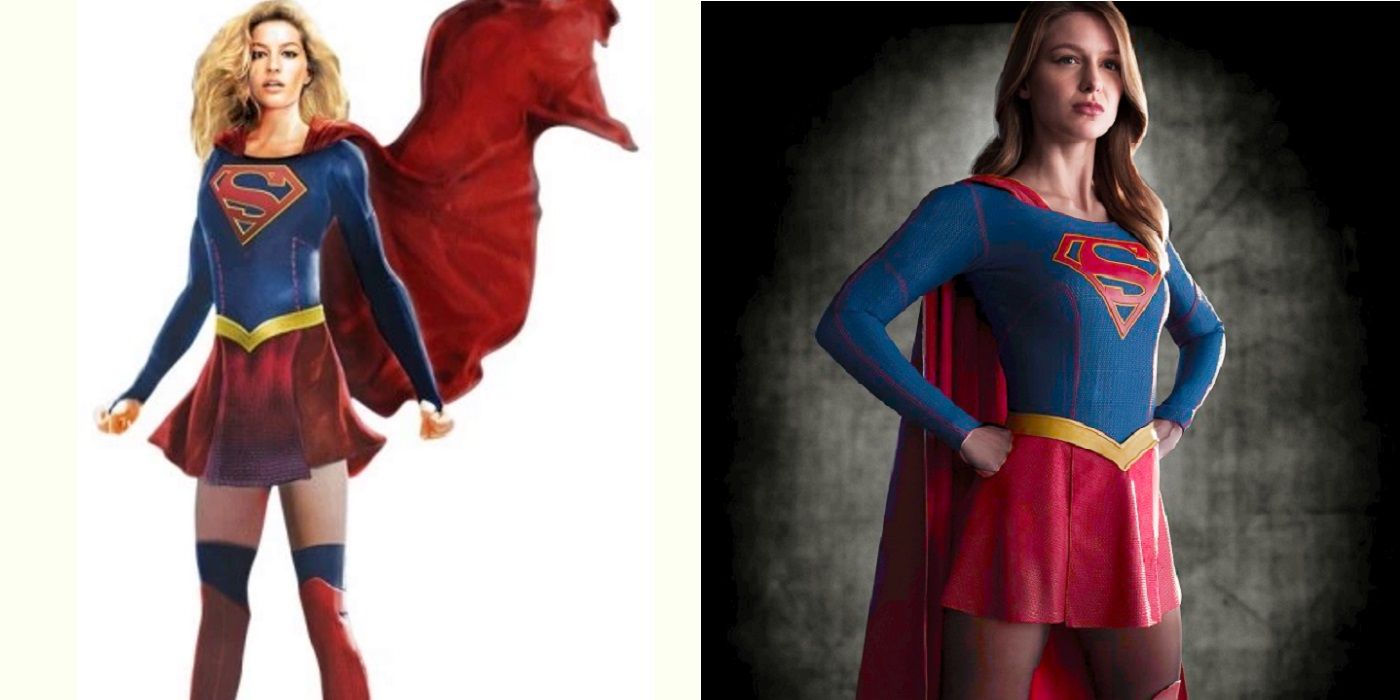
This is the only Colleen Atwood design on the list, so we are a bit unclear as to who to credit for the concept illustration. It is possible that Atwood illustrates her own concept designs. No one was credited when the designs were shared with the world ahead of the release of Supergirl Season 1. Generally speaking, Atwood maintained a great deal from her original concept design, especially Supergirl's S. For that, Atwood actually had Supergirl star, Melissa Benoist, lay down on a bench so Atwood could see how the S would look when Supergirl was flying.
The major changes are with the legs. Atwood famously wanted to show off less skin, but in the concept drawing, Supergirl's tights are less prominent and there are blue stockings visible out of Supergirl's boots that are not present in the final product, which have much darker leggings under Supergirl's skirt.
14 CAPTAIN COLD
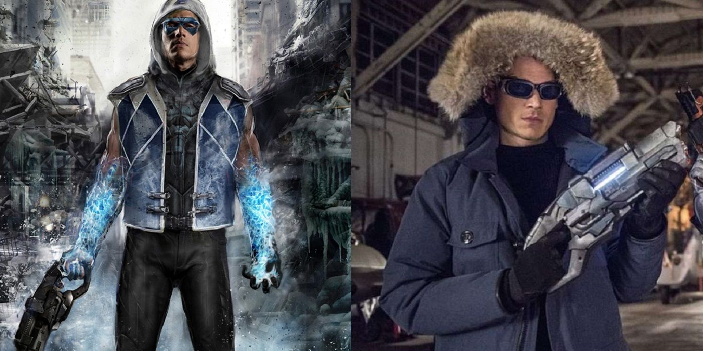
John Gallagher is a digital artist who does some concept work for the Flash. When it came to designing Captain Cold, Gallagher designed the cold gun and they ended up using his design. However, the costume that he came up with for Captain Cold was not as lucky. Gallagher was inspired by the costume that Cold was wearing in the New 52 Flash comic book series.
However, the show was not yet ready to go with such a flamboyant costume (even one that looked as cool as this one), so they went with the more subdued look of the generic winter parka for Wentworth Miller's Captain Cold. Later on, they even brought that design down a notch and got rid of the fur hood.
13 CANARY
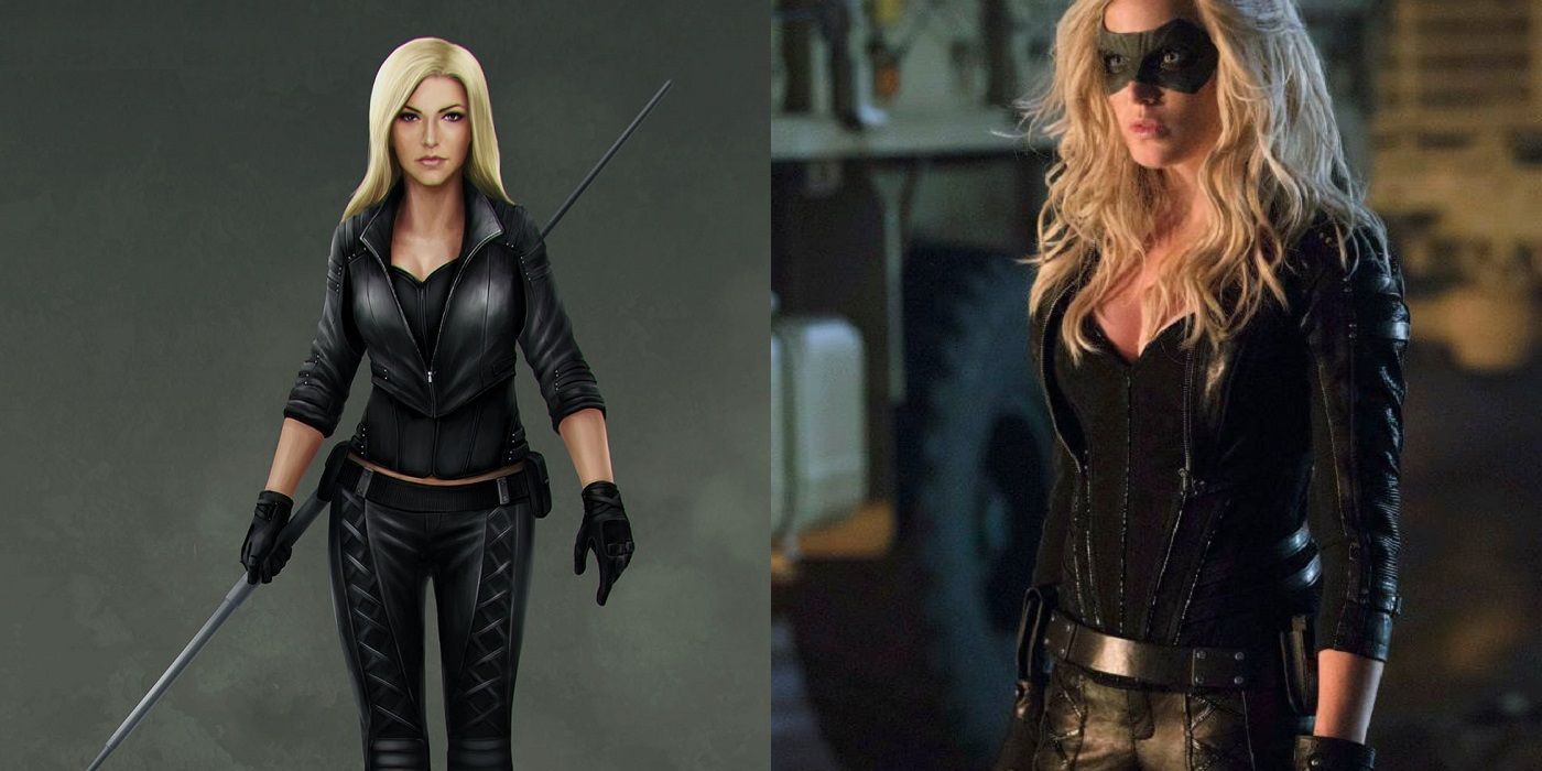
In the early days of designing costumes for Arrow, one of the areas where you can tell that there were a great deal of indecision was just how much to commit to the standard superhero tropes of costume designs. This was most evident in the fact that Arrow, when the show began, did not even wear a face mask, choosing to instead just use grease paint to obscure his face.
Thus, when it came time to design the look for Caity Lotz's Canary, they were obviously similarly unsure whether she would wear a mask. The design went mask-less, but she ended up wearing one on the show. The concept design also had a more traditional jacket look while the actual costume went with an edged jacket-esque top.
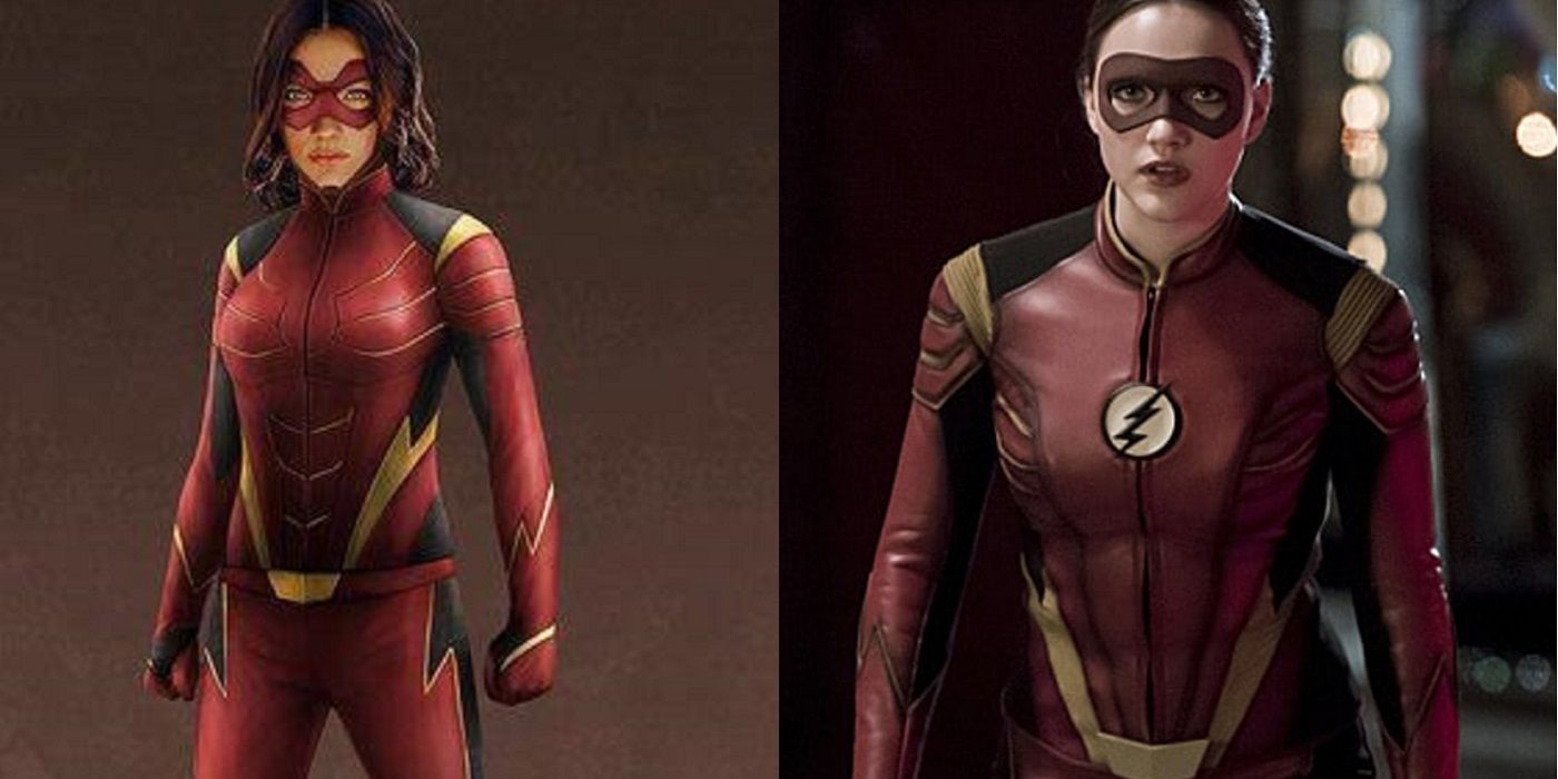
12 JESSE QUICK
Violett Beane plays Jesse, the daughter of Harrison Wells from an alternate reality, held prisoner by the villainous Zoom to force a detente between Zoom and Wells. After Jesse was freed, she then received superpowers along with Wally West, the brother of the Flash's girlfriend, Iris West. Eventually, both Jesse and Wally decided to become superheroes. Wally became Kid Flash and Jesse became Jesse Quick.
When it came time to design a costume for Jesse, the question at hand was how much should they connect Jesse Quick to the Flash. Mani and Poon came up with different costumes, some with the Flash symbol and some without. They eventually went with the Flash symbol, as well as a mask that covers less of her face.
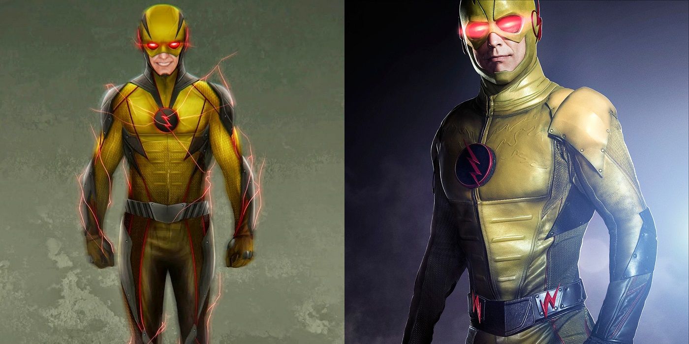
11 REVERSE FLASH
Designing the Reverse Flash's costume was always going to be a hard task, since when you boil it down to its basic impulse, you're talking about a guy wearing a big yellow costume. That's not exactly the most imposing of looks for someone who is supposed to be such a scary villain. Thus, when it came time for Mani and Poon to design the costume for the Reverse Flash (initially worn by Matt Letscher in Flash Season 1 and then mostly by Tom Cavanagh), they tried out some ideas other than solid yellow for the design.
In the end, the final Reverse Flash design worked some dark aspects to the costume design, but not as much as Mani and Poon initially tried out (with the black parts more dramatically featured, along with some red accents).
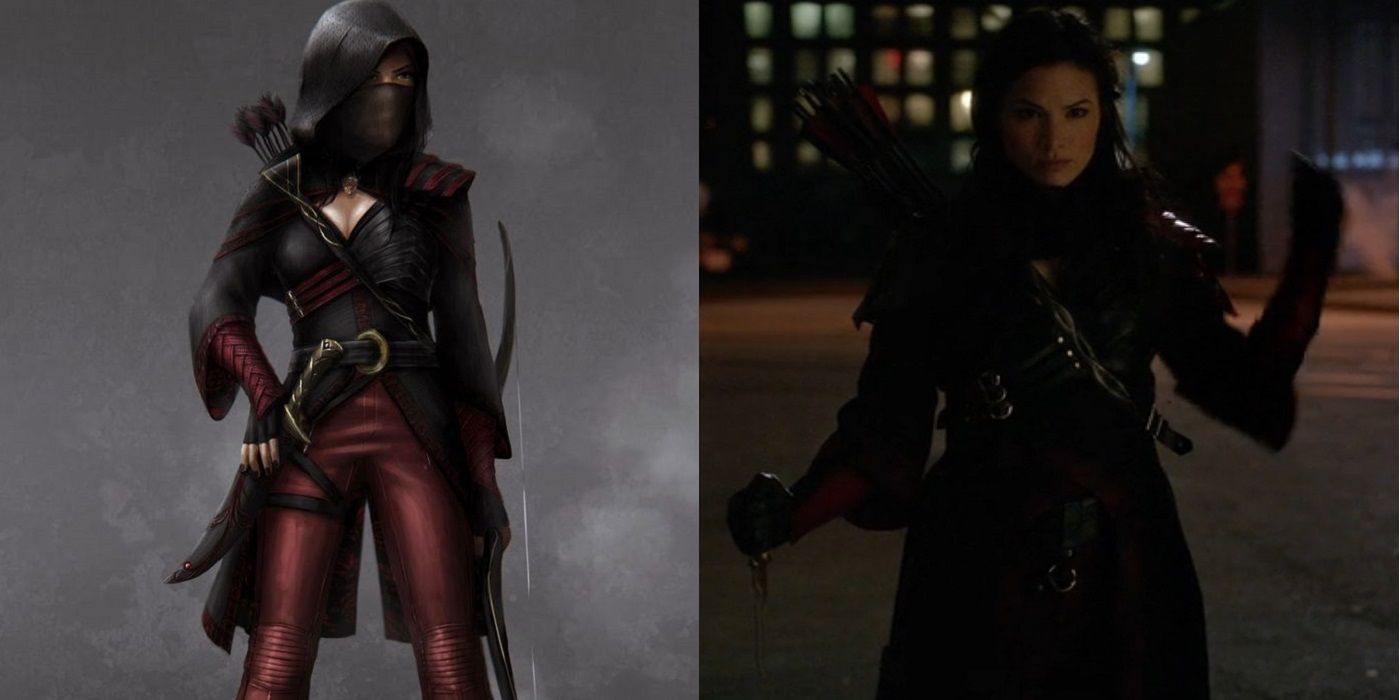
10 NYSSA AL GHUL
One of the things that continues to stand out when you look at enough of the concept designs for the Arrowverse characters is just how well most of these designs were carried out into the actual on-screen costumes. Thus, in a lot of instances, when you look at the differences, we're often talking a matter of degrees.
For instance, with Katrina Law's Nyssa Al Ghul, the basic design of Nyssa's costume matched well with Mani and Poon's initial design. The big change in the final costume was more a matter of degree. Nyssa wore the basic costume, but she also wore a good deal of extra accoutrements on top of the basic design. Notable features includes an extra bandolier, bigger chains holding things in placeanda d ecidedly more urban feel.
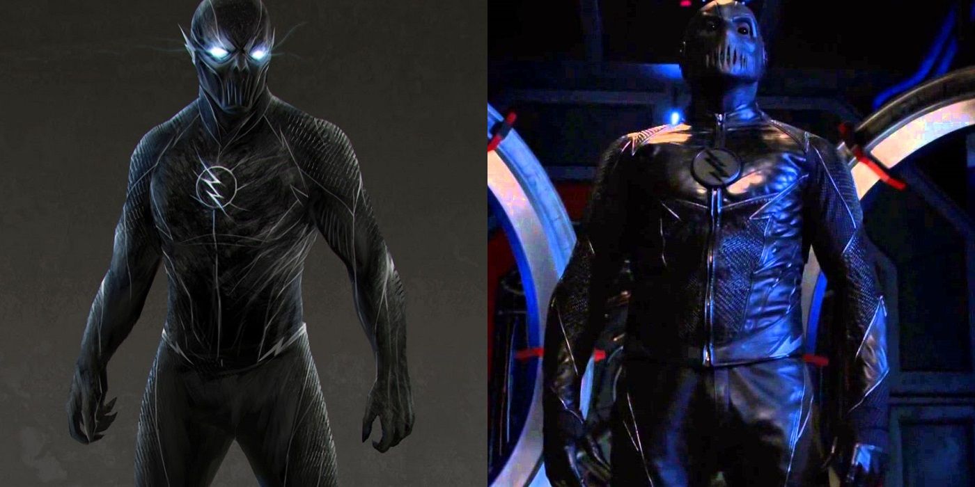
9 ZOOM
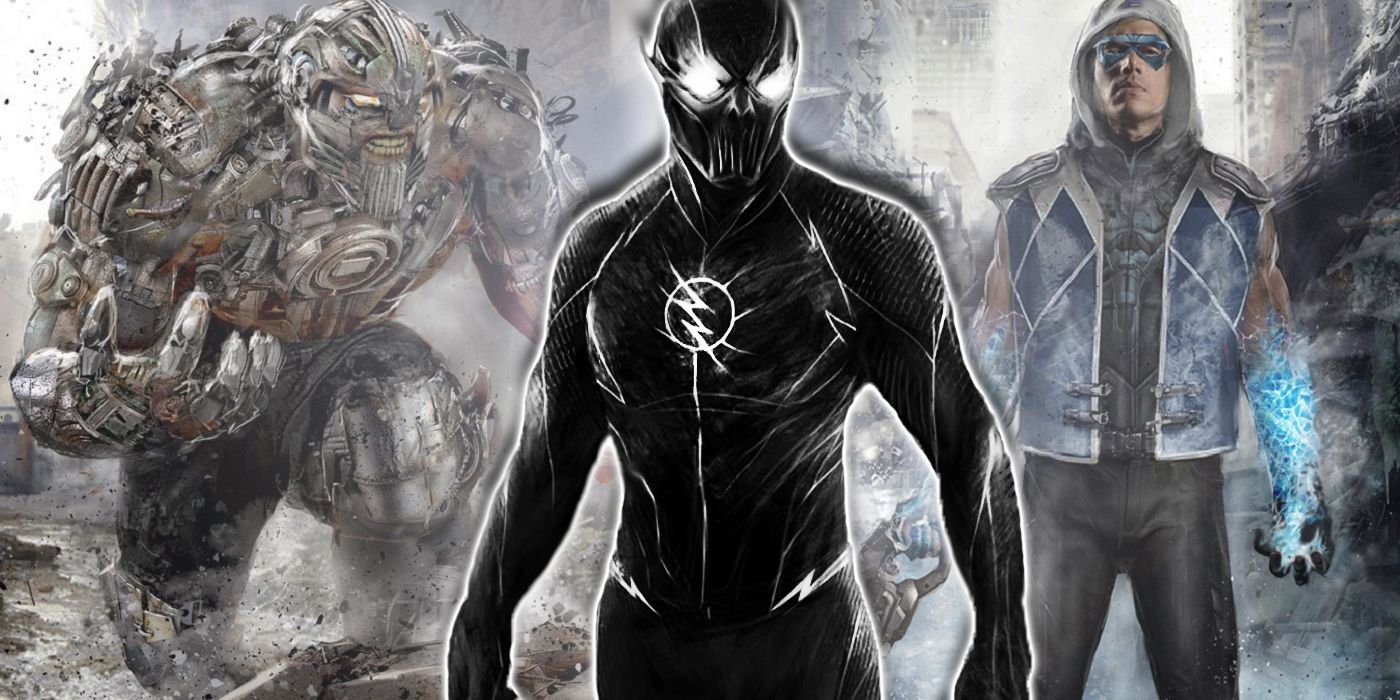
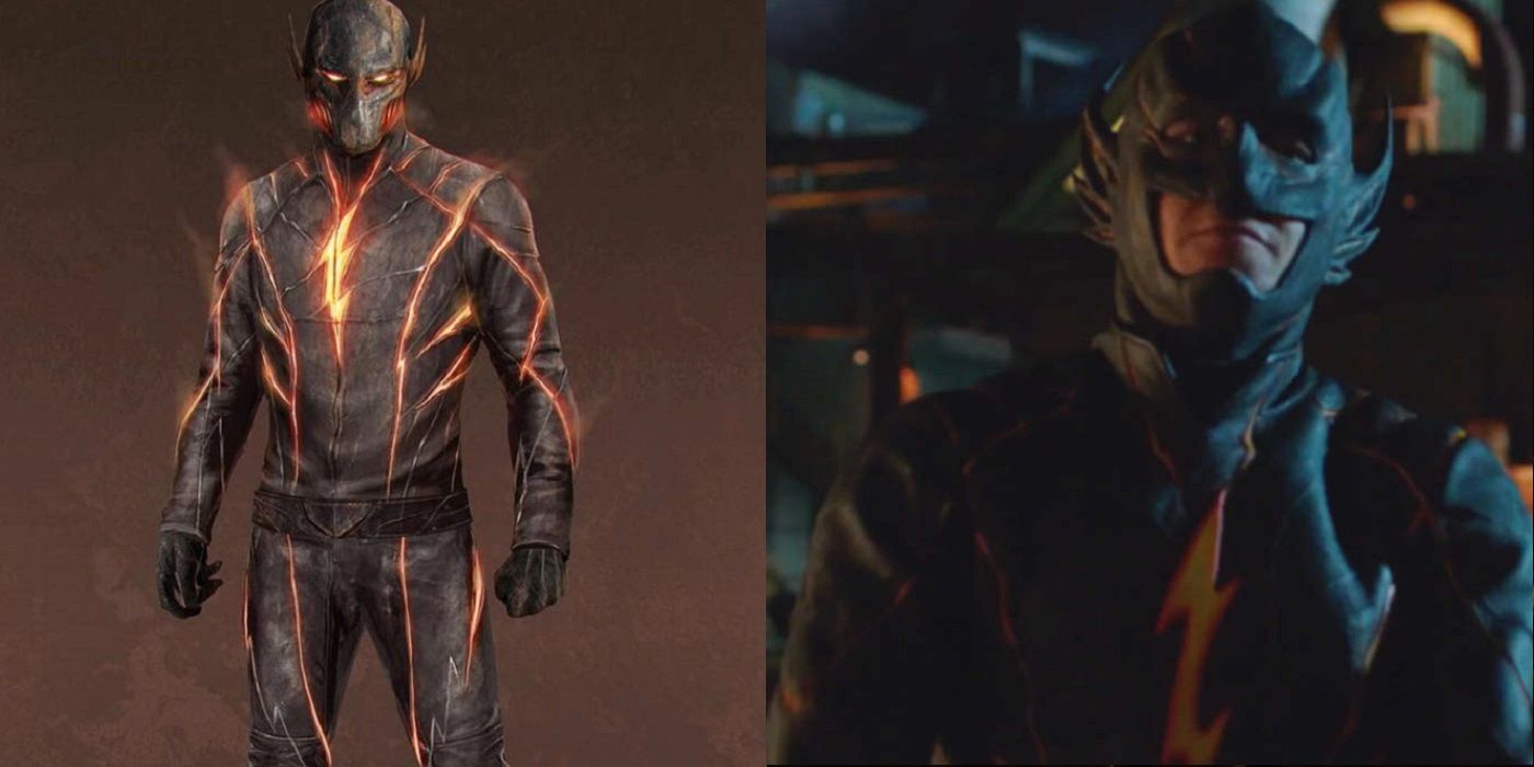
When it came time to design the spooky villain of Flash Season 2, we see one of the few instances where the concept design of Mani and Poon could not quite translate to the reality of an actual physical costume. This is a common problem for superhero television shows in general, where the idea behind the costume sometimes does not match the physical limits of what you can do with clothing (even the fancy materials they use for the costumes on these shows).
So, while the design for Zoom has an almost ethereal feel to it, like there is almost no beginning and no end between the various parts of the body, the finished design is a much more practical looking outfit. The chest emblem also stands out a lot more in the actual costume, while the mask is a bit more distinct, as well.
8 LIVEWIRE
Much like Mani and Poon, it is impressive to see just how much what Ronning and Villanueva's design for Supergirl matches almost to a tee what makes it on to the screen. That is why it is somewhat surprising to see how things were a bit different with a character whose costume is a relatively straightforward look.
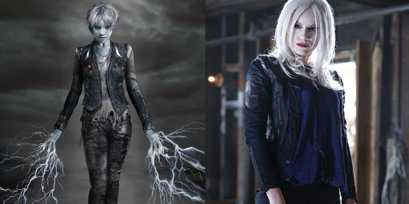
The design for the shock jock turned shocking villain Livewire had a much more ornate look for her jacket and pants than the one that Brit Morgan ultimately wore on Supergirl. They really stripped down the design to a more functional look. Similarly, the haircut was completely different, as well, which is a rarity for these designs (most of the time the hair is one of the main constants, as it is one of the things that tends to be under the control of the casting).
7 MULTIPLEX
The very first costumed supervillain that the Flash fought on the Flash TV series was Danton Black (the real name of the villainous Multiplex, who could make duplicates of himself), played by Michael Christopher Smith. Clearly, right from the start, Mani and Poon were unsure of what direction that were going to go with the costumes of the supervillains on the series.
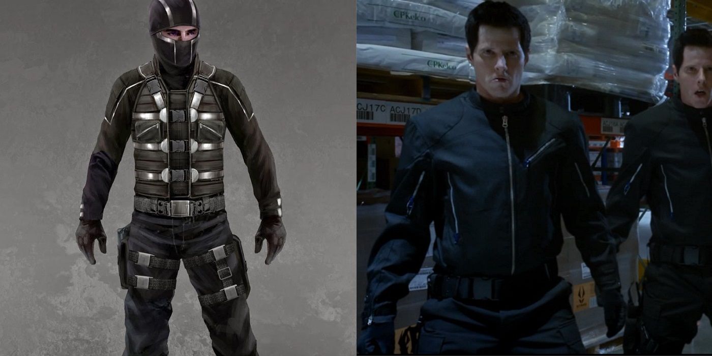
They ultimately decided to go with costumes that were as realistic as possible, especially in the early days of the series (as the show has gone on, they have used more ornate costumes). Thus, while one of the earliest Multiplex designs was highly ornate, in the end the design they went with was little more than a fancy jacket (he also occasionally wore a sky mask over his face).
6 GIRDER
One of the simple facts that you have to deal with when designing costumes for network television is that there are limits as to what the budgets of these shows can produce. You might notice that lots of the photos showing scenes from the shows are very dark. This is because it is easier to make costumes look cooler when you cloak them in shadows. That is especially true for special effects. Darkness makes it easier to blend computer graphics into the show.
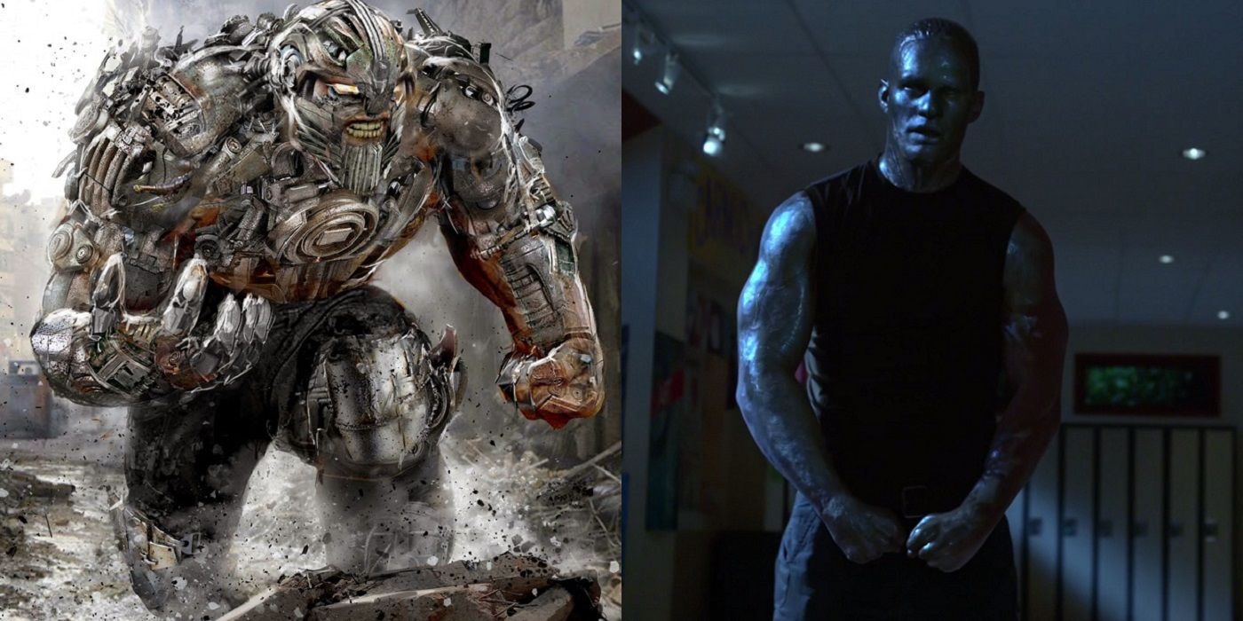
However, sometimes you also have to decide just how grand of special effects you can afford on a television show. Case in point, John Gallagher worked up a design for the villainous Girder that matched the comic book version of the character, but the show ultimately went easy on how much computer graphics they used to make actor Greg Finley look like organic steel.
5 ARSENAL
Right from the start, it seems like one of the biggest debates when it comes to costume designs on Arrow was what to do with the masks for the characters. Initially, Arrow just wore grease paint but he eventually began wearing a modern day version of the classic domino mask that superheroes have been wearing since the Golden Age of comic books. Later on, Barry Allen made him a fancier version of the mask.
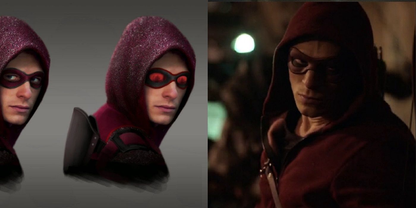
Initially, Arrow was aided just by his former bodyguard, John Diggle, but then Roy Harper became the costumed hero, Arsenal. Thus, there was clear debate as to what kind of mask Arsenal would wear now that Arrow finally had a costumed companion. Some of the early designs were really out there, but they ultimately went with a traditional domino mask.
4 REVERSE FLASH II
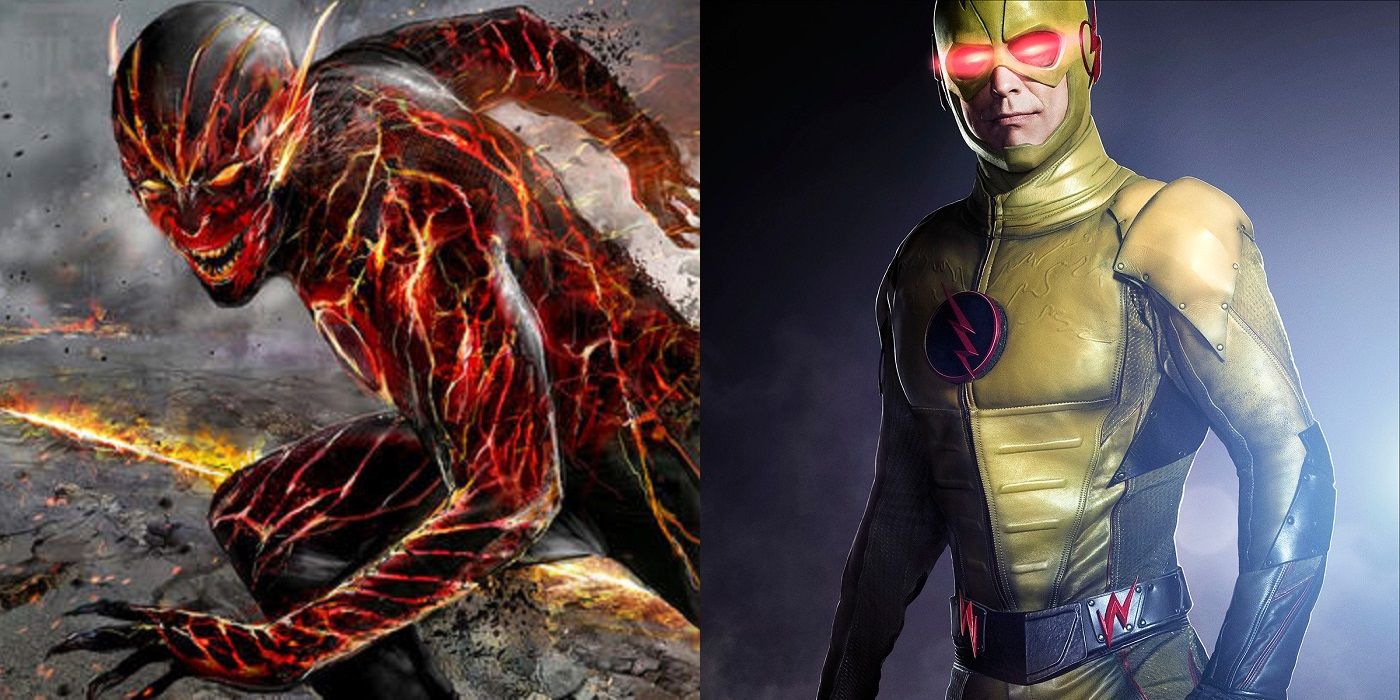
As noted earlier, in the first season of the Flash, the idea was that the Reverse Flash was supposed to be the scariest thing that the heroes could expect to face. Ultimately, they decided to go with basically the classic design of the Reverse Flash (a yellow version of the normal Flash costume). However, early on, other options were certainly considered.
John Gallagher threw out the idea of doing a version based on the new Reverse Flash from the New 52 Flash comic books. This was such a radical departure from the Reverse Flash look that it is was likely never seriously considered and it is is unclear whether this was ever a serious suggestion or just a bit of a lark by Gallagher. Either way, it definitely stands out as a striking (and scary) design.
3 ALCHEMY
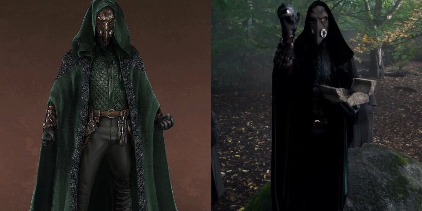
Outside of issues like trying to translate a purely fantastical character from the comic book page to the TV screen (where computer graphics have to step in), the biggest problem of translating comic book character designs to television is when the comic book design is extremely ornate. The comic book character of Doctor Alchemy, besides his dramatic plague mask, also had a very intricately designed costume.
When Mani and Poon initially did their design for Alchemy, they kept the plague mask and also gave him an elaborate, ornate design for his costume. When the costume actually was translated to the screen, though, they kept the plague mask, as it was way too distinct to cut, but the rest of the costume was very much a stripped down version of the original design.
2 BLACK SIREN
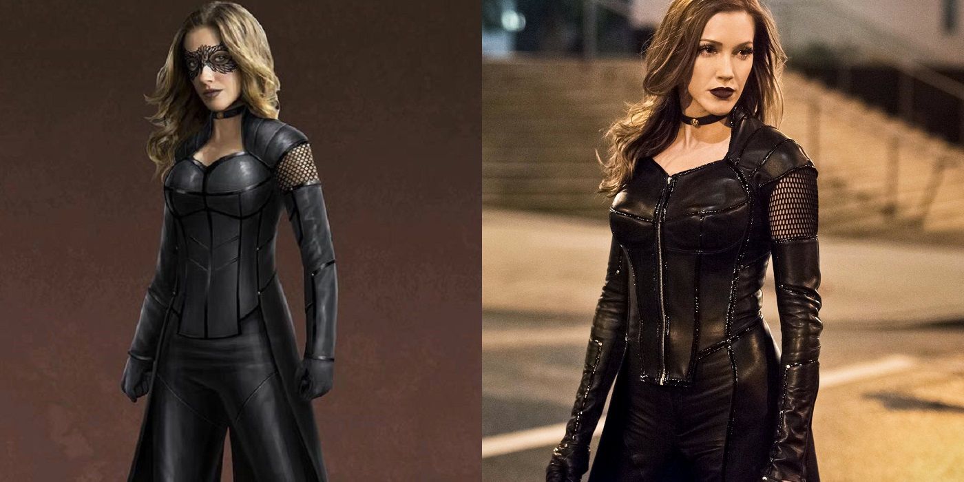
In Season 2 of the Flash, we got to see alternate reality versions of some of the regular cast members of the Arrowverse, including evil versions of Caitlin Snow and Laurel Lance. Laurel's evil version, the Black Siren, was a Mani/Poon design and it was an interesting idea to take the basic approach of Laurel's Canary costume and take it to a darker place.
The version of the costume that ultimately made it to air was very close to the Mani/Poon design, with some changes in the bustier of the costume and, of course, the classic debate over whether or not to give a character a mask. This time, they went with a mask in the design while the character went mask-less on TV.
1 RIVAL
One of the recurring problems that costume designers face when they are creating looks for characters on an ongoing TV series is trying not to replicate the same look on different characters. Obviously, certain characters are inherently going to look the same (like how Thea Queen's costume was intentionally designed to be a female version of Roy Harper's Arsenal costume), but generally speaking you want to keep things more distinct.
That seemed to be the issue that Mani and Poon dealt with in Flash Season 3 where they introduced the Rival, a villain from the "Flashpoint" alternate universe from the beginning of the season. Their initial design evoked the costume worn by Zoom, but the final design that made it on to the show gave Rival a more distinctive face mask that did not cover his full face like the Zoom look.
Which of the unused designs did you like the best? Let us know in the comments!

