Though DC Comics hasn’t been having much critical success on the big screen, the publisher’s properties have been enjoying a great deal of success on TV. The CW’s Arrowverse is comprised of Arrow, Supergirl, The Flash and DC’s Legends of Tomorrow , meaning that there are a large number of characters in play. However, the characters and their appearances do not always hold true to the comics. In fact, many of the characters underwent some serious changes from their concept designs to their appearances in the Arrowverse.
RELATED: Too Fast, Too Furious: 15 Times The CW’s Flash Divided Fans
The characters had rad concept art -- however, not all of these designs translated. Some of the concept art’s majesty was lost in translation to the silver screen, leading to strangely executed, often clunky costumes. Unfortunately, this is not too uncommon in superhero media, but the Arrowverse seems to suffer the worst. On average, the final products could not live up to the concept art they were based upon. Luckily, this was not all-encompassing, there were some exceptions to the rule. Some of the characters in the Arrowverse actually outshined their designs! Because of this, we felt it necessary to present you with eight Arrowverse characters that worked better as concept art, and seven that looked worse.
15 BETTER: HAWKGIRL

Unfortunately, while Andy Moon did a fantastic job on the concept art for Hawkgirl (aka Kendra Saunders), it was one of those concepts that just did not translate well to a physical representation. Hawkgirl’s concept art looks sleek, elegant, and fierce, just like the character should. However, when viewed on the silver screen, Hawkgirl (portrayed by Ciara Renee) looks more like a clunky Halloween costume than the regal character she is meant to be.
Her armor looks a bit more like spandex or pleather than battle ready-- and her helmet is not much better. Honestly, it looks a bit like the messed up top half of a football helmet. Moon’s concept art definitely knocks the actual television representation of Hawkgirl all the way out of the park.
14 WORSE: DEADSHOT

With Deadshot enjoying pretty fantastic design in comics, video games, and the recent Suicide Squad movie, his design in the Arrowverse was a bit of a letdown. Especially the character’s concept art. The Deadshot concept art from season one of Arrow, makes the character look like nothing more than a wimpy Frank Castle knock off. Luckily, between Michael Rowe’s portrayal of Deadshot and the way the concept art translated to an on-screen portrayal, the character was salvaged.
Compared to the Deadshot we are all used to, however, neither Arrow incarnation holds up. A totally stacked weaponized outfit will knock a brown shirt with a bandolier strapped to it out of the park every time. Thankfully, on screen, Deadshot’s got a few more weapons than his concept art lets on.
13 BETTER: FIRESTORM

Firestorm is a delicate case, for sure. Everything goes well for the DC’s Legends of Tomorrow character, that is, until he turns his flames all the way on. That’s where things start to get complicated. Andy Poon’s concept art for the character shows him in his full-flamed state. It even goes so far as to show the detailing on the inside of the character’s gloves.
Unfortunately this does not translate well to Firestorm’s on-screen appearances. Despite enjoying a pretty hefty amount of screen time on DC’s Legends of Tomorrow, the show’s animators just weren’t able to get the fully-flamed Firestorm right. It just feels a little bit off. We can not really seem to get behind this one on screen, regardless of how awesome Andy Poon’s concept art is.
12 WORSE: HUNTRESS

We were all thinking it: how come the Arrowverse’s concept art for the Huntress looks like a cross between Ultimate Hawkeye and a character out of Kick-Ass? The concept art makes it clear that the Huntress’s entire getup is black pleather, which couldn’t be all that breathable. What we can’t get over, though, is the sunglasses.
Luckily, the actual on-screen portrayal of the Huntress doesn’t use the color black to the point of overkill. With brown hair without purple accents, Huntress’s getup works quite well. The best decision on the part of costuming was to replace the sunglasses from the original concept art with a face mask. Now, Huntress looks less like a weirdly edgy secret agent, and more like the vigilante that she is.
11 BETTER: MR. TERRIFIC

Mr. Terrific is one of our favorite DC characters, so maybe we’re being a little bit biased on this one. Andy Poon’s Mr. Terrific concept art for Arrow season five is fantastic. Not only is it accurate to the source material, but it displays Mr. Terrific’s powerset, and doesn’t confuse the viewer with ambiguous fabric designs. Unfortunately, superhero costumes are a little more difficult to recreate than they are to draw. Who knew?
The one biggest shortcoming in the recreation of Mr. Terrific on screen is certainly the facemask. No matter what angle Mr. Terrific (portrayed by Echo Kellum) is shot from, the facemask always looks a bit chunky. While we really love the addition of his T-Spheres, we’re sticking by this: Mr. Terrific looked better as concept art.
10 WORSE: ARSENAL

One look at this concept art for Arsenal (aka Roy Harper) lets you know why we aren’t exactly hyped about it. To put it simply, the fabric is awful. Though we know that some people are fans of plainclothes heroes, we are not, especially in the broader context of Arrow, a show where pretty much everyone is clad head to toe in pleather.
Andy Moon’s concept art for Arsenal showed the popular sidekick to Oliver Queen being clad in nothing more than a hoodie and jeans. Thankfully, the concept art evolved a great deal since it was first revealed. Arsenal (portrayed by Colton Haynes) as he appears on television is all decked out in pleather, just like the rest of the characters on the hit CW show.
9 BETTER: HAWKMAN

You would think because Hawkgirl is already on here that Hawkman wouldn’t make the list. You would be wrong. Andy Poon’s work on the concept art for Hawkman is similarly fierce and majestic. The television representation falls short as well, but in different ways. While Hawkgirl at least retained some of the shimmer of her armor, Hawkman’s ‘armor’ is nothing more than brown leather.
Hawkman (aka Carter Hall) appears more like a frat bro in a mid-tier Party City getup than the latest in a long line of reincarnations of the Egyptian prince Khufu. We are going to have to pass on the Arrowverse’s iteration of Hawkman. With the exception of Andy Poon’s concept art for the character, the Arrowverse’s iteration of Hawkman just looks… unnecessarily clunky.
8 WORSE: DEATHSTROKE

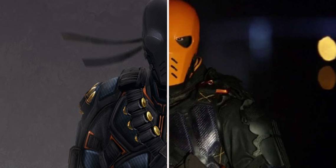
Deathstroke (aka Slade Wilson) has been a large part of the DC Universe for a couple of decades now. Though this is not his first TV appearance (the character made himself known to a new audience through Cartoon Network’s Teen Titans) it is one of his best, design-wise at least. Even though it has so many pockets and pads, you’d think it was the '90s.
Although, it was not always so polished. Actually it was -- a little TOO polished. For some reason, the concept art for Deathstroke looks more like the underside of a new toilet bowl or an unused piece of fine china than a mercenary’s combat outfit. We’re glad that it got a bit more scuffed up in its migration to the silver screen -- Manu Bennett’s Deathstroke ended up looking pretty good.
7 BETTER: CITIZEN STEEL

Andy Poon did a wonderful job on the concept art for Citizen Steel (aka Nate Heywood). The costume is quite well-done, as is the character’s skin -- which is steel, for those of you unfamiliar with the character (and not tipped off by his name). Unfortunately, even the most high budget productions have not been able to pin down the difficult task of animating steel skin (Cough cough, Colossus).
We are sure that you can imagine where we are going with this: Citizen Steel does not look too great when his skin is steel. Unfortunately, making an aesthetically pleasing character with steel skin is a bit out of the financial wheelhouse of the CW. So for now, we’re going to have to settle for the Citizen Steel that we get.
6 WORSE: JONAH HEX

The one thing that really struck me as odd about this design was that it is almost impossible to see the disfiguration on Jonah Hex’s face. Another thing that stuck out about this design was that it felt too polished. Jonah Hex is rugged and disheveled. Unfortunately this design left him looking more like a confederate soldier than an outlaw. Actually, the Jonah Hex concept art for DC’s Legends of Tomorrow (drawn by Andy Poon) looks more clean cut than any confederate soldier I’ve seen in any media to date.
Luckily, Jonah Hex’s appearance in DC’s Legends of Tomorrow is a bit more faithful to the source material and does the character justice, though his concept art did not. He’s for sure more rugged and grizzled, right down to the disfigured face.
5 BETTER: RAGMAN

Unfortunately, without a ridiculously high budget, there are just some concepts that are too far-fetched, even for the special effects teams. And judging by how Ragman has been portrayed on Arrow, we’re inclined to believe that his unique composition and power set fall under that umbrella. Andy Poon’s concept art for Ragman on season five of Arrow knocked the character out of the park where the television show fell short.
Ragman is grimy in his appearance on the show. His tattered, nearly monochromatic outfit, complete with a horrifying serial killer-esque mask really drives the point home that Ragman is not a character to be trifled with. Unfortunately for Ragman actor Joe Dinicol, this did not really translate too well to the character’s on screen representation.
4 WORSE: WILD DOG

The concept art for Wild Dog in season six of Arrow left a whole lot to be desired, especially for die-hard fans of the comic book vigilante. The character design made Wild Dog out to be much more sophisticated and put together than he is. Body armor definitely is not Wild Dog’s style, that is why we’re so glad that the final version of the character’s on screen portrayal took Wild Dog back to basics.
No body armor, just a hockey jersey with a red dog on it. Wild Dog is at his best when he’s stripped down, casual, and not entirely put together. That’s why Wild Dog’s first vigilante costume in the show is definitely our favorite -- his latter get up? Eh not so much.
3 BETTER: BROTHER BLOOD

Andy Moon’s concept art for Brother Blood (aka Sebastian Blood) is downright creepy. The execution of the art? Not so much. The scary factor of Moon’s concept art didn’t translate all too well. Whereas Blood’s concept art showcased his sly, puffy eyes, and patchwork hood of flesh, the actual television portrayal falls short. Brother Blood’s appearances on Arrow are marred by the blatant inauthenticity of his hood.
It’s so clearly fake, that scenes that were obviously supposed to be charged and dramatic come off as just being cheesy. Thankfully, Moon’s art pays attention to the importance of the hood to Brother Blood’s character -- which is important. While all of the other characters are given full body concept art, Brother Blood’s is only from the shoulders up.
2 WORSE: NYSSA AL GHUL

Andy Poon’s Nyssa al Ghul concept art is one of his few designs that just does not really connect. The lighting on the character just feels...off, and it is impossible to tell the fabric composition on any of her clothes. Another thing that felt weird about Nyssa’s concept art was that it is nearly impossible to discern where her hood ends and her hair begins. Luckily, all of these issues were resolved in the character’s actual television appearances on the second season of Arrow.
Portrayed by Katrina Law, Nyssa al Ghul’s on screen representation is one of the most well-designed characters in the Arrowverse. Even though every one of her costumes makes her look a bit like an Assassin's Creed protagonist, we’re definitely huge fans.
1 BETTER: THE RIVAL

The smoldering super suit of The Rival makes for quite the imposing and intimidating picture. Andy Poon’s concept art of The Rival looks like the remnants of a volcanic explosion. With the Speed Force coursing through his coal-black suit, the design positively exudes power.
Unfortunately, it didn’t carry over to the character’s appearances in The Flash season three. While The Rival should have been one of the most intimidating characters on The Flash, the character’s silver screen appearance was so inert that it was almost hysterical. The Rival looks a lot less like an intimidating speedster, and more like someone getting ready to try out bondage gear for the first time. So yeah, The Rival looked so much better as concept art than he did on screen.
Which of these do you like better? Let us know in the comments!