While the premise is a little silly, Kung Fu Panda is a beloved series, one of the better-animated trilogies around. Every movie helps teach Po something new. There was a constant state of progression for the character, never letting him grow stagnant. Jack Black killed it in the role as well.
What's underrated is how well it's animated, something that you can contribute to concept art. Many of the climactic fight scenes are very well done, and the animal characters all have very unique looks to them. It gives the series a look that's all it's own.
10 Black & White
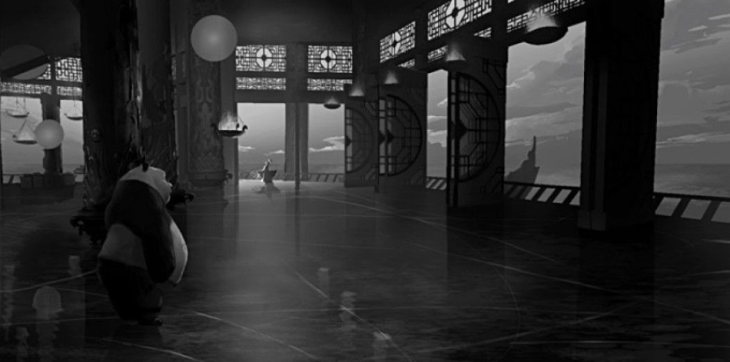
A black and white image or filter always brings a level of seriousness to it that colors can't represent. It's why noir style movies always excel in that format. Mike Yamada does the same here with this piece, adding a sense of weight and gravitas to the scene, making you feel how important that it is. The vastness of the room contributes to some of that as well, images of the world beyond the open slates adding even more. Whatever decision Po comes to is one of grave importance.
9 Tapestry
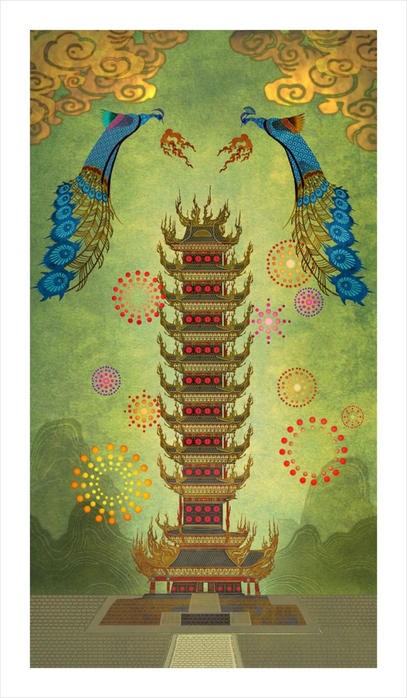
The entire image by Mike Yamada looks like a tapestry that would be hanging in a king or emperor's castle. In this case, it's two dueling peacocks breathing down flames over a massive tower, seemingly setting it ablaze. The entire image works to sum up much of the film, fireworks going off in the background that is similar to the ammunition of Lord Shen's cannons. Peacocks themselves helping represent the lord himself, breathing their flames down on not only Gongmen City, but China as a whole.
8 Mordor
The way the molten liquid is pouring into the mouth of the cannon helps give off an almost tower of Mordor feel to it, that the cannon itself is a source of great evil.
The all-white nature of Shen even gives vague Saruman vibes as well. Mike Yamada helps capture some of the darker tones that Kung Fu Panda 2 has at times. The art itself is good at conveying scale as well, having both Shen and an ape in the foreground to show just how big the cannon is.
7 Exhaustion
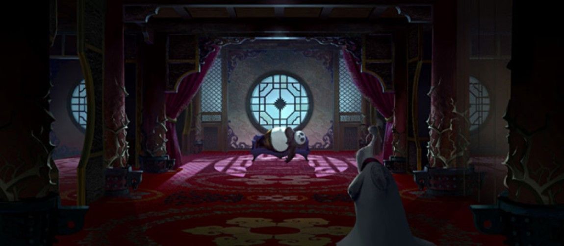
If you didn't know any better, you'd think Po was taking a nap like the lazy panda that he is. Shen more of a loyal caregiver than the villain of the entire movie. It gives the image a nice sense of duality to it. As always, Mike Yamada uses the two characters to give scale to how large the room is, both in width and height. The way the moonlight shines through the window is nicely done, giving a nice bit of illumination around Po's body.
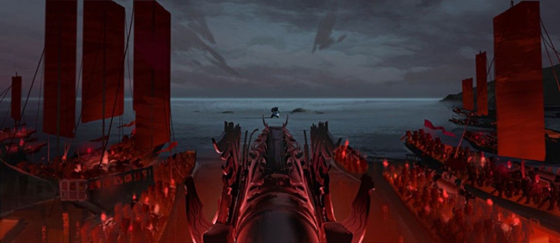
6 War
Having the view be from behind the cannon is a great choice by Mike Yamada. It gives you a cool point of view that you don't often see with these types of images. It makes it seem like you are the one in charge of the cannon, ready to blow all who stand in your way away. The detail on the ships and people inside of them is a little smudgy, but the true heart of the image is in the lone warrior standing up to them all, not caring about the odds against him.
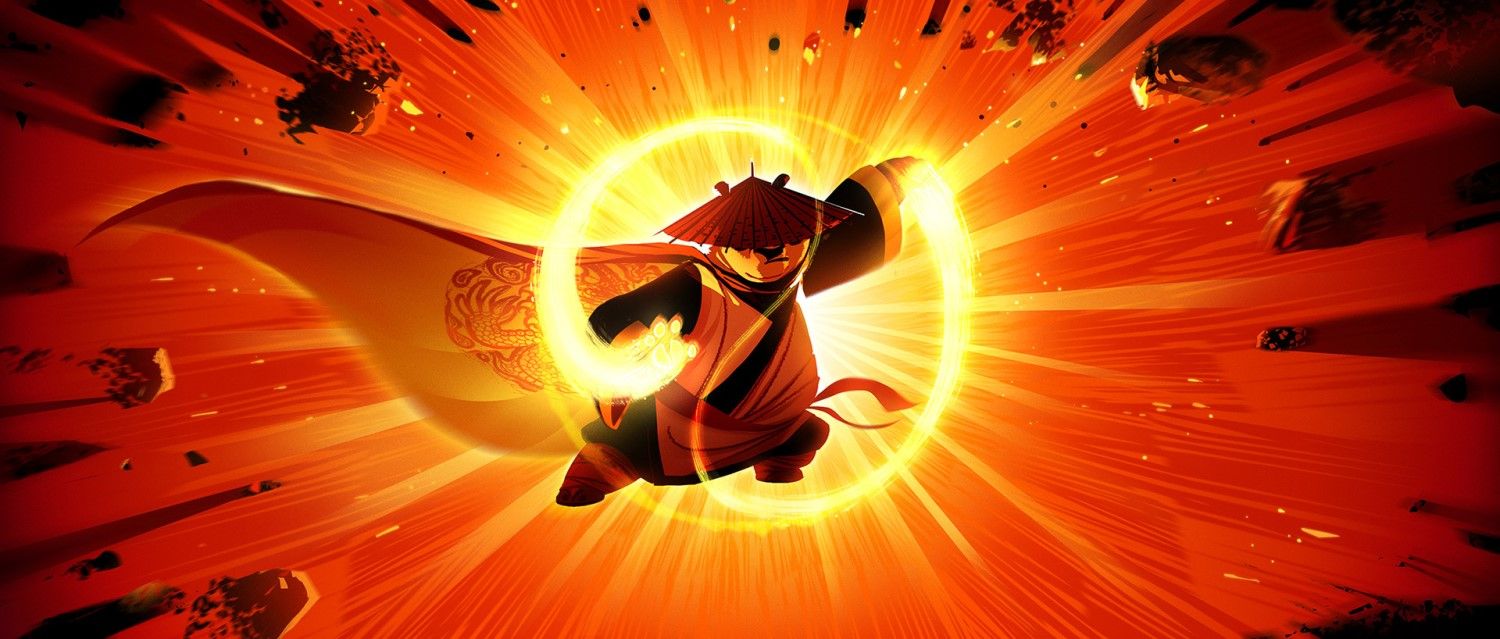
5 Explosive
The sheer brightness of this image is well done, Max Boas driving home how heavenly the chi Po is wielding is. It's as bright as the heavens themselves, making him almost look like an angelic warrior.
It's one of those rare moments where he looks like a true badass as well, casting away his doubts and becoming the chosen one he was always meant to be. You can say a lot about how long the series went on for, but Po fully becoming the dragon warrior was such a cool moment.
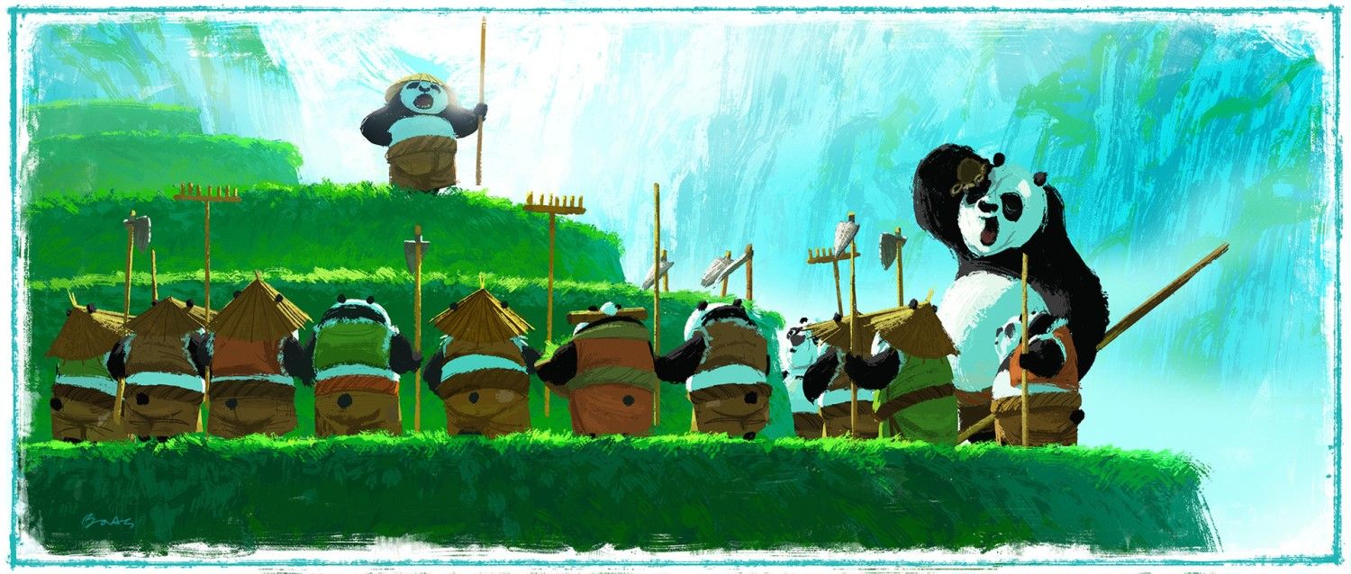
4 Panda Master
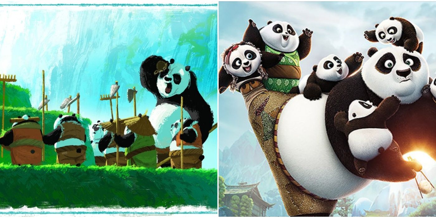
The best part about Kung Fu Panda 3 may be all the little panda and the training Po does with them. For one, they are all adorable looking, just a bunch of round mounds of fluff. They all embody a lot of that energy that Po had when he was first introduced to us in the first movie. It's pretty funny how many of them and yawning as they'd rather still be in bed than here. The light colors used by Max Boas helps show how unprepared all of them are for the fight to come.
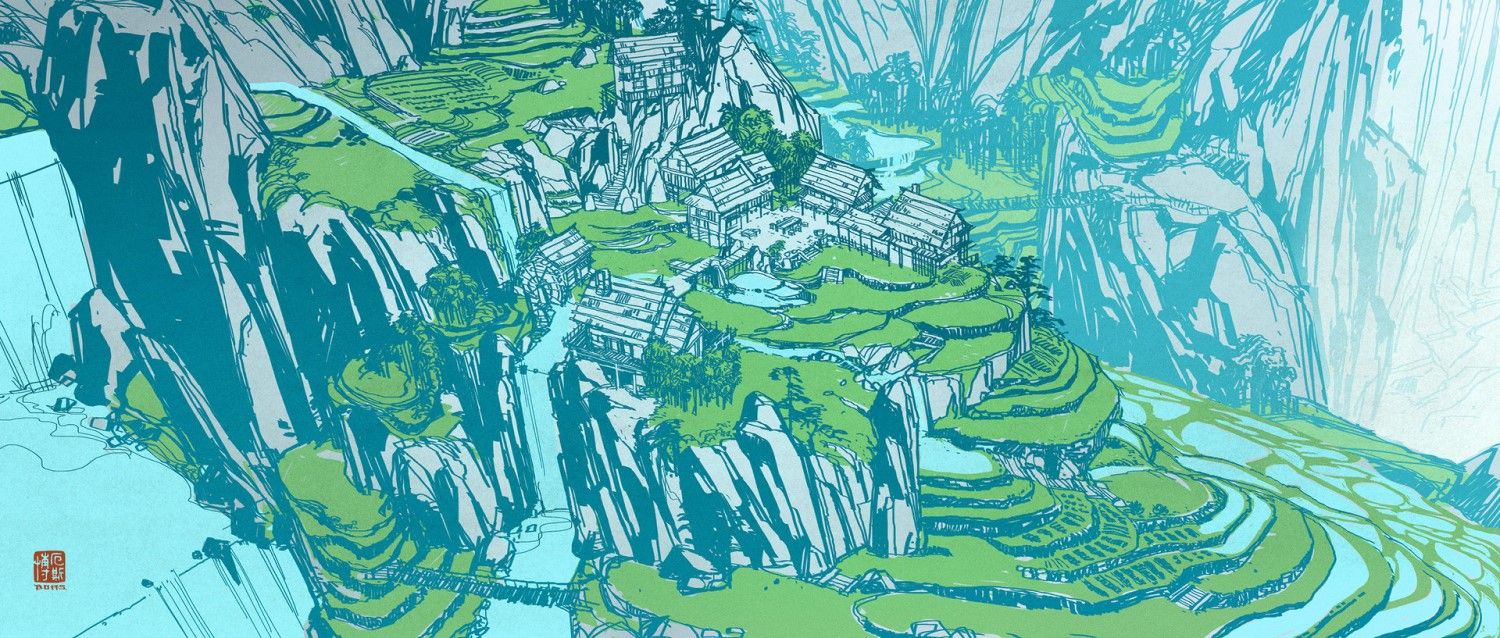
3 Land Of Pandas
The panda village is the hidden home of the pandas, tucked away in the mountains around a lush spring. It's a simple village, but one that Max Boas beautifully illustrates. While only using a mix of green, blue, and white he manages to craft a very vibrant image that encompasses much of the hope the pandas possess. It does a good job of giving you an overview of the entire area, showing off the mountains that shroud it as well as the ever-present stream.
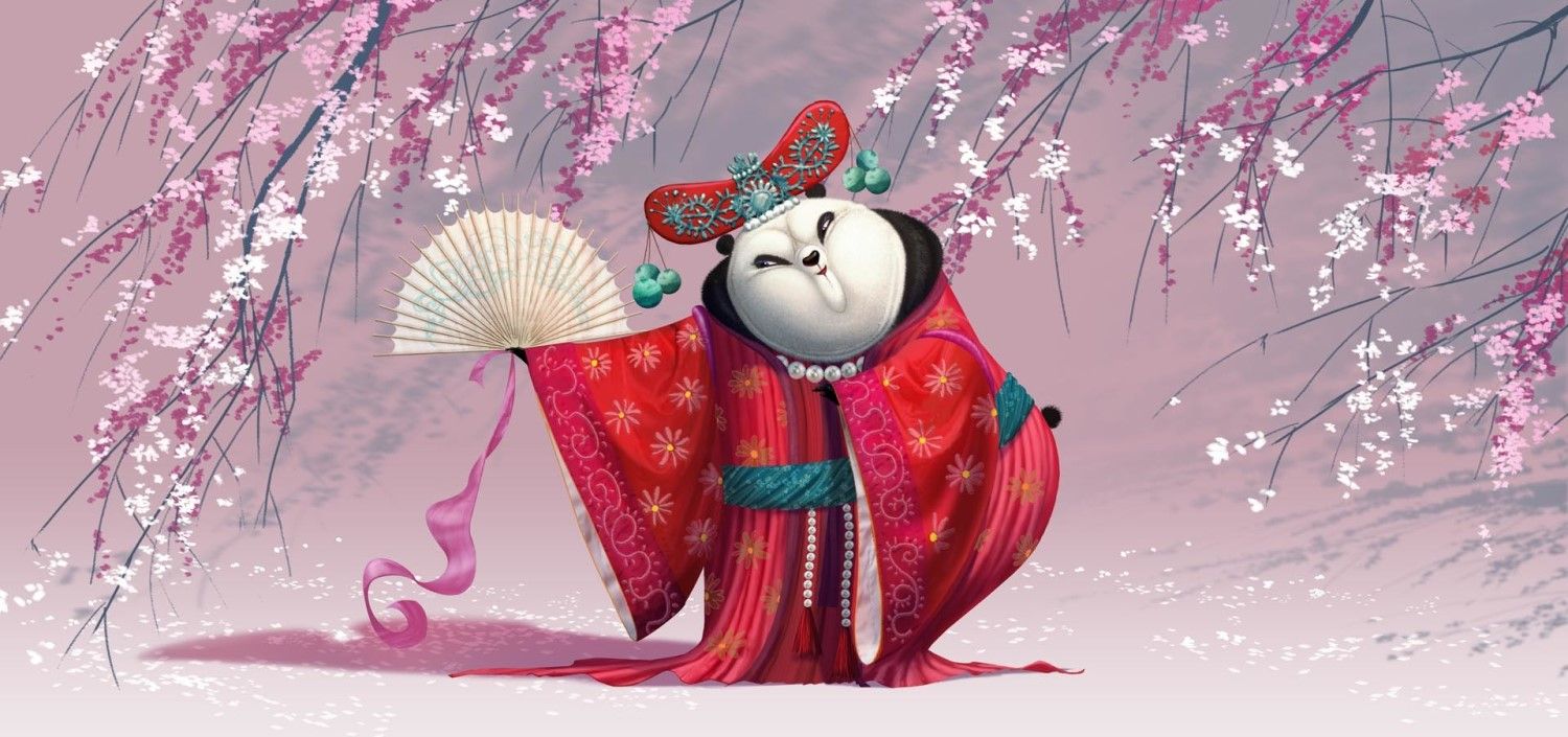
2 Mei Mei
She's exactly the type of secondary character you want in a movie series like Kung Fu Panda. She provides humor with her flirtations toward not only Po but any male panda who catches her eye. The way she fought, utilizing her dancing ability, was wholly unique in a series that has more than a few underrated fight scenes in it. Raymond Zibach does a nice job of having cherry blossom branches surround her while the backdrop is a lighter shade of pink, nicely blending the two.
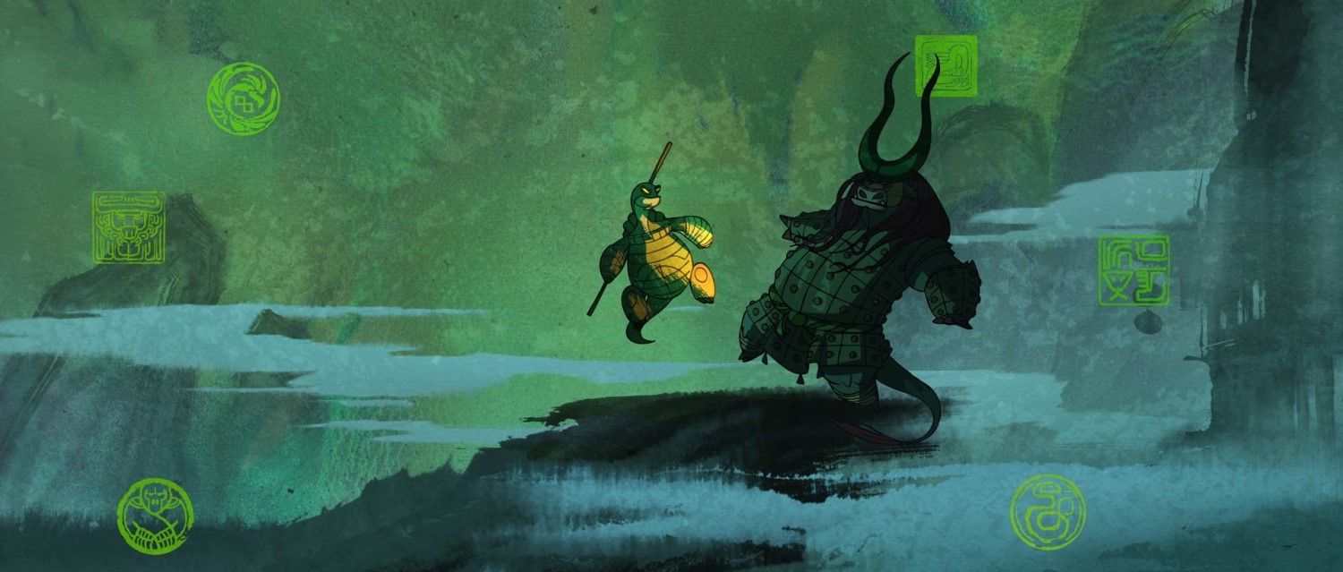
1 Oogway VS Kai
The battle between these two didn't get as much screen time as it should have, but it did help establish what a threat that Kai was, putting him on a realm beyond the previous two villains. Raymond Zibach makes their conflict look epic, Oogway wearing a serious expression for once, feeling emotion rather than having that sense of inner peace. It's subtle, but the way he's lit up while Kai remains covered in darkness is perfect with what their roles are in the film.

