Alex Ross is no stranger to working with icons. In his quarter century in comics, the painter has tackled pretty much every single major superhero from both Marvel and DC Comics -- a feat he accomplished early on with the one-two punch of "Marvels" in 1994 and DC's "Kingdom Come" in 1996, two works that cemented Ross' place as the premier painter of superheroes. With two decades of work on Vertigo's "Astro City" and a monthly gig providing covers for a number of major Marvel series, Ross' impact on comics remains strong today. But his latest project sees the artist tackling a group of completely different, albeit equally notable, icons -- the Beatles.
a href="https://www.comicbookresources.com/article/alex-ross-paints-the-beatles-for-special-apple-records-box-set">Ross has partnered directly with Apple Corps as a licensor to produce a series of paintings depicting the Fab Four as they appeared in the 1968 animated film "Yellow Submarine." The project also marks the first time that Ross will be responsible for distributing the artwork, as he adds "Beatles licensor" to his already impressive resume.
RELATED: Alex Ross Dives Deep Into Marvel's "Secret Wars"
The final product will be unveiled at the Beatles Shop at the Mirage Hotel in Las Vegas on April 30, where Ross will be on hand. Ahead of the big reveal, the artist spoke with CBR about his lifelong Beatles fandom, his 20 years with "Astro City" and the anniversary of the seminal "Kingdom Come."
CBR News: It's obvious from looking at these paintings that you're a big Beatles fan.

Alex Ross: Yeah, I was raised on them through some very lousy 8-track recordings that were in my house -- the "Red" and "Blue Album" collections, the best-ofs that were released in the '70s. As I grew older, my fascination only deepened because once I'm actually getting my own money to buy records, I can now buy the full albums, where I only knew one or two songs. As teenagers that were exposed to the stuff in the '60s as it came out, I had a mirrored existence to them in some degree because I was only hearing that stuff for the first time when I'm 16 or so. I've seen "Yellow Submarine" since I was a child, and it was one of my top films then. And since I've committed to never changing my tastes and top ten lists, it is still in my top five movies of all time [Laughs].
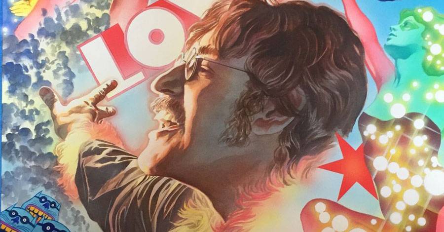
The four Beatles images are really packed with Easter eggs and references, which is something I've noticed about your work going back to "Kingdom Come." Is there anything specific Beatles fans should keep an eye out for?
A lot of it's the oddity of what I would select, because I'm sure for some people that vaguely know the movie, or saw it once and don't remember, [would ask], "Why is there Frankenstein's monster in the John Lennon piece?" I always remembered how striking -- and slightly horrifying -- it was to a six-year-old child. Like, "Wait a minute, the Frankenstein monster drinks down a vial of something bubbling and then he dramatically transforms, Ã la Captain Marvel, into John Lennon?" Of course I wanted to acknowledge that heavily in his piece -- and that became a cornerstone. Before I picked any of the other images to add in, I absolutely wanted to get something like that in there.
I wrote text pieces that are with the prints that explain what each inspiration is, where it comes from and what it's pertaining to, from the film and from those songs. Like of all the images that appear in the animated version of "Eleanor Rigby," the guy wearing the motorcycle helmet with a single tear coming down out of his eye, and he's got this utterly bizarre decal of a tiger with a skull inside of its mouth and a star over its head and wings -- that, I gotta get that into the art. There's something so utterly surreal about those elements.
For me, it was important for each of the four prints to have all four Beatles in each piece. It does focus on the solo contributions of that given Beatle in each portrait, but it's also meant to show the four guys from another sequence in the film. I thought it was particularly poignant between the Ringo portrait and the Paul portrait, that one shows them as supposedly old, as they were pictured in "When I'm 64," as a result of leading into the same song they're shown as extremely young. Doing the paintings of their portraits based on real photographs of the men, not as they appeared in the movie drawn as children, but as how they appeared in real life and putting all four of them together -- well that's obviously something that never happened. They didn't know each other back then, but to me there's something beautiful to that.
Of course, all four men didn't live into this fantastical old age where they'd have long white beards, but I also wanted to treat that as an element of makeup. To me, these four portraits are an illumination of a film that could have been made instead of an animation version, if they had, Ã la "Mary Poppins," acted in front of green screen where they were interacting with some animation elements and other live actors who were wearing costumes. So they're walking around sets that might be half cardboard, half real, but when they're actually portraying their older selves, they're actually wearing wigs. I wanted it to be really clear when you look at the faces that they're young faces. In particular, if you look at the portrait of George, he was shown almost as if he was losing his hair, and I show clearly that there's a bald cap separation on his forehead for wearing the makeup. I really overthink this stuff, is what I'm saying.
With so much thought put into each piece, how did you go about planning them? Did you have to rewatch "Yellow Submarine" on repeat, or was a lot of this already in your head from having been such a big fan already?

Oh, both. I've owned the film for twenty-something years, and I've watched it as much as I've watched any other film in my life. It only gets more surreal the more you watch it. I wanted to pick up on things that are graphic images, of which there are so many that I'm not doing in these, that are powerful and interesting and cool.
One thing I couldn't justify to myself to stick in here, because it would have been a licensing issue, is that, at a point in the movie where Ringo is taking the character of Captain Fred along to gather the rest of the Beatles in this bizarre mansion, they walk past this room of other statues, or motionless figures, of different heroes. You have three of the King Features properties all standing together: Flash Gordon, the Phantom and Mandrake the Magician. It's bizarre that you have these superhero archetypes in this little sequence.
You do come from a superhero background, so what was it like illustrating the Beatles -- who are also massive icons in their own right? Did your approach differ?
It is very much the same. The only thing that comes to mind is a cosmetic quality of how you would have somebody posing to reflect their character. You're only going to go so far with the figure positioning and physical expressions with real people. If you take note of the poses they're in in the four portraits, each one of them is spun very much from the cartoon in terms of where I took my inspiration. There are moments in the story where Paul was pointing to the side as he was starting to sing the "Sgt. Pepper" theme. Of course, he was wearing a whole different costume in that moment, but he sorta jabs forward with this baton that he's been twirling in his hand, and there's something to that thrust that I wanted to capture, so that's why his arm is kind of pointed to the side in the portrait I did.
John is seeming to reach out back behind him with his right hand, and he's singing directly in profile to the side. The reason for that is, when John starts to sing, particularly "Lucy in the Sky with Diamonds," he does this sort of turning motion, with his head tilted back, and that struck me as a visual thing. Instead of him just facing us, there's an energy that he's mid-song, belting out something at that point. Whereas, say, George is depicted when I first saw him in the cartoon as he pulls up in Ringo's car and he turns his head to the side, leaning over to look at the other guys giving them somewhat of a -- well, he always seemed to be scowling in the cartoon. And Ringo was giving the peace sign looking out the porthole window from the submarine, I think at their other selves passing by in the sea of time. There's a moment that exactly captures.
All four things are reflecting that energy, but in the pieces I've done with real life people, you're not going to have them adopt a figure pose like a superhero, sorta chest thrust outward, arms in fists. You'll have some restraint. Because my style with superheroes is to try to pull them into something that feels natural, like a person would actually strike that pose, I'm already there, between the real and the not-so-real, the fanciful.
You're also still very much in the superhero game; you provide covers for "Amazing Spider-Man" and "All-New, All-Different Avengers" for Marvel every month, among other titles. Do you find that the regular work allows you to experiment more?

Oh, absolutely, of course. Especially when you're doing the same subject again and again, you try to push yourself on something or another. A lot of times, when the content of what's described for you to try and picture is so specific, you may not come up with the best way to apply an experiment in each case. You just gotta get across what the content demands. If it's this character fighting another character, that's the thing that needs to be pictured. But you'll always have that thought in the back of your head, "Is there one thing you can do lighting-wise, color-wise that is a little bit different from what you've previously tried?" If I have any reference in front of me, like I'm looking at any other artist's work whose got some different things that I admire that I'd like to try, if I can apply those lessons or try to match something they did a certain way, I'll do it. I'll try and imitate any of my particular heroes or peers.
RELATED: Alex Ross' "Amazing Spider-Man" #5 Cover Originally Featured a Peter Capaldi Cameo
What do you look at now, in order to keep yourself on top of your game and with the times?
Well, I don't know that I am modern or with the times, but... [Laughs]
As I do covers that regularly feature slightly updated versions of classic heroes, there's that part of me that, like, "Boy, I'm still waiting for that shot to get a chance to do a classic version that I grew up with reading and loving." Those opportunities consistently happen, so I don't have a right to really be too bent out of shape that I'm doing something more updated or modernized, because occasionally when I'm drawing -- what's this character I just did for "Spider-Man"? Was it the Living Brain? It's a [Steve] Ditko character from the first year of "[Amazing] Spider-Man" that I'm drawing, this giant, green machine character that looks like he was created in 1963, and there's no alteration -- it's exactly what Ditko did. How can I make much of a fuss? I get those opportunities to live in the past, which is a big part of what drives enthusiasm for superheroes, is nostalgia, what you connected to from lifelong patronage to this.
I regularly read comics, and I follow a lot more than I would have thought of my contemporaries. Wherever I can look at the works of regular graphic artists, whether it's somebody like my peers Adam Hughes or Daniel Acuña or any of the contemporary painters, I'm always looking at their work to see, "Geez, that's so much better than anything I've tried to do. Now I feel terrible. Well, try and work with that and do something that's similar or see if you can translate that into your own style." Always try and meet the challenges put before you.
You've also been involved with "Astro City" since its debut over twenty years ago.
We're actually coming up on -- we'll be numbering one of the issues, I think, #100, because it will have hit one hundred total comics of it, coming soon. Yeah, I did two "Astro City" covers this month, one for a hardcover collection and one for the regular issue. One of those involved brand-new character designs, so it's always challenging and has the same level of invention to it.
When you started working with Kurt Busiek on "Astro City," did you imagine you'd be doing it for decades?
[Laughs] I may not have thought that, but there is an appeal that I never would have dismissed from that proposal. When you look back and you can say, "Wow, we've been doing this a long time," it does make you think, "Well, keep it together. Keep it on, because you're lucky to be able to say you have something like that in your life that's been a long-term successful relationship." You want to keep that strong. Maybe we'll hit a spectacular finish at some point where we just decide this is a great note to go out on, but it's a great thing that it's been mainly the three of us: Brent [Anderson], myself and Kurt. We've had this collaboration for so long that has been very well regarded. And boy, having some things that haven't been well regarded? It's nice to have one thing that you can always say, "Well, most people like this!" [Laughs]

I think it's also safe to say that pretty much everyone regards "Kingdom Come" very well, and it's also celebrating its 20-year anniversary. Is there anything big coming up with "Kingdom Come" for the anniversary?
Well, the biggest thing is that I haven't seen Mark Waid in probably over a decade or so, and we're going to do a signing out here [on May 21]. It's a store called AW YEAH Comics, owned by Art Baltazar. That's in Skokie, Illinois and they had just asked me if I'd mind joining Mark with the event. I thought, "Yeah, why not? That sounds like an interesting idea." We're gonna team-up here for at least one day -- and that's a nice way, I think, to celebrate the whole thing. I'm not anxious to see ["Kingdom Come"] handled by anybody else's hands, if that's something that anybody is tinkering with. Anyway, the less said about that the better. It's kinda like saying "Beetlejuice" three times and then suddenly you brought it to life.
For San Diego this year, anybody that's going to be there, please come over and take a look at our new booth setup. It's going to be a whole different kind of thing as far as the way the artwork is displayed for people to come and look at it. It'll be a two-tiered booth and larger space, and we should be having some interesting stuff that we're selling there, unlike anything we've done before. We're trying to keep expanding our footprint. And I will be having more gallery shows in the future. We're traveling to different museums, so there will be more information forthcoming on those things when they are confirmed.
Alex Ross' "Yellow Submarine" art will be unveiled at the Beatles Shop at the Mirage Hotel in Las Vegas on April 30.