Superhero movies have come a long way from the days when the only way to sell the X-Men was to slap them into black leather bodysuits. Nowadays it seems any of the wildest costume creations from your favorite comics can be brought to beautiful life on the big screen. Of course, any movie of the scale of these superhero blockbusters is going to go through a lot of costume design concepts. Many of these end up being rejected. A lot have good reason for rejection. Some of these rejected designs, however, happen to be superior to the ones that end up making it to theaters. Sometimes the differences are absurdly dramatic.
Thanks to art books, "making of" documentaries and the internet, fans of superhero movies have more resources than ever to examine the process of making these movies. This list compiles 15 of the best pieces of superhero movie concept art with a focus on costuming and character design. These are costumes you'll wish the studios went ahead and chose over the ones they ultimately went with. This doesn't mean the final costumes were bad (though some certainly are). It just means there was a missed opportunity. When possible, this list does try to make sense of the reasons why these spectacular superhero and villain costume designs ultimately got scrapped. Due to production shifts or practical limitations, it might not have been reasonable or even possible for some of these designs to get used. Still, that doesn't mean we don't wish they could have been!
15 JUGGERNAUT - DEADPOOL 2

Juggernaut's design in David Leitch's final version of Deadpool 2 was certainly a massive improvement over whatever Brett Ratner was thinking with the character in X-Men: The Last Stand. That said, it could have been even better. Just look at what Alexander Lozano was designing for original director Tim Miller.
This concept art of Juggernaut has similar proportions to the final version, but a notably different costume. Not dressed in a prison uniform like in the movie, his costume's color scheme is closer to the comics. His clothes and helmet are more worn and beaten, and he's also armed with metal gauntlets.
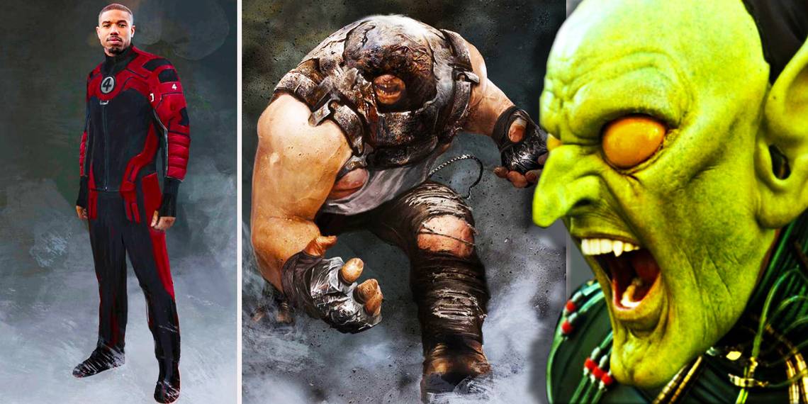
14 THE FANTASTIC FOUR - DEADPOOL 2

What to do with the Fantastic Four? The answer to this question has elluded FOX for the longest time. One potential answer which was shortly scrapped: put them in Deadpool 2. Alexander Lozano's concept designs for Tim Miller's version of the sequel featured new, more classically-styled costumes for the cast of Josh Trank's 2015 Fantastic Four feature.
Perhaps the bomb stink from that disaster was just so toxic it was decided not even Deadpool could save that cast, or maybe putting generally family-friendly characters in a hard R movie was frowned upon. Regardless of how these cameos would have turned out, however, odds are good they'd be the Four's best on-screen appearance (not that that's saying much).
13 SUPERMAN - SUPERMAN LIVES

Fans have long pointed and laughed at those dorky-looking photos of Nicholas Cage testing out an unfinished version of the costume for the canceled film Superman Lives. Looking at all the concept art for the project, however, and you might just come away with the impression we missed out on something great.
At the very least, we missed out on something visually spectacular. Superman was going to cycle through different costumes over the course of the film. This design by Sylvain Despretz was for his "black suit." Somehow it's still more vibrant and colorful than the costume from Man of Steel.
12 ROBIN - BATMAN FOREVER

Believe it or not, Batman Forever almost wasn't the garish camp-fest it ended up becoming! Remember, Tim Burton was still on board as a producer, and Joel Schumacher was torn between wanting to handle darker ideas while also going in a studio-mandated lighter direction, homaging the campy '60s series and selling more Happy Meals than the nightmarish Batman Returns did.
Here's a design for Robin by Carlos Huante that would be right at home in one of the Burton Batman movies, a strong recreation of the classic comic look. Of course, this was nothing like the plastic molded final design by Miles Teves, infamous for putting nipples onto the costume.
11 NOVA CORPS - GUARDIANS OF THE GALAXY

Guardians of the Galaxy succeeded with a relatively loose attitude towards comics faithfulness compared to the rest of the MCU. Many of the changes were welcome and just made the world and characters even more fun than their comic counterparts. One thing which definitely wasn't improved, however, was the uniform for the Nova Corps.
The costumes were fine, but they were relatively stiff and colorless compared to the iconic comics uniform, especially lacking as far as the helmets go. It's understandable why they went in the direction, given the Corps are presented as stiffs compared to the outlaw Guardians, but still, the classic look was missed. Anthony Francisco's concept art presents a more impressive and comics-accurate idea for the uniform.
10 GUARDIANS OF THE GALAXY 2 - MANTIS

Mantis' design for Guardians of the Galaxy 2 was a challenge to figure out. The character was wildly different from her comic counterpart, and her green skin from the comics was scrapped probably because they already had a green Guardian with Gamora. Trying to find the perfect balance between insectoid alien features and human attractiveness was the goal for designing her.
Ultimately the final movie design is great, and this is one case where the difference in quality between the concept vs. the final product isn't that great. This Andy Park design, however, is worth highlighting as an example of a design that still manages to be attractive while being even more alien than the final.
9 ODIN - THOR

In 2011, before Disney and Marvel could sell audiences on practically anything, Thor was Marvel Studios' riskiest project thus far. Thor wasn't as popular a character as the Hulk, and the operatic high fantasy tone was far removed from the more down to earth contemporary science fiction of the Iron Man films. While the first Thor film was "out there" in comparison to its peers, it couldn't afford to go too out there.
Benton Jew's more extravagant "Kirby-esque" designs for Odin's costuming were probably too out there. The final costume for Odin was more restrained and less fun. Ultimately, when the Thor series did decide to go full-on "Kirby-esque" in Ragnarok, it became far more popular than it had ever been before.
8 ENCHANTRESS - SUICIDE SQUAD

Suicide Squad's costume work is all over the map. Some of the costumes are celebrated, others derided by fans, and the general aesthetic proved divisive. Enchantress' outfit is one of the weaker costumes of the bunch, and it's all the more disappointing compared to how beautiful some of the concept art was.
These costume designs by Christian Lorenz Scheurer are extremely dense visually, likely to require a ton of CGI to pull off in motion. Given that complexity, it's understandable why a simpler costume was chosen. Still, even if this could have gone wrong in motion, in still concept art it's amazing.
7 SWAMP THING - JUSTICE LEAGUE DARK

Justice League Dark is one of those DC film projects which seems like it will never happen. So many talented directors from Guillermo Del Toro to Doug Liman have been attached to the project only to leave it. One of the directors previously attached, Joseph Kahn, went ahead and shared some concept art two years after his departure.
All of the concept designs look amazing, but Swamp Thing is the stand-out of this crowd. This version of Justice League Dark got far enough in development they were even doing animation tests! With modern effects technology, this would certainly have been a better Swamp Thing than the old Wes Craven film's version.
6 GOGO TOMAGO - BIG HERO 6

Big Hero 6 is based on a Marvel comic, but Disney's adaptation is so loose, it's essentially an original story. As such, the characters were basically remade from the ground up, and as with most animated movies, there's a wealth of concept art experimentation with their designs.
At one point, the plot of the movie involved roving gangs of baseball-playing ninjas. It would seem that the team was going to dress up in ninja outfits to fight these baseball ninjas. Shiyoon Kim posted a bunch of rejected designs for ninja outfits; this Gogo Tomago drawing is one of many stand-outs.
5 GREEN GOBLIN - SPIDER-MAN

Unlike most of the other designs on this list, this one actually made it beyond the page into physical construction and testing. This attempt to bring the Green Goblin to life through a hybrid of prosthetics and animatronics was both stunning and absolutely heart-stopping.
Perhaps it was just too scary, or maybe just too complicated an effect to keep up for the length of a feature film. Still, the blocky "Power Rangers"-esque mask used for the final product is one of the more criticized aspects of the original Spider-Man film, and this test has left fans wondering what could have been.
4 APOCALYPSE - X-MEN: APOCALYPSE

The line between what's scary and what's just silly in character design can be a fine one. The final design of X-Men: Apocalypse's titular villain, unfortunately, is generally agreed to have fallen firmly on the silly side of things. What a waste of Oscar Isaac under all that ridiculous make-up!
This alternate take on how to make Apocalypse work in live action, illustrated by Jerard S. Marantz, is closer to the scary the filmmakers wanted than the silly they got. The distinguishing features from the comic are there, but both the make-up and the armor appear less overdone, and that makes it them the more menacing and less laughable.
3 COSMIC FORM - DOCTOR STRANGE

Doctor Strange is perhaps the MCU film most reliant on its stunning special effects. Even so, the imaginations of the movie's concept artists exceed what even the greatest effects team could pull off within the necessary time and budget. Sacrifices must naturally be made, but it's still mildly disappointing Ryan Lang's astral form concepts had to be among the sacrifices.
Stephen Strange's Astral Form in the movies is a pretty standard ghost effect, just himself but made see-through. In Lang's concept art, however, the Astral Form takes on a more striking dimension, composed of more ethereal lines of moving light. This would have been a neat addition to the movie.
2 STEPPENWOLF - JUSTICE LEAGUE

This concept art for Steppenwolf, the villain of Justice League, isn't perfect. It's a bit too busy, a bit to Transformers-ish with all the random protruding bits of metal. Still, Jerard S. Marantz' design makes an impression, which is more than can be said for the final design used for the movie.
It also makes a lot more sense for a CG villain. The final design looks like a guy wearing a costume, and given how shoddy the CG was, there was really no reason for it to be a CG character rather than physical costume and make-up work. This design would at least be something you could only do with CG.
1 POISON IVY - BATMAN AND ROBIN

Batman and Robin was a mess both on screen and behind the scenes. The different departments weren't even communicating with each other, leaving the concept artists with no idea of what costume designs were actually in the works. As such, the concept team had to pretty much create their own costume designs knowing they wouldn't be used in the movie at all.
Tim Burgard decided to draw Poison Ivy with a design closer to the comics than the final product. In an interview with the blog Filmsketchr, he said his version "was better than the film version in my opinion." Many would be inclined to agree with his assessment.