Aside from pouch-wearing, “grim n’ gritty” antiheroes who often replaced their classic, seemingly lame counterparts after a death or injury, comics in the ‘90s were known for one thing: gimmick covers. From foil-embossed to die-cut to polybagged with an obligatory trading card, ‘90s comic covers tried every conceivable way to catch the eye and empty the wallet.
Although a bulk of these covers turned out to be quite the eyesore, some were truly stunning, capturing creativity that tied in well to the character or storyline. Here are the 5 Worst Gimmick Comic Covers of the '90s (& 5 Best).
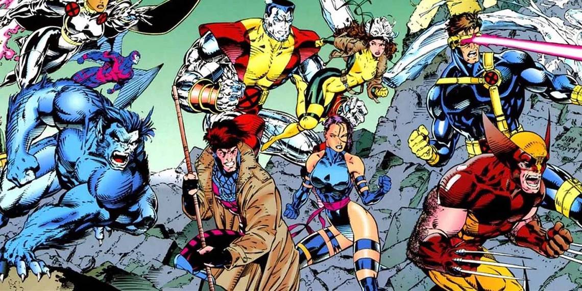
10 WORST: The X-Cutioner’s Song

The X-Cutioner’s Song was a highly anticipated X-title crossover that promised to reveal the origins of the ‘90s poster-boy, Cable. Instead, readers got a highly convoluted and ultimately unsatisfying yarn that didn’t deliver what it promised, as Cable’s origin was left unsubstantiated.
Adding to the hype was the fact that each issue in the 12-part saga came polybagged with a trading card of one of the characters featured in the story. The non-descript bagging aside, the cards would have been more desirable had Marvel not released Stryfe’s Strike File, a one-shot reprinted much of the material on the cards.
9 BEST: Wolverine #50

The best gimmick covers are the ones that effectively tie into the character’s look or power set. This was the case with Wolverine #50, which sported a cover made to look like a military dossier, but with three large claw marks raking across it, revealing photos of Logan’s past on the inside.
A supremely cool visual, the cover tied in well with the story, as the issue dealt with Wolverine’s search for the truth about his past. With appearances by the X-Men and the Weapon X scientist responsible for giving Wolverine his adamantium skeleton, the issue was entertaining from cover to cover!
8 WORST: Robin III: Cry of the Huntress

Tim Drake's Robin was highly popular in the '90s, probably due to fans embracing him as a suitable partner for Batman, and a costume redesign that made him less of a flamboyant moving target and more of a sleek and stealthy ninja. Several solo miniseries paved the way for his own ongoing title shortly after Knightfall, but it's his third miniseries, Cry of the Huntress, that set the bar low for gimmick covers. Involving a story that aimed to re-establish the Huntress for a post-Crisis world, the 6-issue miniseries came polybagged with moving covers that always seemed to get stuck on tight backing, and was less than visible due to the somewhat opaque plastic screens. All in all, Robin 3: Cry of the Huntress just left fans crying.
7 BEST: Batman #500

Batman’s 500th issue needed a proper celebration, seeing as how it was both a milestone issue and the final chapter of the Knightfall saga. Bruce Wayne already having been broken by Bane, the issue concludes the story arc by having Jean-Paul Valley defeat Bane and replace Bruce Wayne as Batman.
To highlight the changing of the guard, the cover came die-cut and foil-embossed. When someone opened the Bruce Wayne/classic costume side, the Jean-Paul Valley side was right underneath, decked out in Tony Stark’s hand-me-downs. Thematically fitting as well as aesthetically pleasing, this issue was one of the better gimmick covers of the ‘90s.
6 WORST: X-Men and Spider-Man 30th Anniversary Issues

To celebrate the 30th anniversary of both the X-Men and Spider-Man, Marvel released an issue of every title in each line with a hologram of Spidey or an X-Man on the cover. Unfortunately, the holograms just didn’t look right unless held at a very specific angle under particular lighting, and the X-Men holograms didn’t really blend in with the rest of the cover. Meanwhile, behind the covers of all the issues were lukewarm stories. Save for some shock-value elements in the X-Men’ Fatal Attractions storyline, the saving grace was Spectacular Spider-Man #189, featuring an emotionally charged battle between Spidey and Harry Osborn’s Green Goblin.
5 BEST: Ghost Rider #15

Ghost Rider experienced a huge surge in popularity during the ‘90s, owing in part to both the sensibilities of the time and the stunning visuals of the character provided by Mark Texiera in the monthly title. In fact, Ghost Rider was so popular that aside from the obligatory guest shot in other titles, Marvel attempted to launch its own line of supernatural-themed horror comics called Midnight Sons, starring characters like Morbius, Blade, and Doctor Strange.
Ghost Rider #15 captured this horror theme perfectly with its glow-in-the-dark cover, highlighting the character’s trademark ethereal and intimidating aura in one outstanding image.
4 WORST: Amazing Spider-Man #400

The '90s were a cruel mistress for Spider-Man, as it brought about the dreaded Clone Saga that Spider-fans still have nightmares about. Released smack-dab in the middle of that saga was Amazing Spider-man #400, where writers and editors decided to compound one bad idea with another by killing off Aunt May. To mark the occasion, Marvel released a die-cut embossed version of the issue which was supposed to look like a tombstone but instead looked like... a big fluffy cotton ball? To say the details of the cover were somewhat indiscernible would be an understatement, and left many fans wondering who okayed the print run without checking the prototype.
3 BEST: Superman #75

The issue that set collectors and speculators mouths to drool, Superman #75 was the gimmick cover of the '90s. A black bag emblazoned with a bloody "S" that symbolized the death of the Man of Steel, Superman #75 came with a poster, trading card, newspaper article obituary, black mourning band, stickers... and oh yeah, the comic book! Although the story itself lacked depth, it was action-packed and provided Superman with the epic sendoff he deserved.
Moreover, the issue will always be a reminder not just of a generation's comic-book memories, but a time when comic books themselves (and not their film adaptions) caught the public eye.
2 WORST: Adventures of Superman #500

There is such a thing as going to the well one too many times, and DC did it Adventures of Superman #500. The first issue printed since Superman's death months earlier, DC decided to offer a special white polybagged edition with a healthy S shield emblazoned on it to indicate the character's return. This was clearly an effort to mimic the huge success of the 'black-and-bloody' Death of Superman issue, but instead of a grab-bag filled with goodies, buyers were treated to... a translucent cover of Jonathan Kent's forearm stretching out to reach his son's? Touching, but disappointing, to say the least!
1 BEST: Silver Surfer #50

One of the first ‘enhanced’ covers to come out in the ‘90s was the Silver Surfer #50, a milestone issue that saw the titular character confront Thanos on the eve his greatest triumph. A foil-embossed Norrin Radd, hurtling towards the reader while Thanos looks on, is a striking visual image and is one of the rare instances in which an enhancement makes perfect sense, as the Surfer is, well... silver. Adding to the uniqueness of the issue was its frank treatment of the Surfer’s past, as well as its being a direct lead into The Infinity Gauntlet.