Another comics colorist is on the docket today! Can he sing with all the voices of the mountain? I don't know, but he can paint with all the colors of the wind. And then some. (Listen with your archive, you will understand.)
8/24/07
236. Dave Stewart

I don't know what I was thinking with the Pocahontas quotage in the header either, but no matter. Dave Stewart is my other favorite current comics colorist. I've encountered him a lot-- probably because he seems to work on some of the best books being published. I'm going to hit the highlights as best I can.
What I like about Dave Stewart is that his work looks a little old-fashioned-- everything comes across as the most beautiful Sunday comics page you've ever seen. He also throws in other neat touches, however; I love how he incorporates certain effects into the art, especially in some backgrounds when it looks like the color has been dabbed onto the page with a sponge.
Stewart tailors his colors to the artists he works with. Take, for instance, his work with Cliff Chiang on the overlooked Beware the Creeper mini from a few years ago. The colors are full and rich but not overly rendered or muddled, totally melded with the smooth, fluid art. There's also his work on the underrated Arcudi-penned Doom Patrol run, where he worked mostly with Tan Eng Huat, though you can see his vibrant, Silver-Age-invoking colors with a guest artist in the latter image here:


(Creeper-- words by Jason Hall, art by Cliff Chiang, letters by John Workman; Doom Patrol-- words by John Arcudi, art by the late, great Seth Fisher, letters by the bodacious Bob Lappan.)
Dave's also worked with Darwyn Cooke, most notably on the New Frontier series. It's a period piece, so Stewart provides that hint by subduing the colors here ever so slightly. It provides a nice, old-timey feel without standing out too much. It also helps that Cooke's cartooning is beautiful.


Dave Stewart's paired with Darwyn Cooke again on the currently-running Spirit series. As usual, my scans can't do the colors justice, but check out the pic at the top of the post, and the one following here. It ranges from brilliantly vibrant to darker and moodier when necessary, but it gives the whole project a refreshingly animated feel. His angular separations are quite interesting, too.

He's also using different effects to correspond with the art. The third issue takes place mostly in flashback, so to differentiate it from the present-day scenes, Cooke loosens up his linework, and Stewart changes coloring tactics. There's cool geometric highlights, the colors sometimes go outside the lines... The visuals are stunning. The scans really don't show how cool it is. Pick up the book and experience it for yourself!


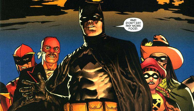
Look at the recent couple issues of Batman, with art by the fantastic J.H. Williams and colors by none other than Dave Stewart. He's gone all out with his work in this comic. As Williams is drawing each of the principal characters in a different style, Stewart is coloring them each in a different style. Take the following images:


The Knight and the Squire are fleshed out and colored like Ed McGuinness characters; the Chaykin-lookin' dude is colored like a Chaykin drawing; the more old-fashioned guys have simpler, flatter colors; Batman is most wonderfully rendered of all, looking like he just stepped out of a painting. The coloring takes the art's baton and runs with it, producing a fully-realized effect. Great work.
Dave Stewart has deservingly won a couple Eisners, and I expect to see him win a few more. He's always using the tools he has in different ways with different artists to provide fresh looks at the comics page. I love his stuff. You can see more of his work in books like BPRD, the upcoming Umbrella Academy, and on the art on that Heroes show, where Tim Sale draws and Dave Stewart colors.