DC Comics has one of the largest and longest staple of superheroes ever. Some of DC’s most famous heroes, Wonder Woman, Batman and Superman, have been around for almost a century and have ascended to the level of pop culture icons that everyone knows by name. All this even though their heroes haven’t changed too much in function -- Batman still lost his parents, Superman comes from a destroyed planet to be Earth’s hero, etc. While all of this stays the same, it’s in how they look that superheroes really go through any real changes. In the past decade especially, DC Comics has gone in overdrive in redesigning their heroes and their entire history. Between the tail end of pre-Flashpoint era, the New 52, DC You and DC Rebirth, the DC Universe has been through a lot of cosmetic changes since 2008.
For the most part, DC Comics costume changes have been fine or have last a small enough time to not even be noticeable. Yet, on occasion, the changes that DC has made to the looks of their classic heroes have been too ridiculous to not call out. This a collection of the worst of the worst when it comes to DC Comics’ wardrobe. This isn't a judgment of the stories that these costumes appear in, at all. Some great comic plots have had some truly hideous costumes. However, this is just about the fashion as we explore all of the real fashion don'ts of the DC Universe from the past decade.
20 HARLEY QUINN

When Harley Quinn first appeared in Batman: The Animated Series, it was by fully embracing the harlequin part of her persona. Harley wore a one-piece, red and black jester outfit and that same costume continued into the comics when Harley made her debut on the page.
However, by 2011 and the New 52, DC felt that Harley needed a newer and much less practical outfit. The jester ensemble evidently didn’t show enough skin, so Harley was made to wear a corset that barely fit, had two-tone hair and have her bottom covered by the slightest suggestion of shorts. The whole outfit is ridiculous and embraces Harley as a goddess to an insane and almost insulting degree.
19 STARFIRE

Harley Quinn’s New 52 design looks like a nun’s habit though when compared to what DC did to Starfire. Princess Koriand'r has always been one of DC’s more skimpy characters but it’s always been within reason and within her character. Starfire, due to her alien nature, is much more open about her body than the average human.
In the New 52 DC went too far. Starfire was no longer a fun free spirit but just an airhead. Starfire’s New 52 costume can only be called an outfit in the most technical sense. It covers up the parts of Starfire’s anatomy just enough to get published. For obvious reasons, we won't even show what it was here.
18 SUPERGIRL

Now though we move away from the ridiculous skimpy costume changes to the ones that are just plain ugly or for, whatever reason, make no sense. Supergirl’s own New 52 costume manages to exist in both camps.
From the waist up, Supergirl’s new 52 outfit is fine. It’s looks alien but that’s the intention. Below the waist though is where things get crazy. Supergirl isn’t wearing the usual superhero briefs at all. However, it’s her boots that are particularly confusing. They’re knee high boots but the knee has been cut out of them for unfathomable reasons. There’s nothing practical or even appealing about exposed kneecaps.
17 NIGHTWING

There’s nothing too aesthetically unappealing about the changes that DC made to Nightwing in the New 52. In all honestly the costume isn’t too different from Dick Grayson’s most famous Nightwing outfit. There’s just one key difference though and it’s a major one. Nightwing, for several reasons, should be blue, but the New 52 made him red.
Nightwing is meant to be about Dick Grayson breaking away from the Robin mantle and forging his own path. Yet if Nightwing takes the main color of Robin, red, and makes that the secondary color of his outfit, he’s not really forging his own identity. Furthermore, putting a bright red symbol of your chest isn’t the smartest move for a hero who wants to slink in the shadows.
16 RED ROBIN

This one might be down to personal preference because there’s nothing too confusing or even wrong about Red Robin’s redesign for the New 52. It is a little strange that in the initial canon of the New 52, Tim Drake was never Robin. He jumped immediately to Red Robin -- but that’s not the costume’s fault.
The problem with the Red Robin look is that shares very little with any other member of the Bat Family, especially with his giant wings. Although the giant mechanical red wings are reminiscent of another hero... Marvel’s Falcon. The look makes Tim Drake look more like Sam Wilson’s protégé than Bruce Wayne’s.
15 SUPERBOY

In DC Comics line-wide reboot, the New 52, a lot of things changed with Superboy, Kon-El. Superboy was still a clone, manufactured by a mysterious organization. However, he wasn’t a clone of Lex Luthor and Clark Kent but the clone of a possible future son of Clark and Lois Lane, Jon Lane Kent. Maybe that futuristic origin compelled DC to give Superboy a TRON-esque jumpsuit but who really knows the truth.
The only thing that is for certain is Superboy’s New 52 duds were pretty darn ugly and suspiciously glowly. Superboy’s previous costume, a black T-shirt, wasn’t amazing but at least it wasn’t so distracting.
14 THE FLASH

The CW series The Flash hit the ground running and captured the hearts of a lot of fans. Naturally the comics wanted to capitalize on that success. When DC ended the New 52 branding and moved onto DC You, The Flash got a costume change and while it was inspired by the TV show, it was strangely awful.
The comics took way too many elements from the show, even telling virtually the same plot as the first season but in a much more stilted fashion. This aping of the comics included the costume which looked like an even uglier version of Barry’s first Flash outfit. The outfit made sense on a TV budget and with a very young Barry, but it didn’t work in the comics.
13 RED HOOD

For the most part, Red Hood’s redesign in the New 52 isn’t that bad. However, that’s because the New 52 didn’t change the look of the angriest former Robin all that much. Jason Todd is still wearing the same leather jacket and armored pants as he always has as the Red Hood. The difference is in the Hood itself because DC made the decision to give Jason’s helmet a face.
The intention is understandable. It gives the artist more chances to express Jason’s mood on the page. However, in practice it just looks silly. Red Hood’s helmet should, like most masked superheroes, only express emotion though eyes. Putting an emoji like face on Red Hood’s costume is antithetical to the hero’s broody mood.
12 SUPERMAN

Before DC Rebirth came along and the man of steel was just completely rebooted, Superman was kind of a mess. This isn’t just in a creative sense, either -- Superman’s life sucked. This was particularly the case when Lois Lane exposed his identity as Clark Kent.
This meant Superman had to go on the run and instead of his bright colorful outfit, he needed a more causal outfit. Clark wore a Superman T-shirt (that anyone could buy), jeans and gave himself a buzzcut -- it was all a bit much. Superman’s normal clothes design is example of farm boy Clark Kent trying to be edgy and failing miserably.
11 AQUAMAN

Throughout his long history, Aquaman has made a lot of strange fashion choices. It’s only natural when you’re one of the most underrated members of the Justice League and are crying out for the recognition you deserve.
Aquaman’s (current) status as a C-List hero is a crime but so is the outfit DC put him. During New 52, Aquaman’s ongoing series was one of the highlights. It married the campy elements of his character and look with real epic storytelling. DC You tried to take King Arthur in a gritty direction, with a new hairdo, some drab looking armor and just strange costume decisions -- Aquaman didn’t look regal or even interesting.
10 BLACK CANARY

In all honesty, Black Canary’s most iconic outfit is one of comics’ most impractical costumes. Fishnets are nearly impossible for anyone to wear without them getting ripped. It defies all common sense that Black Canary can high kick criminals in the face and still look flawless.
Yet the look is just apart of Dinah’s character at this point. So, when DC gave Black Canary a more practical outfit in the New 52, it just didn’t seem right. There are definitely worst redesigns but Canary’s New 52 outfit felt bulky and uninspired compared to what she usually wears while she's fighting crime.
9 THE JOKER

When DCEU unveiled their Joker with his grill and the word “damaged” tattooed across his forehead, fans were rightfully miffed. Jared Leto’s Joker is a huge visual departure from the typical Clown Prince of Crime and it did feel a little too “extreme.”
Yet DCEU’s Joker does have some comic precedence. All-Star Batman and Robin, introduced a very muscular and very tattooed Joker that does share a lot of visual similarities to the DCEU's Mister J. They’re both equally terrible and completely against the grain of what The Joker should represent, but the DCEU isn’t alone in making Joker look like a tattooed thug.
8 GREEN ARROW
Before DC Rebirth, Green Arrow was a very hard character for DC Comics to nail down. The comics vacillated between making Ollie act like his Arrow version and just turning him into a free-wheeling playboy with a bow and arrow. In his look though, Green Arrow was all young and cocky adventurer and it was awful.
The New 52 dramatically de-aged Oliver Queen and that translated into his superhero costume which felt more like a teenager playing dress-up than a real vigilante. Maybe it’s just the missing goatee but there’s something about the new 52 Arrow that makes him seem like a little kid.
7 JASON TODD BATMAN

One of the biggest pre-Flashpoint stories was when Bruce Wayne was assumed to be dead and the position of Batman became an open spot. While the rightful heir, Dick Grayson, eventually became Batman, there was some contention about it. Initially Jason Todd felt that he should be Batman and he even designed his very own, gun heavy, Batman suit.
The one thing that can be said in Jason’s Batman suit is that was in character, at least in character for what writer Grant Morrison envisioned as Jason. Yet even if Jason was a bit of a villain and gun-toting maniac, his Batman suit is way over-the-top. Jason’s Batman suit is like a goth kid’s dream of a hardcore Batman -- not something that should exist.
6 LOBO

Lobo is a real love-him-or-hate-him character in DC’s canon. The alien bounty hunter, is brash and in your face. However, he’s meant to be rather outlandish and maybe even a little disgusting. Lobo isn’t supposed to be what DC turned him into in the New 52, an alien looking punkish hunk.
The new(er) Lobo was made to be much sleeker and sort of suave which no one appreciated. Even more insulting it was claimed that the former Lobo, the gruff beefier one, was an imposter. The new Lobo was the true Lobo. The old Lobo had stolen his name and his look. Thankfully, this has since been reversed.
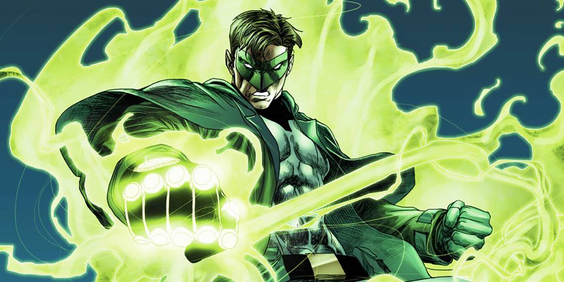
5 GREEN LANTERN

Hal Jordan has had a rough life in the Green Lantern Corps. As the first real human Lantern, everything that could go wrong in Hal’s life has gone wrong -- including him being possessed by an evil fear entity and becoming known as the villain Parallax. Of all the terrible things that happened to Hal, this outfit might be the worst.
DC imagined Hal as rogue member of the Corps. Instead of his usual GL outfit, Hal covered himself with a large (probably stinky) trench coat and some long hair, all in the name of being inconspicuous. In reality, the new Green Lantern (which was quickly done away with) just looked painfully obvious. Becoming a stereotypical hobo doesn’t make you invisible, Hal.
4 ARSENAL

To be perfectly realistic, Green Arrow’s first sidekick Roy Harper has never had the best look. For most his life, whether he’s Speedy, Red Arrow or Arsenal, Roy has had largely the same appearance. Roy’s costume is almost identical to Green Arrow, except that he wears red and sometimes a baseball cap is involved.
During the New 52, DC had a chance to take Arsenal in a different direction. However, his new design doubled down on the worst elements. Arsenal’s look as the same amateurish look of Green Arrow but, because of Roy’s new and rather inexplicably ugly serpent tattoo, it just looks that much worse. The tattoo is the defining feature between the new and old Arsenal and it's horrendous.
3 BATMAN

It’s true that when Jim Gordon became Batman he did manage to have two Batman suits, one for combat and one for stealth. Gordon’s stealthy Batman suit didn’t have a cape but otherwise it fit in nicely with the rest of Batman’s history. Gordon’s main suit, the mech, stood out in all the worst ways.
Gordon as Batman was meant to be jarring. The whole point of the arc was the police trying to make Batman their own and failing but still Gordon’s Batman looks more like a giant robot bunny than anything resembling Bruce Wayne’s designs. Just because Batman can be a mobile cop car, doesn’t mean he should.
2 WONDER WOMAN

Diana has had some truly unfortunate outfits throughout her history. Much more than Batman or Superman, DC tries to change up the look of their Amazon warrior. With this look though, it seems like DC Comic took every previous Wonder Woman costume and just threw them all onto Diana at once. Wonder Woman was less wearing a new outfit and more just wearing everything that’s ever been in her closet.
The look is definition of over-designing. If the look had to stuck to a few motifs, like just giving Diana more armor and/or pants, it would’ve fine. Apparently, no one idea was a bad one, resulting in this very busy design.
1 SUPERMAN

Empirically, there’s nothing too ugly about Superman’s New 52 redesign. It does have a very alien look which is probably appropriate as Superman is an alien, but it is still a little off-putting. The New 52 Superman crosses a line, not adding to the legacy of the Man of Steel, rather taking away one huge aspect -- there were no briefs.
Superman needs his underwear. It breaks up the color scheme of red and blue in a perfectly balanced way, gives Supes some modesty and is just as important to his overall look as the “S” on his chest. Taking the briefs away is egregious. They're back now and that’s the way things should stay.