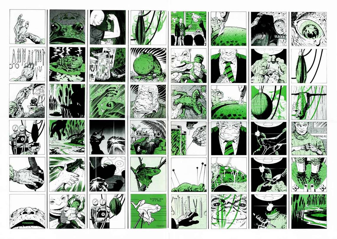
"Frogs!" in Comixscene #3 (1973). Jim Steranko.

Right down to the phrase "reading comics", there's something about the medium we get wrong all too often. Narrative storytelling is not inherent to comics. Other media -- film, music, and even to a certain extent prose -- are continuous, a single uninterrupted flow from one place to another. We assign narrative to even the most abstract works in these forms, yielding to the temptation to figure out "what they mean". Comics, on the other hand, is a medium of constant truncations, constantly cutting itself off from panel to panel, never able to establish much narrative momentum before the view into the action switches and the story rebuilds itself again. Continuity in comics is suggested by the artist at best, and even when things are presented as clearly as possible, when they exist in multiple panels it ultimately falls to the reader to put things in sequence, to make drawing after disconnected drawing line up and make sense.

Jim Steranko's career evidences more preoccupation with the discontinuous, non-narrative qualities of the comics page than most. From the beginning, Steranko intently designed pages that could be viewed as both story snippets and single-unit "posters", open for contemplation as narratives or single, timeless graphic statements. While Steranko's storytelling in the early Marvel Comics days that assured his immortality was clear enough [above], the very thought of the page-as-poster implies a willingness to treat individual panels as separate graphic elements in a unified composition. The panel's function as a narrative moment was no longer paramount once Steranko began designing for the full page; it shared importance with the non-linear functions of spotted color, or visual noise, or whatever else it could be turned into in order to create a better "full effect". And as time went on, the layouts of Steranko's pages got more and more contorted while the splash effect of the page pre-story apprehension increased in elegance and impact [below].

By the time the one-sheet story "Frogs!" was born, Steranko had been out at Marvel for near half a decade, and more or less out of comics for that same length of time. As his comics-form experimentalism reached a dizzying, occasionally unreadable climax in the late 1960s, Steranko moved into painting and illustration, hungry for the massive single compositions that the comics page simply couldn't afford him. In the world of book covers and exclusive portfolios Steranko honed his drawing skill and sense of single-image composition. In the few returns he made to comics post-1969, it's the masterful construction and style of the drawings themselves that zap the reader in the eyes, much as the op-art layouts and bizarre angles of the earlier works do. "Frogs!" is set in a straight grid, no tricks of cover-ups, just square after square of sharp, incisively composed pictures, drawn with a combination of the illustrator's eye for detail and the cartoonist's economy. As single, disconnected drawings -- the building blocks of sequence -- each image is crystalline, fully formed, a complete statement requiring nothing before or after to speak of its intention. This alone is unusual for comics, but what Steranko did with his grid is truly striking.

It's Steranko's grid where the notion of comics' discontinuity gets a real, virtuosic exercise. Rather than creating the usual perpetual-motion illusion of a "movie on paper", Steranko's silent, abstract story gives no clue to objective meaning, inviting readers to scroll their eyes down seemingly disconnected columns rather than reading across rows in the usual manner. Time is far less important here than in most comics; the flashback panels swirl among isolated bursts of moment-to-moment storytelling, and it becomes very difficult indeed to tell just when "now" is. If comics is the art of finding the picture that follows the one you've just drawn, in "Frogs!" Steranko opened his eyes (and by extension the medium's) to the idea that for every single, correct next picture, there are a million incorrect others that could also be drawn.
In its original newspaper-broadsheet incarnation, "Frogs!" yawns out at the reader and dares you to try reading it backward, forward, right to left, diagonally, in a spiral, or with no method at all. It is comics with the act of narrative left entirely to the reader, a sequence of thematically connected drawings with infinite possibilities of combination to explore. (Indeed, Steranko once proposed a webcomics version that would flash the 48 drawings at viewers one at a time in randomized combinations. Sadly, it never materialized.) What story does come through is created by the drawings more than the sequence. The sickly green hue hanging over everything, the repeated cross-shots of medical instruments and slimy, crawling things, the high-contrast blacks and whites of the drawings and the chilling blankness of the backgrounds all place the reader squarely in the realm of the horror story, and the jerky, uncertain progression of the pictures offers real potential for one of the more disturbing images to pop out unexpectedly. This is a horror story about human mutation and surgery and endless, bulging, croaking frogs -- beyond that, you're on your own.
And that's where the real terror of this peculiar little comic comes from. This is the art form in its purest, cleanest incarnation, picture after picture set in checkerboard sequence on a grid. And yet it's comics with their motivating logic missing, comics as a child without understanding might create them: constantly disrupted, switching scenes without apparent reason, openly defying storytelling sense. It's a cold, raw avant-garde approach, one that gives the reader ultimate agency in whatever twisted horror story they can pull from the page, comics with a void where the beating heart of the medium, sequence, should be. Perhaps it's best to call "Frogs!" anti-sequence, the lack of the order that allows the form to do what it does. But that isn't quite it. Steranko goes close to the bone here, but he leaves us the drawings, truncated, cut off from one another, to do what we will with. The gaps between hem may be wider than is comfortable, but they show us a truth of the medium that we often don't remember. It's us, the readers, who make these things happen, who bring them to life. All the drawings can do is point out the way.
Bulletproof thanks to Tony Robertson and John Gandour for their assistance.