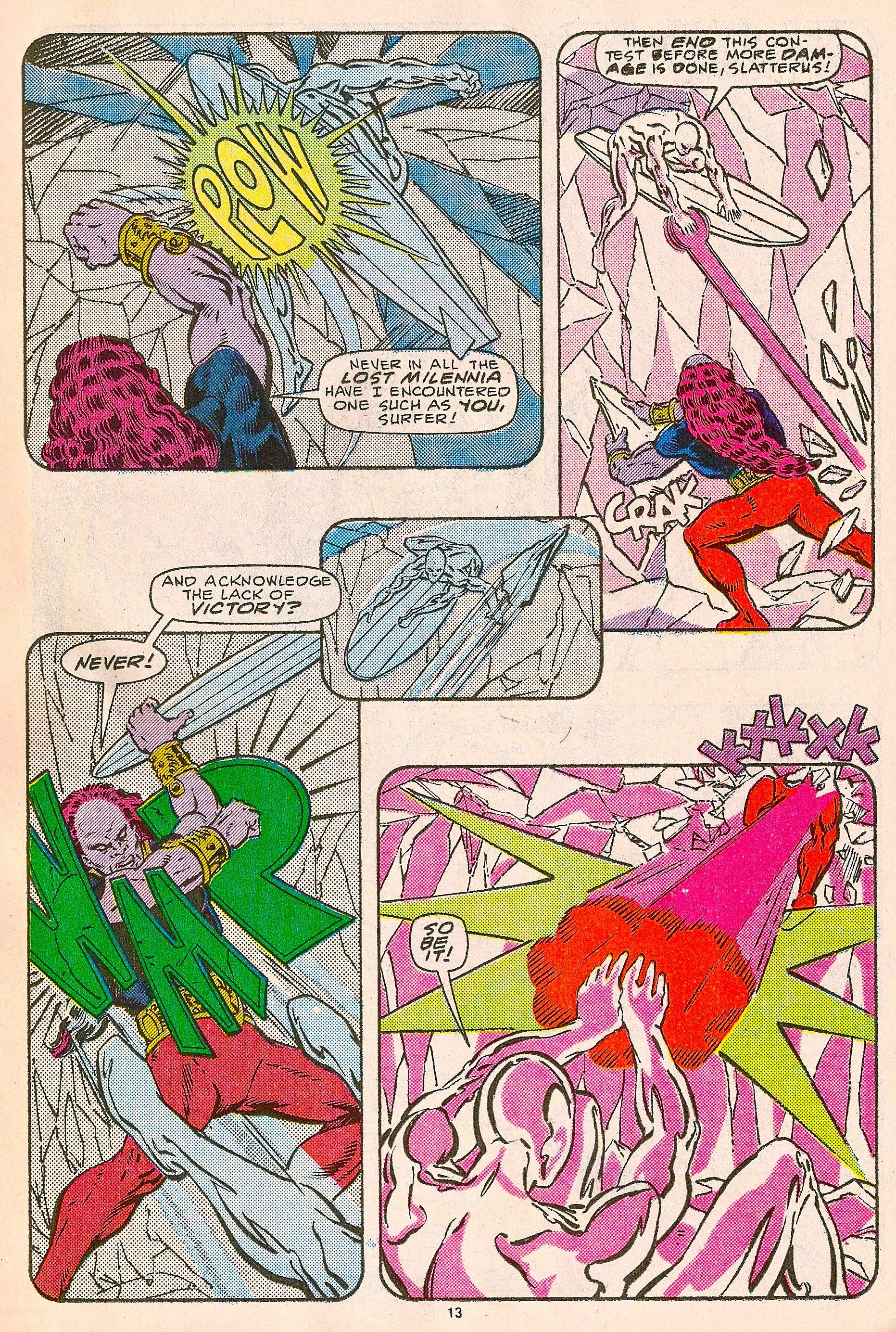
Silver Surfer (2nd series) #1 (1987), page 13. Marshall Rogers.
Space is the first practical consideration an artist needs to tackle when composing a page of comics. The size of the page itself is important, but it's been standardized at something around 6.5" by 10" (with an original size of 10" by 15") for so long that many of America's greatest cartoonists spent their entire careers composing for nothing but "comic book size". Within that dominant stricture, use of the area available becomes a pressing question. Approaches to fitting more than usual into the same amount of space as ever are many and varied, to say the least; but more often than not they involve some kind of addition, a new method for cramming a lot into a little. Meticulous detail, bigger amounts of smaller panels -- we've all seen these approaches succeed, and we've also seen what happens when there's simply more than can please the eye being put on the page.
What's fascinating about the Marshall Rogers page above is the amount of space being explored with five panels drawn in the workaday, simplified-realist Marvel Comics house style. Rogers, like Carmine Infantino before him, was a student of architecture, and brought the architect's understanding of practical construction within a limited amount of space to his every page. Panel-to-panel transitions sizzle and page turns strike notes of suspense or release under Rogers' direction -- as much because of the smooth, perfectly choreographed paths he led the eye down to them as the content of the pictures. Finally, Rogers colored his own pages, giving him a leg up on just about every other superhero artist in history as far as getting the work to do what he wanted it to.
Here Rogers discards the directional action of just about every comics page -- across one tier from left to right, then back over to begin on the left at the next one down -- in favor of something so smooth and simple that it's easy not to notice how this page reads differently than we're all used to. The unbroken S shape of this layout does everything short of laying out a welcome may for the eye: we just about melt from one panel into the next and the next after that, never breaking our contact with the page to start over on the other side. It's an approach that appeals to the visual aspect of comics while challenging the notion of audience member as "reader" by forcing us out of the instinctive action of prose reading. (Little surprise, then, that the S pattern comic has enjoyed greatest prominence on the raw edge of art-comix, most notably in Brian Chippendale's vertigo-inducing Maggots.)
The visual design Rogers creates on this page is as wonderfully designed and harmonious as any masterwork of architecture, but it has a simplicity to it more native to modern sculpture, and a poetic, rhyming quality to boot. It's a master class in kinetic layout. The first thing we see is a sound effect, colored in yellow in green to pop it out from the cool purple and blue of its surroundings. From there we follow the action of the panel up and right, from fist to chin. The triangular shapes radiating out from the impact provide a line we can follow right into the next panel, through the Silver Surfer's figure and right into the energy bolt he fires along a single trajectory.
We ricochet off the side of the page into a long diagonal line: through three panels from the page's top right to its bottom left. It's the same path our eyes travel to read a conventionally designed page of comics, but the bridging middle panel makes all the difference, allowing us to experience the story uninterrupted while providing a burst of extra diagonal energy, its lines dragging us right into the (identically colored) ones at the top right of the fourth panel. Here we're literally knocked into the last frame on the page, which reverses the action of the first while moving in the exact same direction, finishing off with a sound effect to rhyme with the one that started the process.
Now look at the directions Rogers leads the eye in, and marvel at their perfect symmetry. The diagonal lines up and right created by Rogers' compositions in the first and final panels are exactly parallel, with the middle panels creating a rigidly geometric Z shape between them. The path the eye travels across to read this page is a completely symmetrical collection of angles that bounce off the pages' edges like a pinball, each bounce highlighted by an in-story impact. It's a beautiful example of the subtle but masterful control over movement and space Rogers was capable of, highlighted by its pastel color scheme and its relative de-emphasis on the look of the individual drawings. This is comics made to move, and as if that weren't enough, move with a sublime grace.


