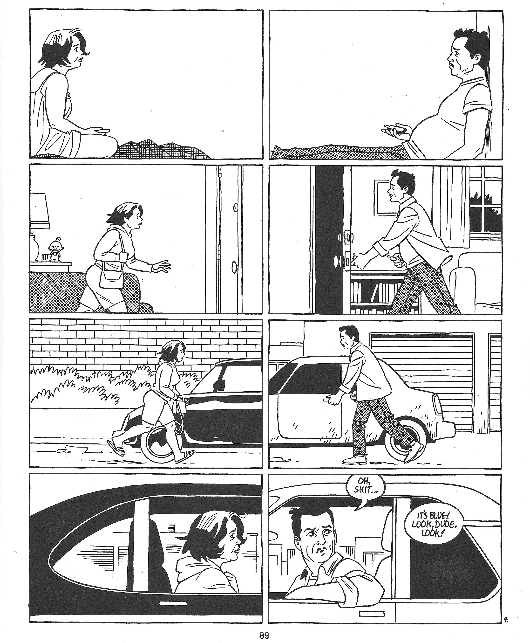
Love & Rockets: New Stories #4 (2011), page 89. Jaime Hernandez.
I don't think I'm advancing anything too controversial when I say that if there's a Platonic ideal for the comic book page, it's a piece of sequential art that works both as an assemblage of individual panels and as a single, unified artwork. This, of course, is a lot easier said than done. When gridded layouts are discarded to turn the page into a poster-style piece of op-art there's always some readability being sacrificed, and the grid is all too often a vehicle for cartoonists to work inside without paying sufficient consideration to what sum their page's parts are creating.
Jaime Hernandez squares that circle in the page above, a slice of comics that flows like fine wine from panel to panel but stands rock solid as a full-page unit. The basic conceit of the page is that it isn't unified by a dual identity as one single picture or any fancy layout tricks, but an immediate, cohesive sense of motion that every panel supports completely. It's not always beneficial for comics to be "pictures that move", but Jaime is a classicist through and through, perhaps the purest one in comics right now. Every panel here is story information above all, a drawing that communicates something of substance as clearly and crisply as possible. That's true of pretty much everything Jaime's drawn for the past two decades, but on this page the story is bracingly simple, and every panel works toward a common goal: closing the perceived space between the characters inhabiting two separate frames.
That's a lot easier said than done, considering there isn't a great deal of space on even the largest of printed comics pages . Certainly not the few miles Jaime wants his audience to feel here. And the gutters between panels are a constant on the page as well: stacked two to a tier, the placement of the individual boxes themselves doesn't do anything to bring their subjects closer together. It's the pictures that are doing all the work. Panel one gives us two figures as far away from one another as they can get within this grid, with an expanse of white negative space between them that's almost uncomfortable to dwell on too long. Most panels don't leave this much blank, and there's a real shock to seeing two that do arranged so that the vast majority of the full tier they make up contains no drawing whatsoever. The only lines bridging that area are the two verticals of the panel borders, rigid and non-negotiable. The eye sees an immense chasm between the figures, about as much space as can be had on this page. It's a long way.
The second tier begins to close the gap by moving the figures closer to one another and pulling the camera back to show the space they've moved through. The horizontal lines behind them and the pitch-perfect body language Jaime employs convey their closing of the gap; the addition of the horizontal line of the doors and door-frames still between them provides evidence of a large amount of space still to be moved through. When those doors give way to the horizontals of the cars in the third tier, so close they almost form a single vehicle, we're suddenly so much closer, though the figures have only moved a few centimeters. The final tier is a beautiful bit of multitasking, bringing the figures so close together that they're almost touching while also leading the reader's eye onto the next page by providing a clear line from the pivotal center point to the extreme right of the final panel: we, like Ray, look over to see who's talking.
It's a beautiful example of comics achieving exactly what they set out to do, without a single line or formal gesture out of place. The overall directionality of this page, like Jaime's drawings, is both complex and refreshingly simple: a classic triangular composition that discards the left-to-right motion of just about every comics page under the sun for a focus on the center, everything rushing toward the axis provided by the gutterspace splitting the middle. It's a wonderful meeting of form and content: a completely unified page on the subject of unification, a single unit made up of eight perfectly chosen, gorgeously cartooned panels, each one complete in itself as a composed single drawings. This is comics at the highest level, with nothing wasted and everything on the page done as well as it possibly could be.


