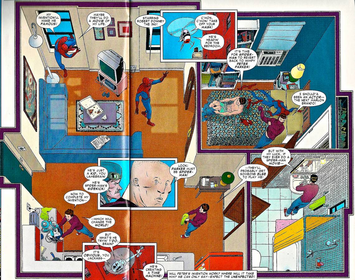
The Amazing Spider-Man Sunday Spectacular (2011), pages 5-6 panels 4-7. Marcos Martin.

The basic motivating idea behind comics art is "pictures that move." The whole point of sequence is to force readers into seeing motion between images, to position individual pictures as the captured points of larger, extended passages of movement. That said, on the printed page "pictures that move" is an obvious oxymoron. The stillness of drawn images is one of the most fundamental problems that comics have to work against, and as with other non-negotiable truths of the medium like its lack of ability to produce sound or light, pretty much every artist of note has come up with a slightly different way to overcome it.
One of the more convincing ways to imply real motion is with layout. An individual drawing can communicate a single motion wonderfully when it's done right, but beyond that it's limited, unable to do more than pin down one small section of time. When individual drawings are put together they form a string of single moments, single actions, but it's the way they're put together that determines whether or not that string reads as something continuous, unbroken. At its best, layout amplifies the motion implied by the drawings it holds, smoothing out the gaps between them and forcing the reader to stitch them together into one unified whole.
That's exactly what Marcos Martin does in the spread above, using an ingenious layout that turns a single panel into a greatly extended length of time while avoiding the hiccups in flow that the breaks and camera-angle switchups between panels always cause. Martin sets a long progression of individual drawings against a single background, emphasizing the conflict between the stillness of the setting and the movements of the character within it. It's motion as we experience it in real life: from a fixed perspective, not the editorial omniscience that passages of panel-to-panel cutting affords. Martin creates sequence within a single image to sell the motion in his pictures, leading readers through it along the exact same path his character takes.
So meticulously choreographed is the arc the figure traces across the room that there's simply no reading this as the typical "snapshot" type of comics panel. It's almost too easy for the eye to follow, a long lazy 'U' shape with an immediately obvious beginning (Spider-man costume), middle (boxer shorts), and end (normal clothing). Martin leaves as little of the space between his images as possible up to the reader's imagination, showing us the exact route to take through the panel, turning the unremarkable subject of "guy walks around his apartment" into a vehicle for strikingly innovative sequencing. The question of clarity is made largely irrelevant when we can see everything happening diagramatically, within a single fixed frame. And just in case readers might think there are seven guys milling around Peter Parker's apartment, Martin drops three inset panels to act as a kind of chorus, showing the amount of time his sequence takes up in a more familiar way.
It's precisely because of the banality of the subject that this little bit of comics works as well as it does. We've all done this kind of meandering through our living space a million times -- well, minus climbing in the window, maybe -- and Martin makes it seem fresh and new by stripping away the panel-to-panel "comics" aspect of the sequence and showing it with as much naturalism as possible. Even when the between-panel cutting brings readers into a more intimate understanding of what they're seeing play out in front of them, it also creates a subtle remove, the sense that this isn't the way you'd actually see it happen in real life. Martin's sequence, on the other hand, shows it as it goes.
More than that, though, this sequence is an excuse for its artist to indulge in a virtuosic display of figure drawing. The bird's eye view is one of the most difficult to compose a convincing human figure from, and Martin just about annihilates the challenge, cutting perfect musculature and drapery into spot-on silhouettes with a few fluid ink lines. This is the traditional way of selling motion in comics: the creation of lively, self-consistent, completely convincing forms whose graceful poses and subtle gestures seem pulled directly from life itself. Even within the most ingenious structure, it always takes capable drawings like these to communicate the message. Adding one to the other, though, makes it just about as good as it gets.