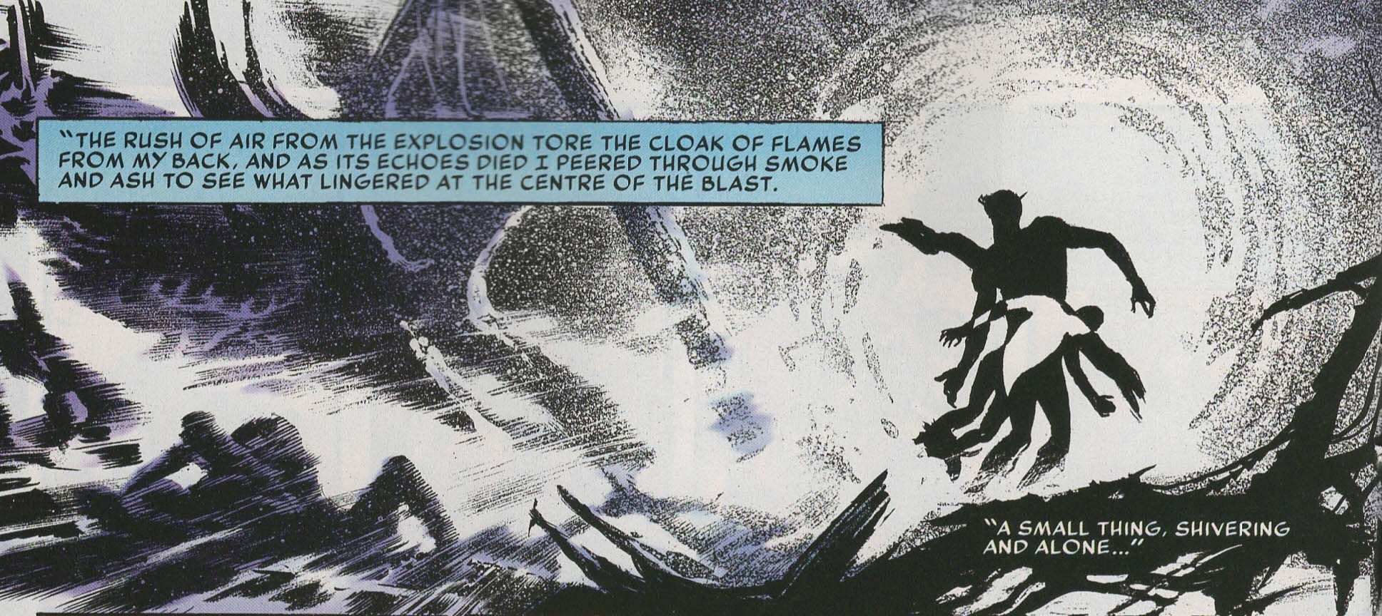
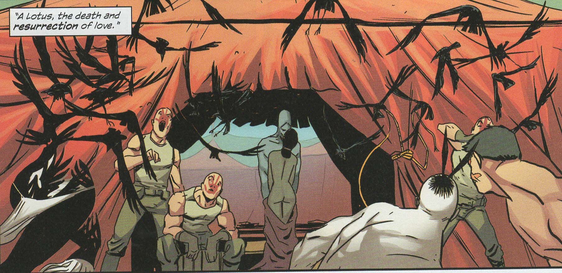
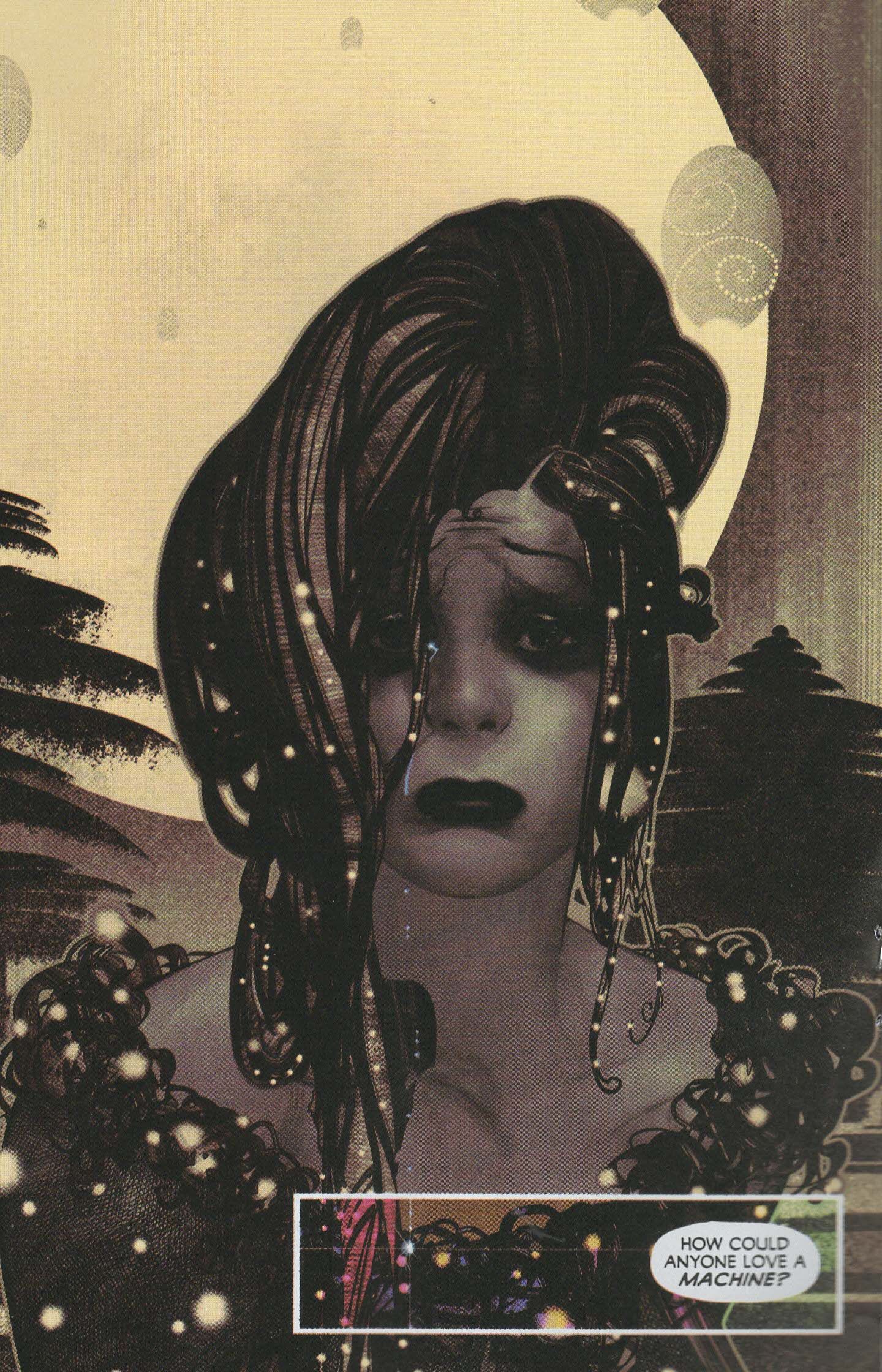
Another poet compared his beloved's upper-lip hairs to the feathers of a parrot feeding a pistachio to the beloved's lips. To help me appreciate the richness of this poetic image, Diloram drew a picture of it in my notebook. It was terrifying. (Elif Batumen, from The Possessed)
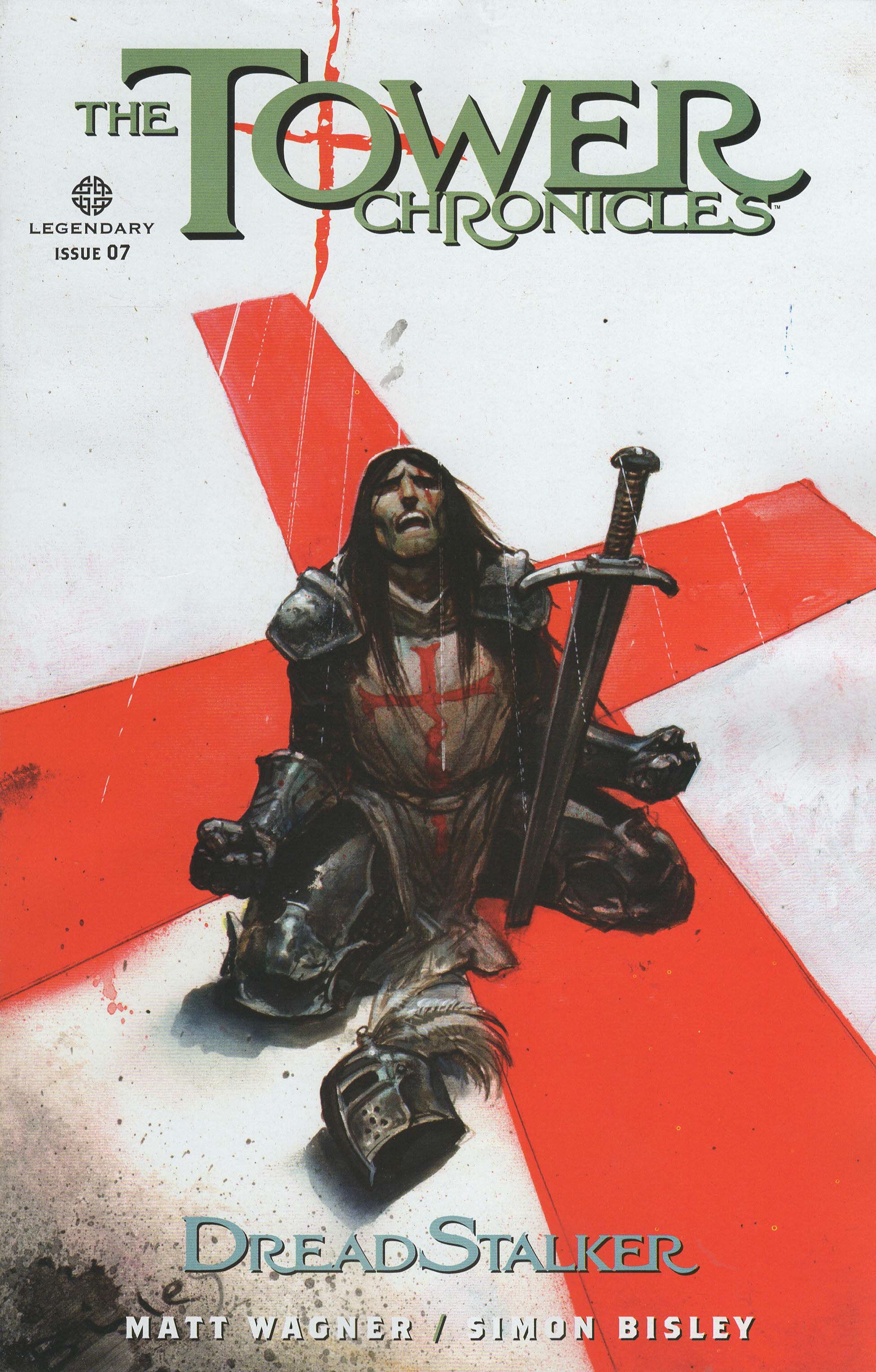
The Tower Chronicles: Dreadstalker #7 (of 12) by Steven Birch (book designer), Simon Bisley (penciller), Ryan Brown (colorist), Sean Konot (letterer), Matt Wagner (writer), Greg Tumbarello (associate editor), and Bob Schreck (editor). $3.99, 22 pgs, FC, Legendary Comics.
I listed the designers in the credits, which I usually don't do, because today I want to discuss logos. Logos are a relatively important part of comics, I imagine, as some cover designs are so spectacular the book practically grabs you as you're walking by. I got a bunch of comics this week, each with interesting logos, and I wanted to check them out. I don't know if Steven Birch designed the logo for this book, for instance, but he's listed in the credits, so he did something!
The nice thing about the logo for The Tower Chronicles is that it nods its head to the book's medieval origins. John Tower is very long-lived, and in this issue and last issue we discovered his origins lie in the Crusades, as he was a Templar who fell in love with a Muslim woman. Yeah, that's not going to end well for anyone. Even before that, though, we had this logo, with the strong "T" and the slightly more abstract "r" bracing the main word. The small serifs add a bit of flourish to the title, but not too much. Four- or five-letter words work well as titles (or at least as the main words in titles), and the use of the "T" is a good, strong choice, as the logo is balanced across the top of the cover and provides a powerful buttress against the more esoteric "chronicles" (nobody chronicles things anymore). The three-dimensional aspect and the gray coloring makes the logo stand out against the white background (the letters are usually white, but that wouldn't work on this background) and add a bit more solidity to the logo. The red cross in the "o" is always present, but it looks better on this cover because of the white background and the motif of John Tower kneeling on the cross in the actual drawing. It's nicely done.
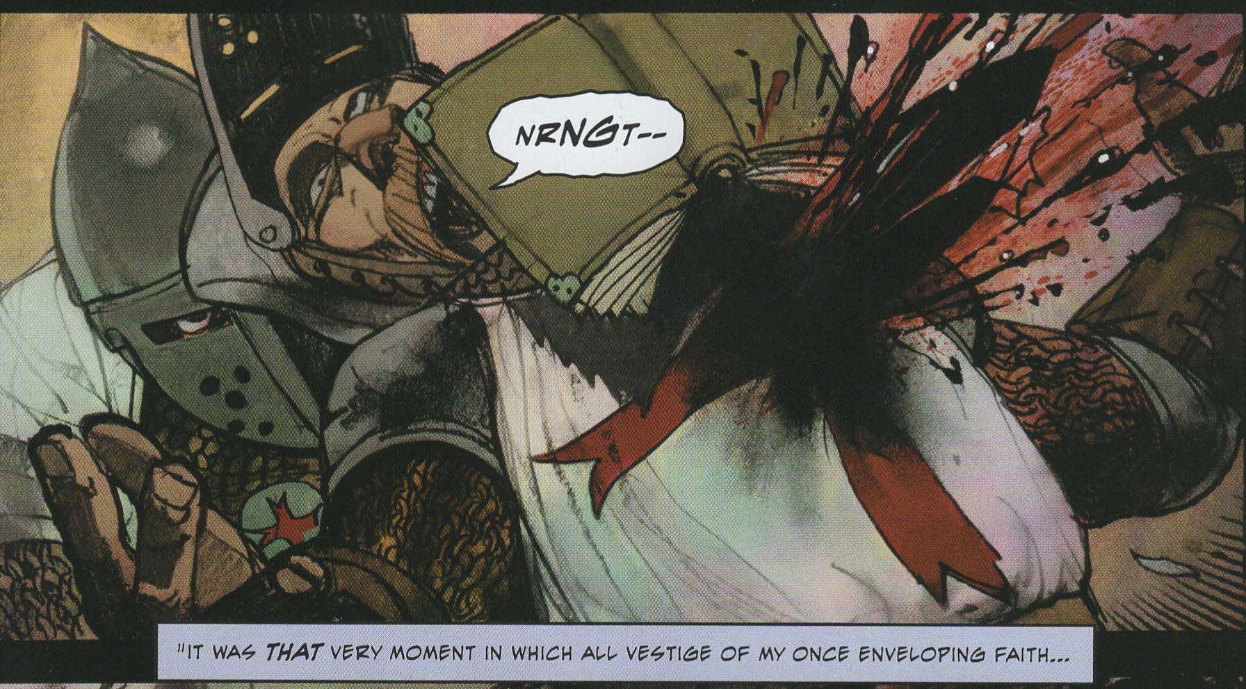
Wagner and Bisley, meanwhile, continue to throw shit into the blender to see what works. John Tower continues to tell Alicia about his past, and the "Lumumba moment" of a Templar falling in love with a Muslim in Jerusalem in the twelfth century (and having a child with her) comes to fruition in this issue in the most gruesome way possible. Wagner, never one to show all his cards, leaves the story of Tower's vengeance against the Templars and his attempts to resurrect his dead wife just before we find out what went wrong with Tower's spell (presumably it gave him immortality, but we still don't know for sure), but there are still bad guys in the present to deal with, so there's more action to get to before the issue ends! The Tower Chronicles has been fairly ridiculous (in the best way possible) since it began, and this issue does nothing to dispel that notion.
I'm still not sure what's going on with Bisley's artwork on the series. I imagine he's penciling it old-school style in order to keep up, but that has led to some sloppiness in the line work, and it's too bad. In the previous series, he seemed to be going more digital, and I imagine he had more time, so the art was crisper. It retains its distinct Bisley style and his mordant sense of humor here, but it's also too messy in some places and far too dark (that's the colorist's problem, I know) in others. Bisley's art is a bit cleaner in 13 Coins, the other series that's coming out right now, and I'm really curious when he drew both of these series. It's okay art, but not as good as some of his work in the past.
The Tower Chronicles is an entertaining but somewhat goofy comic. It's never going to show up on a Top Ten list, but it's clear that Wagner and Bisley are enjoying themselves, and it's a fun read. There's nothing wrong with that!
Rating: ★ ★ ★ ★ ★ ★ ☆ ☆ ☆ ☆
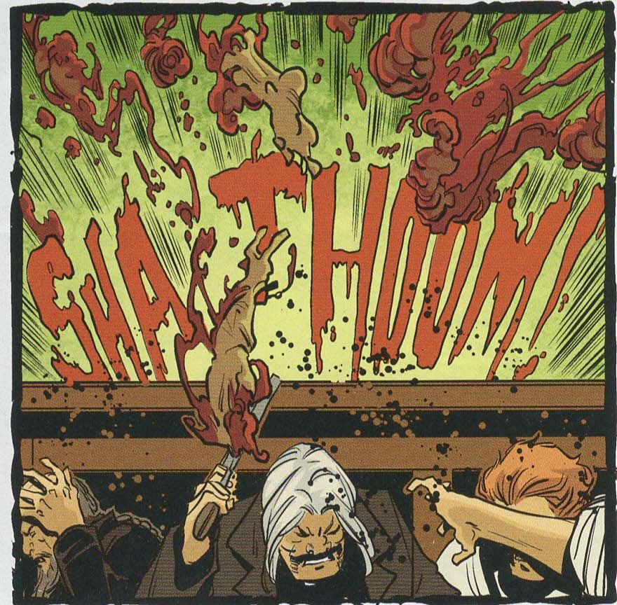
One totally Airwolf panel:
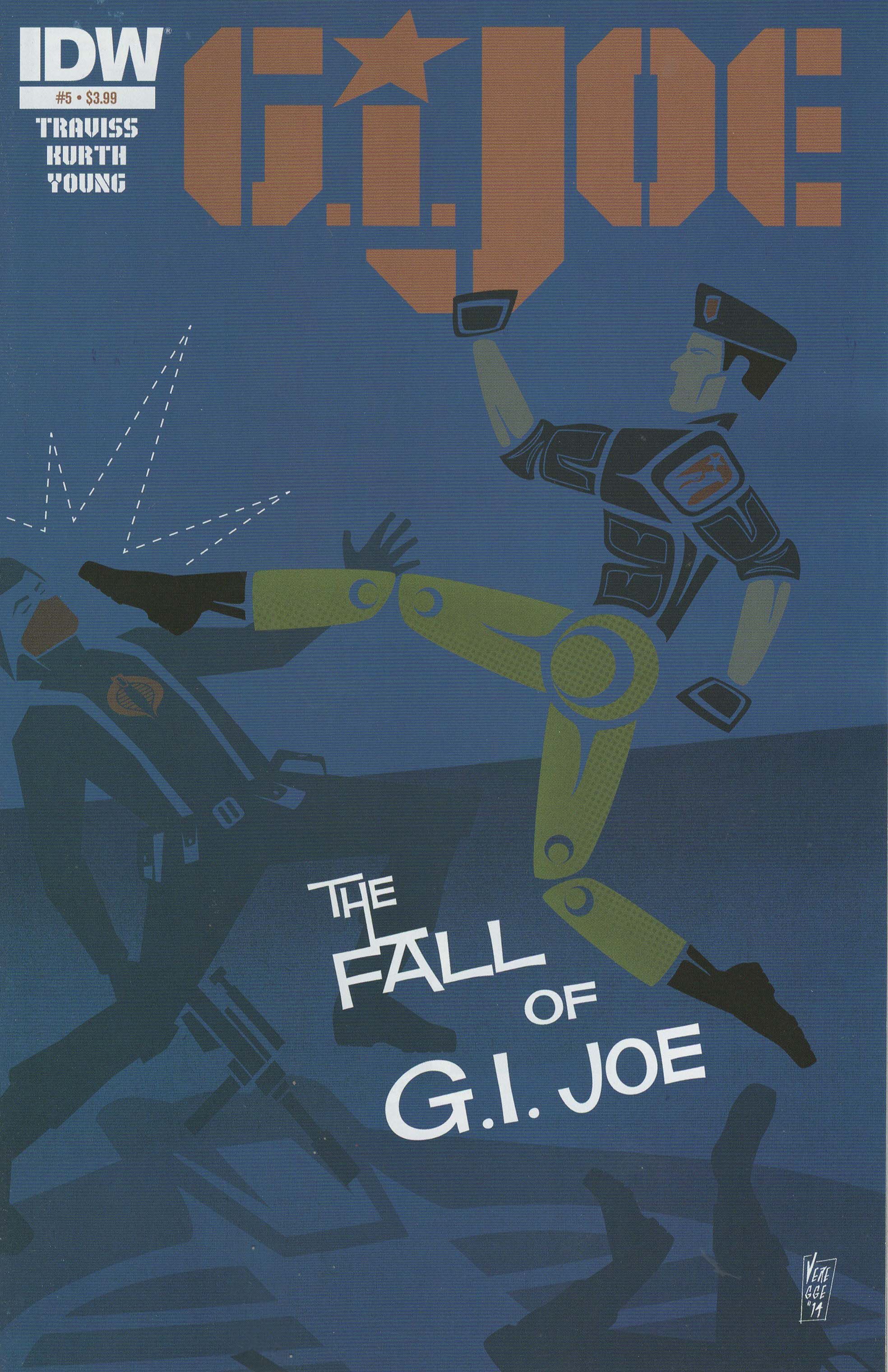
G.I. Joe #5 ("The Fall of G.I. Joe Part 5") by Steve Kurth (artist), Tom B. Long (letterer), Karen Traviss (writer), Kito Young (colorist), and John Barber (editor). $3.99, 21 pgs, FC, IDW. G.I. Joe sort of created by Donald Levine.
The logo for G.I. Joe implies the military, as laypeople tend to equate stenciled lettering on the side of crates with military hardware, perhaps because that's really the way it works or more likely because we've seen so many movies with that trope included. The way the "J" provides a foundation for the slightly truncated "i" is nice, too, as it helps the smaller letter (smaller because the tittle has been changed to a star, which is a smart move) regain some of its stature. There's no third dimension, either, which makes the letters look stark and Manichean. The original logo was far sleeker, but that seems more 1980s, if you know what I mean (and anyone who grew up in that decade probably does). This is a nice logo.
Traviss's G.I. Joe (one of the many IDW publishes) is fascinating, and I worry that she won't be able to finish her tale, although the books seem somewhat sales-proof - perhaps the license is so strong that IDW can publish a lot of them and not worry too much about individual titles performing well. Traviss doesn't have any characters in outlandish uniforms, she doesn't have a cohesive "G.I. Joe" unit or a recognizably evil bad guy, and the book is nothing but shades of gray. Cobra is an international peace-keeping force, or at least that's what their press releases say, and while Traviss is hinting that they're playing a long game and will reveal themselves as evil again, for now, they really are trying to broker peace in a war-torn Balkan country. There's a lot going on in the book, with the focus being the search for Isaac, the son of a Cobra agent (Siren, their PR person), who broke from Cobra because they weren't blowing enough shit up and joined the separatists who are fighting against the government because he wants to blow shit up. Traviss, however, adds more layers to this, from the splintering of G.I. Joe and what happens when former friends and allies come in contact with each other even if they're working on opposite sides (which happens in this issue) to the way foreign countries react to the presence of the United States military. Tomax Paoli, Cobra Commander, is a good voice for this kind of criticism of the U.S., as he currently holds the moral high ground in this series and isn't an American. But he can't control the Baroness, who seems to want a shooting war in Schleteva. Traviss wants to write a story about what happens to soldiers when shooting something doesn't solve problems, and she's doing quite a nice job with it. However, there's not a lot of action in the series so far, and I wonder if that's hurting its sales. It shouldn't, but that's the way it is sometimes. Fret not, though - there's some shooting in this issue!
This is really about as anti-"G.I. Joe" as you can get in a G.I. Joe comic, which might be why I like it. I didn't love the Transformers vs. G.I. Joe comic that Tom Scioli and John Barber (who edits this book) are working on, although I love Scioli's art. That book seems to be far too much for hardcore fans of both franchises, and while I liked both cartoons when I was a kid, I never dove into their universes as much as some people. This book stars the characters you remember, but Traviss is using them to tell a gripping story about real-world politics, and I find it pretty fascinating. But that's just me.
Rating: ★ ★ ★ ★ ★ ★ ★ ½ ☆ ☆
One totally Airwolf panel:
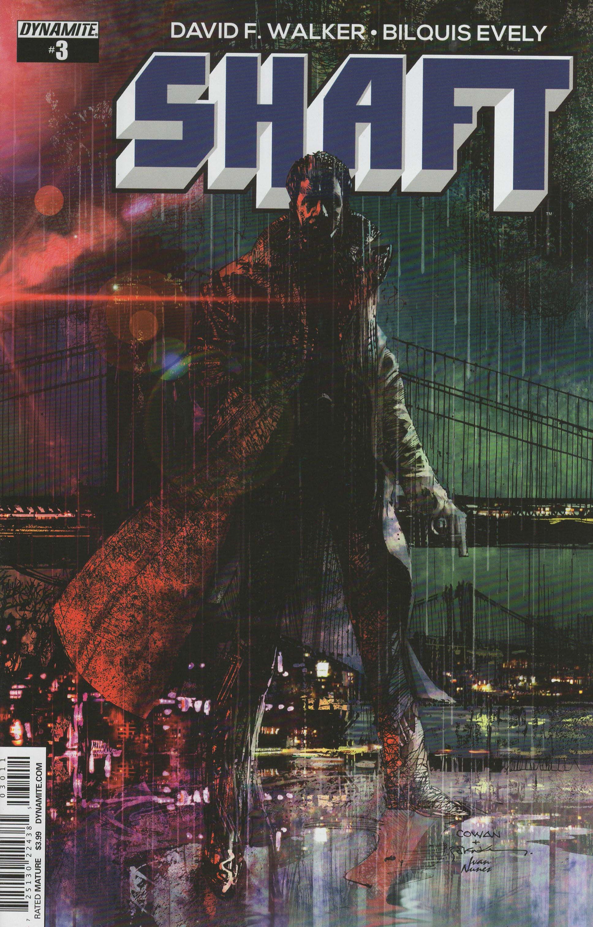
Shaft #3 by Bilquis Evely (artist), Daniela Miwa (colorist), David F. Walker (writer/letterer), and Joe Rybandt (senior editor). $3.99, 22 pgs, FC, Dynamite Entertainment. Shaft created by Ernest Tidyman.
Logo-wise, this is also solid. The lettering is bold and hard-edged, with no curves whatsoever, mirroring the protagonist's hard edges (although this issue ends with Shaft expressing his love for someone, so there's that). Like The Tower Chronicles, we get a third dimension to the letters, but the letters are much thicker than with that logo, which makes them look more dominant. This is a logo for a tough guy, no doubt. Notice, too, that Tidyman came up with a great name - five letters (to fit most paperbacks very well), one syllable (nothing extra here!), the "sh" sound which puts everyone in mind of "shit" so the name can actually double as a curse the bad guys say when he's about to open a can of whup-ass on them, the sexual implication of the word, and the hard "t" at the end to cut it off so that one doesn't trail off, but with the "f" in front of the "t," one can still extend it if one chooses. The logo reflects a lot of this - it's balanced on the page, the "f" and "t" are linked, and the third dimension gives them heft. Well done to whoever designed this logo!
Back when I happened to pick up the first issue of Dynamite's latest Doc Savage comic, I was struck by the artwork of Bilquis Evely. Evely is a Brazilian artist, and her work on Doc Savage was the first time I had seen her pencils, and I really dug them. That series came and went and wasn't bad, and then Evely started working on Shaft. I've never been that keen on Shaft - it was before my time, and when I was older, the Blaxploitation era had passed and back then it wasn't terribly easy to discover stuff from before your time. By the time I started learning about the movies and stars, I just wasn't swept away by it, although I don't have any animus toward that kind of fiction. (Let me put it to you in a way that crystalizes how little I knew about Blaxploitation: the very first time I ever saw Pam Grier in a movie, it was in Above the Law with Steven Seagal. Man, I love that movie.) But I wanted to see more of Evely's work before she was snapped up by Marvel for a new career of arc-shifting on their various titles or by DC to write for Scott Lobdell on a terrible Titans comic, so I picked up Shaft. Why not?
It's not a bad book, either. I don't know anything about Walker, who's written some books and made some movies, but he's done a good job capturing the spirit of New York in the 1970s (at least the New York that we've seen in movies about New York in the 1970s*). Shaft is a Vietnam vet, which doesn't haunt him as much as form part of his personality, and while he's a hard dude (someone gets his head blown off right in front of him in this comic and he doesn't flinch), he's also someone with a strong moral compass. Walker doesn't shy away from the racist language that was, I'm sure, prevalent at this time, and he's spinning a decent little mystery. For me, though, it's Evely's show. She's not fancy, but she gets the job done. She's very good with the many characters in the book - she has a face type, certainly, but she does well with the facial expressions of the characters, and Walker doesn't overwrite too much and trusts her to get that part of the art down. She's good at evoking the time period, as well, both with the fashion (which is fairly crucial) and with the general sense of place. She works with Miwa often, I guess, and Miwa, like she did on Doc Savage, is good at not drowing Evely's pencils in digital coloring. She keeps the palette muted, which makes the 1970s vibe more powerful, and while she indulges in an orange/blue complementary palette a bit toward the end of the book, she does it fairly skillfully, especially when she's using the oranges inside a warehouse where Shaft is getting threatened. Evely and Miwa make a very good team, and they elevate the story nicely.
Much like G.I. Joe, this is a comic that might be flying under the radar because it's not flashy enough. And just like G.I. Joe, it's an entertaining book with more on its mind than you might expect. Check it out before Evely gets swallowed by the Big Two Maw!
* I didn't live through the 1970s in the U.S. too much (when I left the States I was four years old, and I returned in 1979 just around my eighth birthday), but I always wonder about depictions of any era in fiction. When I see stuff that supposedly shows the 1980s, when I was in my heyday, I'm struck by how much people use stereotypes, which makes sense but gives far too simplistic a view of the period. Even movies made during a certain era are using very little slices of that era. How much of our knowledge of time periods before we were born but after the advent of recording devices is informed by popular culture? I would say quite a lot, which strikes me as odd. This isn't a terribly original insight, but I do find it strange when people think everyone in the 1970s was high on coke or every kid in the 1980s was sitting around playing video games. I don't know how old Walker is, but he seems to be around my age. How would he know what New York in the 1970s was like?
Rating: ★ ★ ★ ★ ★ ★ ★ ☆ ☆ ☆
One totally Airwolf panel:
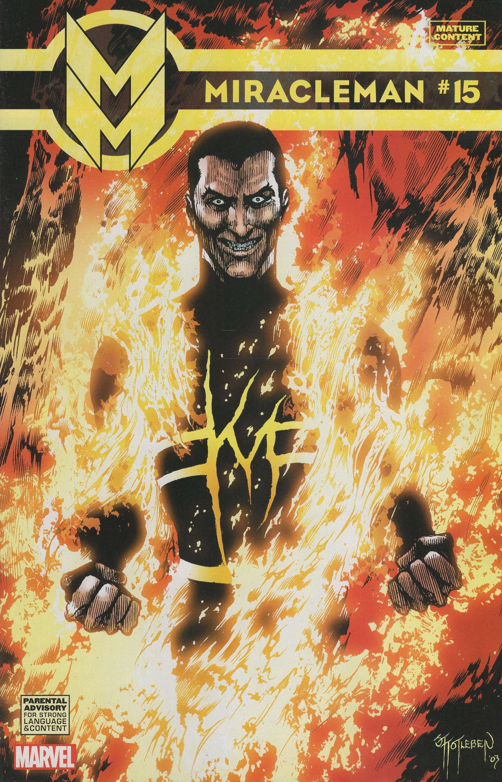
Miracleman #15 ("Nemesis") by Joe Caramagna (letterer), Michael Kelleher and Kellustration (art restorers), Beardy McMagicman (writer), Steve Oliff (colorist), Jeff Powell (designer), John Totleben (artist), and Cory Sedlmeier (editor). $4.99, 22 pgs, FC, Marvel. Miracleman created by Mick Anglo.
Jeff Powell, who has worked on Atomic Robo in the past (and possibly still is?), is credited with the design of this book, which I assume means the logo. He didn't have to do much, as the stacked "M" is the logo from way back, and Powell might have just added the bands encircling it and stretching out to the right, leaving room for the utilitarian lettering of the title. It's a good logo, but I don't know how much (if anything) Powell had to do with it.
When people speak in hushed tones about Miracleman (and they do, don't they?), they often speak of issue #15, which is probably in the running for best single issue ever published. Over 25 years later, it's still devastating, and it puts all other apocalyptic superhero battles - every single damned one - to shame. It's not just because Moore utterly destroys London, as he realized that this is what would happen. It's not just that when Miracleman throws a car at Johnny Bates, he knows the car is still occupied and he does it anyway - the lives of a few people can't measure up to the need to stop Bates. It's not just that the terrific adage about building paradise on a pile of bones has perhaps never been illustrated so well. It's not just that John Totleben's art is so stunning and horrifying that the dude went motherfucking blind when he was drawing this comic (okay, it probably didn't cause his problems, but still). It's that Moore takes this battle and makes it even more epic than you would think, with new mythologies springing up around it - Moore takes time to come up with various religious sects explaining Miracleman's quest for more power, and while it's ballsy to go there, Moore totally earns it - and a clever way of solving the problem of Bates and that final, gut-wrenching scene, which no one has ever topped. This could have been, and possibly should have been, the final superhero book. What more needed to be said?
Marvel's continual weird editing returns in this issue. This is an issue is which Bates kills London, and Marvel doesn't censor the gorgeous and nightmarish Bosch-esque double-page spread of corpses, nor does it censor the naked behind of a 13-year-old boy. But the evil villain who kills everyone in London is not allowed to call someone a "nigger." THAT'S TOO MUCH FOR PEOPLE TO HANDLE!!!! I mean, it's not like Bates is a total scumbag, right? I mean, he has no regard for human life, and he thinks everyone is beneath him, so why wouldn't he use racist terms, right? The book is marked MATURE CONTENT and PARENTAL ADVISORY FOR STRONG LANGUAGE AND CONTENT. Marvel should have added "STRONG LANGUAGE (BUT NOT TOO STRONG LOLOLOLOL!!!)". The issue arrived in comic book stores in its own sealed bag! Yet Marvel censored one word. It wasn't "shit," mind you. It wasn't "bastards." It wasn't when Bates threatened to eat children and when he said he was going to shit skulls. No, those were all okay for the theoretical child who might get their hands on this issue. But a scumbag who has killed and mutilated (and presumably raped) thousands of people using a racist term! Quelle horreur!!! Kill it with fire!!!! (Much like Huey Moon would do.)
Anyway, this issue. Holy motherfucking cocksucking shit, it's good. Yes, really.
Rating: ★ ★ ★ ★ ★ ★ ★ ★ ★ ★
One totally Airwolf panel:
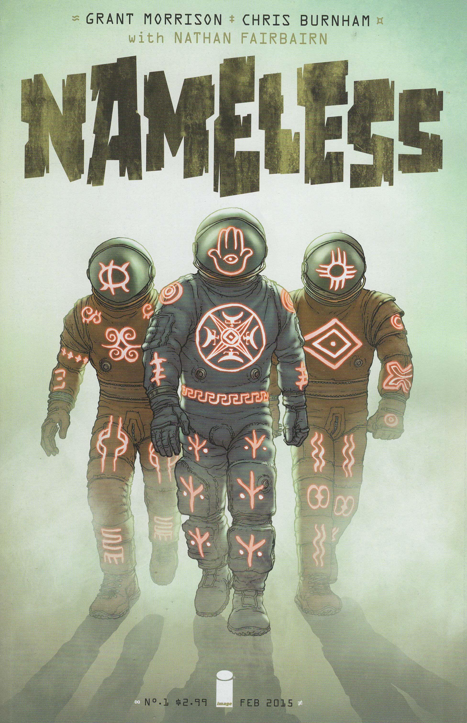
Nameless #1 ("Shit Rains Down") by Simon Bowland (letterer), Chris Burnham (artist), Nathan Fairbairn (colorist), Rian Hughes (designer), and Grant "Yeah, that's the name of this story, fanboys - what are you gonna do about it?" Morrison (writer). $2.99, 24 pgs, FC, Image.
Rian Hughes designed the logo, and as much as I like Hughes, I have an odd issue with the logo. I don't mind the lettering - it's reminiscent of creepy sci-fi movie posters, and as this book slowly turns into a creepy sci-fi movie, that's probably a good thing. What I don't love is the lack of borders on the lettering. Yes, it's a strange thing to be bothered by. The lack of borders makes the letters look weak, even ephemeral, which might be what Hughes was going for, but doesn't seem to work really well. The murky coloring isn't great, either. It's very odd - many of the books in this post don't have strong borders, but possibly because they use bolder colors in the logo, it doesn't seem to be that big a deal. Here, it just makes the logo look a bit formless. But it's probably just me.
I've been looking forward to this comic for a while now, and I really hope our intrepid creators have some issues in the can, as they both seem to have a few problems staying on a tight schedule. That shouldn't be as much of a problem at Image as it was at DC, but we shall see, shan't we. Anyway, it typical Morrisonian fashion, it starts weirdly and ends conventionally, although usually he takes a while to get to the conventional ending. I'm sure that the asteroid heading toward Earth is a fake-out "conventional" ending and we'll get back into the weird stuff eventually, but at least Morrison gives us stakes in this first issue, so we're not waiting for a few issues to figure out what the hell "Nameless" is doing with the Veiled Lady.
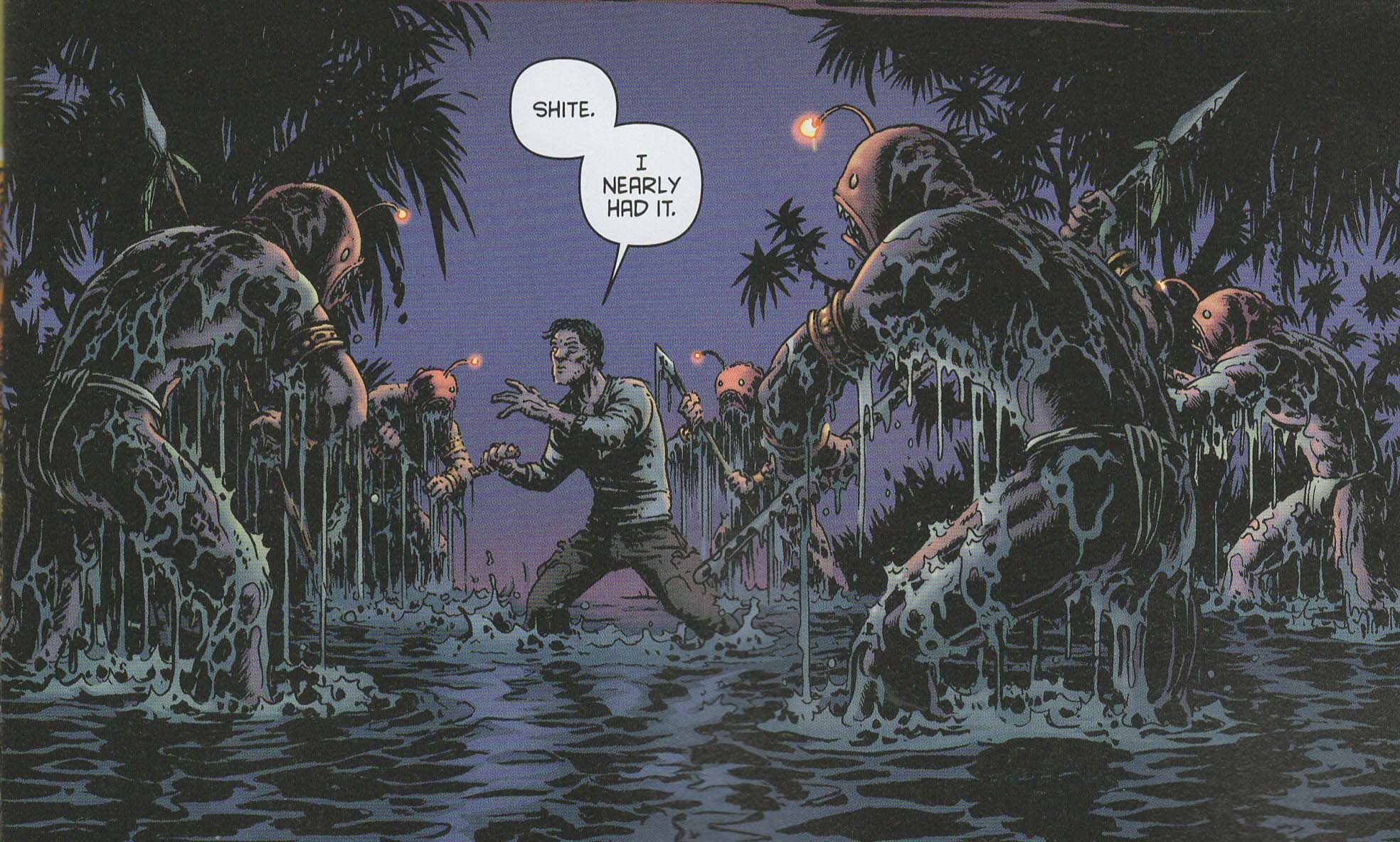
Yeah, the main character is named, for lack of a better term, Nameless. And he's trying to steal a key from the Veiled Lady. Whose minions are giant amphibious-type creatures (see below). And the asteroid has a sigil carved on it that presumably the key unlocks. It's all very Morrisonian, which means I'm perfectly willing to go along for the ride even if I'm not sure what's going on. I know that many, many people are not on the Morrison bandwagon, but I am, and very, very rarely has he let me down (I'm looking at you, Happy!). So I'm just along for the ride.
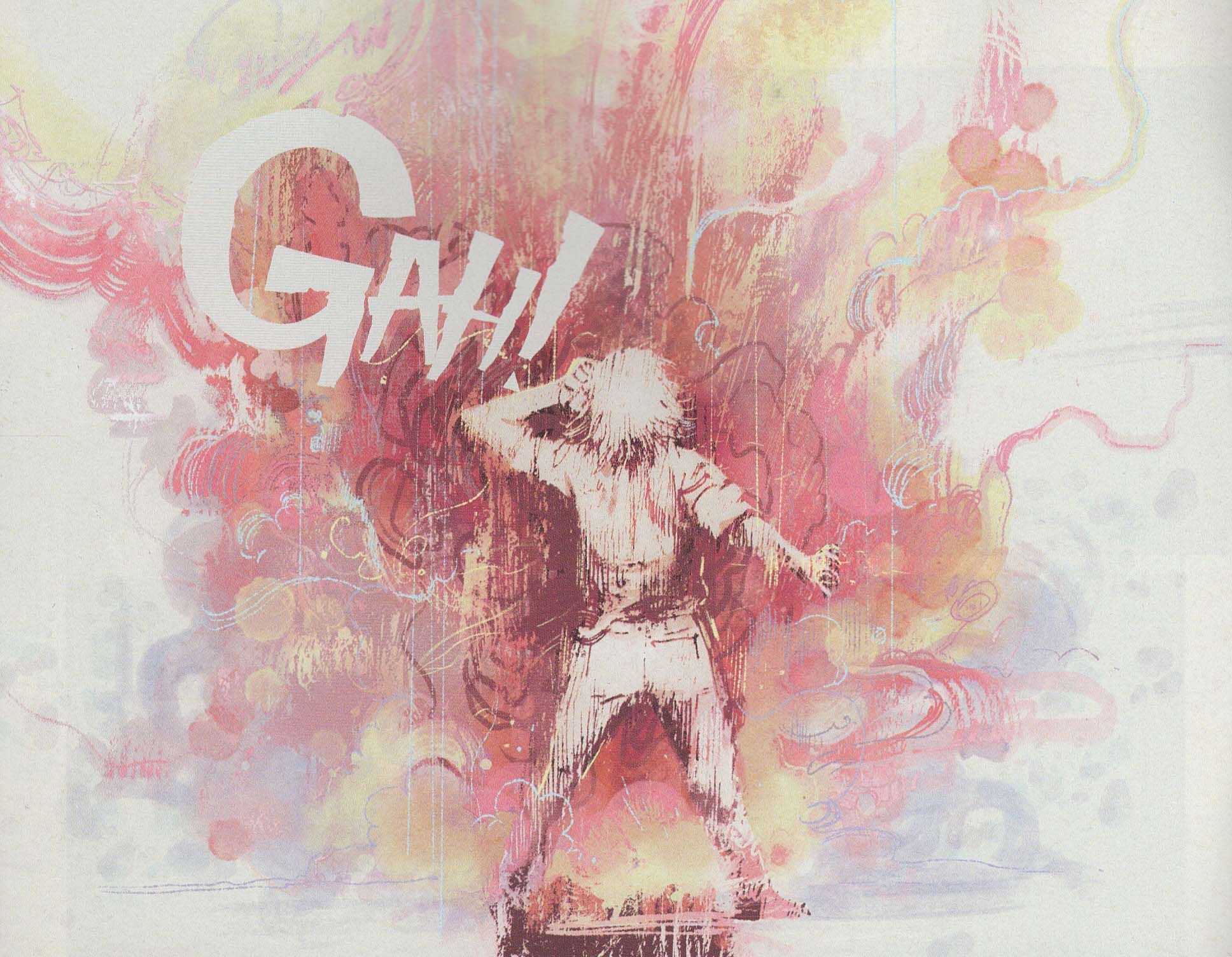
Of course, that's easier with Burnham drawing the book. After toiling in the DC salt mines for most of his professional life and spinning on an Artist Roulette Wheel that sometimes lands on the wrong number, Morrison has been able to work with some pretty danged good artists recently. Obviously, Frazer Irving has been killing it on Annihilator (see below), and Burnham does marvelous work on this book (DC seems to have figured this out, too, as the parade of artists on Multiversity has been quite good). Burnham is particularly good early in the issue, when Morrison's overheated script is its most toasty. Burnham uses weird capsule-shaped panels to swirl our eyes across the page, and his jumps between seconds are done quite well to show the impact of the horror early on without delving into the process too much. His points of view are keen, especially the title page, which looks down at Nameless in his bed, surrounded by four fish-creatures, and his interrogation by the Veiled Lady is done using panels that create walls of a room, which adds to the sense of claustrophobia and gamesmanship. Later, he creates a page that looks like a jewel, as Nameless learns about the asteroid and Burnham uses facets as panels - his use of curves in the issue seems to indicate an unreal situation, as the parts where Morrison slows down and turns the book into a standard chase scene are laid out much more classically, while for the weirder parts, Burnham uses angles and curves more liberally. Burnham is a good partner in crime for the God of All Comics, and it makes waiting for Morrison to make sense that much easier.
It's hard to tell what to make of Nameless, but that's okay. Of course I'm on board!
Rating: ★ ★ ★ ★ ★ ★ ★ ½ ☆ ☆
Totally Airwolf panel:
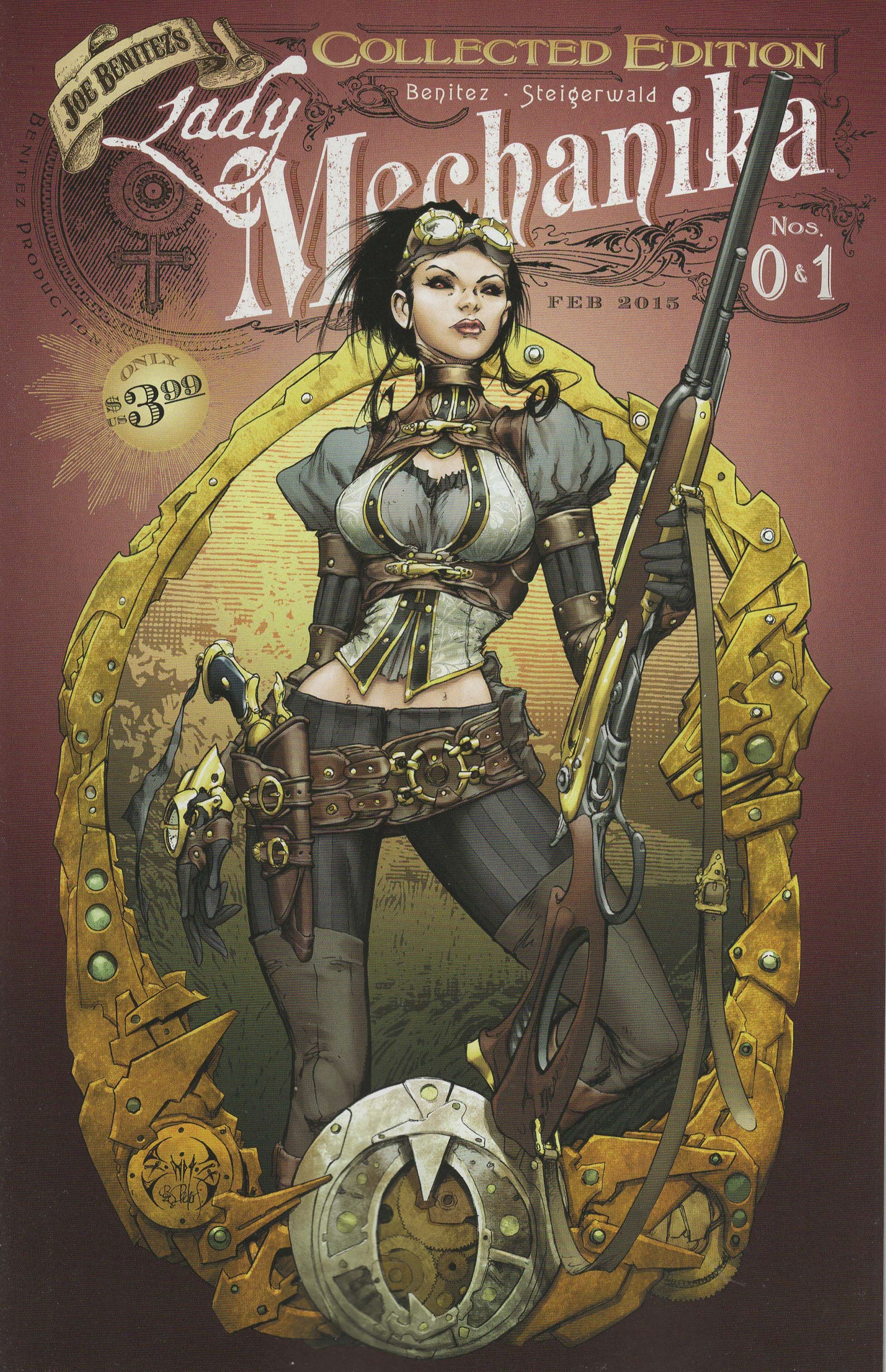
Lady Mechanika #0 & 1 Collected Edition ("The Demon of Satan's Alley"/"The Mystery of the Mechanial Corpse") by Joe Benitez (writer/artist), Josh Reed (letterer), Mark Roslan (designer), Peter Steigerwald (colorist/designer), Vince Hernandez (editor), and Frank Mastromauro (editor). $3.99, 36 pgs, FC, Benitez Productions.
I don't know what the title font is called, but it seems Victorian with a touch of piratical-ness, doesn't it? The "Lady" appears to be a font that is used when pirates are writing in their journals about the islands and ships they've plundered, and considering that Lady Mechanika herself seems to be something of a treasure-hunter/soldier of fortune (it's extremely unclear what she actually does for a living, but at one point a colleague of hers shows up and tells her about a bounty on some werewolves and he suggests hunting them down), the use of that font is not a bad choice. Meanwhile, the "Mechanika" part of the title is a bit more florid, with the rise of the letters to the right invoking a banner of some olde-tymey circus or advertisement for a theatrical production. It's an ostentatious logo (especially with the "Joe Benitez's" added to it), but that's partly because of the steampunkiness of the title.
Lady Mechanika was first solicited in October 2010. A little over four years later, four issues have come out. Yet Benitez is relaunching the book and hoping to keep up a monthly schedule, going so far as to get an art assistant to help him. Why bother with that? Everyone knows you're slow or you don't want to devote every waking moment to the book. Just say it's a quarterly book or something and go with that. I'd rather get that than Benitez trying to stay on a monthly schedule that no one, not even Benitez, thinks he can handle.
Anyway, I took a flyer on this because I don't hate Benitez's art and it's two issues for the price of one, so I figured it would be okay. Plus, I have a weakness for steampunk even though I'm not so enamored of it that I talk about it all the time, so I'm always interested in seeing what's what in steampunk comics. Unfortunately, this isn't that great. Benitez isn't a very good writer, and this book is jam-packed with clichés, from the ugly but totally adorable creature that evil, "civilized" men think is a demon and therefore kill to the evil, creepy government agency that wants to lock away anyone or anything that is outside of society's norms. Lady Mechanika wants to discover the secret of her origins, and both stories are angled that way - the first issue is much more about it, as Ucky the "demon" is also partially mechanized and he actually knows our heroine, but his head gets splattered before he can tell her what he knows. In the second story, a partially mechanized young lady is chased by bad guys but escapes to the city of Mechanika (I don't know why Benitez names his character the same thing as the city; I hope it's not laziness, but who knows), where she dies in the train station. Lady Mechanika thinks she might hold some clues about her own origin, but before she can find out, she's beaten up and the corpse stolen by a gentleman in a top hat. Oh, that's a pickle, certainly.
I don't mind clichéd stories - in some way, it's almost impossible to avoid clichés in fiction these days - but Benitez doesn't really do too much to distinguish these clichés, and that's too bad. The idea of a steampunk world is interesting to me mainly because it can be so much like our world but with some neat changes to make the world just odd enough to work. Benitez changes the world, true, but in as bland a way as possible, with everyone seemingly just cosplaying steampunk characters (which makes Benitez's weird swipe at cosplayers all the more confusing). Unfortunately, Benitez's art doesn't help too much. I like Benitez's art to a degree, but it does seem a bit rushed here, which makes no sense as it took so long for each issue to come out. For the most part, the big moments are done well, but some of the smaller stuff looks sketchy. Steigerwald's murky coloring in the first issue and digitally inserted patterns don't help, either. But the biggest disappointment in the artwork is that Benitez doesn't embed us in the steampunk world. He spends a lot of time on the characters, which is fine, but the backgrounds aren't filled in very well at all. On the first two pages (a double-page spread), Lady Mechanika stands on a rooftop, and behind her, Benitez barely draws any buildings. Yes, it's nighttime and yes, it's foggy, but that just sets the tone for the entire book. There's one long shot of the city of Mechanika, but it's rather indistinct, and there are a few pages with interesting, Victorian-era interiors (the book is set in 1878 and 1879), but that's it. For a book that wants to be steampunk, Benitez doesn't commit enough to the ethos, and that's kind of disappointing.
I didn't have high hopes for this comic, but I was hoping it would be pretty and entertaining. It was nice-looking but not pretty, and it was only mildly entertaining. Oh well.
(By the way, if you want to read a great steampunk comic, you can go pledge to the Kickstarter for Westward #10. Sure, it's the last one, but some of the tiers include the entire series! In the highest-level ones, you get some of the props used, and they look pretty neat!)
Rating: ★ ★ ★ ★ ★ ☆ ☆ ☆ ☆ ☆
One totally Airwolf panel:
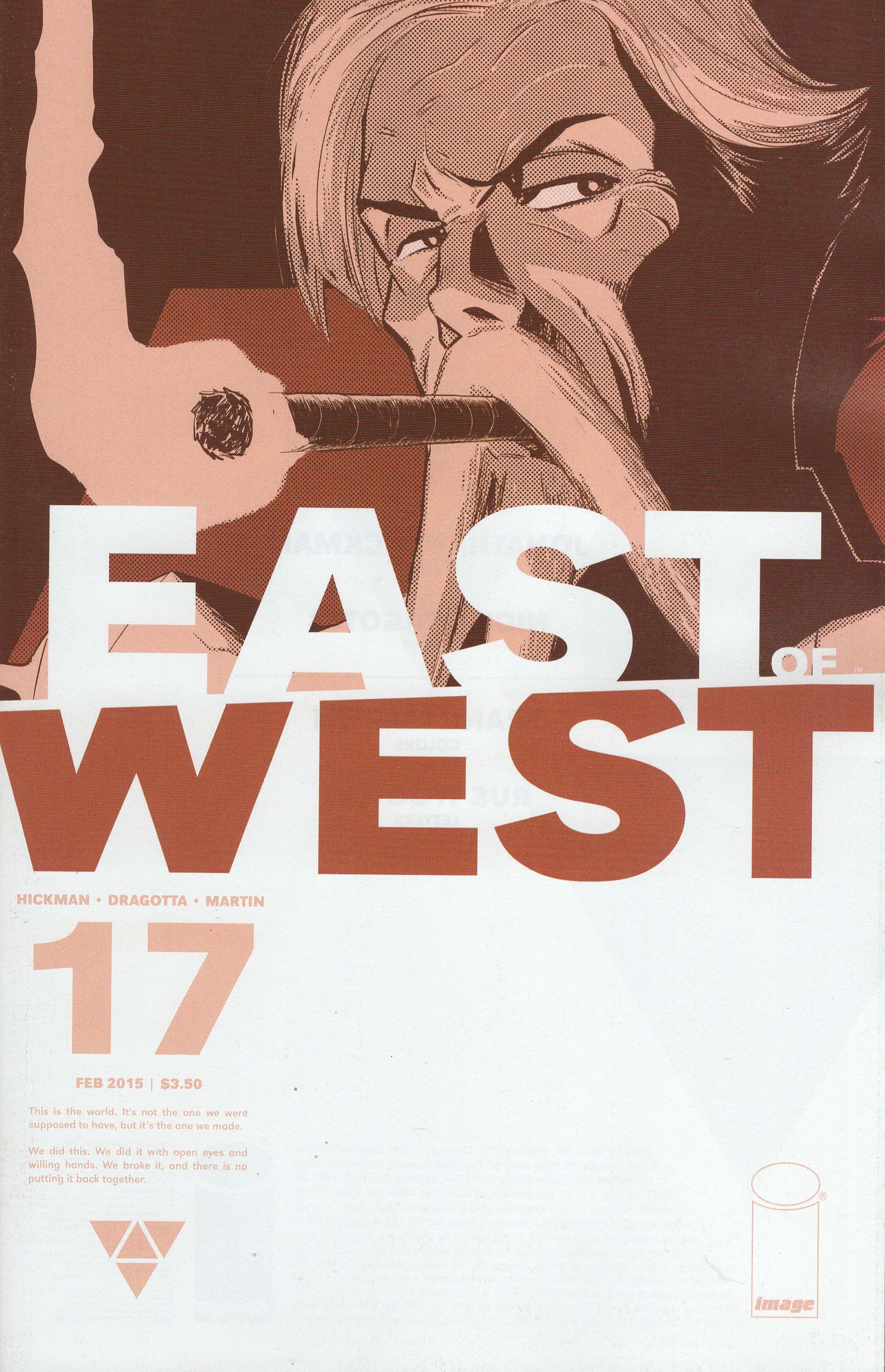
East of West #17 ("This Sacred Meal") by Nick Dragotta (artist), Jonathan Hickman (writer), Frank Martin (colorist), and Rus Wooton (letterer). $3.50, 20 pgs, FC, Image.
East of West, like a lot of Image books these days, is not just about the logo but the entire design of the cover. Given what we know about Jonathan Hickman, I'm going to assume he designed the cover, although the drawings in the top half are always Dragotta's. I appreciate the eye-catching design of the covers even though I don't love them. I imagine they stand out on a shelf or table, and if that helps the book sell, more power to it (I would have bought it whatever the cover looked like, but I know that a lot of people don't pre-order books from Previews). I do like the slight diagonal running between the "east" and the "west" - it's not too obvious, but it adds a bit of chaos to an otherwise sterile design.
The book has been simmering for a while, as this issue is the first of the new year and the one previous to this was "The World," which added a new short story but not much else as far as forward momentum. So Hickman takes some time to catch us up on some of the principals before ending with Death and Xiaolian, who discuss their son and where he is. It's not a bad issue, per se, but it is a bit less dynamic than most of the others - Hickman probably needs to catch us up, but in earlier issues, he was able to do it while still pushing the story forward, while here he simply introduces one new player to the drama (presumably she'll be important down the line) and tells us where everyone stands. He's still able to end the book with a tragic line which was sadder than I thought it would be - Hickman has yet to prove that he can write great characters, but he's done enough with the two characters in this book that the final line refers to that it is a bit emotional. It's a nice way to tease a bit of tragedy down the road a bit.
Dragotta has been killing it on the book, as you know, but I don't love his art on this issue as much as on some others. He does some wonderful work - when John Freeman is firing his gun and spinning the Vizier around, it's breathtaking, but I kept getting distracted by the backgrounds when Death and Xiaolian are speaking to each other. Wolf is fighting one of Xiaolian's soldiers, and the figures are often sketchy and not terribly fluid. It's a minor thing, but it was bugging me. On a comic that usually looks so spectacular, it just bothered me a little.
So this is a solid, probably necessary, but not great issue of East of West, but it's been so good for its run that it can have a down issue. And at least we get a bit caught up with things! That's always nice.
Rating: ★ ★ ★ ★ ★ ★ ★ ☆ ☆ ☆
One totally Airwolf panel:
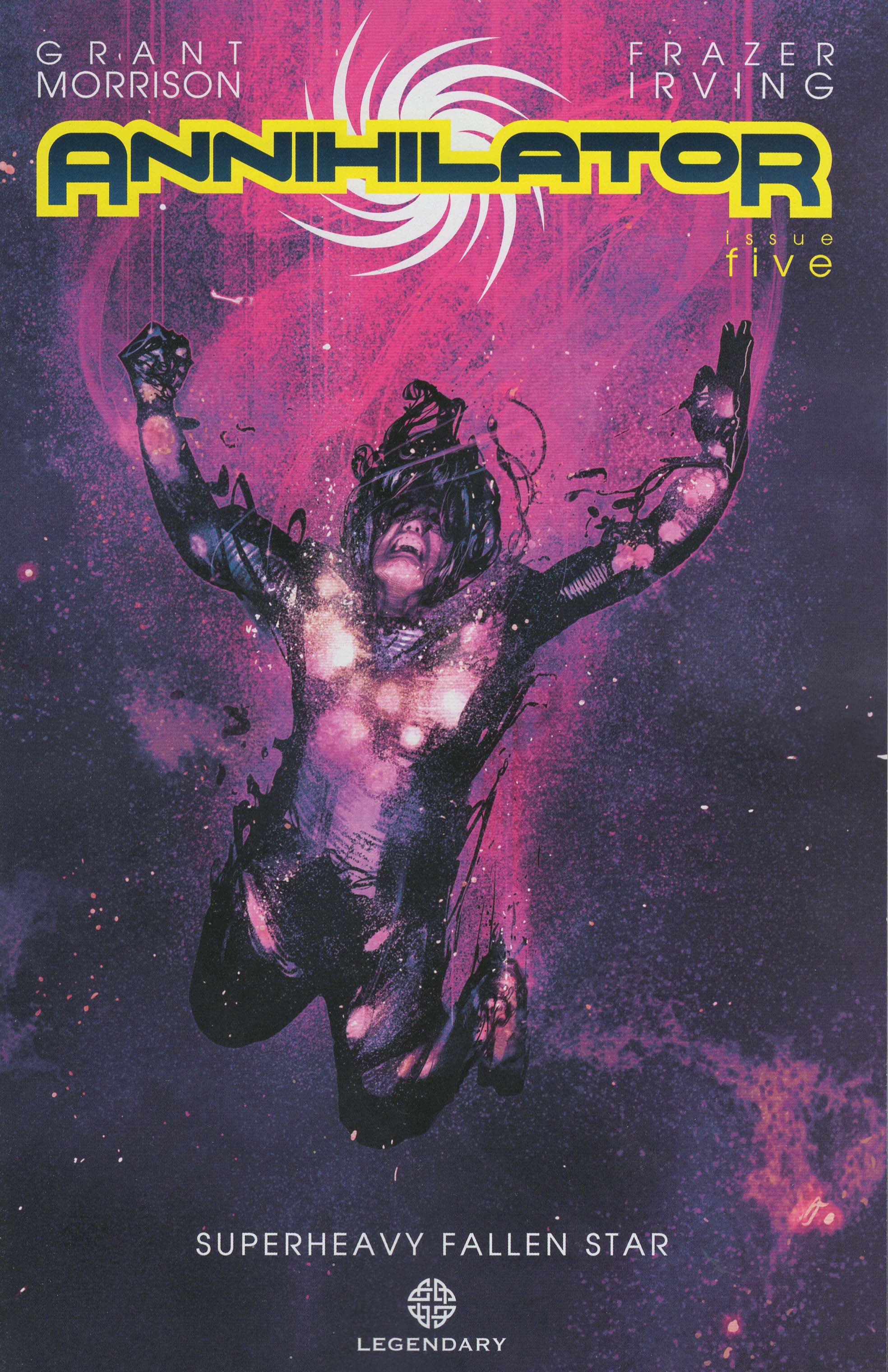
Annihilator #5 (of 6) ("Superheavy Fallen Star") by Jared K. Fletcher (letterer), John J. Hill (book designer), Frazer Irving (artist), Grant "You shall have no other God of All Comics before me!" Morrison (writer), Greg Tumbarello (associate editor), and Bob Schreck (editor). $3.99, 32 pgs, FC, Legendary Comics.
John J. Hill is the book designer here, and I have to assume he designed the logo. It's a tough word to get onto a cover, because it's so long, it's somewhat unusual (we don't often say we "annihilate" something, much less call something an "annihilator"), and it can't be too big because it is, after all, only one word. The larger "A" and "R" are well done, as they provide a good framework for the word, and in this instance, is a good counter-balance to the U-shaped Max on the cover. The font is utilitarian but not boring - it's rounded just enough to imply weirdness but still solidly menacing, while the swirl behind the word is an abstract representation of the annihilator itself and it also expands the logo, height-wise, which is necessary because the letters need to be so small.
Given the hype, it's a bit surprising that Nameless would be the worse Morrison comic that came out this week, but considering that Annihilator has had more issues to resolve into a more coherent story, perhaps it's not that surprising. As we get farther along with Max's story, Morrison begins to resolve some of it, as we learn some of the dirty secrets that Max is hiding from Ray and Luna (well, sort of, as Ray is writing Max's life, but it's only so Max can remember it ... yeah, it's a Morrison comic). It's a cool device that allows Morrison to hide information from the audience - I've never been a big fan of authors deliberately withholding facts just so they create false tension (I forgive it a little in mysteries, but only a little), because that stinks, but in this case, the fact that Max doesn't remember what happened and that Ray is "making it up" allows us to find things out that already happened to one of the main characters but it doesn't feel like Morrison is pulling a fast one on us (even though I'm sure he plotted the whole thing out before the series began). Does that make sense? I don't know, it sounded good in my head. Anyway, the GoAC's arch dialogue also doesn't sound false, because Max can be considered a fictional construct and Ray knowingly speaks in clichés, so Morrison heightens that weird reality and makes the dialogue sound plausible. Morrison is one of the few writers who can do that well, and he's doing it well here.
Irving, of course, is terrific, especially as his manic figure work helps turn Morrison's dialogue even more into archness, as Irving's characters seem to be puppets, jerked around while they read lines given to them from on high. Morrison has always been interested in the interplay between fiction and reality, so Annihilator isn't exactly breaking new ground where he's concerned, but he doesn't always have an artist who can match his ideas, and for this series, at least, Irving is doing just that. Usually, when Morrison does this, he's assisted by more traditional comics artists, and while their pencil work might be good or bad, it's usually not matched to the kind of odd, "hyper-reality" that Morrison is going for. Irving distends figures by using odd perspectives and makes faces almost rubbery, which helps make the story even more of a strange performance more than "reality." That, in turn, makes Max's rejection of Olympia even more "real," as the emotions of the characters feel rawer and closer to the surface. Morrison doesn't do depth of emotion as well as many writers, which is why some of his odder stuff doesn't work as well as it might, but he does an interesting job faking it here, and the performance-style script and Irving's wonderful art help make the emotional moments shine through pretty well.
Annihilator isn't perfect, but it's quite good. I'm curious to see how it ends!
Rating: ★ ★ ★ ★ ★ ★ ★ ★ ☆ ☆
One totally Airwolf panel:
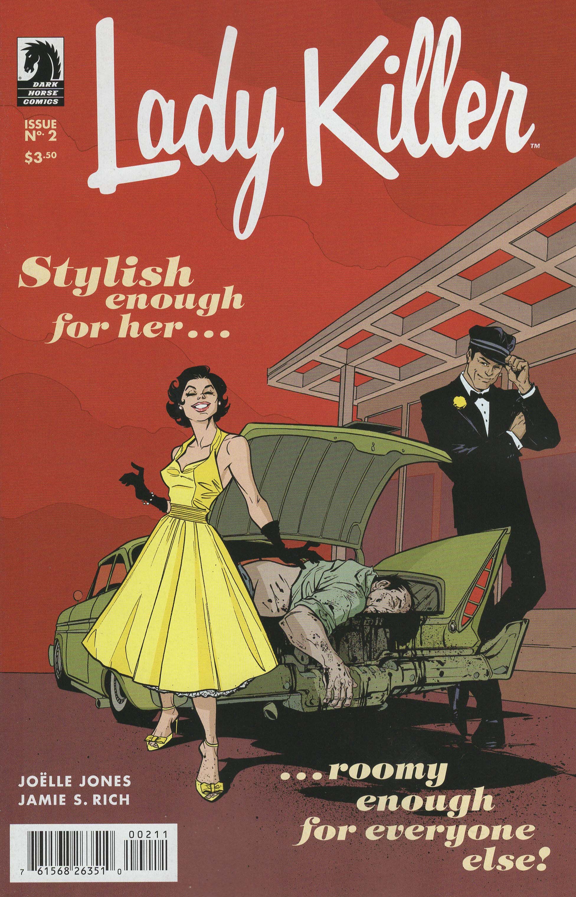
Lady Killer #2 (of 5) by Laura Allred (colorist), Crank! (letterer), Joëlle Jones (artist/story), Kat Larson (designer), Jamie S. Rich (writer), Jemiah Jefferson (assistant editor), Shantel LaRocque (assistant editor), and Scott Allie (editor). $3.50, 22 pgs, FC, Dark Horse.
As with all of these, I assume that Kat Larson, who's credited as the "designer," designed the logo, which I absolutely adore. The book is set in the early 1960s (although I'm not exactly sure why yet), and so we get the stylish, retro, bold, distinctly "American" font, with the half-cursive writing implying femininity (sorry, ladies, cursive implies female, even though I, for one, have excellent cursive handwriting) but the strong "L" and "K" standing out powerfully from the rest. Even the slightly helter-skelter line underneath the letters (it's not exactly flat) helps create a small sense of chaos, while the rounder font for the tagline hearkens back to magazine advertisements, as it's meant to. I love this logo.
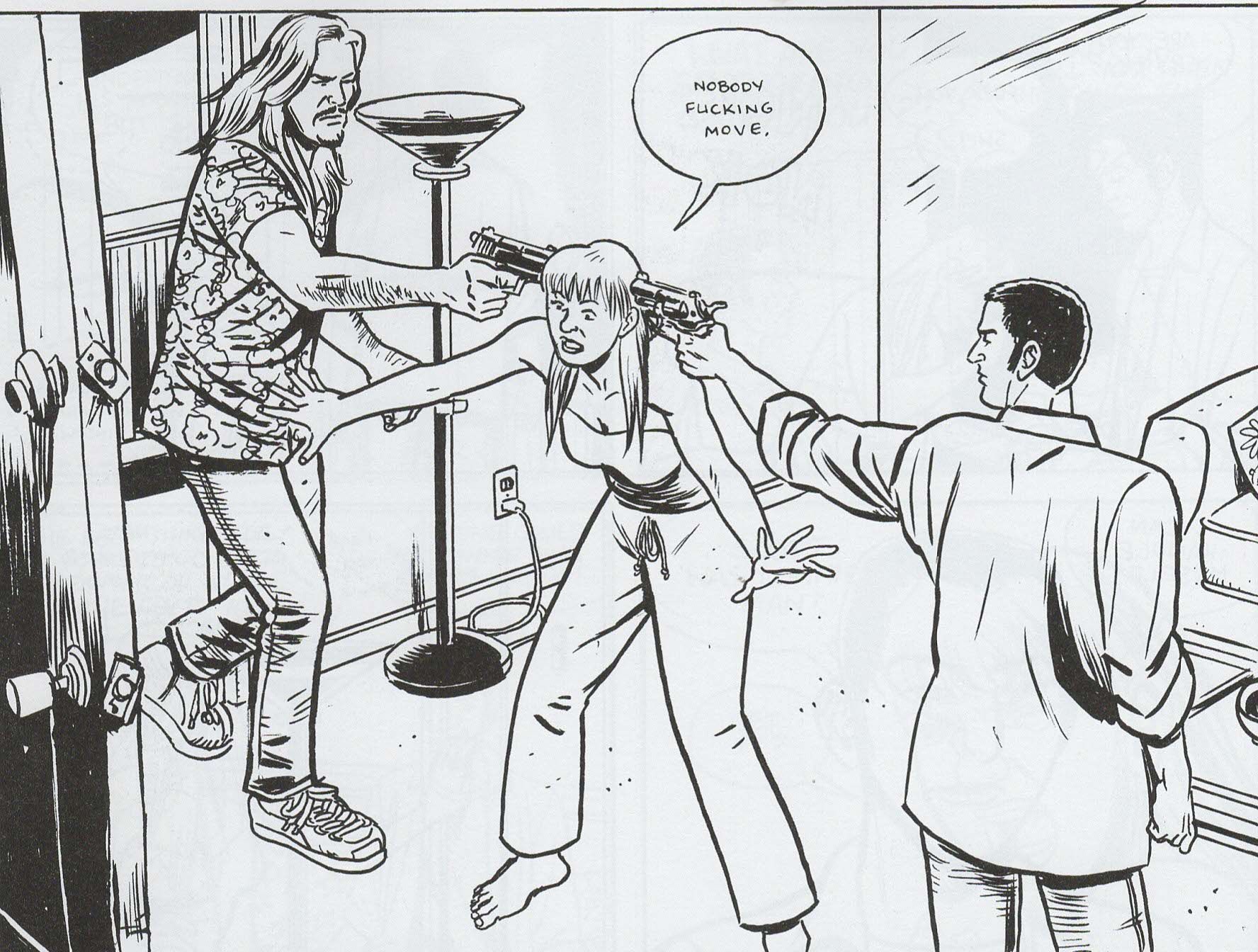
I would really like to see an actual fight to the death between a trained female fighter and a dude who outweighs her by at least 100 pounds and probably knows a little about fighting himself. Well, I guess I really don't, unless the person dying was really, really evil, because that would mean I just saw a fight to the death, but I'm always curious about fighting in comics and other media, and we get one such type of fight in this issue. Josie ambushes her target from the rear and kicks him in the back of the neck as she comes down toward him (she was crouched on a shelf above him). She does not pierce his skin with her stiletto heel, but catches him with the flatter toe. Then she bangs his head onto the ground, hitting his cheek and not rendering him unconscious. He rolls over and she straddles him, starting to choke him with his tie. All of this seems plausible, as she took him by surprise, although I wonder if he'd already be unconscious. Anyway, he manages to push her off and grab her choker, which he uses as leverage to hold her head still and punch her across the jaw with his left hand. This does not knock her out, nor would I expect it to. He's probably right-handed (he holds his cigar in his right hand), so perhaps his left cross isn't too strong, but it probably hurts. Josie falls away from him and he stands up, looming over her. She manages to roll into a kick that catches him on the side of the head. It's a weird sound effect ("swsh") because it implies that she misses, but in the next panel, he's holding his cheek. Again, there's no blood, so she didn't pierce his skin with her heel. Then she tackles him, gets on top of him with his face down, and strangles his fairly quickly with his tie. Jones makes the fight believable, because Josie gains the early advantage from surprise and then manages to tackle him while he's a bit unsteady on his feet. I wonder how long it takes to choke someone out, but that's a minor point. It's believable because it doesn't last that long, so the target can't use any weight advantage he has to beat on her. As someone who has gotten in two very brief fights in my life (and those were when I was not very old - I was probably 15), I don't know the mechanics of fighting very well, and I'm very curious about smaller women fighting larger men, which seems to happen quite often in comics, television, and movies these days. It's not that I think the men will naturally win, I just wonder about the physics of a 200- or 250-pound man beating on a 120-pound woman. Jones, it appears, thinks about this too, which is why Josie's assassination doesn't seem as far-fetched as it might otherwise.
This is a gorgeous comic, by the way. But you should have already known that, given that Jones is drawing it. Josie is about to have a crisis of faith, too, so that's something! Plus: Pregnant women who smoke! Ah, the Sixties!
Rating: ★ ★ ★ ★ ★ ★ ★ ½ ☆ ☆
One totally Airwolf panel:
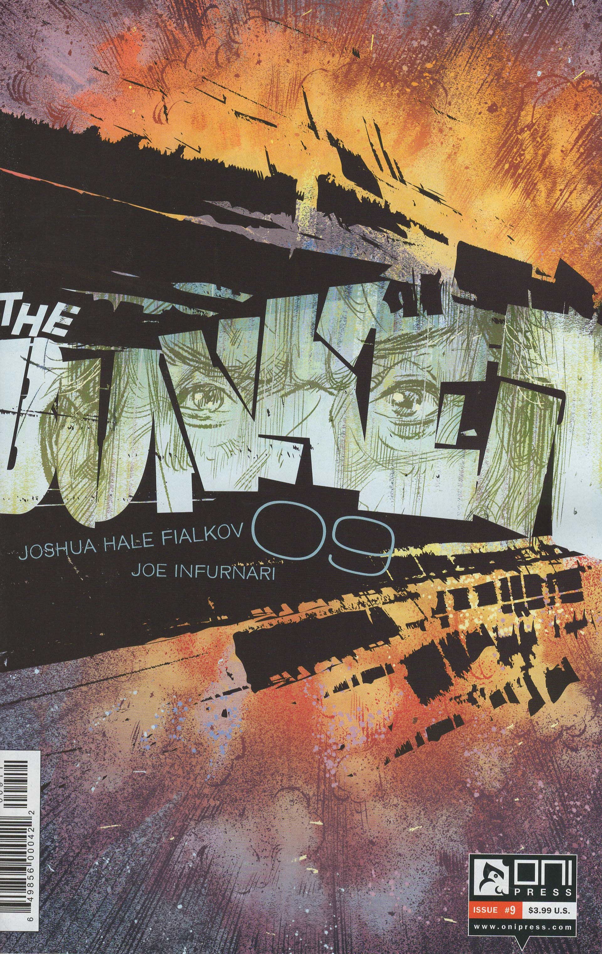
The Bunker #9 by Joshua Hale Fialkov (writer), Jason Fischer (color flatter), Joe Infurnari (artist/colorist/letterer), Jason Storey (designer), James Lucas Jones (editor), and Robin Herrera (editor). $3.99, 22 pgs, FC, Oni Press.
East of West is the only comic so far that has had its logo anyplace else than the top of the cover, but we're going to see some more of them from this point forward, beginning with The Bunker, which places it in the center. The left-to-right motion of the logo itself is well done, as the letters cram into each other in their hurry to reach the side of the page, while their extreme blockiness implies the closed-in stone of the bunker itself. Jason Storey (again, I assume) uses a triangle of violent black blocks to force the letters to the right, while Joe Infurnari's drawing of Grady, the sort-of Evil Mastermind™ of the series, looms in the letters themselves. Infurnari chips in with the explosion behind it, which makes the cover look even more violent. Again, I don't know if the placement of the title in the center of the page helps or hinders the book on the shelf, but it's a striking design.
The Bunker is a tough comic to review issue-by-issue, mainly because Fialkov is writing such a sprawling time-travel epic that it's hard for me to keep track of everything. He infodumps us a little in this issue, which is fine, but then we get Grady and Billy, and I know they're heading to San Francisco because a bomb is about to go off, but I forget what they want to do with it. I mean, they stop it (and it turns out to be a dud anyway), but was that the original plan? I usually just read on, enjoy the experience, and don't worry about it too much. Fialkov seems to know what he's doing, and that's enough for me. I don't trust Fialkov completely (I'm thinking of dropping The Life After, because it's just not doing it for me), but he does have a solid track record. So things happen in this issue, and the plot gets moved along, and it remains a compelling grand plot. I just get lost occasionally. Unfortunately, Infurnari's usually strong art is a bit wonky in this issue, too, if only on one page. When Billy and Grady are entering the building where the bomb is, they're getting frisked and then ... something happens. There's a small panel with Billy's grimly set face and Grady looking a bit worried, then a long shot of Billy walking toward the turnstiles with Grady running behind him repeating "shit," then Billy suddenly jumping the turnstiles and telling Grady to get a move on. What happened there? They were being patted down, the guard said "Hey -" as if he found something hinky, but then Billy is strolling toward the turnstile, not running, and it never appears he's carrying a weapon or anything that might be considered dangerous. I have no idea what's going on in that sequence, and it's frustrating. Billy gets captured after the bomb reveals that it's a dud, but the only reason anyone was paying attention to him was because of this page, and I don't know why he freaked out like he did.
I enjoy The Bunker, but once you accept the premise (five friends send letters back in time to their earlier selves because the world has gone to shit), you're just along for the ride. I think it's going somewhere neat, but I'll just have to wait and see, won't I?
Rating: ★ ★ ★ ★ ★ ★ ★ ☆ ☆ ☆
One totally Airwolf panel:
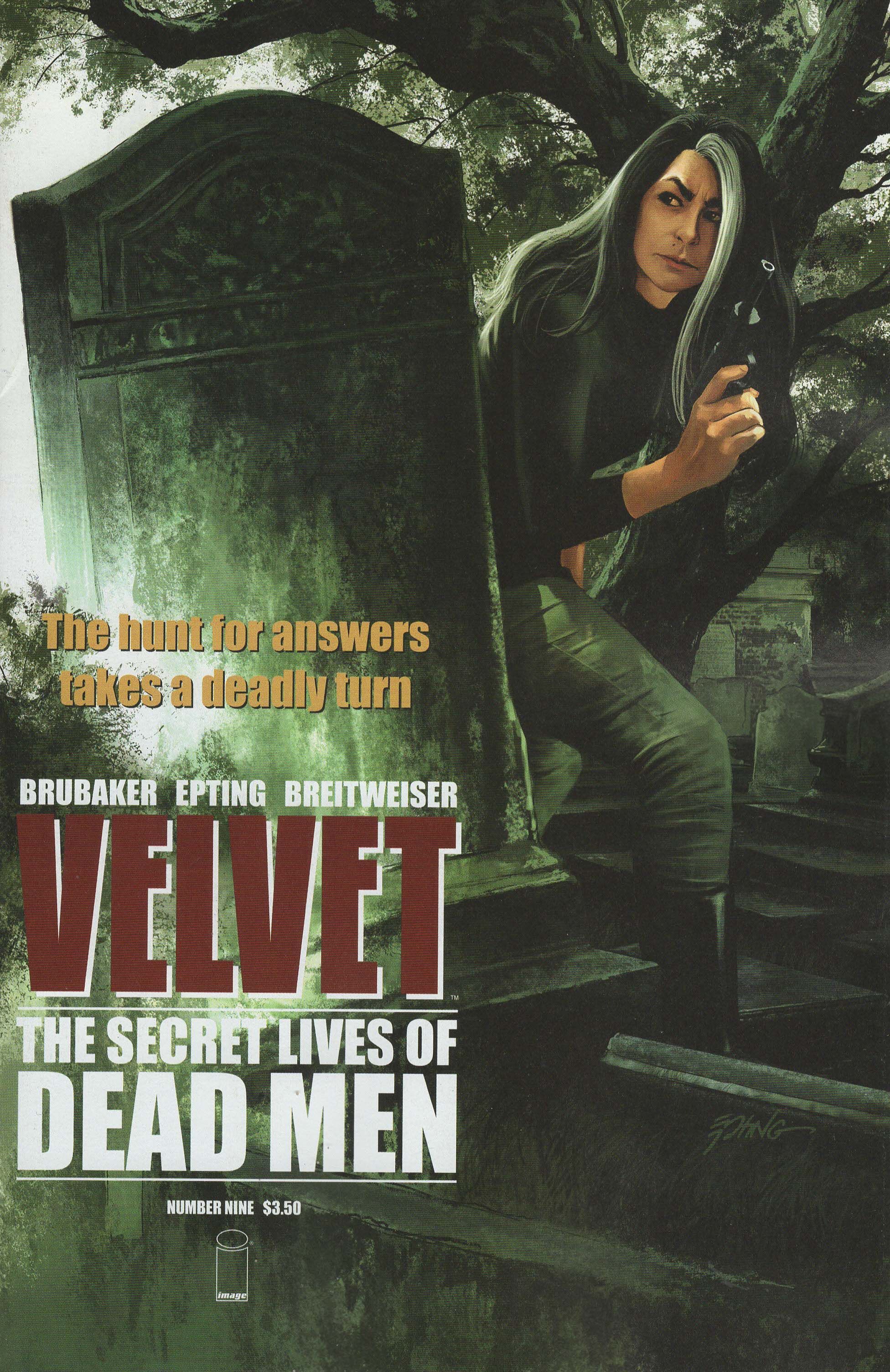
Velvet #9 ("The Secret Lives of Dead Men Part Four") by Elizabeth Breitweiser (colorist), Ed Brubaker (writer), Chris Eliopoulos (letterer), Steve Epting (artist), Drew Gill (production), and Eric Stephenson (editor). $3.50, 21 pgs, FC, Image.
Drew Gill is credited with "production" on this issue, so I assume he designed the logo. It's not the greatest logo (although it does have one interesting feature, as I'll mention below), but the third dimension does make it stand out among the credits and the name of the arc. The fact that it's placed fairly low on the page is interesting, too - I know some retailers shelve their books in staggered rows, so only the front row is fully visible, and perhaps our creators are hoping a retailer puts this in front just so people can see the title! The logo is actually in the correct place given the cover drawing - it's where there's enough dark space so that it doesn't obscure anything, while at the top, it would force Velvet, the trees, and the gravestone downward and probably shrinking them unnecessarily. I don't mind where the logo is placed, I just wonder if it's the smartest thing to do. At my shop, the books are laid out on a table, so everyone can see the entire cover, but I know that's not always the case. The name of the book is incredibly sensual, as "velvet" is just a sexy word, and Gill gets to use deep "V"s, which are very sexual letters. So that's nice.
I didn't like this issue of Velvet as much as the others for one reason: the stupidity of the main character. So Velvet tracks down a man who's been in an insane asylum for 14 years, so she's pretty sure he's not setting her up. Damian was once the head of the Intelligence Division, but his station in Paris got hit by the KGB and he was the only survivor, which supposedly put him off his tree. Velvet even doubts the official report, and then Damian tells her what really happened, as he dug into a conglomerate (remember kids - in fiction, big business is evil 99% of the time!) that seemed to be working with the spies, which prompted them to come in and kill everyone Damian was working with, even though he managed to escape. According to Damian, he wasn't killed because he knew what one of the bad guys in the shadows looked like, and if he died, that would become public. So they threw him in an asylum. That's fine and all, but it's obvious he's not insane, yet Velvet lets him go to the bathroom by himself when they're on the train to Paris. Seriously? The moment he stood up and said he had to go to the bathroom, everyone reading this comic knew he was going out the window. So unless Brubaker reveals at the beginning of the next issue that Velvet knew he was going out the window all along (unlikely, as she seems genuinely surprised when she finds the "loo" empty), the only conclusion we can come to is that she's an idiot. I mean, come on, Velvet!
Other than that (granted, it's a fairly crucial plot point), the issue is fine. We get a sense of the plot, we get gorgeous art from Epting and Breitweiser (seriously, she's killing it on colors on this comic), and everything is humming. And then Velvet decides to become an idiot. So sad!
Rating: ★ ★ ★ ★ ★ ★ ☆ ☆ ☆ ☆
One totally Airwolf panel:
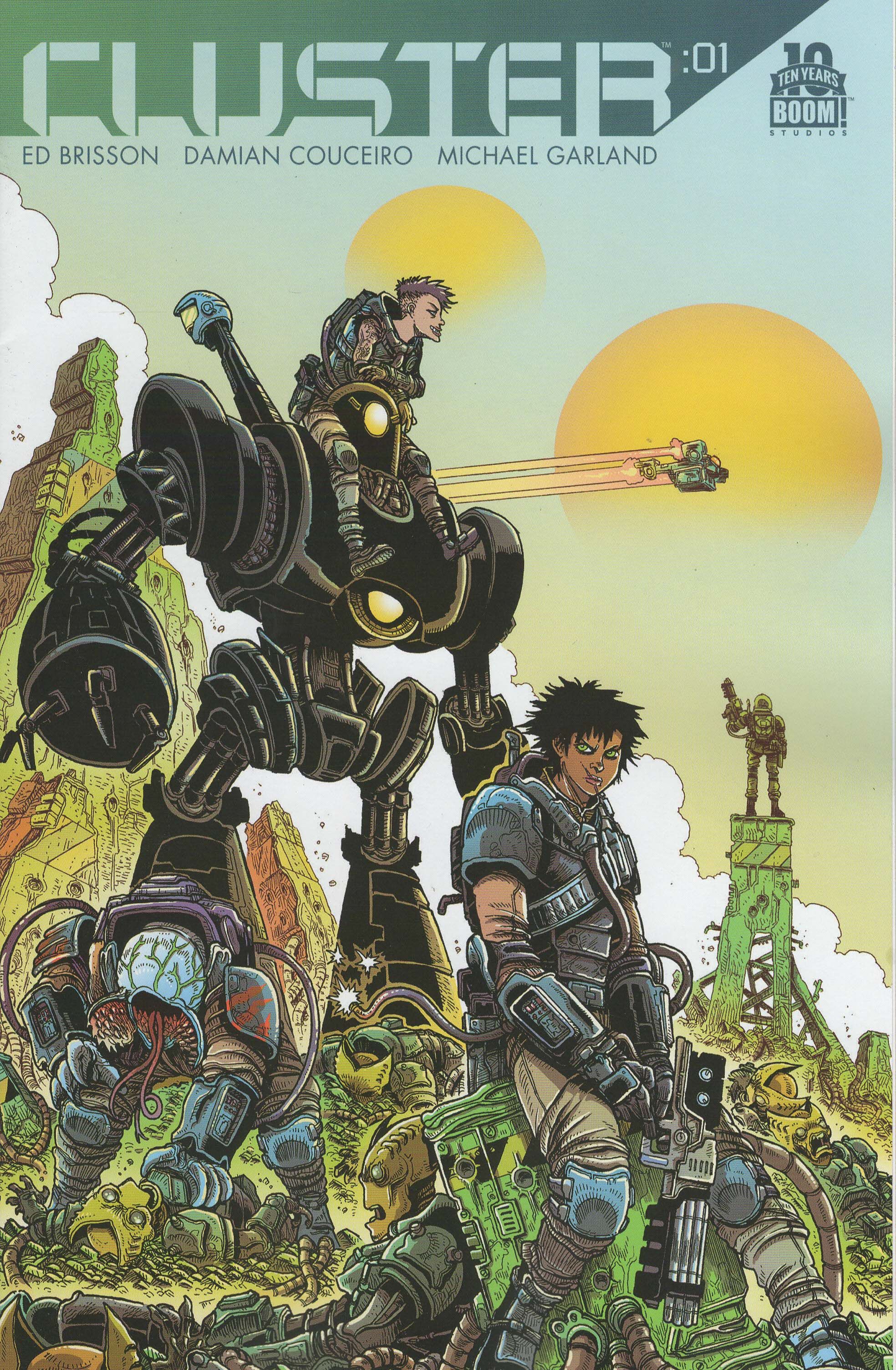
Cluster #1 by Ed Brisson (writer/letterer), Damian Couceiro (artist), Kelsey Dietrich (designer), Michael Garland (colorist), Cameron Chittock (assistant editor), and Eric Harburn (editor). $3.99, 22 pgs, FC, Boom! Studios.
We saw military-style lettering on G.I. Joe above, and we see a bit of something similar with Cluster, as Dietrich (again, I assume) gives us shapes that form letters, with gaps at the joins, which gives us that stencil feel, but the more rounded letters evokes not only a military but the future. This is lettering we wouldn't be surprised to find in any sci-fi movie of the past 50 years. It's in the upper left, which is where our eye tends to fall when we first look at a piece of paper, and it's sectioned off from the drawing, which is not bad idea considering it's that gorgeous Stokoe cover. The issue number is a neat idea, too, with the time format rather than just a number, which ties into the countdown aspect of the actual plot. The numbering aside, the title font isn't the most original thing in the world, but it certainly works.
I was thinking about waiting for the trade for Boom!'s books these days, but they seem committed to four-issue trades that are only a dollar cheaper than buying the single issues, so there doesn't seem too much of an incentive to wait. This is just a four-issue mini-series, so at least it will tell a complete story, but I thought about waiting and just decided against it. It took far too long for the first trade of Lumberjanes to come out, for instance, so who knows if this will be collected before the end of the year, even. And I've liked what I've read of Brisson's work, even if he tends to be really bleak. This isn't as bleak as his Murder Book comics, but not everyone will get out alive, so there's that.
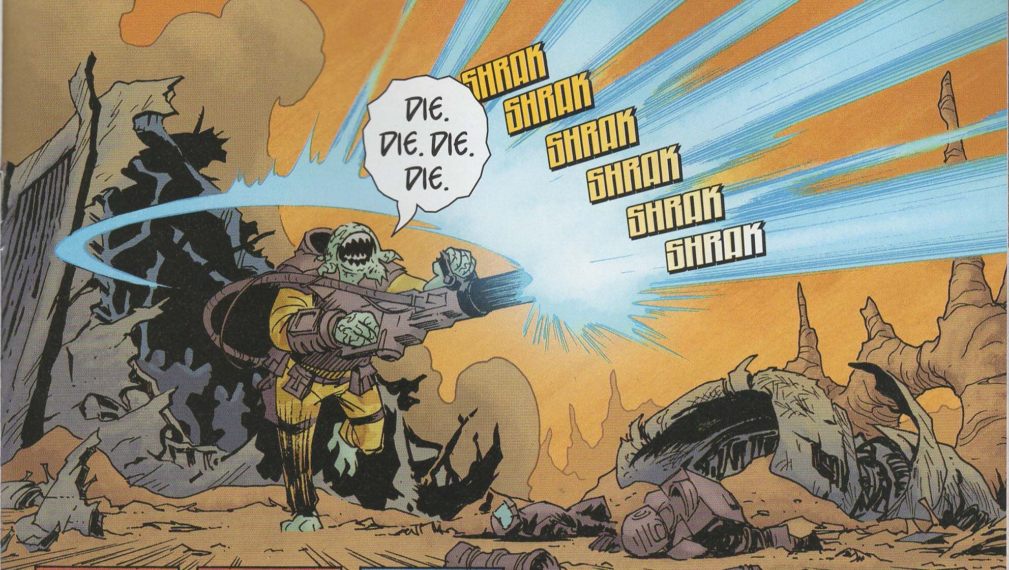
The set-up is fairly simple: on a distant planet, humans are trying to terraform the landscape, but they keep getting thwarted by ugly lizard aliens. So a prison has been set up on the planet, and prisoners are used as soldiers to fight the aliens. A young lady named Samara, who was in a car accident that was apparently her fault and apparently led to someone's death, is sent to the prison. Her father is an important politician and could have gotten her out of the sentence, but Samara insisted upon it, as she's apparently burdened with guilt. The prisoners are implanted with a bomb in their chests, and if they're away from the prison for more than 24 hours, it goes off. So they're sent on a mission that immediately goes FUBAR, and they have only a day to get back to the base. Lo, behold the set-up!
Brisson runs through a whole bunch of clichés, but my relationship with clichés is complicated, to say the least. With some works of fiction, they bother the heck out of me, and in others, they don't. I can't really explain it. As I noted above, so much of popular culture has to rely on clichés to a certain degree, and occasionally it works better than others. Samara is a typical guilt-ridden hero who believes she deserves her punishment, while the other prisoners fall into slots fairly easily. The idea of a prison on another planet isn't new, nor is using prisoners to fight wars, nor is implanting them with explosive devices, nor is the entire race-against-time aspect of the series. No one has much of a personality yet - Samara is sullen, Grace is a punk, Halleran is on old hard-ass - but Brisson has to get through a lot before the main plot kicks in, so it's forgivable. Brisson does give the warden an interesting speech about Samara not finding redemption by punishing herself, which is a nice touch, even if we've seen stuff like it before.
But I don't hate the book. Despite the familiar set-up, it's a good set-up, and I love a good underdog against the hostile world story, and there's an undercurrent of something else here too, as we're still not sure what Samara's crime is. Couceiro and Garland go a long way to making this a nice comic, as their work on the book is very good. Unlike the clichéd book I wrote about above, Lady Mechanika, Couceiro does an excellent job making both the characters visually interesting and a barren world like Midlothian (that's a Scottish term, by the way - it's the county in which Edinburgh is located) seem more like a real place than Lady Mechanika's city. The prison and the planet are filled with details, and Garland does nice work making Midlothian look even more like a desert with his browns and oranges. The characters are expressive and distinctive, and Couciero uses nice chunks of blacks to make the world a bit darker even when the group is outside in the harsh sunlight. He does a good job with perspective, too - the solitary cell in which Samara sits after getting in a fight is lengthened at the top, shrinking the sitting Samara even more, for instance. I'm not sure why there appears to be exactly one (1) non-human inmate, but Slaregg (see below) is designed well, which is nice. Garland changes the colors on the lines of her face when she's upset, which is neat touch.
As I noted, I think this is only a four-issue story, and the first issue, while not a titanic achievement in sequential storytelling, is an entertaining yarn. So what the heck, I'm in for the rest of it!
Rating: ★ ★ ★ ★ ★ ★ ½ ☆ ☆ ☆
One totally Airwolf panel:
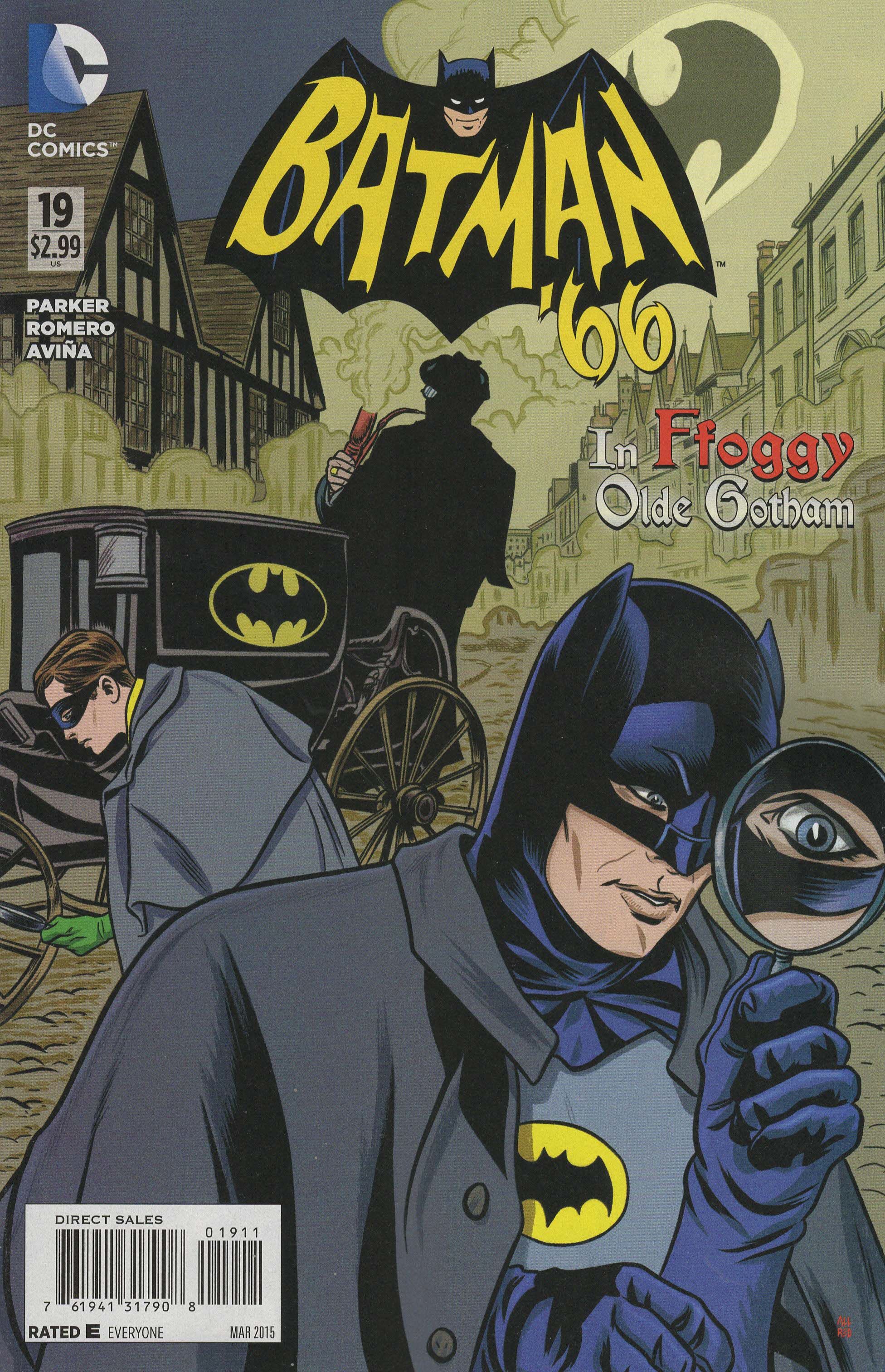
Batman '66 #19 ("The Villain of Vapor Street") by Wes Abbott (letterer), Tony Aviña (colorist), Jeff Parker (writer) Leonardo Romero (artist), and Jim Chadwick (senior editor). $2.99, 20 pgs, FC, DC. Batman created by Bill Finger and Bob Kane. Robin and Alfred Pennyworth created by Jerry Robinson, Bill Finger, and Bob Kane.
The Batman '66 logo is utterly charming, but it's basically the one used on the television show. I do wonder why the numbers are a bit more ragged than the letters, but other than that, it's awesome.
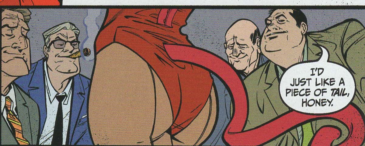
Every so often, I like to pick on editors in these posts, and weirdly enough, it seems editors are more thin-skinned than a lot of creators. If I trash an issue, rarely does a creator bother to show up and bash me, because they either didn't see the bad review (which is probable) or they realize that there are different strokes for different folks, and such is life. But editors really get a bug up their butts if I point out something idiotic, and I wonder why. Is it because when they don't do their job, it's an empirical, objective matter, but if the writer or artist doesn't do their job (entertaining ME!), it's much more subjective? Beats me, but someone didn't do their job in this issue. In the first chapter, our villain is called Marmaduke Ffogg, which is correct. In the second chapter, Batman calls him Phineas Ffogg, which is incorrect. "Phineas" is a better name than "Marmaduke," but that's not the point. So first of all, Parker screwed up. It happens. Phileas Fogg, of course, went around the world in a breezy 80 days, and "Ffogg" is close enough to "Fogg" and "Phileas" is close enough to "Phineas," so perhaps Parker just had a brain cramp. Or maybe he was watching the latest excellent episode of Phineas and Ferb (one with Vanessa in it, because Vanessa is awesome) and absent-mindedly wrote "Phineas." Okay, so that's a mistake. Then letterer Wes Abbott gets his mitts on the pages. When Ffogg first shows up, Abbott uses a beautiful gothic font, black with an orange trim. It's really neat. If he took that much time with "Marmaduke," you think he'd remember that that's Ffogg's first name. But he letters "Phineas" without hesitation - perhaps he too was mesmerized by the cartoon, perhaps the episode where Doctor Doofenshmirtz raps at a junkyard rave. But fine. Then the book, presumably, goes to editor Chadwick, as he's the only editor listed. He, too, completely misses the boner. Everyone makes mistakes, of course, and it's such a minor thing that I can certainly be accused of nitpicking. But this is just another symptom of what seems to be a lackadaisical attitude toward a product. I tend to give creative types a bit of a pass here, although it's still Parker's initial mistake. Parker's first job is to tell a story, and he does a nice job with Ffogg, Penelope Peasoup, and the disturbingly sexy ladies of the Gotham Girls' Academy, one of whom is Ffogg's daughter, Prudence. It's a typically charming story, with Batman and Robin's chivalric attitude about hitting women turning into a major plot point. Abbott's job is to letter Parker's script, and if Parker wants to change Ffogg's name in the middle of the story, who the hell is Abbott to say otherwise? But the editor's first job is to make sure that the script makes sense and everything is spelled right and that the villain has the same first name in both chapters of the story. I mean, really.
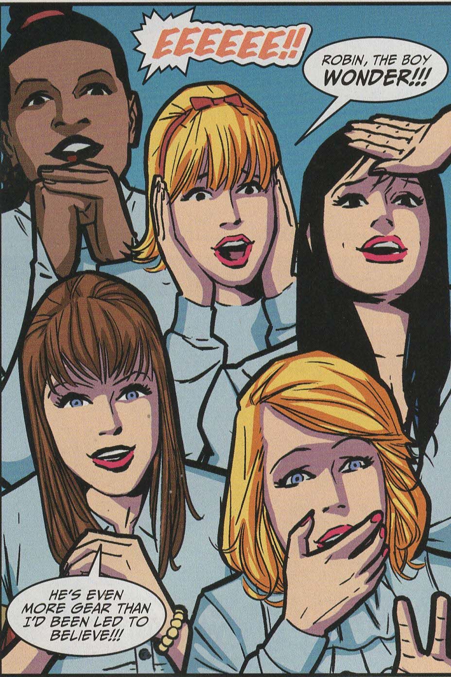
Still, it's a fun issue of Batman '66. Romero does a good job with the likenesses of Bruce, Dick, and Alfred, his Penelope is much hotter than Glynis Johns was on the show (although when she was younger ... damn, the girl could bring it ... and Johns is 91 these days, so good for her!). And Romero does well with the swooning girls whenever they see Robin. So yes, it's a typically good issue of the series. Maybe "Phineas" is Ffogg's middle name?
Rating: ★ ★ ★ ★ ★ ★ ★ ☆ ☆ ☆
One totally Airwolf panel:
The Sixth Gun: Days of the Dead #5 (of 5) by Cullen Bunn (writer), Bill Crabtree (colorist), Crank! (letterer), Brian Hurtt (writer), Mike Norton (artist), Brian Stokes (layout assistant), Keith Wood (designer), and Charlie Chu (editor). $3.99, 22 pgs, Oni Press.
The Sixth Gun has always had this kind of design, with the title in the center, the large "6" behind it, and the bands splitting the cover into two very distinct sections. Very often it's been used to show two completely different images from the inside, and while it's an interesting device, it does hinder the presentation when Brian Hurtt wants to use a larger, dramatic, singular drawing, because the logo splits it and lessens the impact. Still, it's an interesting conceit. The block lettering is no-nonsense, while the black splatter behind the title always invokes blood, but also some kind of evil stain tainting everything it touches. As usual, I don't know if, when shelved, people can see the title of the book, but the placement of the logo and the "6" always makes it eye-catching.
I certainly don't begrudge Cullen Bunn and Brian Hurtt from squeezing more juice out of The Sixth Gun, as it's a very good series and they're two fine gentlemen, but the spin-off series have been really for hardcore fans only. This series, for instance, simply shows why Jesup Sutter hates Drake Sinclair, which could have been easily explained in about three sentences in the regular series. The belief that every minor plot point in comics needs a mini-series is not limited to the Big Two, it seems, and I bought into it, so I'm not going to complain too much. It's just that this mini-series is wildly inessential, although it's an interesting story and Norton's art is always solid. If you're interested in the main series and you haven't gotten into it yet, stick to that. If you really love the series and need to know all the minutiae, heck, this is a perfectly good story. You know, ancient evil, creepy monsters, blood feuds - all the stuff you love!
Rating: ★ ★ ★ ★ ★ ★ ☆ ☆ ☆ ☆
One totally Airwolf panel:
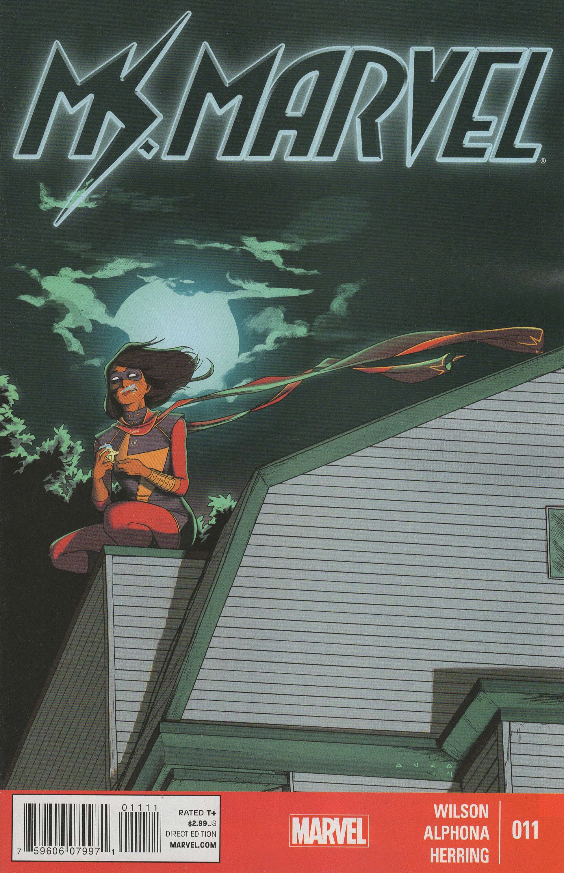
Ms. Marvel #11 ("Generation Why Part Four of Four") by Adrian Alphona (artist), Joe Caramagna (letterer), Ian Herring (colorist), G. Willow Wilson (writer), Devin Lewis (assistant editor), and Sana Amanat (editor). $2.99, 20 pgs, FC, Marvel. Kamala Khan created by Sana Amanat, G. Willow Wilson, and Adrian Alphona. Lockjaw created by Stan and Jack Kirby.
Kris Anka draws the covers for this book, but I'm not sure if he designed the logo. It's a good logo - it's sleek and streamlined, with the tilt to the right implying fast motion in that direction, which fits with the youthful tone of the book. The neon fringe is also quite neat, giving the logo a nice glow. Even the shape of the "a" and the "r" - with the rounded tops that seem to meld together - help create the feeling of fast motion. The "s," of course, evokes the lightning bolt that was once part of Carol Danvers's costume and is now part of Kamala's, so there's nice continuity there. It's a strong, exciting logo, so well done, anonymous designer (unless it's Anka's design, in which case, well done, sir!)!
I'm not as enamored with Ms. Marvel as many other people are, but it's a fine comic book. Wilson (who is, after all, 32) tries hard to write a good teenager, and for the most part, Kamala does "sound" like a teenager, although she is a bit mature for her age. Wilson's big plot with the Inventor sort-of comes to an end in this issue (there's a dangling plot thread that will certainly come back around), and while it's gone on a bit too long, Wilson managed to keep it fairly lively. Kamala uses her brains, isn't afraid to call the cops (or at least alert someone who can call the cops), and the Inventor is both goofy and menacing, which is a nice trick in a superhero comic. I'm not sure why I don't love the book more - the characters are interesting, Wilson doesn't let the superheroing overwhelm the "real-life" stuff, and the viewpoint of the characters and even the setting (Jersey City isn't too much different than New York, but it's something) are unusual. I admire the comic, but don't swoon over it. It happens. It's possible that it's a bit too earnest - Kamala's speech about her generation not being a bunch of "phone-wielding losers" made my teeth ache a little, because it's such a straw man argument. Guess what, Kamala? Old people always think the younger generation is lazy. The Baby Boomers thought my generation was lazy, and now we're old and think teenagers are a bunch of losers. I get that I'm probably not the perfect audience for this book and that any teenagers who read this might feel empowered by Kamala's "you go, teens!" speech, but it still feels stilted. The book often feels that way, as the characters say things that make the book sound a bit too "afterschool special," and it undermines the rest of the very good work going on. But that might just be me.
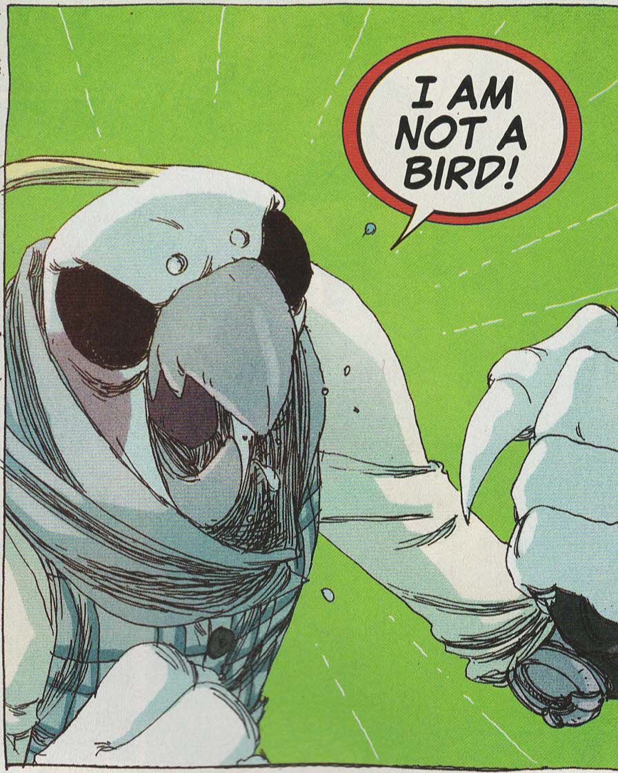
Alphona is a big reason for the book's success, and he does some nice work on this issue. His work is cartoony, of course, but he still manages to ground the book in realistic settings, so it's always clear where the action takes place. His characters are distinctive and unique, and the cartoony nature of his work allows him to draw a giant bird as the villain and not make it look too ridiculous. I don't know if he or Wilson places some of the visual humor in the book, but I certainly would like to learn how to dropkick a bison in three easy steps. Plus, he's inventive with sound effects - when we get to the big climax, the three-dimensional effect is part of the scene, as the letters crack and splinter just like the Inventor's machine. It's a cool device. Alphona is a perfect fit for the tone Wilson is going for, and it makes the book much more fun than it might otherwise be.
It's nice that the book is enjoying success, and I wish it well. It's the kind of comic I don't eagerly look forward to, but I never regret buying it. Of course, knowing Marvel, they'll increase the price to 4 dollars and I'll drop it (I'm pretty sure it's the last $2.99 book they publish), but that's just the way it is, isn't it?
Rating: ★ ★ ★ ★ ★ ★ ★ ½ ☆ ☆
One totally Airwolf panel:
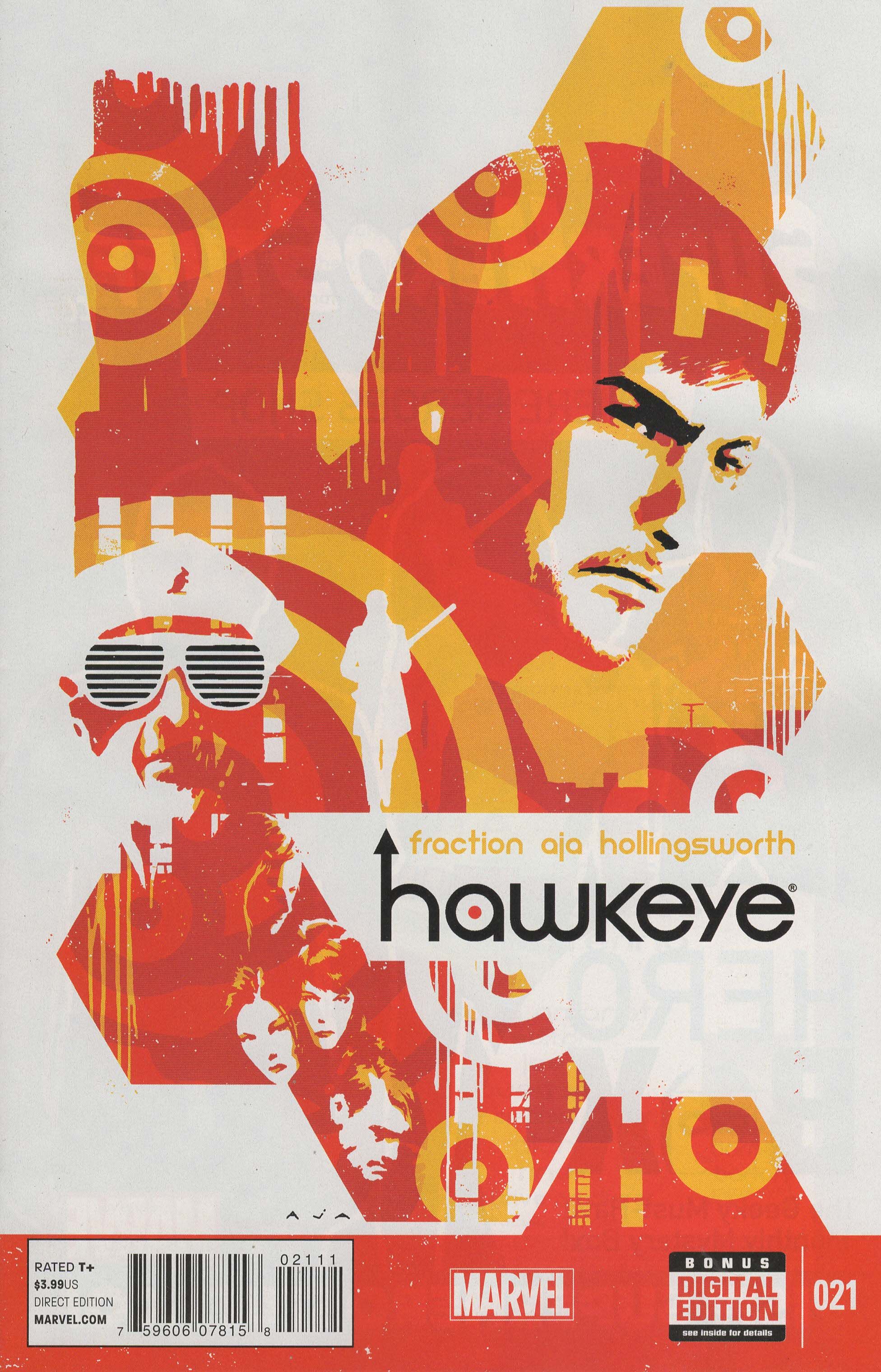
Hawkeye #21 ("Rio Bravo") by David Aja (artist), Raúl Allen (art assistant?), Chris Eliopoulos (letterer), Matt Fraction (writer), Matt Hollingsworth (colorist), Devin Lewis (assistant editor), and Sana Amanat (editor). $3.99, 20 pgs, FC, Marvel. Hawkeye created by Stan Lee and Don Heck. Barney Barton created by Roy Thomas and Gene Colan.
Yet another book where the logo floats on the cover, and this time we get it slightly lower than halfway down the page, but David Aja's amazing covers integrate the logo well. The arrowed "h" has always been nifty, and the red dot in the middle of the "a" evokes a target. The combination of capital and lower-case letters is also neat, and the decision to keep the "y" above the foundation line was a good one, as it adds uniformity to the lettering. This has always been a good logo, and that hasn't changed!
"Rio Bravo" is the penultimate issue of the series (well, this iteration of it), and that means it's the penultimate issue of Fraction's interminable story arc. I've never loved Hawkeye as much as the masses (hey, it's a trend!), but some of the issues have been absolutely brilliant. Aja's artwork is staggering, and as he does so often, in this issue he uses wonderful silhouettes for striking effect as Clint and the tenants prepare to defend themselves against the bad guys. Aja uses a lot of panels on each page to create a wonderful sense of claustrophobia, and when Clint gets ambushed and beaten, he switches to an even more ragged line, drops in completely black panels that indicate Clint moving in and out of consciousness, and Hollingsworth changes the palette to shades of reddish-brown, as the book descends into violence and tragedy. It's a beautiful book, and it almost justifies the tremendous gap between publication dates.
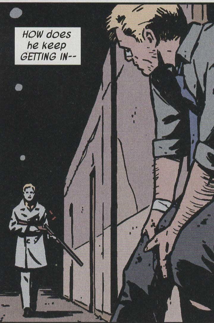
Fraction's story continues to drag the book down a bit, though. There's nothing wrong with the plot, but stretching it out over so many issues (it's basically the only plot Clint has been involved in throughout the entire series, and only a handful of issues - the ones in Los Angeles with Kate - have deviated from it) is trying my patience. It's not even that Fraction has offered us great insights into Clint's human condition or delved into the meaning of existence or any grand philosophical questions - he's just run in place so Aja can design marvelous works of art that might show the world in a slightly different light (the Pizza Dog issue, the deaf issue) but advance the plot not one iota. Finally, in this issue, shit hits the fan, but it's almost too late. Fraction has really pissed away a lot of goodwill on this book, which is too bad because parts of it are still very gripping. I don't think the death of the end of this earns much emotion simply because, like Gil, Fraction never spent enough time making the characters real, but he still gets to it in a compelling way and the actual structure of the death is well done. It's too bad that the book slowed to a crawl, both literally and figuratively, because it has come very close to absolute greatness, but even reading it all at once (so the breaks between issues don't exist) might not mitigate the flaws in the plot. We shall see.
Rating: ★ ★ ★ ★ ★ ★ ½ ☆ ☆ ☆
One totally Airwolf panel:
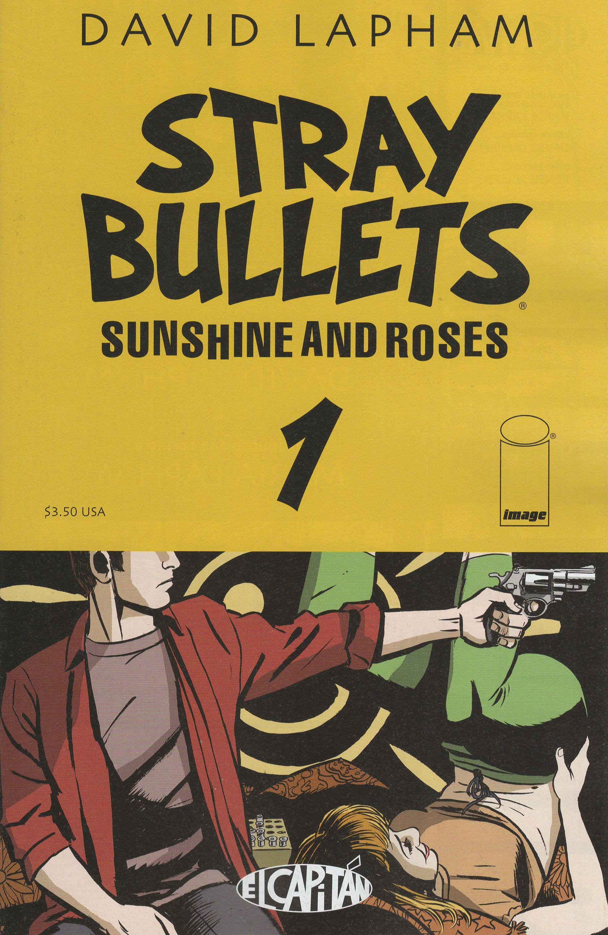
Stray Bullets: Sunshine and Roses #1 ("Kretchmeyer") by David Lapham (writer/artist) and Maria Lapham (editor). $3.50, 28 pgs, BW, Image.
Stray Bullets has used the same font forever, and it obviously works for Lapham. The slight Comic Sans feel of the lettering actually helps give it a slightly chaotic feel, which fits the general tone of the comic, while the subtitle is more staid but the off-register nature of some of the letters give it a typewritten feel to it, which fits the old-school vibe of the comic. The letters of the title almost look like they're crashing into each other, which I suppose is the point.
This is the fiftieth issue of Stray Bullets, but I suppose Lapham would rather do these "series of mini-series" so he can take breaks between each arc and also to emphasize that you don't necessarily need to read the previous 49 issues to get into this one. I mean, it certainly helps to know who Scott and Beth are (Beth especially, as she's so delightfully deluded), but it's not completely necessary. I mean, Monster earns his nickname in this issue, so you're not left wondering why people call him that. Lapham goes back to 1979 to tell this story, so it's before Beth really became "Beth," although there are plenty of indications in this issue that she's close to the edge. As usual with any random issue of the series, we get really nice dialogue punctuated by moments of horrific violence and all the characters slowly circling around each other as things get worse and worse. It's uncanny how Lapham can do this so often (I mean, every issue of Stray Bullets is kind of like this one) but still keep things fresh. But he does!
(I should point out here that if you haven't yet dived into the series, you should, but skip the "Über Alles" edition that collects the first 41 issues. The binding is terrible, and because the book is so huge, you really have to be careful opening it too wide, which makes it delicate to read. Image is releasing each arc in new trades, and you should get those. I wish I had waited, because I'm scared to open my "Über Alles" edition now.)
Rating: ★ ★ ★ ★ ★ ★ ★ ★ ☆ ☆
One totally Airwolf panel:
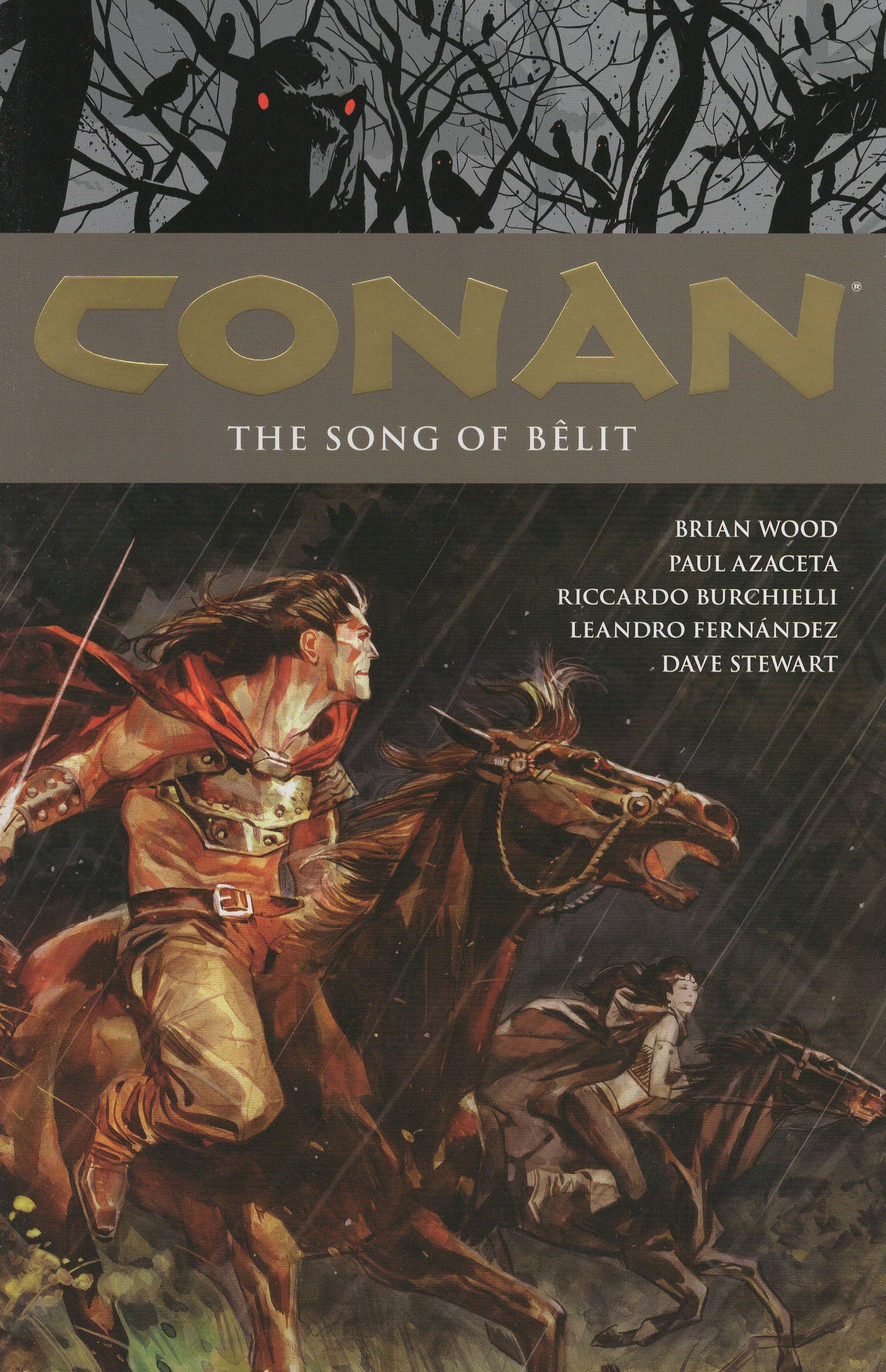
Conan volume 16: The Song of Bêlit by Paul Azaceta (artist), Jimmy Betancourt (letterer), Riccardo Burchielli (artist), Leandro Fernández (artist), Kat Larson (designer), Richard Starkings (letterer), Dave Stewart (colorist), Brian Wood (writer), Roxy Polk (assistant editor), Ian Tucker (assistant editor), Aaron Walker (assistant editor), and Dave Marshall (editor). $19.99, 154 pgs, FC, Dark Horse. Conan created by Robert E. Howard.
Wood's Conan run wraps up, and I'm sure it will all end happily for all concerned.
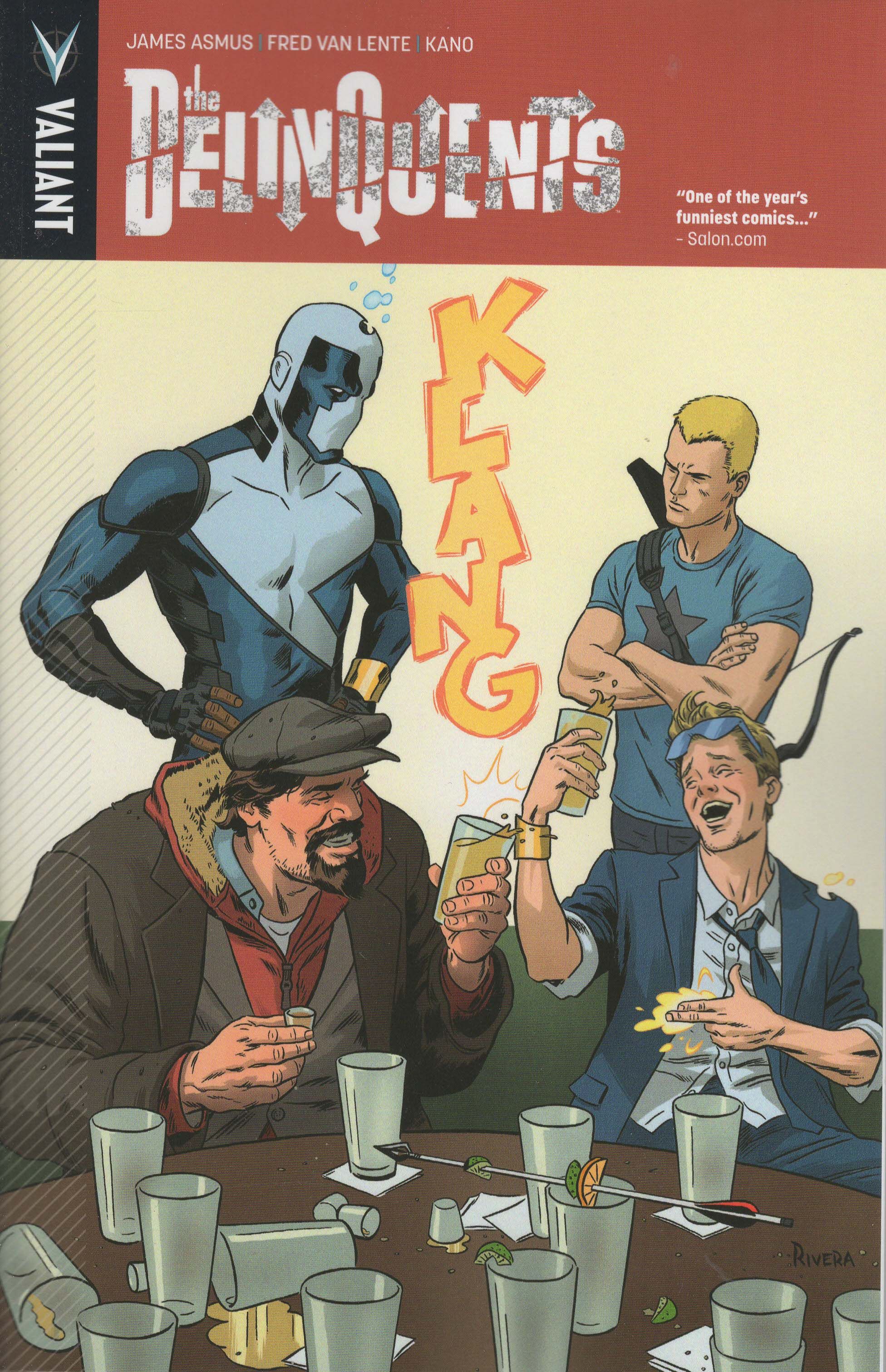
The Delinquents by James Asmus (story/writer), Kano (artist), Dave Sharpe (letterer), Fred van Lente (story), and Josh Johns (editor). $14.99, 102 pgs, FC, Valiant. Quantum and Woody created by Christopher Priest and Mark Bright. Archer and Armstrong created by Jim Shooter, Bob Layton, and Barry Windsor-Smith.
I was keeping up with two Valiant titles, and both got cancelled. I'm glad they teamed up, but unless something happens, I'll be easing back on Valiant books for a while. We'll see.
Gantz volume 34 by Hiroya Oku (writer/artist). $13.99, 209 pgs, BW, Dark Horse.
I'm a few volumes behind on my Gantz reading. Luckily, they take about five minutes to read, so I'll catch up quickly!
**********
All right, so I'm back. I hope to be able to post these on Friday or even Thursday, but this week was a bit big (17 issues!) and the reason I stopped doing this in the first place hasn't changed - I still do have a lot more real-world commitments than I used to have, so I just don't have as much time to do this. But I do miss it, and so I'm going to start up again. You might notice that these aren't in alphabetical order. I always felt like I was giving some of the comics at the end of the alphabet short shrift because I just wanted to get done. Maybe it didn't read that way (that's for you guys to decide), but it felt that way to me, and I don't want to do that. So now I'm just going to put the books down somewhere and pick them up in random order and review them that way. Maybe it will lessen that feeling I have, maybe it won't. I don't know if it really matters, but I'll try it.
One thing I missed is writing about real-world stuff, because that's always fun to discuss. I'll have to write about my lovely daughters in future posts, but they're doing fine (in case anyone was wondering). I did happen to notice that there was a big football game between a bunch of punks and a bunch of cheaters - boy, the rooting interests in that game must have been morally wacky! I loved the weather during the week before the game, because it was one of the crappier weeks we've had in Arizona in a while. It rained on several days, for quite a while (we often get downpours that last ten minutes, and then it's beautiful for the rest of the day), and last Sunday, we had more fog than I've ever seen in Phoenix, and I've lived here for 13 (loooooonnnggggg) years. I had to drive past the stadium on Sunday morning, and it's probably a quarter mile from the freeway, and I couldn't see it at all. I could barely see the parking lot, which comes up almost to the road. It was kind of weird. The fog had burned off by the afternoon and the weather during the game was perfect (although I'm sure the roof was closed, because why would you open a roof in Arizona in February, the only time of the year that would make sense?), but I was happy that it was so terrible while everyone was trying to party. Of course, the place to be was the Waffle House, because if there's something that you can find in Phoenix, it's motherfucking waffles!!!! (And in case you didn't get enough of Chrissy Teigen from that photo, damn).
I watched about five minutes of the game (I'm mystified by people who don't care about either of the teams watching the Super Bowl - I get the social aspect of it, but once the Eagles were eliminated from playoff contention, I lost interest in football), but I guess there was quite the halftime show. As this is the Internet, it spawned some thinkpieces, such as this one by Danger Guerrero, who remains probably the funniest writer on yonder world wide web. Meanwhile, Left Shark became a national hero, spawning some nice memes, committing to Boise State, and giving us gifs like this:
Oh, Left Shark. You're awesome:
I feel like doing a Top Ten List, so let's check out the Top Ten Marillion songs, pre-1989! This is because their first lead singer left in 1988, and their first album with their new singer came out in 1989, and the band's sound changed somewhat. It's kind of unfair to compare the two eras, so I'll probably do a post-1989 list at some point, but let's just start with this, shall we?
10. "Grendel" (1982) - This is one of the earliest Marillion songs, and it's a 17-minute doozy in which we get the point of the view of Beowulf's monster as he stalks the hypocrites who "kill [their] own and feel no shame." It's a dark, dangerous song, full of terrifically violent lyrics, and it showed off the lyrical magic of lead singer Derek Dick (otherwise known as Fish) as he wove this epic. When he takes on the persona, the lyrics really get excellent: "So you say you believe in all of Mother Nature's laws / You lust for gold with your sharpened knives / Oh when your hoards are gathered and your enemies left to rot / You pray with your bloodstained hands at the feet of your pagan gods." The music keeps pace, speeding up and slowing down to fit the tone of the lyrics, and we build to a climax where Fish screams his condemnation, Grendel takes his revenge, and the music pulses along with a creepy syncopated beat. Whenever a song clocks in longer than 10 minutes, the fear is that it will feel like it, but this song speeds along beautifully. Here are the lyrics.
9. "Slàinte Mhath" (1987) - The final Fish Marillion album shows the tension within the group - Fish wanted to become, it seems, more of a torch singer, but he also didn't want to be too sentimental, while the band seemed perfectly happy pushing the envelope, musically, even as their lyricist couldn't decide. "Slàinte Mhath" (the term is a toast in Gaelic meaning "good health") is a good indication of this tension, as Fish sings about long-lost things, life's sadness, the inevitability of death, and the circular nature of history, but all couched in a meeting in a bar, where he loves to set songs. Meanwhile, the music on this album is probably the most "commercial" on all of the band's first four albums, and the beautiful piano that begins the song and the major power chords throughout signal that this is an "accessible" song even as Fish does wander into some darkness. The band could always wring emotion out of situations, and they do it very nicely here. Here are the lyrics.
8. "Incubus" (1984) - Fugazi is Fish-era Marillion's most problematic album, because it's the one where Fish's opaque lyrics occasionally threaten to overwhelm everything. It doesn't make the album bad, just more of a struggle than the others. It does contain my favorite song by the band, so there's that, plus "Incubus," an extended metaphor about broken lovers in which Fish plays a director who turned his ingénue into a star but then watches as she outshines him and tries to forget he ever existed. Fish, like he does often, writes "pathetic" well, and the shift to where the girl tries to forget him is gripping: "You who I directed with lovers will / You who I let hypnotise the lens / You who I let bathe in the spotlights glare / You who wiped me from your memory like a greasepaint mask ... just like a greasepaint mask." As with many early Marillion songs, the music shifts gears often, but Steve Rothery's guitar is particularly compelling in this song, and he holds everything together nicely. Here are the lyrics.
7. "He Knows You Know" (1983) - This is a song about drug addiction, and of course it features long, lyrical phrases that almost obscure the meaning, but still paint a terrifying portrait of the subject matter. It might be the most standard "rock" song of early Marillion, as we get Rothery's eerie guitars, Mick Pointer's crisp drums, Pete Trewavas's throbbing bass, and Mark Kelly's ethereal keyboard driving the beat forward as Fish dives deeper into madness. The slightly shorter single version comes with this amazing video, which could not be more "1983" if it tried. Dang, it's awesome. Here are the lyrics.
6. "Kayleigh" (1985) - Misplaced Childhood, Marillion's third album, is my favorite of all time and the only one I would consider "perfect," as I wouldn't change a thing about it. That being said, it's a concept album, so the songs don't stand out as much as on some other albums, because they all relate to each other. Of course, if you've ever heard of Marillion, the chances are it's because of this song, and it really is terrific. Fish found the perfect mix of yearning, memory, regret, and images in the lyrics, ending with that great couplet "Maybe it'll prove that we were right, or it'll prove that I was wrong," and it has a cool, sentimental guitar solo. It's a really beautiful love song, despite its sadness. Here are the lyrics.
5. "Cinderella Search" (1984) - Once again, Fish goes a bit too abstract in the lyrics, although the name of the song gives away the theme. Still, the first part of the song is a nice ode to searching for love, but then the tone shifts, with a piano coming in to signal a change to a more tragic mood, as Fish rails against a lover who won't commit fully to the relationship. The music speeds up, Rothery's guitar chugs along, and we get a great lyric: "And was that love in your eye I saw, or a reflection of mine?" Even when Fish is being opaque, he comes up with some terrific images. Here are the lyrics.
4. "Forgotten Sons" (1983) - This is a powerful anti-war song, as the band drives through the verses, with Rothery providing some excellent guitar work in the middle before the music becomes more expansive as Fish becomes a bit more personal toward the end. The middle is a bit goofy, as Fish epitomizes Death for a verse, but he was probably 24 when he wrote it, so we can forgive some of his quirkier flourishes. As usual with Fish's lyrics, he brings it home with a great couplet: "On the news a nation mourns you, unknown soldier, count the cost / For a second you'll be famous but labeled posthumous." This might the angriest Fish is during his Marillion career, which is interesting as he writes about failed love so often. War bugs him, I guess. Here are the lyrics.
3. "Warm Wet Circles" (1987) - As a song on the final Fish album, this is going to be again a struggle between sentimentality and reality, and Fish does a beautiful job straddling that line. The lyrics are amazing: "I saw teenage girls like gaudy moths / A classroom's shabby butterflies / Flirt in the glow of stranded telephone boxes / Planning white lace weddings from smeared hearts and token proclamations / Rolled from stolen lipsticks across the razored webs of glass" is a nice sample, both brutally honest and indulgent of immature emotions, and then the song moves into even more powerful moments, as Fish links sex, violence, and the nervous anticipation of new love. This song is part of three linked tunes that begin the album, and while it's the best one, it's not by much. Fish became more sentimental when he went solo, but on this album, he does a superb job not descending into mawkishness.
2. "Childhoods End?" (1985) - The triumphant end of Misplaced Childhood (with "White Feather" providing a nice coda), as Fish has grown up over the course of the album, and he's able to embrace his own childhood but also move on from it. In a vacuum, it might not work, but coming at the end of the journey on the album, it's a wonderful epiphany. Here are the lyrics.
1. "Jigsaw" (1984) - This is my favorite Marillion song, no matter which lead singer it is, and it's one of the most wonderfully complex loss-of-love songs possibly ever. Fish's lyrics are full of wonderful images but they never become too abstract ("We are Siamese children related by the heart / Bleeding from the surgery of initial confrontation"), and the verses are wonderfully quiet, with Kelly's haunting keyboard providing a beautiful background, while the chorus is full of anguish, rage, despair, and pain, as Fish screams "Stand straight - look me in the eye and say goodbye; stand straight - we've drifted past the point of reasons why" while the music thunders in the background. Rothery's guitar solo also sounds wrenched from a place of pain deep inside him, and the modulation on the last chorus twists the knife even more. When Fish gets to the last line and speaks "You must have known that I was considering an escape," you can hear him surrender completely. It's sad but still marvelous. Here are the lyrics.
Let's take a look at the Ten Most Recent Songs On My iPod (Which Is Always On Shuffle):
1. "Many Too Many" - Genesis (1978) "You set me on a firmly laid and simple course, then removed the road"
2. "Unchained" - Van Halen (1981) "I don't ask for permission, this is my chance to fly"
3. "Broken Hearts" - Living Colour (1988) "A tear that takes forever rolls down your timeless face"
4. "The Last Mile" - Cinderella (1988) "I guess I've always been a travelin' man, 'cause when I'm movin' I can make a stand"
5. "I'll Stick Around" - Foo Fighters (1995) "How could it be I'm the only one who sees your rehearsed insanity"
6. "Blow Up The Outside World" - Soundgarden (1996) "Nothing will do me in before I do myself"
7. "Suck My Kiss" - Red Hot Chili Peppers (1991) "All I really want to be is free from a world that hurts me"
8. "I Thought You Were A Spy" - World Party (2000) "Nothing I can say can change the way I feel"
9. "Independence Day" - Elliott Smith (1998) "Everybody knows you only live a day, but it's brilliant anyway"
10. "Could We Start Again, Please?" - Yvonne Elliman and Philip Toubus (1973) "I think you've made your point now, you've even gone a bit too far to get the message home"
No, I haven't forgotten Totally Random Lyrics. I'll give you something easy this week!
"Been running so fast
Right from the starting line
No more connections
I don't need any more advice
One hand's just reaching out
And one's just hangin' on
It seems my weaknesses
Just keep going strong"
Sing along!
Well, that's it for this week. Next week I expect I'll buy fewer issues. So that should be fun! Thanks for sticking with me this far, and have a good rest of the weekend!


