Yes, I'm back doing weekly reviews. Did you miss me? I know that you did! You can't hide it!
This week, we're focusing on the art in the comics. I write way too much about the writing, and that's just not fair. So even though I lack the language for really describing art, I'm giving it a go! Join me, won't you?
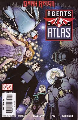
Agents of Atlas #1 by Carlo Pagulayan (penciler), Jason Paz (inker), Jana Schrimer (colorist), Jeff Parker (writer), and Nate Piekos (letterer). Back-up story by Benton Jew (artist), Elizabeth Dismang Breitweiser (colorist), Jeff Parker (writer), and Nate Piekos (letterer). $3.99, 24 pgs + 13-pg back-up story, FC, Marvel.
Parker, despite being known more for his "fun" comics than he spy stuff, is quite good at this sort of thing (it's not a spy comic per se, but it is a bit more serious than most of his recent work for the House of Ideas), so it's no surprise that in this first issue, we get a nice recap of what exactly the Agents of Atlas are doing and how they plan on fitting into Norman Osborn's New World Order. It's a charming first issue, although for all the sound and fury, not much happens. It's a well-done info dump, but an info-dump nevertheless. There are some nice scenes, of course - Man Mountain Marko's encounter in the depths of the Atlas city is nicely handled - but it feels a bit padded, like it could have been done in half the page count. I appreciate Parker integrating the introductions of the characters into a bigger story arc, but that doesn't change the fact that it's still just an introduction to the Agents of Atlas. The second story, which takes place in the late Fifties, guest-stars Logan (the only spy anyone in the Marvel U. ever had, apparently) and implies that people need to be mind-controlled to believe that anything but old-fashioned American capitalism might be a better solution to running an economy. So there's that.
I last saw Pagulayan's art on The Incredible Hulk, and it looks different here. Not necessarily better, just different. It's certainly pleasing to the eye, but it features what seems to be the new house style at Marvel: It's weirdly "realistic" in that it's not quite photo-realistic, but it definitely looks airbrushed. In the same way that Salvador Larocca is going with Invincible Iron Man, the inks are almost non-existent, and everything has something of a sheen to it. Pagulayan hasn't gone as far as Larocca with the new style, so it looks a bit better than Invincible Iron Man does, but you still get a weird, not-quite-right feeling from the art. Not that Pagulayan can't, you know, draw, as the big splash page with Lao the dragon shows, but much of the issue looks, if not computer-generated (because it's obviously not), then at least attempting to look computer-generated. Compare Pagulayan's art to Arthur Adams' cover and Benton Jew's back-up story. Adams is a master, and notice how his characters are idiosyncratic in the "Arthur Adams" style - the women look a bit younger than they are, and their legs are longer than they need to be. Jew's art is inferior to Pagulayan's, mainly because his characters are too stiff, but at least Jew has a style, and the art looks rougher - this is something that was drawn and inked, and looks like it has more substance. Based on this issue, Pagulayan would have made the insects in the back-up story far too pretty to be seen as a threat, but Jew makes them truly menacing.
I'll probably give this a few issues, because I know Parker has it in him to make the story more exciting. It's certainly a title that could breathe some fresh air into Marvel, which means, like, say, The Order, it probably won't last a year. But that doesn't mean you should ignore it, right?
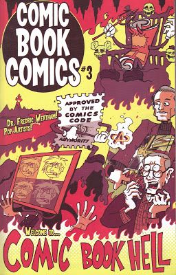
Comic Book Comics #3 by Ryan Dunlavey (artist) and Fred van Lente (writer). $3.95, 32 pgs, BW, Evil Twin Comics.
As with the first two issues, the biggest problem I have with this series is that unlike Action Philosophers!, this series feels like it drags a bit. With the philosophers, Van Lente could pack as much information into as short a space as he needed, and it moved along quickly. Here, with more space and a larger but ultimately more narrow subject, he tends to meander a bit. As a history of the medium, it's certainly interesting, but it's not as dynamically entertaining as the first comic by these two gentlemen.
Of course, because I'm focusing on artists, I'll blame the tepid pace of the comic on the writer, because Dunlavey has always been fantastic on this book. He has a truly manic style, and because a great deal of what Van Lente is describing is (somewhat) dry, the fact that Dunlavey makes this book look so great is a testimony to his mad skillz. He's great at visualizing metaphors that inform the narrative - Wonder Woman as a lesbian clutching an Indigo Girls CD, a goofy television dominating entertainment and crushing all before it, the evolution of Batman from the Scarlet Pimpernel (as a monkey) to the Shadow (as a caveman) - and making the panels seem to jump around with energy. It's interesting to compare his work to Pagulayan's - Pagulayan has as much more action to draw, yet despite his technical skills, often his work in Agents of Atlas looks static, whereas Dunlavey, who has to draw less dynamic images, nevertheless makes the characters move. Even when this book drags (and I love Van Lente as a writer, but I cannot tell a lie), Dunlavey makes it fun to look at.
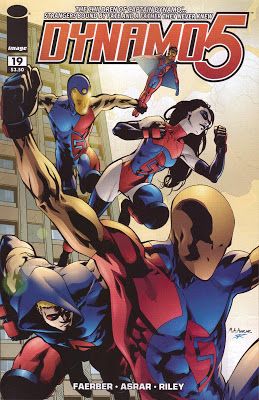
Dynamo 5 #19 by Mahmud A. Asrar (artist), Ron Riley (colorist), Jay Faerber (writer), and Charles Pritchett (letterer). Back-up story by Alexander Serra (artist), Jason Millet (colorist), Jay Faerber (writer), and Charles Pritchett (letterer). $3.50, 20 pgs + 6-pg back-up story, FC, Image.
If we simply look at this issue for what it is, it's just a big fight between superheroes and supervillains, nothing we haven't seen hundreds of times before. As usual with one of the best pure superhero books out there, however, Faerber makes sure there's more. From the first page, where we see the aftermath of the first battle and how horrible a fight between people with this kind of power would be (but not as bloodily as Invincible, which, frankly, gets a bit excessive at times) to the surprises we get throughout the book, it's much better than your average Big Two superhero slugfest. Of course, a lot of the credit goes to Asrar, drawing the hell out of this comic as usual. His fight scenes as choreographed extremely well, as his characters are wonderfully fluid and dynamic, working well within the panels to give us the maximum amount of action. As always, the characters look great - there are dozens of characters, and Asrar does a nice job keeping them unique. Asrar's sense of perspective is wonderful, too, which is necessary in a book where each panel often has deep focus on different characters on different planes. And, of course, Scrap is fantastic in every panel in which she appears. If she's not Asrar and Faerber's favorite character, I'd be shocked, because she's always so very, very awesome.
This is another fine issue from this always impressive comic, and I'm just glad Asrar doesn't seem to be going anywhere. His work on the She-Hulk one-shot wasn't as impressive as his work here, which is kind of annoying.
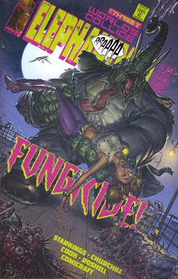
Elephantmen #15 by Ian Churchill (breakdowner), Boo Cook (finisher/colorist), and Richard Starkings (writer/letterer). Back-up story by Steve Buccellato (artist) and Richard Starkings (writer). $2.99, 24 pgs + 8-pg back-up story, FC, Image.
As I always do, I have to thank Richard Starkings for sending this to me. I always enjoy it! This issue is the final part of the "virus-from-space" arc, and just like the last issue, it seems like Starkings is speeding things up a bit, as we get quite of bit of action, from the end of the threat on the beach to the aftermath in the hospital, when Serengheti shows up to kill himself some elephantmen, starting with his daughter Sahara's consort, Obadiah Horn. Plus, there's a cute short story with the origin of Vanity Case, Hip Flask's sidekick.
Ian Churchill and Boo Cook, who have taken over the art chores from Moritat, do a nice job. Churchill's art has evolved nicely from his brief stint on Uncanny X-Men, which was really ugly. He has softened his angles and beefed up his characters, so that we get a voluptuous and gorgeous Sahara on page 1 and some amazing hybrids, more monstrous than Moritat's versions. Whereas Moritat made most of the elephantmen (with the exception of Obadiah, naturally) somewhat shabby (at least those in the present), Churchill makes them a bit more dangerous, even someone like Hip Flask, who's often a bit goofier than the others. Churchill and Cook are slightly grittier than Moritat, which works in some scenes and doesn't in others, but they've done a nice job taking up the reins for their brief run. Buccellato, who draws the Vanity story, has a manga-influenced look that fits well with the sensibility of the comic. I always get the feeling that this is more of a non-American kind of comic (whether it's European or Japanese or some kind of amalgam, I can't say), and Buccellato reflects that.
Wow, another good issue of Elephantmen. It's astonishing!
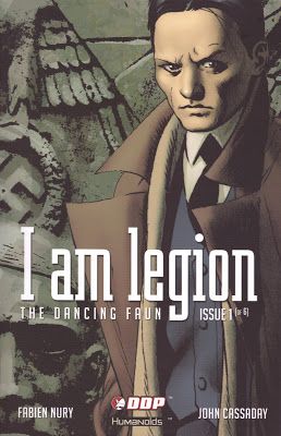
I Am Legion #1 (of 6) by John Cassaday (artist), Laura Martin (colorist), Fabien Nury (writer), Justin Kelly (translator), and Crank! (letterer). $3.50, 22 pgs, FC, Devil's Due.
This comic is five years old, so I guess it's not really that impressive to review it, but it's nice to see it finally getting an American release, so long after DC dumped Humanoids and never finished it. Devil's Due has decided to release it as six standard comics rather than a big-sized book with heavier stock like DC did (only one of which came out), but that's okay (and the paper is still heavier than your usual comic). This issue sets the story up, with Nazis, evil dudes transferring their consciousness into other bodies, a young girl with weird powers, resistance fighters, and vampires. Okay, not exactly vampires, but "strigoi." I missed the strigoi reference when I read this the first time, even though I know what's going to happen in issue #2 (beyond that, of course, I'm in the dark). It's a fine read, in other words.
Of course, the main draw is seeing Cassaday's interior work, now that he seems to have given up on that because it's going to take him the better part of two decades to draw one issue of Planetary. It's certainly classic Cassaday, if that's your thing (it is mine), with precise linework, some odd faces that appear to be badly-rendered photographic reproductions (I like Cassaday, but this aspect of his work has always bugged me), and photo-reference out the ying-yang. Cassaday makes it work, though, because he doesn't allow the photo-referencing to overwhelm the art, and his inking helps ground the art to the specific time period. It's a delicate balance, but that's why he's a good artist!
I'm looking forward to finally reading this. And, since Cassaday is already done with it, there will be no interminable wait between issues! Huzzah!
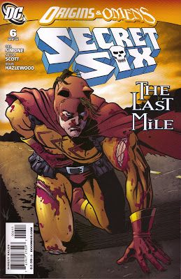
Secret Six #6 by Nicola Scott (penciler), Javi Pina (artist), Doug Hazelwood (inker), Jason Wright (colorist), Gail Simone (writer), and Sal Cipriano (letterer). Back-up story by Pete Woods (artist), Jason Wright (colorist), Gail Simone (writer), and Sal Cipriano (letterer). $2.99, 18 pgs + 6-pg back-up story, FC, DC
You know what you thought when you saw that cover: "Me and Billy Boy and Old Lady Jane, We hitched a ride, took a fast movin' train ..." Or is it only me who loves AWESOME music?
After last issue's amazing revelation, Simone continues to ratchet up the tension, as we learn more about Junior and the secret origin of the woman who helped the group in Las Vegas (it involves horrific stuff, which is par for the course on this title) and a betrayal, which we knew was coming - it was only WHO would betray the team that was up in the air. Without giving too much away, I'm still not sure how one character became immortal or why bullets might hurt that character, but I suppose we'll find out next issue. I read a review in which the reviewer complained about the use of rape in a character's origin, because it's such a cliché, and I tend to agree with that complaint, especially given what we know about the character's history. This character's history didn't spring full-blown from Simone's imagination, and it once again shows the desire of DC's latest stable of writers to "darken" not only the present, but the past as well. I'm sorry for being so vague about this, but with last issue's revelations still not common knowledge, I don't want to say more. Of course, the one "bright" spot about the rape in this instance is that we see its consequences, which is more than I can say for, say Sue Dibny, who never seemed to mind that she was brutalized.
Nicola Scott's very nice pencil work, which seems a bit too delicate for a book like this, works because she manages to balance the "superhero" aspects of the book - no, the villains aren't heroes, but they still wear garish outfits - with the grit. This is particularly pertinent, of course, with her depiction of Junior, who is gruesome and terrifying but fits well into the comic. The first page is a masterful drawing of Junior's fractured psyche, making the character even creepier. She also gives us a nice head shot of Jeannette, who looks extremely frightening as she explains what she is (which turns out to be no explanation, really). Pina, who draws the flashback to the sixteenth century, is a good style shift, as Scott's precision might not have worked as well with the fuzzy reminiscence that the flashback is supposed to evoke.
Misgivings about the rape aside, I'm still digging this comic. We'll see what Simone has in store for next issue, when we find out what's really going on.
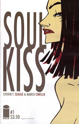
Soul Kiss #1 (of 5) by Marco Cinello (artist) and Steven T. Seagle (writer). $3.50, 22 pgs, FC, Image.
In Seagle's new mini-series, a girl named Lili is about to be raped on an Arizona highway when she wishes for salvation, which comes in the form of, well, Satan. Yeah, that's no fun. Unfortunately for Lili, she discovers that Satan left her with a nasty power that doesn't bode well for the men in her life. It's an intriguing premise, although nothing too groundbreaking, but although Seagle does a fine job creating a sense of tension throughout the book, Cinello makes the book. He shifts styles throughout the comic, with bold lines and vibrant colors to introduce Lili (as a moth, which makes sense later in the book) and then a much looser and monochromatic style for the flashback. In Lili's past, everything is orange, perhaps even hellish, and the we feel the presence of the sun even when we get closeups of the characters. Later, in the present, the palette becomes cooler, with blues everywhere, until Lili's power is unleashed, when we once again get a burnt umber color and a looser style. It's a nice shift and helps move the reader through the book and not-so-subtly hints at the tone Seagle is going for. Cinello's slightly cartoonish style makes Satan, who is not all that cartoonish, even more imposing - he looks completely alien in Lili's world.
It's a good start to the series, made better by Cinello's art. And Seagle is excellent on non-superhero titles, so I'm looking forward to the rest of this.
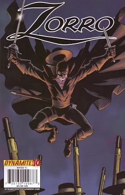
Zorro #10 by Cezar Rezik (artist), Salvatore Aiala (colorist), Matt Wagner (writer), and Simon Bowland (letterer). $3.50, 22 pgs, FC, Dynamite Entertainment.
Let's see. Will Diego act like a goofball in public to deflect people from thinking he's Zorro? Yes! Will Zorro make a dramatic entrance at night and kick some soldiers' butts? Sí! Will the Spanish soldiers show themselves to be total jerks? Mai oui! Will the fiery señorita think Diego is a foppish fool, setting the stage for when she swoons for his alter ego? Jawohl! So why do I like this book if it's so predictable? Well, it's partly because it's so predictable that I like it. This is never going to top my list of best books out there, but it's an entertaining comic with nice art. Occasionally, that's all I really want.
Rezik's art is pleasant enough to look at, although nothing truly astonishing. I will point out that his panel of Zorro leaping into action is pretty stunning - we can't see Zorro's face, but his teeth and eyes gleam white in the moonlight (which is odd, as the moon is directly behind him, but I guess we can chalk it up to artistic license) and it's fun to watch the head bad guy threatening while his cronies grin wolfishly at their victim, who's no longer listening to them because he's too busy staring at Zorro behind them. Rezik does a nice job with the bad guys' smiles and Zorro's, because they're both anticipating the same thing - laying a smackdown on someone! Just because Zorro's cause is righteous doesn't mean he can't enjoy beating up some tools!
As always with this book, it's not a great book, but it's a very solid read. Wagner always makes sure there's plenty going on, and it's always fun to see Zorro kick some butt. It might lose out if I have to cut titles, but right now, economics would be the only reason to drop it.
Wasn't that fun? Wasn't it bleak in January, not knowing what I was reading beyond vague allusions to comics that I picked up? How did you survive?????? Especially when you had no totally random lyrics to vex your mind:
"There's something that you feel that you can't explain
That makes you feel lost when it starts to rain
It bothers you the most when you are on your own
It whispers your intentions will all be in vain"
Well, that was cheery, wasn't it?

