
"The scene was night in a summer garden. Pinprick stars gleamed down on shaking summerhouses. Plotters glided behind pasteboard hedges. I saw a woman, dressed in her maid's clothes, hear her husband utter the first tender words he has offered her in years only because he thinks she is someone else. Could one catch a realer moment? And how except in the net of pure artifice? The disguises of opera had been invented for Mozart." (Peter Shaffer, from Amadeus)


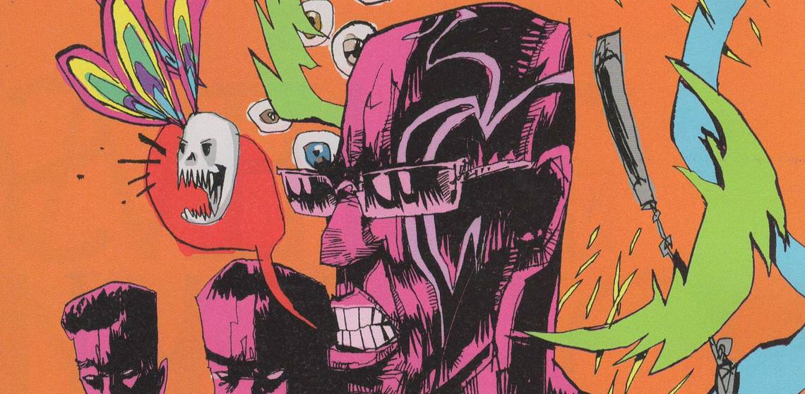
Old Wounds #2 (of 4) ("Discovery") by John Bivens (artist), Russell Lissau (writer), Josh Southall (letterer), and Pj Perez (editor). $2.99, 24 pgs, BW, Pop! Goes the Icon.
Issue #2 of Old Wounds came out on 6 May, according to the Pop! Goes the Icon web site, but my retailer failed to get it. Pj Perez was swell enough to send it to me, which was awfully nice of him. It always bugs me when small press books slip through the cracks and I don't get them, because I don't know who to blame and I get all philosophical about it. Is my retailer screwing up? I doubt it; he likes the fact that I pre-order a bunch of weird stuff, and he knows I'm coming in every Wednesday so he won't get stuck with issues that no one else will buy (which is a concern for retailers, I know, and it's even more pertinent outside of such eclectic places like New York). Is it Diamond? I rather think this is more likely, because Diamond employs semi-trained sloths as their employees and no one can do a damned thing about it because they're not a monopoly, according to the idiotic semi-trained sloths in the United States Congress. But because I'm usually the only person to get these small press books and because small press books, by their very nature, don't get a lot of press (you see what I did there?), I have no idea when these comics are coming out. I don't really have time to scour the news wires for press releases about books coming out. It happens with every publisher except DC and Marvel and possibly Image and Dark Horse. The Life After #10, for instance, came out this week and I never got issue #9, and Oni is, I guess, too small to bother. It's quite annoying, I'll tell you what.
Anyway, Old Wounds continues to be an intriguing comic, although we don't get too much forward momentum in this particular issue. That's not to say that nothing happens, but Lissau is taking his time a little (odd, considering the comic is only four issues), so someone else close to Michael dies (which underscores the danger he's in, of course, but doesn't do much else, because the character who dies isn't in the book long enough to make an impression) and the female detective from issue #1, Hess, finds out Michael's secret, which we could see coming a mile away. The problem with writing a comic like this is that you have to have dramatic moments, and you have to have revelations, and you have to have conversations like the one Michael has with one of the characters about trusting Hess with his secret, but it still feels perfunctory once you've established the basic premise. I imagine it's very difficult for a writer - how do you give the reader enough information without going too far and doling it out too liberally? We don't need another victim to establish that someone is gunning for Michael, but it does help to have the conversation Michael has with that victim. Hess tells Michael things the audience already knows (mainly about his safety and why she needs to provide protection for him), but it does get her into the house so that she can discover his secret, which has to happen, so there's that. It's a conundrum, because as a writer, you want to trust your audience to make some intuitive leaps, but you don't want them to feel like they have to make giant ones. Lissau keeps the momentum that he established in the first issue going pretty well, but at the same time, there's a bit of a feeling of revving an engine without putting the car in drive - it's exciting to listen to and anticipate the car leaping forward, but at some point you need to grab the gearshift. Look at me, using metaphors and shit!

Bivens is still doing his nice work on the book, though, as his rough line work gives the comic a beaten-up, "old" feel to it, which is not bad when the story is about retired vigilantes and the trials they've gone through. He continues to use grayscales to very good effect, adding depth and nuance to the work without drenching it in shadows, which can be a boon but occasionally hides far too much. Bivens's art on the book veers toward fussy, but each line adds heft to Michael's world, and too much black would obscure that. He does use darkness quite well when Michael decides to revert to vigilante mode, and that's why not using it too much in the rest of the book works, as it makes that panel stand out well and shows the shift in his mind nicely. Bivens gives both Michael and Hess terrible hair styles, but that's just something that bugged me. Other than that, the book is really stellar, art-wise.
I certainly don't think this is a bad issue, but it does get by a bit on the fumes of the compelling first issue, and now that Michael has decided to fight back, I imagine that Lissau will kick things into a higher gear in issue #3 (sorry about the car metaphors, but they work in this instance!). I do hope you can find Old Wounds at your comics-vending establishment, because it's certainly worth a look, and I fear that Diamond's inept system might keep people from reading it, and that's just no good.
Rating: ★ ★ ★ ★ ★ ★ ½ ☆ ☆ ☆
One totally Airwolf panel:

Material #1 by Clayton Cowles (letterer), Ales Kot (writer), and Will Tempest (artist). $3.50, 26 pgs, FC, Image.
Material is Ales Kot's worst comic since his terrible debut, Wild Children, and it suffers from a lot of the same problems that that work did. Kot is a tough writer to pin down, because it seems like he embraces the blurring of fiction and non-fiction more than any other current writer, so it's hard to figure out where his fiction ends and the non-fiction begins. Maybe that's the point - Kot is creating a persona, one that he shows to the world but is still a fiction, and that's fine. The problem is that part of the persona seems to be the writer who wants to delve into these "important" ideas, and Kot just isn't as good at that as he might want to be. If he wants to write fiction, he allows too much philosophy into it, and if he wants to write philosophy, he's gotten too much fiction into it, and the resulting hybrid is a fascinating but unsatisfying stew. Kot throws all this stuff into his comics, and it's tough to figure out if he believes it or if he agrees with the student in the first scene of this comic, who calls bullshit on a rambling old professor. But the student is as full of bullshit as the professor is, so who knows what Kot is trying to say here. It's tough to suss out how much of this we're supposed to take seriously - Kot has shown that he has a sense of humor, but he also shows that he takes this stuff very seriously, because he's a deep thinker. The problem with this, of course, is that this is a comic book. Even Alan Moore can't get all his deep thoughts into a comic and make it interesting, and Kot is no Alan Moore. Kot, for instance, boils down the problems with racism within police departments to a single evil dude threatening a 15-year-old boy. There's very little doubt that there are racist cops, and that it's a big problem in the United States right now. However, because of the laws that are in place, it doesn't feel the same as the Golden Age of Protests, the 1960s, when the cops could be far more brazen about their racism and largely get away with it. Today's racism hides more effectively, and racists today are petty, stupid, and scared. The man interrogating the kid is an old-school caricature of a racist, and Kot wants us to believe that there's an evil that can be punched, while the racism that exists in today's society is far too complex to fit into four pages of a comic book. It's the kind of thing that makes white liberal writers feel better about themselves, but doesn't add anything to the conversation. Similarly, the rambling about art in this comic sounds like something a person who has lived their entire life in a college classroom would say, and again, it's hard to tell if Kot takes it seriously or not. The best part of the book is about the recently released Guantanamo inmate who finds that he can only become sexually aroused by torture. It's a cliché, but it's a good one, and it speaks to Americans' almost pornographic interest in warfare and violence without being too obvious (the man isn't necessarily American, after all - Kot doesn't make it clear). It's the only time in the book that we feel like we're reading about a character rather than a construct through which Kot can expound on his deep thoughts. Too bad it's only a small part of a sprawling comic.
Part of the reason why it's so hard to figure out where Ales Kot ends and "Ales Kot" begins is because Kot deliberately makes himself opaque on social media. There's nothing wrong with that, of course, but he does come off as a bit of a tool on Twitter (which, unfortunately, isn't that difficult), and that makes it hard to parse his intentions with regard to his comics. He writes about a racist cop in this comic, and he's very clearly angry about inequality in the world. He has recently threatened to name a "massive abuser" in comics, but decided not to for no good reason that I can tell except that he doesn't have any proof, just innuendo. He has implied that Marvel is part of the problem, employing people who aren't kosher, but he works for Marvel (which I have no problem with - if he wants to work for Marvel, more power to him). I've often said that I don't call for people or companies to be boycotted because if you get your panties in a bunch over one thing, you'll quickly find that the world is a shithole and you shouldn't support anything. Kot admits that his working for Marvel is "paradoxical," but acknowledging it doesn't excuse it, especially if you're so angry about corporations employing assholes. When I want to boycott something, I just boycott it. I don't make a big deal about it, and I don't encourage others to do the same - make up your own damned minds. If I were harassed by someone, I would name them, but unless I saw it happen, I would keep my mouth shut about it. Kot might know there's a "massive abuser" working in comics, but does he know that because he's seen it happen or because others have told him? If it's the latter, he needs to be careful about what he says. And he shouldn't be opening his mouth in the first place. And if he does, he should nut up and name names.
The reason I bring up the "real-world" Kot and what he's doing is because his Image books seem to fall on the side of making a stand against artifice even as they use artifice to work, and these contradictions within his fiction don't seem to occur to Kot in real life. He seems to think real life is easier than it really is, while his fiction seems to make the characters' "real life" (the real life of the fictional world he's created) more complicated. The characters talk a lot about nothing while they actually do things, while Kot seems to talk a lot about something while doing nothing about it. The performance art of "Ales Kot" and "his" "fiction" (to steal his use of quotations marks from a recent issue of Zero, where he did shit like this a lot) is, right now, more interesting than the comics as worthwhile reading experiences. Material is not a good comic if you're looking at it from the viewpoint of an illustrated story (no, I haven't mentioned Tempest's art in this review, but it's fairly uninspired), but as part of the mythology of "Ales Kot," it's an interesting building block. However, I'm losing interest in the artifice of "Ales Kot," so I doubt if I'll get more of this series. Of course, he has another new series coming out in two months, so we'll see what that's all about!
Rating: ★ ★ ★ ½ ☆ ☆ ☆ ☆ ☆ ☆
One totally Airwolf panel:

The Tower Chronicles: Dreadstalker #10 by Simon Bisley (artist), Ryan Brown (colorist), Sean Konot (letterer), Matt Wagner (writer), Greg Tumbarello (associate editor), and Bob Schreck (editor). $3.99, 22 pgs, FC, Legendary Comics.
Meanwhile, in a comic where an immortal monster-hunter decides to enter Hell to find a knife embedded in a demon so he can bring his wife back from the dead (nothing "real-life" about that!), Wagner and Bisley continue to confound. Wagner is a good writer, but he's spent so long with Tower and his dead, boring wife and not enough time with alive, interesting Alicia Hardwicke (I CANNOT get enough of that name!!!) that I just fall asleep whenever the plot turns that way and away from the knifed demon spitting fire on two sycophants who bring him the wrong food (he wants dire-maggots and they bring him terror-slugs, for fuck's sake!!!) or the creepy organization tracking Tower or the representatives of Al-Qaeda and the Taliban trying to kill each other so they can keep their funding (which manages to make terrorists scary and ridiculous at the same time, which is pretty much how we should all feel about terrorists). So there's still some cool stuff going on, but man! I can't deal with Tower's dead wife. Yawn.
Meanwhile, Bisley also continues to confound. His penciling is too sloppy, but his style is so fun that it tends to make up for the sloppiness. I know he's on a tighter deadline than he usually is, but Legendary didn't have to rush this through - they could have delayed the sequel a while and allowed Bisley to take more time, because I can't imagine that he considers this his best work. Maybe he does, but he's wrong, sadly. And no one at Legendary has read my wonderful posts or, you know, seen a hard copy of this series, because it's still too damned dark on the printed page. It's ridiculous, and I imagine that colorist Brown does need some of the blame for using dark colors a lot, that wouldn't be a problem if the printing process were better. Has no one at Legendary noticed this, or are my eyes just that awful and old?
This is such a frustrating comic. With very little more effort by all concerned, it could be great, but it settles for merely being decent. I certainly like decent comics, but when you can see where things could soar, it makes it just all the more annoying. Man.
Rating: ★ ★ ★ ★ ★ ★ ☆ ☆ ☆ ☆
One totally Airwolf panel:


The Life After #10 by Gabo (artist), Crank! (letterer), Joshua Hale Fialkov (writer), Ari Yearwood (editor), and James Lucas Jones (editor). $3.99, 28 pgs, FC, Oni Press.
As I mentioned above, I didn't get issue #9 of The Life After, and I even tried tracking it down at a couple of other comic book stores, but it has vanished. It's frustrating - I've mentioned that I haven't really loved the series and was planning on dropping it after this issue, which ends the second arc, but I would like to have the complete story before making up my mind. But I decided to read issue #10 even though I hadn't read #9 yet, and let the chips fall where they may. I'm still searching for #9, though!
As it turns out, this is a pretty good issue, and it makes me question whether I should drop the title or not. When it comes back for the next arc, I can decide then, but this makes it harder, as Fialkov wraps up Jude's journey through the afterlife in a pretty cool way while still setting up a return to it. The comic could even end here, and while the ending would be a bit of a downer, it would still work pretty well. He manages to throw more than one curveball at us, which is nice, and show how pragmatic you have to be to survive in the afterlife. The issue is funnier than usual, too, which makes the depressing ending have a bit more of an impact. Jude acts like an idiot at one point, which I usually don't like, but Fialkov has kind of written him as an idiot, albeit an idiot whose fault is that he cares too much, so what he does at this crucial point fits with his character. It's a good way to show that he's changed ... but not too much.
I haven't been a huge fan of Bautista's work on the book, but he gets to draw a double-page spread in which demons fight bunnies, and it's as humorous and horrific as you might expect. I still don't love his art on a book with this tone, but he does a pretty good job here.
I'm still on the fence about this comic - I should just cut the cord and be done with it, but I do like Fialkov's writing, and he shows in this issue that he does still know what he's doing. More of the book is promised, but we'll see if it does continue. I'll decide when it gets solicited again!
Rating: ★ ★ ★ ★ ★ ★ ½ ☆ ☆ ☆
One totally Airwolf panel:

Scarlett Couture #2 (of 4) ("Project Stardust Part 2") by Des Taylor (writer/artist). $3.99, 26 pgs, FC, Titan Comics.
I mentioned when I reviewed the first issue that Taylor is a better artist than writer, and while there's nothing wrong with that - you have be better at some things than others, don't you? - it still vexes me. I love looking at Taylor's artwork - his clean lines and airbrush sheen is obviously heavily influenced by computer graphics, but his work is strong enough to resist the "cheating" that some artists fall into when they start using digital tools, so each character looks unique, and his slight cartoonish style helps make it look more like "comic art" rather than photo-referenced work. His choices with regard to narratives - he likes glamorous women, so he uses them in his comics - is smart, too, as he can get away with the digital sheen because he's showing women who might as well be models if they aren't actual models. But that doesn't make them unrealistic - yes, they're all attractive and have good bodies (the men do, too, so there's that), but Taylor makes sure that Scarlett's mother looks older, and he makes an effort to differentiate the two tech ladies that Scarlett uses for information about her enemy. When we get a bit of background about the model/spy who's been killed, Taylor does nice work with the "retro-1960s" look that made her famous, and his use of fashion in the book is excellent, as everyone wears well-designed clothing. He doesn't do as much action in this issue as he did in issue #1, but he's still good at that, too. There's nothing wrong with his art on the comic.
The story, however, just moves along, hitting all the notes we expect. Taylor sets up the threat that he hinted at in issue #1, Scarlett gets in an argument with her superior about her reckless actions in issue #1, and we get some clues when Scarlett investigates the murder of the model/spy. There's some tension between two men who trained Scarlett, but we don't know what that's about, and the bad guys do bad things. It's not bad, but it's somewhat boilerplate. As I have often noted, I like spy stories, so I'm certainly interested in this, but it still bugs me a bit. Oh well.
Honestly, I'd read Taylor's comic about Kelly and Claudia (the two tech geeks) hitting the clubs together. They're awesome.
Rating: ★ ★ ★ ★ ★ ★ ☆ ☆ ☆ ☆
One totally Airwolf panel:

Surface Tension #1 ("Ghosts") by Jimmy Betancourt (letterer), Albert Deschesne (letterer), Jay Gunn (writer/artist), Kirsten Murray (assistant editor), and Andrew James (editor). $3.99, 36 pgs, FC, Titan Comics.
I reviewed this back in February, when Titan sent me a .pdf, and now it's here! It's a good comic - you should check it out.
I want to note that my retailer cracks me up sometimes. I've mentioned that I get far weirder stuff than his average customer (not that the books I get are all weird, but they're much less likely to be a Batman comic than most of the people who shop there), and he's very good at making sure I get my stuff, because I spend so much money at his shoppe (as my weekly updates on the money I spend show!) - he gives me Previews for free, as I've noted in the past, which he doesn't do for everyone, because he knows I'll order so much from each catalog that it's worthwhile for him to give it to me. But he and his one employee crack me up occasionally, because they don't always know what they're looking at when my stuff comes in. He separates out the variant covers he receives each week an immediately prices them at $5-7 - I don't buy them, but I know plenty of people do, and if they're willing to pay that for their comics, more power to him for jacking up the price - bags them, and leaves them by the register so his customers can paw through them. This week, his employee bagged three of my weird comics - this one, Scarlett Couture #2, and The Life After #10 - because he thought they might be variants of something else. My retailer only got one copy of each - for me - and the employee just glossed over the fact that they were, in fact, separate issues than the myriad number of variants that come out from DC and Marvel. The only frustrating thing about it is that I go into the store on Tuesdays and pull my own books, because I have the time and I like to shoot the shit with the people there*, but also because I want to make sure I get the oddball books that I pre-ordered. So when weird stuff like this shows up, I have to be diligent to make sure the issues don't end up in the variant pile. I know it's not my job, but they're busy pulling the main crap that I certainly don't mind pulling my own stuff. I just found it humorous that these issues stymied the employee (who's a really nice guy who works really hard, so I'm not trying to pick on him) so much. Poor Titan Comics!
* It's usually just the owner, the employee, and one other customer, whom they've nicknamed Mr. Mint (they love nicknames at my store, but I don't think I have one, sadly). Mr. Mint comes in every Tuesday and, I kid you not, examines pretty much every issue to find the "perfect" one. He checks the stapled edge, the cover, everything. I always think of the dude in Clerks who's looking for the perfect dozen eggs. Mr. Mint is very interesting to talk to, as we have some similar views and some wildly disparate views on good comics, and if he wants the "perfect" comic, who am I to begrudge him, but I find his ritual fascinating.
Rating: ★ ★ ★ ★ ★ ★ ★ ½ ☆ ☆
One totally Airwolf panel:

Sex #21 ("The Swing of Things") by Joe Casey (writer), Piotr Kowalski (artist), Brad Simpson (colorist), and Rus Wooton (letterer). $2.99, 18 pgs, FC, Image.
I didn't get issue #20 when it came out for some reason, which is too bad because it was really, really good - it might have been the best issue of the series so far. In the letter column, someone writes that they're not quite sure what to make of Sex because the tone is somewhat inconsistent. Frankly, that's one of the reasons why I like it. It's certainly messy, but that's the point, to a degree. Whenever I think Casey has gone a bit too far with the actual sex (not that I'm offended by it, but I mean that it's taking over the rest of the book), he'll come up with an issue like #20, which features absolutely none (and no nudity, either). When the book skirts a bit too close to getting bogged down in the minutiae of Simon's business, it throws up a sexual energy vampire like the one we get in this issue. This issue is loaded with sex and nudity, but Casey still moves plenty of the existing plots forward. This comic zags when you think it will bend and curves when you think it will jump and it's a weird stew of the mundane and the insane. It's the most "real-world" comic by Casey I've read in a while, but the spice of the weird sex makes it compelling and a bit disturbing. Kowalski's fairly run-of-the-mill artwork - I hope that doesn't sound insulting; he's terrific on this comic, but I mean that he doesn't go nuts with storytelling or even style - is kind of perfect for what Casey is going for, because he's portraying "real" people doing "real-world" things, and Kowalski has done really nice work with the many different body types that he has to draw naked in this comic. This time around, it's elderly women, and yep, he does a great (if disturbing) job (not disturbing because they're old and I should celebrate all body ages yadda yadda yadda, but disturbing because they're wearing fetish gear - no one needs to see grandma in fetish gear).
So I don't care what Sex "is" - I'm just enjoying the weird ride. And the dicks. I mean, everyone loves dicks, right?
Rating: ★ ★ ★ ★ ★ ★ ★ ☆ ☆ ☆
One totally Airwolf panel:

Ragnarök #5 ("A Draft of Knowledge") by Laura Martin (colorist), Walter Simonson (writer/artist), John Workman (letterer), and Scott Dunbier (editor). $3.99, 20 pgs, FC, IDW.
I mean, it's Walt Simonson doing Thor. What more could you possibly want, you hosers? Thor chats with a head that has been cut off but who once was his pal, gives up an eye for knowledge (much like Odin had to do), then decides to take the eye Odin gave up and stick it in his own head (because why the hell not?). It's pretty fucking awesome.
So I don't want to write about the issue. IT'S WALT SIMONSON DOING THOR!!!!! In the same way IT'S JAMES STOKOE DOING GODZILLA!!!!!, that should be all the incentive you need and if that doesn't do it for you, I'm afraid you might have no soul or, at the very least, find Girls funny. I want to write about the name of the story, "A Draft of Knowledge." I was always under the impression that taking a long sip of something was spelled "draught" both in "English" English and "American" English, but apparently I'm wrong and "draft" is perfectly correct for us Yankees on this uncivilized side of the pond. That bothers me for some reason, and it's completely inexplicable. I don't mind that I can get a "draft" beer, but taking a "draft" of my beer seems wrong. Thor gets his "draught" of knowledge in this issue, and I honestly could not figure out the title until I saw him do it, late in the issue. I really thought it was something like a written document about knowledge that would come into play somehow. It was only after the fact that I thought, "Oh, I get it." This is why language and spelling are so very nifty. At least to me. You may not care a whit.
On the other hand, this issue's story actually has a title! How many readers actually pay attention to the story's titles? Just think - those hard-working writers come up with fun titles for their stories, and you just ignore them. Can't you see them crying when you gloss right over them?!?!? You're all monsters. (When Joey Q finally relents and lets me write the X-Men for my epic 100-issue run, every single title of each story will be an ABBA lyric. You only think I'm joking!!!!!)
Rating: WALT SIMONSON DOING THOR!!!!!!
One totally Airwolf panel:

The Infinite Loop #2 (of 6) by Elsa Charretier (artist/colorist), Pierrick Colinet (writer/letterer), and Sarah Gaydos (editor). $3.99, 24 pgs, FC, IDW.
I'm not a particularly wise person, and I'm probably only a good writer inside my own head, but I know a thing or two. One thing everyone who has ever picked up a pencil to write a story about a phoenix who lives under a California pier and solves a murder at a museum where the curator is a horseshoe crab (which I did in sixth grade) should know is the immutable principle of "Show, Don't Tell." It's a great principle because it's simple but also hard. It's simple to understand but hard to put into practice, because most writers are in love with the sound of their own prose and they really, really want you to understand their beautiful, unique, and revolutionary thoughts. With comics, it's even harder to adhere to the principle, because the presence of a great artist can make a writer feel even more superfluous, and nobody's ego wants that. Comics are a wonderful and unique art form, and the tension between writers and artists (even if those are the same person!) is part of what makes them wonderful. How much does the writer need to write? Is the artist capable of picking up the slack if the writer gives them free rein? Is the writer such a genius that even a great artist shouldn't interfere with their amazing prose? Is the writer a hack whose comics are wonderful because of the artist? All of these things are part of comics, and while movies and music are collaborative, certainly, the number of people collaborating on them means that praise or blame is often tougher to assign - not that we don't do it, but it's still tougher to assign. With a lot of comics, you have very few people involved, and therefore it becomes easier to figure out where one person's duty ends and another's begins. That's always fun, right?

In this issue of The Infinite Loop, which started well with a rousing issue #1, Pierrick Colinet falls into the trap of ignoring "Show, Don't Tell." On the first few pages, he gives us our protagonist, Teddy, who is tasked with suppressing "time anomalies" until she meets one that looks like a human and becomes smitten. Colinet gives us different aspects of Teddy's personality arguing over what to do with the anomaly, and it grinds the book to a halt before it even begins. Yes, it functions a little bit as a recap (even though the recap on the inside front cover is perfectly sufficient), but it's basically Teddy arguing about free will and duty, which we already know the comic is about. In the first issue, Colinet was able, through a conversation that took up very little room, to sketch out this premise, and with the appearance of the anomaly, it became clear that Teddy was going to have to choose. Taking five pages to essentially reiterate what we already know doesn't help, even if Colinet tries to make it interesting and Charretier (who I'll get to) draws it well. As we were forced to learn last issue (in the back matter, where I railed against it because it basically tells us the plot without letting it unfold in the actual comic), the story is about a same-sex relationship in a place where those are frowned on, and so we have to have villains, but the two Unit 70 guys are so one-dimensional they might as well have "villain" tattooed on their chests (Colinet does hint that one of them is a repressed homosexual, which is fine but also a bit clichéd). Then Teddy takes the anomaly to her apartment (where we're supposed to be sad that everything is for one person, but if you're living alone, why wouldn't everything be for one person?), where the dialogue gives us the exact same tension that we got in the first five pages. I mean, I think we get it. Colinet might as well have big placards on every page reading "Teddy has a crush on a girl, but that's forbidden, and the point of this book is to show her choosing between her duty and her heart!!!!!" I mean, that's the stuff of good, if not great fiction, but he doesn't have to be so damned obvious about it. We're not complete idiots.
Charretier, meanwhile, continues her astounding work on the book. The first five pages are tolerable because she draws them so well, giving us different aspects of Teddy that have nice little differences to show their different personalities. When we meet Spender and Prospekt, the two Unit 70 guys, Charretier makes their latent homosexuality a bit more un-latent but still enough within the bounds of "dudes wearing cool clothes" that they can deny it, if they choose. Her designs for Teddy's neighborhood and apartment are stunning, sleek, and modern, and the way she draws Teddy and the anomaly flirting is terrific, as their small gestures tell us far more than Colinet's heavy-handed script does. The way Spender and Prospekt kill people is very odd and disturbing, and Charretier does a superb job with that, too. She uses panels expertly, fitting a lot of visual information onto each page without overwhelming the reader, and she moves us around the page really well, too. She knows when to soften things, so a page showing Teddy and the anomaly sharing a bed (just for sleep) features a rounded panel surrounded by leaf-shaped panels, invoking a flower. The page also shows Teddy's surprise, discomfort, and acceptance when the anomaly holds her hand. It's a terrific page, and it's completely wordless - Colinet does know when to leave his artist alone, and he should trust Charretier more often!
So far, the book is getting by on an intriguing if not particularly trenchant premise and absolutely wonderful artwork. Colinet does seem to know where he's going with the story, and I do hope he eases back on the words a bit, but for now, I'll just love the art and hope the writing catches up. We'll see.
Rating: ★ ★ ★ ★ ★ ★ ★ ☆ ☆ ☆
One totally Airwolf panel:

Über #25 by Digikore Studios (colorist), Daniel Gete (artist), Kieron Gillen (writer), and Kurt Hathaway (letterer). $3.99, 22 pgs, FC, Avatar Press.
Gillen has gotten quite good at showing the futility of war in this comic, as each issue seems to show a small aspect of the insanity of throwing bodies at other bodies and hoping something good comes from it. He does this in different ways, and in this issue, it's giving us a story about Japanese soldiers on Okinawa who know they're beaten but are simply trying to make the Americans pay for any advances they make. Gillen doesn't quite make us believe that it's a pure and noble thing to sacrifice yourself for a country that simply wants you to die as a distraction, but he makes a good effort at it. The sacrifice, meanwhile, goes about as well as these things go. But Gillen ties the Japanese theater into the main part of the war (at least I think he does), so there's that!
Über continues to mosey along, and I continue to enjoy it. That's all I really have to say about it.
Rating: ★ ★ ★ ★ ★ ★ ½ ☆ ☆ ☆
One totally Airwolf panel:

Sandman: Overture #5 (of 6) by Neil Gaiman (writer), Todd Klein (letterer), Dave Stewart (colorist), J.H. Williams III (artist), Rowena Yow (editor), and Sara Miller (editor). $3.99, 24 pgs, FC, DC/Vertigo. This Sandman created by Gaiman, Mike Dringenberg, and Sam Kieth. Destiny created by Marv Wolfman and Bernie Wrightson.
I guess Gaiman is to blame for this series running so very, very late (the first issue came out in November 2013), and while I don't really care that much, it's still amusing when an issue shows up. It's certainly meant to be read as a big epic, so each individual issue doesn't matter all that much, no matter how hard Gaiman tries to end this on a cliffhanger. What is very neat is Williams's art, unsurprisingly, which is as ineffable as always. He fits each scene to his style, so that Morpheus's conversation with his mother is full of swirls and curves, while part of the comic takes place on the pages of Destiny's book. Williams draws the brutality of the universal war as well as the ethereal realm, and the "Transformer" robot as well as the winged alien. He is, not surprisingly, tremendous.
I have no problem waiting months for this series, because it's such a gorgeous experience. I'll even probably buy the hardcover, because I'm kind of a sucker for Sandman. Don't judge me!!!
Rating: ★ ★ ★ ★ ★ ★ ★ ★ ½ ☆
One totally Airwolf panel:

Batman '66 #23 ("The Groovy Grave of Solomon Grundy"/"The Final Form") by Wes Abbott (letterer), Flavia Caracuzzo (colorist, "Form"), Giancarlo Caracuzzo (artist, "Form"), Kelly Fitzpatrick (colorist, "Grundy"), Jeff Parker (writer), Brent Schoonover (artist, "Grundy"), and Jim Chadwick (editor). Batman created by Bill Finger and some guy. Robin created by Bill Finger, Jerry Robinson, and some guy. Solomon Grundy created by Alfred Bester and Paul Reinman. Basil Karlo's name was created by some guy, but Clayface is an amalgam of several creators.
This issue of Batman '66 highlights things I love and don't love about this comic and "non-canon" forms of fiction in general. In the first story, Hilda (the aunt of Marsha, the Queen of Diamonds) resurrects Cyrus Gold as Solomon Grundy (and Batman appreciates her knowledge of science, as seen below). That's funny enough, but then Batman uses science to defeat Grundy, and while the "real" Batman often uses science, too often in recent years he uses his fists to punch every bad guy into submission. This is a straightforward "good guy takes down 'bad' guy" story (Grundy, as usual, is more of a force of nature than an actual bad guy), with Batman figured something out that we mere mortals would be hard-pressed to come up with ... mostly because it's ridiculous. But it fits well with the aesthetic.
Meanwhile, in the second story, we get an example of doing something that I don't like. Parker names his villain Basil Karlo. Now, you might not think much of this, but it bugged me. Basil Karlo, of course, is the original Clayface, called that just because he was an amazing actor who could change his appearance to well in his roles and because he wore a mask that looked like clay. There was nothing odd about him. In 1990 or thereabouts, he became SUPERCLAYFACE, as he used some wonky science to get awesome clay powers before melting through the very earth to his doom, presumably. I don't know what he's been doing since then, but the point is, Basil Karlo is a known quantity in the DCU. So when Parker calls his character "Basil Karlo" and makes him the villain False Face who then who becomes Clayface, it bugs me. I know it doesn't really matter, but I don't like fiction using names that have already been used before for brand-new characters just so we can say "a-ha!" I mean, everyone ignores what Cisco actually does on The Flash because they're too busy waiting for him to turn into Vibe. And if he doesn't turn into Vibe, why call him Cisco in the first place? I don't mind Easter eggs, but for some reason this bugs me. Poor Basil Karlo. He was a great actor, once.
Still, two fun stories are always nice. Batman defeats one for with SCIENCE!!!! (wonky science, sure, but still) and the other with ... psychology. Oh, Batman, you nutty dude, you! So there's that.
Rating: ★ ★ ★ ★ ★ ★ ½ ☆ ☆ ☆
One totally Airwolf panel:

Grindhouse: Drive In, Bleed Out #5 (of eight) ("Lady Danger: Agent of B.O.O.T.I. Part One") by Alex de Campi (writer/letterer), Mulele Jarvis (artist), Marissa Louise (colorist), Ian Tucker (assistant editor), and Brendan Wright (editor). $3.99, 22 pgs, FC, Dark Horse.
So this comic is about a superpowered spy (I assume; I mean, check out the panel below) who works at a convenience store until her covert agency calls on her to fight a drug smuggling bad guy who has kidnapped a doctor and some nurses in Thailand. Much mayhem ensues. It's very hard to go wrong with such a premise, especially when you're doing it "grindhouse" style, meaning with tongue planted firmly in cheek even though you do bring in some serious elements, and de Campi is a good writer, so it's not surprising she makes it work. We can see the twist coming a mile away, but that's not the point. The point is that de Campi wants to make a fun, insane comic, and she succeeds. Jarvis does a very nice job with the ridiculousness of it all, as Lady Danger and the bad guy's female minions all seem constantly on the point of bursting right out of their clothing, but incredibly, they do not. I did find it interesting that the doctor is a man and the nurses are all females - that's a bit reductive - but it does kind of play into what de Campi is doing in the story, so I'll let it slide. I'm also not sure what to think about the text at the bottom of most of the pages, which are little advertising teasers for other Alex de Campi comics. On the one hand, it's annoying. On the other hand, it seems to have some satirical point, so I'm not too put out by it. Just because I'm not sure what the satirical point is doesn't mean it doesn't exist, and if it doesn't, well, it's only mildly annoying. De Campi was at the Phoenix Comic convention this weekend, but I didn't manage to talk to her, so I couldn't ask. Oh well.
As usual with these Grindhouse stories, "Lady Danger" is very fun. I can't imagine there will be too many surprises in the final part, but I'm still going to read it and (probably) enjoy it!
Rating: ★ ★ ★ ★ ★ ★ ★ ☆ ☆ ☆
One totally Airwolf panel:

Curb Stomp #4 (of 4) by Colin Bell (letterer), Ryan Ferrier (writer), Jeremy Lawson (colorist), Devaki Neogi (artist), Jasmine Amiri (associate editor), and Eric Harburn (editor). $3.99, 22 pgs, FC, Boom! Studios.
I didn't have high hopes for the end of Curb Stomp, and I was right to not have them, because it ends pretty much the way I expected it to. It's not a bad comic, but it is mediocre, and that's a shame. Everyone who deserves to die dies, and everyone who deserves to survive survives. When I watch television or movies, I often wonder who the writers will have kill the bad guys, because there seems to be an unwritten law that bad guys get killed by those who deserve to kill them. Usually in movies, when they introduce a female bad guy, they have to introduce a female good guy because the male good guys can't kill a female bad guy, for instance. It's more than that, though - when we were watching Agents of S.H.I.E.L.D. at the end of its season, I knew that Adrianne Palicki wasn't going to kill Brett Dalton because she didn't "deserve" to kill Grant - others in the show, starting with Skye and then probably May and then Fitz had a "better" claim to kill him. Writers always do this, and it's annoying. Ferrier does it, too - certain characters "deserve" to kill other characters because of the way they've acted, and Ferrier also has his cake and eat it too, as he makes sure that Betty doesn't become a cold-blooded murderer - she only kills in self-defense - but he still manages to have the villains get what they deserve. It's annoying storytelling, because it reduces everything to basic plot points that make sense only if you're telling a morality tale. Morality tales are boring, man.
Neogi's shortcomings are most evident in this issue, because there's so much action. As I've often noted, action is very hard for many artists to do well, and some never quite master it. Neogi hasn't mastered it yet, so her fight scenes have perspective and posing problems, with very little depth and too-stiff figure work. Some of the riot scenes work a bit better, because she can just use massed humanity without worrying about where everyone is in relation to others, but they're still not great. Neogi is a new artist, so she has plenty of room to grow, and I hope she does, because some of the art in this series has been quite nice. This issue is not a shining example of her work, though.
So that's Curb Stomp. It's too by-the-numbers, but that's an unfortunate feature of too many comics these days. Ferrier hasn't written too much, so perhaps he'll get better, too. There were some interesting ideas in this comic, but it took the path of least resistance, and that's too bad.
Except the colors. The colors were stupendous.
Rating: ★ ★ ★ ★ ½ ☆ ☆ ☆ ☆ ☆
One totally Airwolf panel:

Chew #49 ("Blood Puddin' Part 4 of 5") by Rob Guillory (artist/colorist), John Layman (writer/artist), and Taylor Wells (color assistant). $2.99, 20 pgs, FC, Image.
Each issue of everyone's favorite comic has at least one amazingly cool thing on each page, and usually multiple amazingly cool things on each page. I always wonder how Layman and Guillory pull it off. I mean, Layman's a dope, so I don't know who he's getting to write this comic unless he's doing it through automatic writing while someone has hypnotized him and he's channeling someone good, and Guillory is far too well-adjusted to come up some of the twisted stuff he comes up with. Who's really creating this comic, you faux-creators?!?!? The truth must come out!!!!
What's most impressive about the way Layman writes the book is that he slips in these excellent emotional beats in the coolest places and with little fanfare and he moves past them quickly, as you would. It makes them linger even more, so when Colby asks for Chow Chu's help, he uses something that he knows will get him to help but Layman doesn't stay on it past two panels, and even the second one of the sequence is brilliant, as his lettering and Guillory's drawing make it clear that Chow is still not fully on board. Layman has done such a nice job with these characters over the past 49 issues that when Tony and Savoy face each other, I really wasn't sure if Tony would kill Savoy or not, and that's the point. With most comics, the plot dictates what happens - they need Savoy alive or dead, and that's what happens. Plot is very important in Chew, obviously, but Layman has done such a good job making the characters "real" that we get the sense that there really is an emotional battle going on in Tony's head. Plus, we still get the insane random panels of the good guys fighting ridiculous bad guys. Which is neat. And Guillory gets to draw stuff like corpses with pizza slices sticking out of them like ninja stars, so that's fun for him.
As always, I apologize for being so in the bag for Chew. It's my favorite comic, of course, but I do try to be objective. It's just such a great comic!!!!!
Rating: ★ ★ ★ ★ ★ ★ ★ ★ ½ ☆
One totally Airwolf panel:

Genius volume 1: Siege by Marc Bernardin (writer), Adam Freeman (writer), Troy Peteri (letterer), Afua Richardson (artist), and Betsy Gonia (series editor). $14.99, 126 pgs, FC, Image/Top Cow.
Hey, remember the good old days, when I reviewed that Top Cow collection and inadvertently sparked a big controversy? Good times (that was when Dan and Ben showed up regularly, too - what happened to those dudes?). That was almost five years ago (boy, how young and naïve were we?), and it featured the first issue of this series. So yeah, it's been a long, strange trip from there (and I'm pretty sure some of was available in 2008) to a trade collection, but I liked that first issue, so I hope the rest are as good!
Infinite Bowman by Pat Aulisio (writer/artist). $15.00, 164 pgs, BW, Hic and Hoc Publications.
An astronaut (spoiler: it's Dave Bowman) travels through different reality levels of the universe to become a space god. Holy shit, you guys, this thing looks insane.
Knight Rider volume 1 by AndWorld Design (letterer), Brian Denham (artist), Shannon Eric Denton (writer/editor), Jason Johnson (artist), Milen Parvanov (colorist), Sai Studios (colorist), and Geoffrey Thorne (writer). $14.99, 95 pgs, FC, Lion Forge/IDW. Knight Rider created by Glen A. Larson.
I saw Shannon Eric Denton at the Phoenix convention yesterday, and I threatened him with bodily harm if this book wasn't good. He wasn't impressed with my threat. Looking at my physique, I can't say I blame him. He was getting filmed as part of crowd footage b-roll for Con Man, the web series by Steve the Pirate and Richard Castle, so Norah (who was sitting down behind Shannon's table, as she was a bit tired) might end up in the show eventually.
Louise Brooks: Detective by Rick Geary (writer/artist). $15.99, 80 pgs, BW, NBM.
I don't love Rick Geary's work, but I do like it, so I try to check it out when he does something a bit weirder than his usual collection of murder stories. A silent film star who returns to Wichita and solves a murder? Sure, I can dig that.
Parts Unknown volume 1: Invasion by Randy Clark (inker), M. Anthony Delepine (letterer), Mindy Eisman (letterer), Brad Gorby (penciler), and Beau Smith (writer). $18.99, 104 pgs, BW, Afterburn Press.
Beau Smith can write two-fisted tales of action and adventure as well as anyone, so I'm glad this early work is back in print. Should be fun!
You Don't Say by Nate Powell (writer/artist). $19.99, 172 pgs, BW, Top Shelf.
Speaking of early works, this is a collection of Powell's stuff from 2004-2013. Powell is one of the most interesting cartoonists in the business, and it's nice to see these stories getting a nifty collection.
Money spent this week: $151.04. YTD: $2532.34.
**********
I've missed the last two weeks of this column because of real-world crap once again intruding on fantasy land. My older daughter, who had the spinal fusion surgery on 8 April, was home recovering nicely until she got a staph infection. Yeah, that's no fun. She was re-admitted to the hospital on 9 May and had two surgeries over the next few days to open her back up, drain the wound, and then close her back up. She went a few days with her back open, which was one of the more horrific things I've seen in my life. She was in the hospital for a week, and since then, we've been giving her antibiotics every 8 hours directly into her vein to try to kill any infection that might be left in her. After 6 weeks, we'll switch to an oral antibiotic for 6 months. One problem could be that the bacteria gets onto the titanium rods in her back and can't be killed easily - apparently that becomes tricky - which might mean they have to take the rods out completely and put new ones in. So yeah, needless to say we're hoping that's not the case. So I haven't had big chunks of time to review a lot of comics - as you might have noticed, I've been able to write a few reviews, but nothing of the lengths of these regular columns. I hope I'm back on track now, though!
This particular post is up on Sunday for a variety of reasons, one of them being the Phoenix Comic convention, which was going on this weekend. I like going to the con - I can take the light rail, so parking isn't an issue - and I went yesterday, even though I had to pay for my ticket like a sucker. I rarely pay to get into conventions, and usually my retailer gets a ticket that he lets me use on Saturday. This year he didn't know if he'd have one, so I had to decide whether to wait or get it my own self. Another guy at the convention said he might be able to hook me up, but he'd have to talk to some people at the con on Thursday to find out. I called him in the late afternoon on Thursday and left a message, but I didn't hear from him. Around 9 o'clock I went on-line and checked the availability for Saturday, and there were still tickets left, but I wasn't sure if he was going to call me back and I didn't want to wait too long. So I bought a ticket for me and my daughter on-line, and I kid you not, the instant I clicked the "Purchase ticket" button (or whatever it said) and the screen that says "No exchanges or refunds" came up, he called me back with a ticket. I swear, it was pretty much instantaneous. The screen popped up and less than a second later, my phone rang. DAMN IT!!!! No big deal, though - like I noted, I usually get into conventions for free (I'm going to Rose City in September, and I assume I'll get a press pass), so I can pay for one every so often. It was just bizarre that, had I needed to go to the bathroom or decided to get a snack before I started or something like that, I would have gotten a free pass. C'est la vie.
The con was fun, as usual - the convention center in Phoenix is huge, so they expanded the con this year, and it felt much less crowded than it did last year even though I imagine the same or more people attended. It's nice when convention planners realize they need to expand and do so - last year it wasn't overly crowded, but it was getting a bit squeezed in, so they expanded before it became a major issue - especially because they moved celebrity autographs and pictures to a different floor. I have nothing against people spending $50 to get a picture with Alyson Hannigan, but the lines last year did stretch far and wide, and if that's the only reason you're at the con, why not put it in a different location? Well done, Phoenix Con. Well done.
I got to speak to Jim Steranko at length, which was cool. He's as impressive in real life as his art in comics is, and I bought a nifty print of his from the late 1970s. He also told me some very cool news about something he's done, but I'm not allowed to say what it is!!!!
Norah got tired after a while, so I didn't stay quite as long as I wanted, but I still saw plenty of people. I talked to Layman, naturally, and Shannon Eric Denton, as well as Fábio Moon, who rarely shows up in the States, so that was neat (his brother and Rafael Albuquerque were at the con, too, but they were away when I passed by their booth). Tony Parker, who's also a Phoenix local, was there with Paul Cornell, promoting their new Dark Horse book, which I'll mention when I get to this month's Previews but which sounds neat-o. Basically, it was a fun show. I also bought Norah a fez:

I was happy to see the Warriors and Cavaliers win their respective conferences in the NBA (I would have been perfectly happy with the Hawks, too), even though I'm not going to watch the Finals and don't really care who wins it (I'd like to see the Warriors win, but I'm not going to be bothered if they don't). The reason I like seeing those two teams in the Finals is because the NBA, more than any other major sports league, isn't about parity. I like parity, even if it means the teams I like go through down periods (I'm actually frightened to check the NL East standing these days because the Phillies are so putrid). The NBA hasn't had parity in decades, and it usually makes the playoffs boring. Consider this: Magic Johnson and Larry Bird were rookies in the 1979-1980 season. In 1980, Johnson's Lakers won the NBA championship, with Johnson destroying the 76ers in the final game. Since then, the NBA champions have made up a fairly exclusive group. Since 1980, these are the champions:
Los Angeles Lakers: 10 ('80, '82, '85, '87, '88, '00, '01, '02, '09, '10)
Chicago Bulls: 6 ('91, '92, '93, '96, '97, '98)
San Antonio Spurs: 5 ('99, '03, '05, '07, '14)
Boston Celtics: 4 ('81, '84, '86, '08)
Detroit Pistons: 3 ('89, '90, '04)
Miami Heat: 3 ('06, '12, '13)
Houston Rockets: 2 ('94, '95)
Philadelphia 76ers: 1 ('83)
Dallas Mavericks: 1 ('11)
You'll notice the trend: Very teams have won it, and only two teams have one it once. The losers of the Finals are a bit more eclectic, but the winners are a very small group among the larger NBA, as only nine teams have won the championship over the past 35 years. By contrast, since the 1979-1980 season, 16 different teams have won the Super Bowl, 20 teams have won the World Series, and 15 teams have won the Stanley Cup. The NBA wasn't always like this. In the weird and wonderful 1970s, when the Finals were broadcast on tape delay and the ABA put a minor scare into the league and inadvertently provided Will Farrell with a movie plot, the NBA had EIGHT different champions in 10 years. They were:
New York Knicks ('70, '73)
Boston Celtics ('74, '76)
Milwaukee Bucks ('71)
Los Angeles Lakers ('72)
Golden State Warriors ('75)
Portland Trail Blazers ('77)
Washington Bullets ('78)
Seattle SuperSonics ('79)
Look at that glorious list. Those are the kind of teams who should win championships every once in a while! That's why I wanted Oklahoma City to win a few years ago, and why I'm glad that this year, at least one weird team will win. Of course, both of the these teams look like they're going to be good for at least a few more years, so maybe they will join the "haves" and join that multiple winners list, but for now, I'm loving the two party crashers to the NBA Finals.
I've written before about Danger Guerrero, who I consider one of the funniest writers on the Internet. Recently, he broke down the new Hamburglar commercial, commenting on some of its oddities. And the Hamburglar responded! Now, as Danger points out, this is just good marketing by McDonald's, as they were hoping he would write about it on the web site, but it's just so strange and hilarious that how could you not write about it? So check it out, but resist eating at McDonald's!!!!
As some of you might recall, I grew up in Warminster, Pennsylvania, for the most part (I spent 1975-1979 in Germany). If you're burning with desire to know more about Warminster, well, here's the web site for you!
I saw Mad Max: Fury Road the Friday it opened, and really dug it. I'll probably see it again next weekend, because it really is worth a second look. Of course, plenty of digital ink has been spilled about its feminist themes, and of course, someone created a goofy meme tumblr about it. It's the Internet!
A few weeks ago, on Facebook, Matthew Southworth linked to an article about the 30th anniversary of the MOVE bombing. The MOVE bombing occurred on 13 May 1985, and it was quite an interesting event from my childhood. I remember watching a great deal of the drama on television, and I seem to recall actually watching when Mayor Wilson Goode actually bombed the apartment building inside of which the MOVE members lived. I don't know if I really did see it live - it was on television so much that I saw it many times, and I'm sure I'm conflating those replays with the moment it actually happened - but it happened in the afternoon, so I would have been home from school, so it's certainly possible. Anyway, I just assumed that such an unbelievable event - the mayor of one of the largest American cities dropping a bomb on a building full of civilians and their children, then letting the fire burn until it destroyed much of the block on which the building sat - was an event that most Americans know about. The article Southworth linked to, however, is titled "Why have so many people never heard of the MOVE bombing?" Apparently, it's not a particularly famous event in American history. Matt had never heard of it, and he's about my age, but he didn't live in Pennsylvania in the 1980s. It's just very strange. Of course, the times had something to do with it - no Internet meant no instant access to everything, and the 24-hour news networks were in their infancy and CNN wasn't yet a major force on the scene, but it's still odd that not a lot of people know about this. I read a few commenters mentioning about the fact that it was a black, Democratic mayor who dropped the bomb and that people swept it under the carpet because of that (MOVE was made up of black radicals), but people like that tend to forget that politics was a lot different 30 years ago, as the divisions between the parties weren't as pronounced as they are today, and that MOVE wasn't popular among the residents of the city blocks around their building, a huge majority of whom were black. The MOVE members were stockpiling weapons, using megaphones to broadcast rants throughout the neighborhood at all hours of the night, and they let the children poop in the yard. The neighbors weren't inclined to give them the benefit of the doubt. It doesn't change the fact that a mayor bombed his own city, and that the fire chief told the firefighters to let the fire burn so it became a conflagration (whether that was because he didn't want the MOVE members to be saved or because MOVE members were shooting at the firemen is still up for debate, I guess) or that several children died in the fire. It was a weird time all around, certainly. Here's the article about the 30th anniversary of the bombing, in case you're interested. My question is: Does anyone reading this know about MOVE? And if you do, is that only because you were old enough in 1985 and lived in the Philly area? Can you imagine if this happened today? Holy shit, the media shitstorm would be something to behold.
Moving on to more pleasant topics (unless you hate this band!), for today's Top Ten list, I thought I'd list my favorite Styx songs. Now, many, many people (including, I'd guess, a lot of you readers right now) think that Styx is terrible. Hey, you're entitled to your opinion! I've never been that big on telling others that their pop culture preferences stink, because what's the point? I happen to like Styx! I will not have any songs on this list from their first album (which I've never heard), their fourth album (which I've never heard), or their albums after 1983. They've released four albums in the past 25 years, but I haven't heard any songs from them. So basically, these are songs from 1973-1983. Let's check them out! Honorable mention goes to all the songs on The Grand Illusion (some of which appear on this list), which is a straight-up classic. Honestly, there's not one bad song on that album. Even the songs I didn't put on this list (which includes, yes, "Come Sail Away") are great.
10. "Snowblind" (1981). Paradise Theatre is another Styx classic, not quite on par with The Grand Illusion, but close. This song, about cocaine addiction (how Seventies is that?), fits in with the album's theme ("You tricked me with visions of paradise"), and features a terrific guitar solo (by James Young, I assume) and that great, eerie keyboard as an intro, over which Young sings (I think, it certainly sounds gruffer than Tommy Shaw voice, as Shaw pretty clearly sings the chorus). Even as Styx got a bit more sentimental, they coud crank out a cool song like this. Take a look at the lyrics here!
9. "Great White Hope" (1978). Pieces Of Eight, the follow-up to The Grand Illusion, isn't that great an album, but it begins with this terrific song. James Young's lyrics aren't anything great (you can read them here), but they're not awful, and he sings them with great conviction, and the undertone of despair in them helps make them more interesting than they are on the surface. It's the music that makes the song, though, from the great, rhythmic drum beginning that leads into the galloping guitar part to the oh so Seventies keyboard solo and the groovy guitar solo. When the band slows down to lead into the second verse, we once again get that great driving beat that leads us out. It's such cool music, and it helps sell the lyrics well.
8. "Superstars" (1977). The Grand Illusion is an album on which the band (partly) deals with fame (even though they hadn't quite achieved yet; this album propelled them to superstar status), and "Superstars" is the most explicit song about that theme, and Dennis DeYoung's evil little soliloquy at the end makes it feel more Satanic than he probably intended (DeYoung can't help it; he has an evil-sounding voice). Shaw's crunching guitar propels the song along, and his vocals, which are downright tremulous compared to DeYoung's, heightens the romance of the pursuit of fame before DeYoung undercuts it. It's very cleverly done and shows what Styx could do when DeYoung and Shaw weren't at each other's throats. Check out the lyrics here!
7. "Father O.S.A." (1973). For most of their second album, Styx's songs were typical mid-1970s rockers/ballads, with some good songs ("Lady" is a highlight, but not the only one) and one really weird one (John Curulewski's "A Day"). Then they got to "Father O.S.A.", which is a prog-rock classic, and it really kind of pointed the way forward for them. It's a great musical song, with DeYoung's epic organ parts overwhelming the acoustic guitars of Young and Curulewski during the verses, and then bleeding into an eerie synthesizer solo that helps build to a vocal climax. DeYoung's relatively opaque lyrics about a defeated man facing his mortality are specific enough to get the idea across but vague enough to be universal, and he does a nice job with them. Styx never completely embraced prog-rock, but this song showed they could do it when the mood struck them! Here are the lyrics, and no, I have no idea what "O.S.A." means.
6. "Miss America" (1977). Another classic from The Grand Illusion, "Miss America" begins with a spooky keyboard riff courtesy of DeYoung that segues beautifully into a hard rock guitar part. James Young sings the song with his typical sneer, and the lyrics are terrific, as Young goes after the façade of the pageant and the American obsession with perfection and the rottenness underneath. He lets no one off the hook, from the participants to the audience, with that great line "In your cage at the human zoo, they all stop to look at you" summing up his disgust. As the album is partly about Styx's own fame, it's clever for Young and the band to aim the spotlight at themselves, too. It's an excellent song. The lyrics are here!
5. "Too Much Time On My Hands" (1981). Tommy Shaw helped turn Styx into a commercial juggernaut, and for that (and dreck like "Babe") he deserves some opprobrium, but the dude could write some good songs, and this one is one of his greats. The lyrics are great and eminently quotable, the synthesizer part is excellent, Shaw's guitar solo is very cool, and holy shit that video is awesome. You all know the lyrics, but here they are!
4. "Man In The Wilderness" (1977). Here's another Shaw song, with that cool, grungy guitar leading in, and Shaw's lighter voice helping make the song a bit more plaintive than it would have been had DeYoung sung it. His lyrics aren't too deep, but they're heartfelt, and the wild guitar solo in the song really takes it to another level. The downbeat lyrics are right here.
3. "Boat On The River" (1979). Cornerstone is another only okay Styx album (I mean, "Babe" is on it, so it automatically gets huge points off), but this tune is killer, with Shaw playing a creepy mandolin, DeYoung accompanying him on accordion (and looking really stalker-y in the video), and Chuck Panozzo adding an eerie upright bass. Shaw once again is a good choice for the lilting tune, giving the lyrics some weight but also making them a bit ethereal, which is a good mood for the tune and which DeYoung, I doubt, would have been able to match. I love this song more for the music than the lyrics, but it's still excellent. The lyrics are here.
2. "The Best Of Times" (1981). As I've mentioned before, I'm horribly sentimental, and Paradise Theatre is Styx's most sentimental album, and this song is the most sentimental song. That doesn't mean it's sappy (although some would say so), as DeYoung does a nice job keeping it from descending into mawkishness. The lyrics are great, as DeYoung gives us a tremendous love song, and he sings it with such conviction that it overcomes any hints toward sappiness. I think if Shaw had sung this, his voice might not have been able to handle it, but DeYoung's rawness does the trick. Take a look at the lyrics!
1. "The Grand Illusion" (1977). This might be a boring choice, but when it's this song, which is, honestly, almost a perfect tune, there's not much of a contest. The excellent intro leads us to DeYoung's bombastic and scathing lyrics, sung with the right amount of showmanship and contempt, all backed by Shaw's terrific but not overwhelming guitar until we reach the amazing, grinding solo. I mean, come on - what else could be the best Styx song?!?!? Recite the lyrics from memory here!
No songs from my iPod today, so let's check out some Totally Random Lyrics!
"Look at the sign, we're in the wrong place
Move out boys and let's get ready to race
Four fifty-four's coming over the hill
The man on patrol is gonna give us a bill
The time's real short, you know the distance is long
I'd like to have a jet but it's not in the song
Climb back in the cab, cross your fingers for luck
We gotta keep moving if we're going to make a buck"
All right, old-timers, this is right in your wheelhouse!!!
I hope everyone has a nice day and is enjoying the weather if the weather is nice in your area. Here in the Basin it finally reached 100 degrees consistently, which means it will probably stay that way until October. Good times!