"We want to find a funny, upbeat way of bringing the issue of homelessness to TV. So we've got three wacky homeless characters. But they're wise. They're wacky and wise."
The Anchor #1 ("Five Furies Part One") by Phil Hester (writer), Brian Churilla (artist), Matthew Wilson (colorist), and Ed Dukeshire (letterer). $3.99, 22 pgs, FC, Boom! Studios.

I wasn't sure if I was going to pick this up, but I figured with Hester writing it and Churilla drawing it, I couldn't really go that wrong. I'm still not sure about it, but it's a solid first issue. It's a lot of set-up, as Hester introduces the Anchor, a dude who stands at the gate of Hell and fights demons that want to get out. Meanwhile, on earth, his actual body (in Hell it's his soul) wanders around, and in this issue ends up in Reykjavik fighting some kind of ice monster. The fact that whatever happens to his spiritual body manifests in his physical body helps him win. Yay! Plus, he meets a cute Icelandic chick and does something gross (not to her - ewwww - but in a different context - although, on second thought, something gross happens to her that is because of him, but not his fault). All in a day's work for "Clem," as the Icelandic chick - Hofi - dubs him, based on his wearing the cross of St. Clement on his belt (which just happens to look like an anchor - the traditional story is that Clement was martyred by being tied to an anchor and thrown overboard into the Black Sea). As a set-up issue, it works perfectly fine - we get the basic premise of the story, two main characters, and a big fight. Hester is an underrated writer, and Churilla has a nice, cartoony-but-not-too-cartoony line that reminds me of Scott Wegener, and we get an ending that leads into next issue but doesn't change the one-and-done nature of the issue. As first issues go, this works fine. It doesn't dazzle me, but I'll probably check out the next issue, at least.
I did want to address something I read recently on The Savage Critics. Here's Retailer Extraordinaire Brian Hibbs:
As long as I'm talking about cover stocks, let me mention that last week's BOOM! titles also had a new stock that I liked very much -- one of the things that has REALLY hurt BOOM! sales, in my opinion, is that they've had lousy "hand" (that is to say, holding it in your hand, if you think "This feels flimsy, and not worth the cover price!", that's "hand").
I don't know if Hibbs has polled anyone about this, and I certainly can't compare to his expertise in the retailing arena. I have noticed the phenomenon with regard to Boom!'s comics, but I wonder if that's a reason for not buying their comics. I don't think it's a terribly good reason, but the reasons for not doing something, after you get past economic and taste, are often goofy ("It doesn't feature superheroes!" "I remain devoted to boycotting Mark Millar books!" "That movie doesn't star Rosamund Pike!"). So I wonder if you - yes, you! - have decided not to buy a Boom! comic because it wasn't "heavy" enough. Does that figure in your buying in any way? Consider: The Anchor has NO ads to break up the flow of the issue. The paper stock on Vertigo books is a bit heavier, but the glossy stock Boom! uses doesn't seem different than any other regular comic. In terms of pages, The Anchor has 14 (if we simply count the number of 8½-by-11 pieces of "paper" that make up the book, which includes the front and back cover) while a random Marvel book (this week's Incredible Hercules, for instance) has 18. Herc, of course, has eight (8) adverts in the course of the comic to break up one of the best superhero fights you're ever going to see (see below!), so there's that (in fact, I smell a theme!). I can't believe consumers would think a Boom! comic isn't worth the cover price because it's not heavy enough. Maybe because it's $3.99, people expect to get more for that extra dollar, and when the book "feels" thinner than a $2.99 comic even though the story is the same length, they feel cheated. That doesn't explain the 22-page comics that Marvel sells for $3.99, though, unless the presence of extra ads "fools" consumers into thinking the book is longer than it is. If you don't like Boom! comics because you don't like the stories, that's one thing. I hope Hibbs is wrong, though, because it would be depressing if he were right (in the comments, one person agrees with Hibbs, so I guess he's not completely crazy).
This issue: 22 story pages; Hester's introduction to the series (where a letters page will go); Boom!'s page about their current and upcoming comics.
Fables #89 ("Witches Chapter Three: Baba Yaga") by Bill Willingham (writer), Mark Buckingham (artist), Steve Leialoha (inker), Andrew Pepoy (inker), Lee Loughridge (colorist), and Todd Klein (letterer). $2.99, 22 pgs, DC/Vertigo.

Hey, it's another gorgeously illustrated issue of Fables! That's a shock. And hey, it's another interesting and intricate issue of Fables! That, too, is a shock. Willingham continues to use these characters in marvelous ways, from Bufkin figuring out his strengths (with some help from the magic mirror) to Frau Totenkinder divining what's going on with the Dark Man. And Buckingham, who entered this comics world as Chris Bachalo's inker, moved on to aping him in his pencils, has moved on from that and doesn't get enough credit for bringing this fabulous world to life. His detailed art, page designs, sense of humor, and ease with which he draws flying monkeys and giant genies and small birds make each issue of Fables (well, the ones he draws) a pleasure to look at. Frau Totenkinder's new look is eerily exotic in an indeterminate way (she's not exactly Romani, but she's close), Baba Yaga is horrific, and Buckingham does a fantastic job showing the way the genie slowly comes around to Bufkin's way of thinking (to his regret). It's a tremendous book to gaze at, and it's nice to see Buckingham continuing to grow as an artist.
Plus, that's a pretty excellent cover.
This issue: Six (6) story pages, then an ad. Two (2), then an ad. Five (5), then a double-page ad. Two (2), then an ad. One (1), then an ad. Six (6), then the end of the issue. Adverts: Two movies available on VOD (?); the new Fables novel (Peter and Max); a video game; Luna Park, the new graphic novel from Vertigo; Jack of Fables; a three-page preview for that Cinderella series at the end of the issue; the "On the Ledge" column on the final page.
Gødland #29 ("Iron Black Moses") by Joe Casey (writer), Tom Scioli (artist), Bill Crabtree (colorist), and Rus Wooton (letterer). $2.99, 20 pgs, FC, Image.

I always hope a new issue of Gødland means that the book is back on track for at least a semi-regular schedule, and then, after it shows up, we wait another 3-6 months for the next issue, and I spiral back into a Gødland-free depression zone. Don't Joe Casey and Tom Scioli know what they're doing to me????? I mean, not only do we get a cameo by President Obama in this issue, the creators suggest we "clip and save this collectible portrait" and dot the lines of the panel. And the joke gets even better from there. Plus, Adam's cosmic adventure with Neela gets even cosmicker in this issue, and Scioli goes absolutely nuts with the art, from a giant single-page panel of Leviticus and Vayikra smashing R@d-Ur Rezz to the wackiness of the planet at the "very edge of universal reason." Every issue I can't imagine how Casey and Scioli will up the ante, and every issue they do. Okay, so the Universal Decimator goes into a cocoon stage early on in the book and doesn't bring the awesome, but that's okay, as every one else steps up their game. I mean, R@d-Ur Rezz makes a cat's cradle to escape his pursuers. Bow down before the excellence of Gødland!
Dang, I love this comic. I'm so excited to read it when I buy it, I'm so excited to read it as I'm reading it, and I'm so excited to flip through it while I'm writing about it. Then the long, cold winter of my discontent begins anew, and I must wait until the day, far in the future, when another issue comes out. Oh, how long I must wait!!!!!
This issue: 20 story pages; one letters page (on the inside back cover).
The Incredible Hercules #136 ("Thorcules versus Hercuthor!") by Greg Pak (writer), Fred van Lente (writer), Reilly Brown (penciler), Nelson DeCastro (inker), Guillem Mari (colorist), Ulises Areola (colorist), A. Street (colorist), and Simon Bowland (letterer). $2.99, 22 pgs, FC, Marvel.

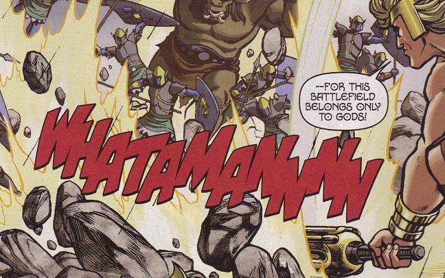
Okay, so not only is the recap page of this comic often more entertaining than the actual stories in most other Marvel and DC books (I've mentioned this before; in this one, Thor narrates about some of their fights and wishes that Hercules would wear some underwear), but in this issue, my campaign to get Simon Bowland an Eisner for best letterer resumes in full force. Yes, I know the debate last time was whether the writers come up with the sound effects and Bowland just implements them, but in the absence of any creator coming by here and letting us know for certain that Bowland didn't come up with them, I'll keep pimping him for an Eisner. Last time, I simply wrote the sound effects. This time, if you'll forgive the SPOILERS!!!!!!!!!, I'll scan them:


This is in the middle of one of the best superhero fights I've seen in a long time, as Herc (pretending to be Thor) battles Thor (pretending to be Herc) in order to keep Queen Alflyse from rampaging across Asgard. Pak and van Lente keep it clever, as Thor tells Herc he needs to lose, which Herc certainly understands but also certainly doesn't want to do, because his pride is at stake. Of course, it all works out in the end (I won't tell you how, especially with the way they deal with Malekith), but the writers continue to make very nice points about the characters in the midst of all the mayhem, as they do when Zeus tries to figure out why a buffoon like Hercules is considered a hero. Plus, as you can see, Brown's art is fantastic as usual.
What a wonderful comic. Come on - a purple nurple!!!!! Who doesn't love that?
This issue: Recap page; three (3) story pages, then an ad. Three (3), then an ad. One (1), then an ad. Three (3), then an ad. Three (3), then an ad. One (1), then an ad. Two (2), then an ad. Five (5), then an ad. One (1), then the "next issue" page. Adverts: Milk (with some dude named Ryan Sheckler; Kia; a video game; a video game; a video game; Punisher #11; The Incredible Hulk #603; Realm of Kings.
Scalped #32 ("The Gnawing Part Three of Five") by Jason Aaron (writer), R. M. Guéra (artist), Giulia Brusco (colorist), and Steve Wands (letterer). $2.99, 22 pgs, FC, DC/Vertigo.

It's been a while since an issue of Scalped came out, which is a shame. It's always a gripping read, even one like this, which seems to fly by. It's not that this isn't packed with stuff, but the set pieces in this issue - the witness escaping both police custody and Dash; Dash returning to Carol's house and getting kicked out; Red Crow showing up at Carol's place; Dash visiting his mother's grave and making a deal with the proverbial devil - are notable by the fact that Aaron lets Guéra draw the hell out of them, and Guéra, perhaps not surprisingly, does a wonderful job. There's just not a lot of words in this issue, which is fine, because it's always nice to see writers and artists have such a good synergy that the writer trusts the artist to tell the story, which Guéra does. The jailbreak could be completely wordless and we'd know exactly what's going on. The same could be said for Dash's visit to his mother's grave and subsequent deal. We see from Dash's face that he's about to go straight to hell, and then we see his disgust when he's forced into his alliance. Aaron has gotten some good fill-in artists for this series, but no one captures the grittiness of this world like Guéra does. You can just feel the despair oozing off the pages when you read an issue of Scalped, and that's at least half due to the art. Aaron rarely has to tell us the characters have no choice when they do things, because we see it all over their faces. As we hurtle toward the end of this story arc (and wherever the hell Aaron is going with it, because it just doesn't seem like Dash has many options left), it's due in a large part to Guéra's art that we're so emotionally invested in the book.
This issue: Fifteen (15!) story pages, then a double-page ad. Seven (7) story pages, then a seven-page preview of Peter and Max. Adverts: A video game; the "On the Ledge" column on the final page. I can't remember if the Vertigo books from the past few months had fewer ads when they ran the preview of the novel; I assume so, which may be why there's hardly any advertising in this issue, which is late.
Secret Six #14 ("Depths Part Five of Five: Early Release") by Gail Simone (writer), Nicola Scott (penciller), Carlos Rodriguez (penciller/inker), Doug Hazlewood (inker), Mark McKenna (inker), Jason Wright (colorist), and Pat Brosseau (letterer). $2.99, 22 pgs, FC, DC.

As I always point out, I love the fact that this book makes me feel uncomfortable, as it's often really creepy, and Simone can do things in this comic that I wouldn't want to see in a more "straight-forward" superhero comic (even though costumed people abound in this book). Case in point: Grendel standing over a spread-eagle Wonder Woman and licking her palm with an extremely long and wet tongue (tentacle rape comes to mind, very deliberately, I'm sure) as he tells her he's going to "eat" her (he means it literally, but the sexual element is very strong). This is on the first three pages, mind you, so it's not like Simone eases us into it. I forgive it in this comic, even though if this thing took place in, say, Wonder Woman's own magazine, I might think it's excessive. It all gets back to tone and the "audience," I suppose, of the book - it's a standard DC comic, so theoretically it can be sold to kids, but Simone seems to understand the horror better than others writing for DC, and she addresses it head-on. It's an unpleasant comic, not in that it's not excellent (it is), but in that Simone is dealing with horror and, in a superhero way, she brings us the consequences of the actions. Wonder Woman is not a superhero in this book, she's a woman avenging as close a rape as we can see on the page, as well as the imprisonment of her sisters. Scandal does something in this book that makes the one person whose opinion she cares about lose respect for her. Deadshot shows, again, why he's such a cool guy, but his "betrayal" of the team has to have repercussions in the future, I'd imagine. This is about as intense a comic as you can get from the regular DC and Marvel universe, and Simone is brilliant at showing how depraved these people are without making them completely hateful. I mean, you have to love Ragdoll, right? But even someone as nasty as Lawton is a compelling character with a nice undertone of tragedy (this comes mainly from what I know about Lawton from when Ostrander wrote him back in the day - and I suppose I should mention that next issue is the one guest-written by The Man himself - but Simone has done a fine job building on that). Even Mister Smyth is oddly sympathetic, or at least comprehensible!
I love comics that keep getting better. This is one of them.
This issue: Four (4) story pages, then an ad. One (1), then an ad. Two (2), then an ad. Three (3), then an ad. One (1), then a double-page ad. Four (4), then an ad. Three (3), then an ad. Three (3), then an ad. One (1), then the end of the issue. Adverts: Kia; the movies available on VOD; Victorian Undead, the new Wildstorm mini-series by Ian Edginton and Davide Fabbri; The Great Ten, the new mini-series by Tony Bedard and Scott McDaniel; a video game; Lobo: Highway to Hell, the new mini-series by Scott Ian and Sam Kieth; Batman #692 (Tony Daniel's return to the title!); World's Finest, the new mini-series by Sterling Gates and Julian Lopez; DiDio's "DC Nation" column on the last page of the comic.
The Unwritten #6 ("Inside Man Part One") by Mike Carey (writer), Peter Gross (artist), Chris Chuckry (colorist), Jeanne McGee (colorist), and Todd Klein (letterer). $2.99, 22 pgs, FC, DC/Vertigo.

Carey and Gross get back to the main story, as Tom gets sent to prison while he awaits trial. Carey cleverly moves him from Switzerland to France by way of one of the victims of the massacre being French and the French wanting to try him, and this sets him down near where "The Song of Roland" is set, which apparently leads into the next section of the tale, as Tom suddenly begins acting very un-Tom-like but definitely more Roland-esque. Meanwhile, Lizzie is tasked to "undo the harm that's already been done," so we'll have to see what that entails. Oh, and Frankenstein's monster shows up. Well, of course he does!
To call this issue "efficient" might sound like an insult, but it's really not. Carey moves all the pieces into place for his next arc after the first one ended oddly, with Tom arrested for murders he didn't commit. Obviously, Carey is going for a slow burn on this title, which is fine (it might annoy people who buy the trade of the first arc, because its ending is so inconclusive, but fuck those assholes and their monthly-serial-killing ways, right?), so, much like Fables (with which this seems to share a sensibility), individual issues might have little cool moments, but in terms of advancing the plot, they might disappoint. A lot "happens" in this issue, but none of it pays off now, because that's not what Carey's going for. It's still an interesting comic, and as I happen to enjoy "The Song of Roland" a hell of a lot more than Shelley's band of whining Goths, I have high hopes for this section of Tom's journey.
Of course, even if the writing portion of the issue "disappoints" (to the extent that it does, which isn't much), we can still marvel at Gross's art. His style when he's drawing the portions of the book with Roland and Oliver is nicely different from his regular style, looking more "medieval," for lack of a better word, reminiscent not only of a manuscript but also of, say, Charles Vess's art when he was drawing Shakespeare for Gaiman back in the day. He also does a fine job with the dankness of the prison, and I don't know if he designed Lizzie's outfit when she goes into the police station, but it's pretty dang awesome (not as awesome as these outfits, but still pretty keen). And, of course, the image of the monster in the church at the end is chilling yet strangely tender. Gross is excellent on this book, and it mitigates Carey's desire to do a slow burn on the book a lot.
But I'm patient. And I do enjoy the cool conceit of the comic, so I don't mind that Carey is going slowly.
This issue: Two (2) pages of praise for the comic, with the second page adding a recap that also introduces the "Inside Man" of the title. Two (2) pages of story, then an ad. Two (2), then an ad. Three (3), then an ad. Three (3), then a double-page ad. Two (2), then an ad. Five (5), then an ad. Three (3), then the "On the Ledge" column. Two (2), then the end of the issue. Adverts: The two movies on VOD; Luna Park; The Dream Hunters adaptation by Gaiman and P. Craig Russell; a video game; Peter and Max; The Absolute Death.
The Veil #4 (of 4) ("Veil") by El Torres (writer) and Gabriel Hernandez (artist). $3.99, 24 pgs, FC, IDW.

As we come back around to the topic I was ruminating about in the first review, the commenter who agreed with Hibbs specifically mentioned IDW's titles, which cost the same as Boom!'s do but have more "hand" because their card stock is heavier. This comic is a good example - in terms of story, it's two pages more than The Anchor, but it feels substantially thicker. Is that enough to get people to buy it? I don't know. I do know that some IDW books that I buy might have better "hand," but the art is occasionally blurrier than on a Boom! comic - like this issue is. Some of the pages look less crisp than they could be, as if we're looking at a photograph of the art rather than the art itself (I'm well aware I'm never looking at original art in a comic, but I'm talking about the reproduction values of the actual original art). Therefore, even though I've been very pleasantly surprised by this series and I think Hernandez's art is a bit better than Churilla's (even though I think they're both good), The Anchor's interiors actually look better than the interiors of this issue do. I hope that people who think that the IDW book is worth the four dollars and the Boom! book isn't check out the interior work, too, rather than just making a snap judgment based on "hand." I wonder if IDW's commitment to heavier stock means that the art doesn't reproduce as well, because this isn't the first time I've noticed it.
That is, of course, a production issue, and it has nothing to do with the actual content, and The Veil is, for me, the most surprising comic of the year, because Torres took a fairly standard horror trope - a girl can see the dead - and crafted a truly terrifying comic that - and this is key - follows through on the premise. I don't want to give too much away, but too often in popular entertainment, creators rely on a deus ex machina to pull back from the edge just when things are about to get really unpleasant. This doesn't only happen in horror, of course, but in all forms. I've told the story of my experience with Dolph Lundgren's Punisher movie before, but it's worth repeating. As crappy as the movie is, it was goofily entertaining, and when the Asian villain takes those kids hostages, I told my friend, "This movie gets five stars if the kids die." It's not that I wanted to see kids get killed, even in a fictional setting, but if the director puts kids in jeopardy to elicit an emotional response from us ("Save them, Dolph!"), he should have the balls to acknowledge that the evil villain probably would kill at least one. I ought to have a name for this, in fine Cronin fashion - maybe I could call it the Independence Day Syndrome, because of that damned dog outrunning a fireball because whatever you do, you can't kill a poor dog! Torres sets up his story in such a fashion that his bad people really ought to follow through, and by God, they do! There are always casualties in horror, after all, and they shouldn't all be girls who had pre-marital sex. This is truly a horrifying comic, one of the better ones I've read recently, and I encourage you to go find the trade when it comes out. Hernandez's art is amazing and creepy, and Torres really gets under your skin with his story.
This issue: Twenty-four (24) pages of story, then eight (8) pages of ads, all for IDW products and including a three-page interview with the new creative team on Transformers.
Let's break down the advertising:
Video games: 7
Two movies available on VOD: 3
A Kia: 2
Milk: 1
House ads: 20
I don't know what that says about publishers' ability to sell advertising space, but that's the breakdown.
So that's the week. Quite excellent in terms of quality: A nice debut, a very good continuing series, a long-missed favorite, Marvel's best book, another great issue of Native Noir, DC's best book, a new arc of a promising series, and the terrifying conclusion of a very good horror comic. It's all about quality, not quantity here at the Burgas home! And now, it's time for totally random lyrics!
"Through all the cities and all these towns
It's in my blood and it's all around
I love you now like I loved you then
This is the road and these are the hands
From Mozambique to those Memphis nights
The Khyber Pass to Vancouver's lights
Knock me down get back up again
You're in my blood I'm not a lonely man"
Once you get this song in your head, you'll never get it out! That's how insidious it is!
Oh, and GO PHILLIES!!!!! We can't let the damned Yankees win, can we?