'We are happy lovers. Aren't we? And happiness makes one stupid. Happiness and wisdom do not go together, just as body and thought do not go together. Because only pain is the thought of the body. In other words, happy people become stupid people. It is only when they get tired of their happiness that lovers can become wise again, if that is what they otherwise are.' (Milorad Pavić, from Last Love in Constantinople)


The Activity #4 ("What Goes Up Must Come Down") by Nathan Edmondson (writer), Mitch Gerads (artist), Joseph Frazzetta (color assistant), and Jeff Powell (letterer). $3.50, 23 pgs, FC, Image.
This issue of The Activity is slightly better than the ones that have come before, but it's still not making me stick with the book (I have pre-ordered through next issue, and then that's it). This is more exciting than last issue and more clear-cut than the first two issues, and even the fact that Edmondson is trying very hard to make sure that the team doesn't do more than they should and that they're part of a great machine and therefore we might not see every part of the operation is a good move, because it lends to the verisimilitude of the venture. However, it's still stuck in first gear, and now Edmondson has introduced a possible leak in the team, and as we don't really know the characters all that well, I don't really care all that much.
Gerads' coloring is too murky, as well. Much of the operation takes place at night, true, but that doesn't mean we wouldn't appreciate some "fake" lighting to make things clear. Some movies try to recreate the actual darkness of night, and don't you hate it because you can't see what's going on? There's a full page panel in this book that seems like it would be hella cool if it weren't for the fact that we can barely see it. It doesn't even need a lot of light, but it needs some. It's annoying, because while the art isn't great, it's not bad, but the most exciting parts of this book are really dark. Sigh.
This is the best issue of The Activity so far, so if you're keen to see what it's all about (each issue is relatively self-contained, although, as I mentioned, Edmondson is introducing grander plot points), check it out. It's not enough to get me to keep buying it, but that's the way it is, isn't it?
Rating: ★ ★ ★ ★ ★ ½ ☆ ☆ ☆ ☆
One totally Airwolf panel:

Batwoman #7 ("To Drown the World Part Two") by J. H. Williams III (writer), W. Haden Blackman (writer), Amy Reeder (penciller), Rob Hunter (inker), Guy Major (colorist), and Todd Klein (letterer). $2.99, 20 pgs, FC, DC.
If you haven't heard, Amy Reeder is off Batwoman due to the ambiguous "creative differences" (which is like the "irreconcilable differences" that always break up celebrity marriages), and Trevor McCarthy will replace her on issue #9. Several things are interesting about this. First of all, Reeder has been working on this book for a very long time, so I'm surprised she hadn't finished issue #9 yet, unless Williams hadn't gotten her the pages. Second of all, this can't be about the plot of the book, so it must be about the artwork, and hasn't Williams had a long time to evaluate her artwork on the book? Third of all, some of the people complaining about McCarthy taking over puzzle me. Some of McCarthy's work on Gates of Gotham was positively Williams-esque in terms of layouts, and his pencil work is probably just as good (or just as bad, depending on your point of view) as Reeder's - they have some differences in style, but they're not opposites by any means. If you're going to get another artist for this arc and you want to keep it somewhat visually consistent with the first arc and whatever Reeder has already done, you could do a lot worse than getting McCarthy to do it. I understand that some commenters are upset because Reeder is a woman and she's being replaced by a man and it's just another instance of a woman losing a job, and that's fine, but that doesn't have anything to do with the actual work. Art-wise, I think the transition will be fairly smooth.
It's too bad about Reeder, but it's part of the shift we're seeing in mainstream comics back toward the dominance of the writer, if we accept that the dominance of the writer ever went away. Others have been noticing this, mainly with regard to Marvel's double-shipping policy that doesn't allow a single artist any time to do even three or four issues in a row, so the book becomes linked to the writer with a bunch of artists showing up (David Brothers wrote about this recently, and I agree - if you think about it all, you don't think about it as "Waid and Rivera's Daredevil, you think about it as Waid's Daredevil and whoever happens to be drawing it), but I noticed something very odd about DC's solicitations for June: Underneath the title, there is one name - the writer's. It doesn't even read "Written by _____," it's just GEOFF JOHNS or J. T. KRUL, and then underneath that, we get "Art by ______," subtly implying that the artist is not as important as the writer. Twenty years ago, I might have agreed with this. I like to think I'm wiser now. So dumping Reeder (if indeed Reeder was dumped) or Reeder leaving on her own because she felt expendable (if indeed that happened) makes a bit more "sense" if we accept the primacy of the writer. It's not a trend I really love, but it appears that's what's going on.
Anyway, I like the way Williams and Blackman are writing this arc, with a bunch of different threads occurring at different times, all presumably leading to the present. I'm still not a fan of the supernatural bent this comic has always taken, but it's been enough issues that I suppose I've made my peace with it. The best parts of the comic are when Kate or Chase or Maggie actually has to do some detective or other police work, and then the weird ghosts and other shit show up, and I just sigh and hope it's not too annoying. Usually it's okay, but they're never my favorite parts. Reeder is still not done any favors by the weak inking, unfortunately (she had this problem on Madame Xanadu, too - I know she's influenced by manga, but some muscular inks might help her out quite a bit), but she puts together some nice pages, and doesn't Kate look adorable when she's having sushi with Maggie?
Reeder's departure may have dominated the Batwoman news this week, but I still think this is a pretty good arc, because I always appreciate it when writers try to tell a story in an unusual way. Williams and Blackman might not stick the landing, but it's still nice to see them try to put this all together.
Rating: ★ ★ ★ ★ ★ ★ ★ ☆ ☆ ☆
One totally Airwolf panel:

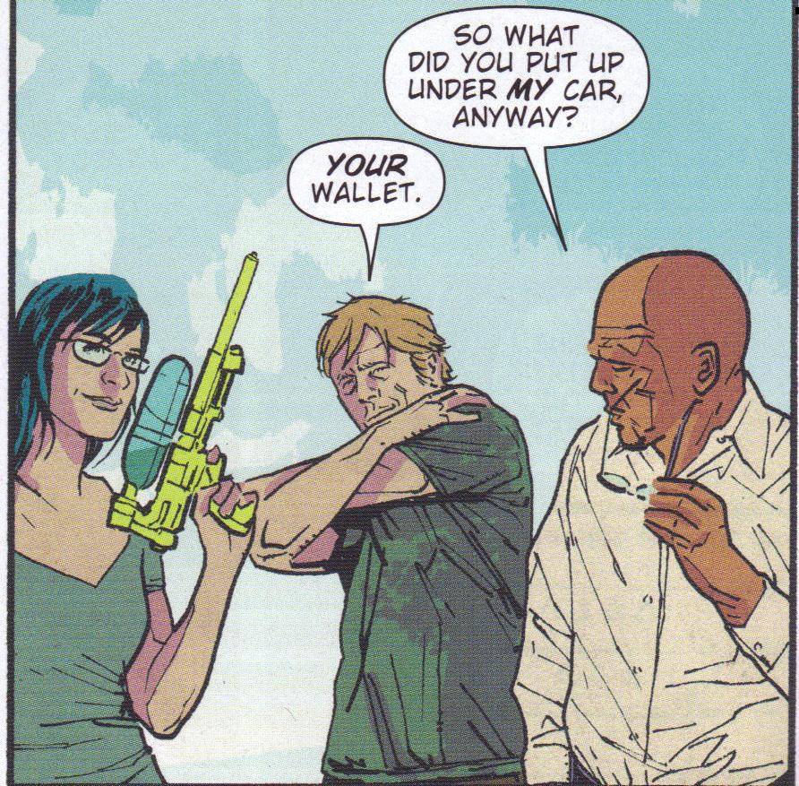
Blue Estate #10 ("White Russian") by Viktor Kalvachev (story/artist/colorist), Kosta Yanev (story), Andrew Osborne (writer), Toby Cypress (artist), Nathan Fox (artist), Dave Johnson (artist), Peter Nguyen (artist), and Kieran (artist). $2.99, 23 pgs, FC, Image.
Issue #12 is the final issue of the first "season" of Blue Estate (I'll rant briefly about "seasons" of comic books below, believe me), so Kalvachev and Osborne are ramping things up nice and quickly, as various threads are coming together and the book ends with many, many heavily-armed men converging on a single location, which can't be good for anyone. There's also the wonderful phenomenon of a horse getting stoned in the back of a VW van, because why the hell not???? There's also an entire page devoted to a sexual event (I'm not sure if it's a position or not) called the "Beluga," because why the hell not???? There's a couple in what honestly looks like a physically impossible sexual position (NSFW!), because why the hell not???? As usual, Kalvachev's coloring and clever use of artists makes the book, even with so many artists working on it, look seamless (yes, I know I was ranting about interchangeable artists above, but a few things mitigate this: it's always been that way and has been planned fairly carefully by Kalvachev from the beginning, and I give non-Big Two books, with their thin margins, a longer leash than DC and Marvel comics), and as usual, this is a blast to read. It's just one of those comics that doesn't take itself too seriously but still manages to be an exciting and tense comic. Oh, yeah, and there's a David Hasselhoff cameo, because why the hell not????
Rating: ★ ★ ★ ★ ★ ★ ★ ★ ☆ ☆
One totally Airwolf panel:

Glory #24 ("Once and Future Part Two: The Way It Is") by Joe Keatinge (writer), Ross Campbell (artist), Ms, Shatia Hamilton (colorist), and Douglas E. Sherwood (letterer). $2.99, 20 pgs, FC, Image.
In this issue, Glory gets out of bed (that would be a bulletpoint is there were a DC or Marvel book) and takes Riley to her Bat-cave, where she explains some things. Meanwhile, in more flashbacks, we get caught up even more on her history, and if this is part of her established history, Keatinge is doing a nice job with it, because I feel like I know enough about what happened in her past to make the present comprehensible. Of course, Keatinge pulls the rug out from under us at the end, but it's not that big a surprise because, frankly, I've been reading comics for too long, I guess. But surprise endings don't make or break a story for me, and getting there is pretty fun. Campbell gives us another bloodbath early on in the book (well, beside the cover ...), but he also does a good job on the rest of the book. It's nice to see how big Glory is, and Campbell makes sure she still looks beat to hell - she might heal quickly, but not that quickly. So she looks both imposing and vulnerable, because she's a giant, muscular chick who happens to have bandages and scars all over her body. Campbell, hilariously, cannot escape the problem that so many artists have with feet - Glory's look like stumps when she walks into Riley's room - but that's okay; at least she has feet! Mainly, this is a gorgeous comic, Hamilton's wonderful colors complementing Campbell's detailed work very well. Two issues in, and I'm sold on the comic!
Rating: ★ ★ ★ ★ ★ ★ ★ ★ ☆ ☆
One totally Airwolf panel:

Mouse Guard: The Black Axe #4 (of 6) by David Petersen (writer/artist). $3.50, 23 pgs, FC, Archaia.
By the time this entire series comes out, it will be well over a year for the six issues to show up, and I do hope that if Petersen has any more Mouse Guard stories to tell (and why wouldn't he?) that he does them in a graphic novel format, because the wait between single issues is really annoying and, I imagine, works against the book quite a lot. Because this issue, in which two mice hunt a fox so that the Ferret King will release their companion, is really good. Petersen does a nice job showing how they stalk the fox, and the actual battle is superb. He also gives us an eerie scene in the fog early on in the issue, which adds to the sense of doom in the entire book. Finally, he shows how death affects everything, as the fox might be a predator, but even predators have families, and Petersen does a good job injecting a sense of tragedy into the story. Finally, there's the ending, which leads well into the final part of the series. It's a fine issue, put together very well, and highlighted by Petersen's stunning artwork. Mouse Guard continues to be an excellent comic book, and I hope it still has a decent audience, even though I think it would be better to skip the single issues and go straight to the hardcover!
Rating: ★ ★ ★ ★ ★ ★ ★ ★ ½ ☆
One totally Airwolf panel:

Northlanders #49 ("The Icelandic Trilogy Part 8: Wealth 1260") by Brian Wood (writer), Danijel Zezelj (artist), Dave McCaig (colorist), and Travis Lanham (letterer). $2.99, 20 pgs, FC, DC/Vertigo.
The penultimate issue of Northlanders feels a bit rushed, unfortunately. I've speculated before that Wood hasn't adjusted too well to the 20-page limit, as some of his latter work on the book feels like it could use an extra page or two, and this issue is no exception. It's not a bad issue by any means, but Oskar's sudden rise and fall in this issue feels, well, sudden. Last issue he imprisoned his father so he could go to war, and in this issue, he's successful quickly and, just as quickly, unsuccessful; although he's still around at the end of the issue, everything is aligning against him. The best part of the issue is Freya's conversation with Godar, because the old man knows exactly what's going to happen and Freya, doing her best Lady Macbeth, refuses to believe him. She's too smart, though, and the instant things start to turn against Oskar, she realizes it and begins to take steps to save herself. I can't believe that this story doesn't end with Iceland losing its independence, and Oskar as a symbol of that works, but it still feels like it's happened too quickly. Unlike some of the other comics that work under the 20-page mandate, this comic is too complex to rush, and that's too bad (that's not a criticism of other comics, in case you're wondering, but because Wood is writing about things that occurred in a precise historical time frame, he has to at least pay a little bit of lip service to real-world concerns, which are usually more complex than what's happening in a superhero comic). Oskar's rise and fall is fascinating because of the way it happens, and it's too bad Wood wasn't able to devote a bit more space to it. I suppose we're lucky he was able to end the series with this ambitious 9-part story in the first place and accept what we get. I'm bummed about next issue being the last one, but I'm keen to see how Wood brings it to an end.
Rating: ★ ★ ★ ★ ★ ★ ★ ½ ☆ ☆
One totally Airwolf panel:

Saga #1 by Brian K. Vaughan (writer), Fiona Staples (artist), and Fonografiks (letterer). $2.99, 44 pgs, FC, Image.
It's a big week for #1 issues, and I bought three of them. Let's begin with this monster!
First of all, no matter what I or anyone else thinks of Saga, you should buy it. It's 3 dollars for 44 pages of story, and that's a damned fine value. A few years ago, when Vertigo was charging a dollar for their #1 issues, I checked out a few that I probably wouldn't have looked at otherwise, and it's just a good marketing strategy to lower the price on your first issue (or offer more for the same price) than, say, charging 4 bucks for your first issue and then lowering the price on subsequent issues (which Marvel was doing for a while). So go buy this, because that's the best way to figure out if you want to keep buying it, right?
As for the issue ... well, I wanted to love Saga, and I didn't. I liked it quite a bit, but it's not the greatest comic ever written and it's not even the best comic I bought this week. Overall, the plot is fine - that there couple on the cover are from two different sides in a long, long war, but they have sex (I refuse to say they've fallen in love), have a baby, and now both sides want them dead (but not the baby, mostly because it's a curiosity, as no one thought these two species could actually produce a baby). Romeo and Juliet in space, essentially, which others have used because it's so accurate. So in this issue, the baby is born; Alana and Marko (the parents) escape from cadres of soldiers from both sides; both sides send assassins after them; we meet several of the principals who will, probably, continually vex our star-crossed lovers; and we discover a bit about the war, which has been farmed out to many other worlds because the two sides live on a planet and its moon, and neither world can be destroyed without causing chaos on the other one. There's a lot going on, in other words, and Vaughan does a nice job pacing the issue to get it all in without going too fast. Plus, robot sex, so it's got that going for it.
It's the small things that bug me about the book and keep me from loving it. Scant seconds after Alana gives birth, the bad guys burst in and try to kill her and Marko. We never get a sense that childbirth has any impact on her physical well-being at all. Maybe her species recovers really quickly from pregnancy, but Vaughan doesn't get into that. It might sound like nit-picking, but if you're going to have one of your protagonists give birth on panel, you have to get into how she deals with it. So that was weird. Plus, are we really supposed to believe they both survived the big battle even though they're stuck between two sides with a lot of weapons? Staples's art is pretty good, but I imagine she's had some time to work on this, and it does look sloppy in places. Her character designs are fine - impressive, even - and the action scene that comes right after Alana gives birth is well done, as is the introduction of The Will, but her figure work is occasionally stiff and awkward. The biggest problem I have with the art are the backgrounds. I'm sure someone knows the process by which they're created, but it's different than just straight pencils. The figures are pencilled and inked boldly, while the digitally-created backgrounds are usually in soft focus (due, I would imagine, to the coloring and wash techniques Staples uses, but I can't be sure), occasionally feature some embarrassingly amateur stuff (the entrance to the "royal embassy," most notably), and because of the difference between the strong figure work and the backgrounds, the book often looks like the characters have been photoshopped into a diorama. Staples has done this kind of thing before, but in something like Mystery Society, on which she was superb, she blended the figure work better and filled in the background more. As she gets better, she needs to stop doing this kind of thing. Well, in my humble opinion.
Vaughan has a reputation for writing good characters, and Alana and Marko seem like they fit nicely into the stable of "good Vaughan characters." Something the ladies of everyone's favorite podcast said about the book hit me in the face, and I'm going to go all mouth-breathing and knuckle-dragging for a moment, if you don't mind. They liked the character of Alana because she's the leader of the couple even though Marko isn't a sniveling weakling. That's perfectly fine with me - Alana is the leader, but Marko is still able to hold his own against her (even though I don't agree with some of things she says; "we have a family now" is not the rallying cry for losers, because when you have children, you do sacrifice some of yourself to make the child's world better, and you don't put the child in danger just because it's not in your nature to keep your head down). I submit, though, that Marko is a more interesting character, and the reason that Alana is the leader of the group is because Vaughan would get in trouble if a woman voiced some of the concerns Marko does in the book. If, for instance, Alana instead of Marko said they should lay low and stay out of trouble, would it have been good writing or an example of the woman being weak? If Alana had rejected the map as silly but Marko had told her it was exactly what they were looking for, would it have been an example of the woman being dim? If Alana had been nervous about the weird things in the night, would that have been an example of a woman being a coward? Marko seems to have more common sense than Alana, plus he shows that he can be both brave and scared, while Alana seems too perfect. As we move ever so slowly from women as eye candy in comics, are writers - men, especially - making female characters too perfect because if they show any weakness, it will be seen as sexist? I don't know, honestly. I love female characters like Jessica Jones partly because she's a bit of a mess, and there's nothing wrong with that. I don't think Alana is that interesting a character yet, because she doesn't seem to have anything wrong with her. Marko has plenty of things wrong with him, yet he still manages to be strong when he needs to be. You might ask if I'd feel the same way about Marko if the dialogue was switched, and I don't know. I'm not even sure if I'm articulating the way I really feel. All I know is that there's something off about the way Alana is written, and it's enough to bother me.
I don't know - maybe I'm talking out of my ass. It's certainly possible, as I'm not that bright. I do know that I didn't love Saga, but I do think it has a lot of potential. A lot of smarter people than I seem to love it, though, so take that as you will. I'll be there for issue #2, and I strongly encourage you to check this out. Forty-four pages for three dollars, people! Make up your own mind!
Rating: ★ ★ ★ ★ ★ ★ ☆ ☆ ☆ ☆
One totally Airwolf panel:

Saucer Country #1 ("Run Part One") by Paul Cornell (writer), Ryan Kelly (artist), Giulia Brusco (colorist), and Sal Cipriano (letterer). $2.99, 20 pgs, FC, DC/Vertigo.
As you may recall, I'm trying to stop getting new series from the Big Two and move to trades exclusively, at least for those two companies. So I wasn't going to get Saucer Country even though it sounded keen. Then, I was in the comic book store ... and I totally caved. Oh well. It's not like it's a bad comic book, right? I still haven't decided if I'm going to keep buying it in this form or if I'm going to wait for the trade - this seems like it's very much written for the trade, so it just might have to wait.
But hey, it's Cornell and Kelly, so you know it's going to be at least worth a look. Cornell begins the book on a dark desert road in New Mexico, where the governor, Arcadia Alvarado, and her ex-husband, Michael, wake up in a car and don't know what happened. Governor Alvarado keeps having flashes that seem to indicate she was abducted by aliens, but even though she tells her chief of staff and head strategist about it at the end of the issue, we still don't quite know if she was really taken or not. Maybe she's nuts, after all. The backdrop of this is that she announces in this issue that she's running for president, so that might throw a spanner in the works. And there's a professor at Harvard who has written a book about UFOs and whatnot who is fired for being loony and who talks to (possibly) imaginary people. You know, like you do.
Kelly's great, so it's no surprise the book looks great. The set-up is intriguing, although not perfect. I don't quite understand the idea of Chloe Saunders, the Republican strategist (Alvarado hires her because she's from the opposite party and can give her a different perspective, and I'm glad Cornell actually used the political parties in this country, because too often writers punk out in that regard), telling the governor to let people think her ex-husband beat her. I'm not sure if Michael actually did beat her and Chloe wants Alvarado to let people think that, or if Michael actually didn't beat her but she should let people think it anyway. Alvarado goes along with it, so I hope it's the former, because that would be a douchey move to make if he didn't actually beat her. It's unclear in the issue which it is. I suppose we'll have to wait and see. It's a small thing, but it bugged me.
Overall, though, this is a decent beginning. Cornell has given us what will probably be interesting political intrigue, as presidential campaigns are dramatic enough without throwing alien abduction into the mix. Plus, Alvarado has some specific ideas about the aliens, so we'll see where that goes. I'm not sure it's a great comic, but we'll see. I'll have to mull over whether I want to keep getting it, either in single issue or trade format. I have a feeling that if it's any good, it will be because it's good in trade form, as Cornell seems to be going for a really long-term story.
Rating: ★ ★ ★ ★ ★ ★ ½ ☆ ☆ ☆
One totally Airwolf panel:

The Secret History of D. B. Cooper #1 by Brian Churilla (writer/artist) and Ed Brisson (letterer). $3.99, 23 pgs, FC, Oni Press.
If you want to make a monster comic, there are certain artists you can call to make it awesome, and Brian Churilla is one of them. Churilla knows this, too, so instead of waiting for someone to write a monster comic for him, he decided to write his own damned monster comic! Now, technically, this comic is about D. B. Cooper, the famed skyjacker who disappeared in 1971 and who has been a subject of speculation ever since. In this comic, he's a CIA agent who has an ability, apparently, to appear inside other's minds and kill them from there, making him a particularly skilled assassin. We begin a week before his famed exploits over Washington/Oregon, as he's stalking his prey, and when he ends up in someone's mind, he encounters a lot of weird beasties, which is where Churilla gets to cut loose. His companion is a large, one-eared teddy bear, he finds a monster inside what looks like a giant vagina, and things get messy. But he's really good at what he does!
This is a wacky comic, but it works. Churilla gives Cooper a daughter who will, presumably, have an impact on the series. He gives Cooper a douchebag rival in the agency, who will, presumably, continue to be a douchebag. There's a nice Cold War vibe to the entire comic, with men in cheap suits smoking cigarettes in seedy locations, and Churilla has a lot of fun with the monsters, because he's good at it. He has a nice, loose cartoony style that helps him create these wacky creatures and keeps the messy violence from being too awful - it's a somewhat gory comic, but it's never gross. If you've never read a Churilla comic before, do yourself a favor and give this a look. Come on - you know what Bagley's work on Avengers Assemble is going to look like, and this costs exactly as much as that!
Rating: ★ ★ ★ ★ ★ ★ ★ ½ ☆ ☆
One totally Airwolf panel:

Wasteland #35 ("Breaking the Warrior") by Anthony Johnston (writer), Justin Greenwood (artist), Matthew Razzano (toner), and Douglas E. Sherwood (letterer). $3.99, 23 pgs, BW, Oni Press.
I don't know how Greenwood was "coloring" the book before this, but this is the first time I've noticed Razzano's name in the credits (forgive me if I missed it before), and even before I did, I noticed the tones were a bit slicker than before. The art isn't quite as rough as it has been, which doesn't bother me too much on this book, because it still feels gritty. The tones do make Greenwood's already cartoony art a bit more so, so that some panels look like Scott McDaniel. But that's fine - I don't mind Greenwood's art, and he tells the story well enough. Johnston does some nice things in this issue - Abi reminds us why she's so kick-ass (mainly because she kicks ass) and we find out a bit about Michael, which, considering how mysterious he's been for so long, is nice. I'm not sure what the last page is supposed to mean, but it might be because of how long the book has taken coming out that I've forgotten something important. Oh well - no big deal, as I'm sure Johnston will explain it.
As I've said since Greenwood came on board, I'm so glad that this book is back on schedule. It's not quite as good as when Mitten was drawing it, because Greenwood isn't as good as he is, but that's to be expected. Greenwood is working well, and Johnston's scripts are tighter when he focuses on one or two primary characters. The last arc was interesting but sprawling, and the delays between issues didn't help. Now the story is more concerned with Abi and Michael and the issues are coming out with regularity, so the book feels like it's getting its footing back. It's very cool to see.
Rating: ★ ★ ★ ★ ★ ★ ★ ☆ ☆ ☆
One totally Airwolf panel:

Corto Maltese: The Ballad of the Salt Sea by Hugo Pratt (writer/artist), Hall Powell (translator), and Patritzia Zanotti (colorist). $25.00, 253 pgs, FC, Universe Publishing.
I've read very little of Pratt's writing, and unfortunately, it hasn't really worked for me. I figure if I don't like this, his masterpiece, then I never have to worry about reading his stuff again.
Womanthology: Heroic. $50.00, 321 pgs, FC, IDW.
True story: The gracious Ms. Kelly Thompson, responding to some of my whining, sent me a link so I could read this early. I was going to do a quick review on Tuesday to remind y'all that this was coming out this week. But I sat on the link too long and it expired, because I, apparently, suck. So now I have the hard copy, and it's pretty awesome. It's a gigantic hardcover with not only the various stories, but a lot of other stuff too - bios of pioneer female comic creators, a comic strip running along the bottom of the pages - and it just looks freakin' cool. Now, I might hate everything in it, but the package is amazing. It's fifty bucks, sure, but you can tell that a lot of work went into making sure it's a very cool comic. I'm really excited to read this sucker.
X-Men: Season One by Dennis Hopeless (writer), Jamie McKelvie (artist), Mike Norton (artist), Matthew Wilson (colorist), and Clayton Cowles (letterer). $24.99, 100 pgs (plus a reprint of Uncanny X-Men #1), FC, Marvel.
Boy, I hate calling these things "seasons," don't you? I mean, they're not television shows. I wonder if DC copyrighted "Year One," but couldn't someone at Marvel come up with something better? Sheesh. Oh, and I forgot to mention when the news came out, but as two of the three creators are working on this book - NEW PHONOGRAM COMING!!!!!! Man, I cannot wait. Yea, verily, it will be tremendous.
**********
I can't discuss my current state without getting blindingly angry - here's yet another bill the Arizona legislators have come up with - so I'm not going to. I mean, once we have the sponsor of that bill claiming that employers should have the right to fire women for using birth control pills because we don't live in the Soviet Union, we've officially gone through the motherfucking looking glass. I mean, come on, Arizona. I know other states come up with absolutely idiotic shit, but why has this contraception thing suddenly become the issue? I mean, if I were a Republican, I'd be super-pissed that the presidential candidates are basically handing the election to Obama, and while Arizona is a conservative state, how long can the legislature waste their time with shit like this before the staunchly conservative electorate realize that they don't have any jobs or, you know, freedom? Fuck politics sometimes.
In more fun news, this week was the first week I bought a DC comic with the new logo (it debuted last week), and I still can't get over how furshlugginer ugly that thing is. I mean, look at that shit:

So I asked my six-year-old to come up with a better one. I told her it had to have the letters "D" and "C" in that order, and I showed her some logos to get her started. I left her mostly alone, although I did suggest she could do more than just write "D" and "C" in different colors (although that would still be better than the new one). She eventually came up with this:

Wouldn't buying a comic with that logo on it just make you happy? It has butterflies on it, for crying out loud! I expect DC to make another logo change soon, just when they realize how shitty their new one is. Pay my daughter some straight cash, homey, and we can talk!
My wife reset my iPod (she does it accidentally quite a lot, unfortunately), so there might be some repeats from recent weeks as we check out The Ten Most Recent Songs On My iPod (Which Is Always On Shuffle):
1. "Shake It Out" - Florence + the Machine (2011) "I am done with my graceless heart so tonight I'm gonna cut it out and then restart"
2. "Indian Summers Dream" - Stress (1991) "Should I force the moment to its crisis just to provoke an emotion within you?"
3. "All My Little Words" - Magnetic Fields (1999) "You said you were in love with me, both of us know that that's impossible"
4. "Hope Alone" - Indigo Girls (2002) "You were looking for your distance and sensing my resistance you had to do your will"
5. "Take a Chance on Me" - ABBA (1978) "You say that I waste my time but I can't get you off my mind"
6. "To Be Lonely"1 - Mucky Pup (1989) "Look for reasons why, but nothing becomes of it"
7. "Need You Tonight" - INXS (1987) "All you got is this moment, twenty-first century's yesterday"
8. "Get Out the Map" - Indigo Girls (1997) "We'll leave the figuring to those we pass on our way out of town"
9. "Memories Can't Wait" - Living Colour (1988) "Don't look so disappointed, it isn't what you hoped for is it?"
10. "Happiness in Slavery" - Nine Inch Nails (1992) "Stick my hands through the cage of this endless routine, just some flesh caught in this big broken machine"
1 I couldn't find a video for this song, so here's one for "Hippies Hate Water." They totally do!
Finally, for no good reason except some commenter on a blog mentioned it recently, here's a picture of Colleen Camp in a French maid's outfit. I'm going old school this week!
Have a nice day, everyone. It's currently in the 80s here, but it's supposed to be in the mid 60s and rainy this weekend. Soon I'll be yearning for those cool days when it was only in the 80s!