"Reading," he says, "is always this: there is a thing that is there, a thing made of writing, a solid material object, which cannot be changed, and through this thing we measure ourselves against something else that is not present, something else that belongs to the immaterial, invisible world, because it can only be thought, imagined, or because it was once and is no longer, past, lost, unattainable, in the land of the dead ..."
"Or that is not present because it does not yet exist, something desired, feared, possible or impossible," Ludmilla says. "Reading is going toward something that is about to be, and no one yet knows what it will be ..." (There, now you see the Other Reader leaning forward to peer beyond the edge of the printed page at the ships of the rescuers or the invaders appearing on the horizon, the storms ...) "The book I would like to read now is a novel in which you sense the story arriving like still-vague thunder, the historical story along with the individual's story, a novel that gives the sense of living through an upheavel that still has no name, has not yet taken shape ..." (Italo Calvino, from If on a winter's night a traveller)


Aladdin: Legacy of the Lost #1 (of 3) by Ian Edginton (writer), Patrick Reilly (artist), Richard Starkings (letterer), and Jimmy Betancourt (letterer). $4.99, 47 pgs, FC, Radical Comics.
I received this last week in the mail, so it's probably been out a few weeks. You can still find it! I've always enjoyed Edginton's writing on things that aren't from the Big Two, and while this isn't a masterpiece, it's not bad. Edginton is a bit hamstrung by the fact that he follows the Aladdin legend very closely (which, even if it was his choice, still restricts him), so there aren't a lot of surprises here - Aladdin is a street urchin who lives by cheating at gambling and picking pockets, Qassim hires him to find the genie's lamp and then betrays him, Aladdin escapes deep into the cave of the lamp, accidentally releases the genie, and ends the issue as the mysterious new wealthy man in town - but it's still pretty entertaining. Edginton makes sure the book has a good Middle Eastern feel, and Reilly does a decent job with the art. It's in the "Radical house style" - meaning it's painted and looks slightly computerized - but he does a good job blending the supernatural with the grittiness of the souks. Qassim's sand creatures are pretty cool, and the genie is certainly impressive. I'm not sure if Edginton plans on following the legend note by note, but for a first issue, this sets the stage pretty well. The story of Aladdin is always interesting, so it's fun to see if get an updated take.
One panel of awesome:

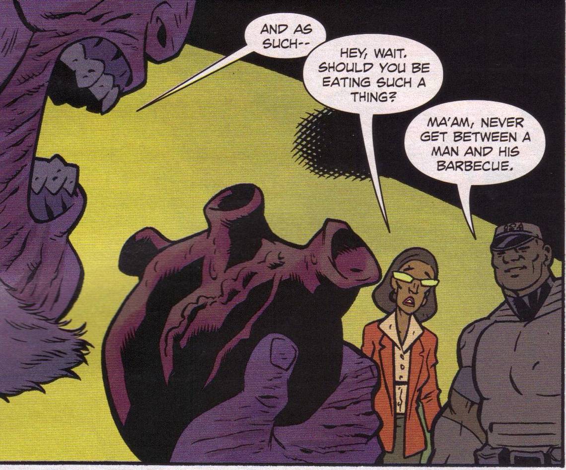
The Anchor #5 ("Black Lips Part One: Hofi's Gift") by Phil Hester (writer), Brian Churilla (artist), Matthew Wilson (colorist), and Johnny Lowe (letterer). $3.99, 22 pgs, FC, Boom! Studios.
It's kind of interesting that this is the first issue of a new arc. It doesn't feel like one. I actually think that's pretty cool. Trades are fun and all, and the prior issue does resolve some things, but this does follow almost directly from it, with a fairly important plot point from the first arc becoming the main thrust of this story. So it doesn't feel like the beginning of a new arc; it just feels like the continuation of the story. Which is groovy.
I've mentioned before that part of the fun of this book is Churilla's monster designs, and he gives us more this issue, with a lava monster and (I guess) Satan, although it could be someone else, I suppose. It's really fun to check out what weird thing Churilla will come up with next. And Hester is doing a good job slowly revealing more and more things about Clem and his past. I didn't realize that whenever he ate a heart he remembered more about his past - I just thought we were seeing bits and pieces of his past because we needed to learn about him, not that the hearts were making him remember. That's pretty neat. Hester keeps things moving along, even in a set-up issue like this - Clem fights the lava monster and, in the past, escapes an angry mob, but there's still a lot of explication in this issue, as well as a nice cliffhanger. Hester has gotten better and better at putting together a single issue, which is why it's kind of neat that he's not really "writing for the trade," even though the first trade does tell a complete story. It's a good trick to learn, and Hester has figured it out.
I can never say this is my favorite comic of any given week, but it's a fun read every time out. There's nothing wrong with that!
One panel of awesome:

Batman and Robin #8 ("Blackest Night Part Two: Batman vs. Batman") by Grant "Screw Rucka!" Morrison (writer), Cameron Stewart (artist), Tony Aviña (colorist), and Jared K. Fletcher (letterer). $2.99, 22 pgs, FC, DC.
This issue is a perfect reason why I'm not really totally in love with the title as a whole. Morrison does a good job explaining how Batwoman came to arrive in the mine and why Dick's idea to resurrect Batman might not be all that smart (and reconciles the fact that we saw Batman at the end of Final Crisis, so what was that body?), but this is basically a fight issue, so there's not much space for any Morrisonian weirdness. However, the actual issue isn't ... um ... the issue. I understand the Batman books currently exist - DC needs to publish a Batman book, after all - but this all feels like so much placeholding. Bruce Wayne is coming back in a different mini-series, and while this book might lead into that (I don't know), it just feels like a lot of sound and fury. I would much rather read a story about Dick and Batwoman fighting the weird British bad guys alongside the Knight and Squire than a story about a resurrected Batman going berserk. The best part of this book is when Batwoman fights the weird-ass chimney sweeps. The rest is just wheel-spinning, and it's frustrating. I don't know if I expect more out of Morrison, but this just lacks any kind of verve. Morrison could go either way - make this book "important" to the larger DC picture as a whole (which would be annoying, but at least fit into a larger tapestry) or make it a really good story. The first arc of Batman and Robin had a pretty good story. The second arc, while not as good, had a pretty good story. So far, this arc hasn't done either. It's not that great a story because it's not even much of a story, while it doesn't feel like it fits into a larger tapestry. Again, it might, especially because Morrison is writing the "return of Bruce Wayne" thing, but the first responsibility ought to be telling a good story. If it later becomes important, fine.
Interestingly, the art shows how much influence an inker and colorist can have on pencil work. Stewart inks his own work, so that's not an issue, but Aviña's coloring makes this look rougher than Sinclair's did last issue. I don't think it's a terribly good fit - the art looks rushed in places, and I'm not completely sure if it's due to the coloring or not. The book took a month off after Philip Tan's arc and Stewart presumably had a while to work on it, so I don't know if he was rushing to meet a deadline here. If he was, why release this book two weeks after issue #7? Again, it might get back to this book fitting into a bigger DC story and it needs to get out before Bruce Wayne comes back, and that would be annoying. The art still looks good, but it lacks the crispness that makes Stewart's art so brilliant. Is it the different colorist, or is it Stewart rushing his inks?
Anyway, we're probably not going to get them (as we're back in Gotham next issue, I assume), but this book needs more crazy chimney sweeps and fewer resurrected Batmen. But I might be in the minority in that regard. And wouldn't it be nice if DC could figure out where word balloons go? I didn't think it was that hard!
One panel of awesome:

Daytripper #3 (of 10) ("28") by Fábio Moon and Gabriel Bá (writers/artists), Dave Stewart (colorist), and Sean Konot (letterer). $2.99, 22 pgs, FC, DC/Vertigo.
If you can read the cover, it has a quote from Jeff Smith: "Honest and arousing." I should point out that this book is neither of those things. In this issue we discover that the brothers are actually being quite dishonest, and it's a bit creepy to think it's "arousing." I know what Smith means, so don't jump my shit or anything, but I just found it interesting that Smith uses those two words.
I was somewhat surprised to see that issue #2 is sort of continued in this issue, but then Moon and Bá throw us for a loop at the end, proving that they're unreliable narrators but making this a much more interesting comic. I already liked it, but this issue shows that they're doing something very ... well, I'd call it clever - you might call it pretentious, but as I pointed out last issue, it's proudly pretentious, and that's refreshing. It's a simple story of a broken love and renewed hope, and as silly as Brás acts (falling in love at first sight, for instance), his goofiness is endearing. Moon and Bá make it work because they tell the story as well with pictures as with words. Olinda's anger is palpable, Brás' longing is pathetic but believable, and his joy at realizing he's not dead inside is beautiful. His attempt to connect with the girl he sees is not the point, and we know it. The point is that he realizes that he doesn't have to live in the past. Moon and Bá do quite a bit without words in this issue - they could actually do more, and it might be more effective. But the way they show Brás striving for something better in his life is refreshing, and makes the ending that much more bittersweet. And makes the book a lie, about which I can't say more without spoiling things, but which makes it far more interesting going forward.
One panel of awesome:

Legends: The Enchanted #0 by Nick Percival (writer/artist), Richard Starkings (letterer), and Jimmy Betancourt (letterer). $1.00, 22 pgs, FC, Radical Comics.
This is another comic I received for free from Radical, and I'd like to thank them for it. It's only a dollar, and there's no reason why you shouldn't get it, just to check it out. It's a preview of a graphic novel that's coming out soon, so you can get a sense of whether you want to plunk down the $20 for the longer book.
Legends is a lot like Fables, in that it takes fairy tale characters and gives them a modern spin. Percival might not like the comparison, but that's too bad, because it's going to be made. He makes things a bit darker than they are in Willingham's book, but it's still "fables" - that's Little Red Riding Hood on the cover - dressed up as adults. That's not to say it can't be done well in a different way than Fables does it, but that's the basic premise of the book. Jack fights giants and gains different powers when he swallows different "beans" - which look suspiciously like pills; Red Riding Hood lures wolf-like things into a fight so she can slaughter them; and old hag destroys Pinocchio and plots against our heroes. Percival shows that he has a sense of humor with Jack, who's not subtle when he kills giants and leaves destruction in his wake that might be worse than what his enemies brought, and the book builds tension fairly well. It's difficult to get much sense of how well the story will progress, but we get some nice teases about an apocalyptic battle between two sides, which is always fun to see.
Percival's art is probably the real draw, as he's in the tradition of great fantasy artists of the past. As usual, I don't know if he paints everything or does a lot on the computer, but he's good at it - unlike some artist who work like this, his action scenes are fluid and kinetic, while his faces (always tough to do with this kind of art) look fairly good - it helps that many of them are scarred and twisted and inhuman, because it's easier to work with that. The world he's created is horrific and creepy, but it's fully created, and we're really thrown in completely, buying every small detail. Art like this is probably an acquired taste, because it looks like still animation too often, but it's kind of neat when it's done well.
I don't know if the longer novel is going to be any good, but for a dollar, this is well worth a look. It might not break any new ground in the "adult fairy tales" genre, but it's not bad. And good slaughter is always fun to see!
One panel of awesome:

Marvel Boy: The Uranian #2 (of 3) ("Taking Flight") by Jeff Parker (writer), Felix Ruiz (artist/letterer), and Val Staples (colorist). $3.99, 22 pgs + 2 back-up stories, 17 pgs total, FC, Marvel.
You know, even in three-issue mini-series, which one would think are fairly compressed, we get the dreaded "middle issue" syndrome, where the first issue, which in the best case scenario kicks things off with a bang (and this series did), is over, but the third issue, in which the giant conflict will be resolved, hasn't arrived yet. This is certainly not a bad issue by any means, but Parker simply sets up the final conflict by showing the bad guys doing dastardly things and the Uranians teaching Bob how to fly. It's entertaining, especially when Bob goes on a date, but it still feels a bit like treading water. I was jazzed by the inclusion of Bob in the Timely Comics of the 1950s (and we even see the cover from the reprint in the back in this issue), but Parker downplays that this time around and introduces the bigger, more superheroey theme, which I'm sure will work fine in the third issue but leaves this issue feeling a bit meandering. Ruiz's art is a nifty as ever, however.
If you haven't read Parker's blog, he wrote that there's going to be a new Agents of Atlas series coming from this "Heroic Age" thing. Not too shabby. Maybe it will last longer than a year!
Oh, and one more thing: Was anyone else annoyed by some of the lettering in this comic? I'm thinking of most of the black-on-white text that "regular" folk use (the Uranians speak in green word balloons). At the very end it gets corrected, but for most of the book, it was bothering me. I looked very closely at the words and saw that they were black with just a tiny hint of red around them, as if they were 3-D and the tops were black and the bases were red. Was this just my copy? If not, was it a printing error, or is Ruiz trying to burn my eyeballs out? Discuss.
One panel of awesome:

Phonogram: The Singles Club #7 (of 7) ("Wolf Like Me"/"The Queen is Dead"/"Blood Mountain"/"30"/"Once in a Lifetime") by Kieron Gillen (writer), Jamie McKelvie (artist/letterer, "Wolf Like Me"), Julia Scheele (art assist, "Wolf Like Me"), Matthew Wilson (colorist, "Wolf Like Me"), Nikki Cook (artist, "Queen"), Becky Cloonan (artist, "Mountain"), Andy Bloor (artist, "30"), and Sean Azzopardi (artist, "Lifetime"). $3.50, 27 pgs, FC, Image.
Just buy the fucking trade, okay?
Actually, let's consider McKelvie and Wilson, shall we? There are exactly eleven (11) panels in this comic that contain dialogue, one page that contains lyrics from the TV on the Radio song "Wolf Like Me," and no words on the other 12 pages. So the art has to carry it, and our artists are up to the task. McKelvie's clean lines and wonderful facial expressions give us all the "dialogue" we need (okay, the pictograms help, but they don't show up that much), from Kid-With-Knife's cheesy "Looking at you, babes" smile to the ladies on page 4 to his howl and subsequent "eat shit and die" grin on page 6 when he challenges the posers, from his wonder at seeing the kebab grill on page 9 to Emily and David's exchange of looks, a "we're so elitist and can you believe we're friends with this guy?" moment that we've probably all had at least once in our lives (and have probably been the subject of also). The gorgeous double-page spread (which I won't reveal, because I don't want to spoil things) is simply marvelous, once again showing how the magic works in Gillen and McKelvie's world - it's simple and primal, and poor Kid-With-Knife - he's just swept along in it, even though he enjoys deflating Kohl's proclamations about it. Wilson does a wonderful job, too - the exteriors are lit in that fuzzy orange of streetlights, making Kid-With-Knife's glowing wolfish eyes even eerier. Inside the club, of course, we get the washed double-page spread, which makes it almost heavenly. McKelvie's art was good in the first series, but having Wilson on board for this series has really helped quite a bit.
The back-up stories are fun, too, highlighted by a battle with a Viking (really). They're not in the trade, which won't make the trade any worse, but will deprive you of moments like what a Talking Heads song really means. Can you live without that?????
Well, shit. It's over. I can't wait to re-read these. I apologize for all the shameless pimping I've done for this series, but dang, it's good. I'm sure you couldn't figure that out from my reviews, right?
One panel of awesome:

Secret Six #18 ("Danse Macabre Part 3") by Gail Simone (writer), John Ostrander (writer), Jim Calafiore (artist), Travis Lanham (letterer), and Jason Wright (colorist). $2.99, 22 pgs, FC, DC.
If I might take out my grammar cop badge briefly, I'd like to direct your attention to page 1 of this issue. As Bane fights the Black Lanterns, he says to Alice, "Waller has struck our base. Scandal is there alone. She is alone. You have Nightshade's powers. Open a portal to bring us back to base." I know Bane could rip my spine out of my nostrils, but hey Bane? It's TAAAAAAAAAKKKKKKKKKKKE!!!!!!!!!!!! "Open a portal to TAKE us back to base." This might be my latest most annoying thing people say that is incorrect, even more than the fact that nobody knows the difference between "lay" and "lie." So many people say this on television, in movies, in real life, and in comics. Bane is "there." Black Alice is "there." Therefore, Alice won't be "bringing" anyone with her from "there" to a different "there." She'll be TAKING them. What's wrong with "take"? When did it become a nasty word? Ugh. Sorry, Gail Simone, but that drives me batty. Seriously.
Luckily, it's on the first page, so we can move past it quickly. This isn't the greatest Secret Six issue, because it relies way too much on a deus ex machina that does seem to come out of nowhere. In the interest of thoroughness, I went back and looked at the first two parts of this story, which is the only place the deus ex machina should have been mentioned ... but it's not. So the teams' salvation does come out of nowhere, and it's not explained how it works. Now, the first thing people will mention is that this is all explained in Blackest Night the series. Hey, that's great. I'm not fucking reading that. You may think that's my goddamned fault, and maybe it is, but if you're DC and you're tying all these books into your big fucking event, shouldn't you make sure that the people who read a DC book or two but aren't reading your big fucking event (yes, DC, they exist!) understand the books that they're reading? I get that footnotes are all childish and shit and in our "serious" funny books we can't interrupt with something as goofy as footnotes, but if this deus ex machina was explained in Blackest Night, wouldn't it be prudent for DC to put that in the book somewhere? All it does is make people reading the book confused. I still don't know what Waller was talking about. I mean, if Green Lantern can defeat the Black Lanterns with "energy," why the fuck hasn't he done so? Damn, I hate crossovers.
Anyway, the denouement of this issue is kind of neat. The Six manage to get Waller off their trail, with Deadshot again providing some cool-ass moments. Without the crossover-itis (I know, it's often necessary to goose sales, but that doesn't mean I have to like it!), this is a neat little story. I hope it can get back to that now that the not-zombies are gone.
One more time: TAAAAAAAAAKKKKKKKKKKKKKKKKE!!!!!!!!!! I'm going to start a foundation to bring "take" back. Ah, you see what I did there?
One panel of awesome:

Starstruck #6 (of 13) ("Mumbo-Jumbo!") by Elaine Lee (writer), Michael Wm. Kaluta (artist), Charles Vess (inker, "Galactic Girl Guide"), Lee Moyer (painter), and Todd Klein (letterer). $3.99, 27 pgs, FC, IDW.
You know why you should buy Starstruck? Well, beside the weird sci-fi story, the wacky characters, the neat world-building that keeps getting more and more intricate, and Kaluta's absolutely stunning art? I mean, if that's not enough, that is. No? Okay, then, how about ... penises! Yes, Lee and Kaluta have Galatia 9 fight a bunch of ugly monsters who ... well, aren't wearing any clothes. Now, if this were a scaredy-cat comic published by a scaredy-cat company (you know who you are, National Publications and Timely Comics!), we'd get them in thongs or in poses that block the junk. But the junk is part of life, people! Don't fear the family jewels! Embrace them! Oh, okay, maybe that's going a bit far. But don't fear them!
If we ignore the phlopping phalli, Kaluta really knocks this out of the park, with a wonderfully choreographed fight scene and a nice encounter on a spaceship with a weird trinity. I refuse to review this too closely, because it's a wonderful mess and Lee is throwing stuff at us fast and furious and I know it will read a lot better in toto, but I just have to emphasize how magnificent the book looks. It's tremendous.
There's also an advertisement for The Green Hornet in the back. That's The Green Hornet ... published by Dynamite Entertainment. I've seen this before - Ben Templesmith's stuff from IDW often gets an advert in the back of Wasteland, which is from Oni, but that's because Templesmith does the covers and Oni doesn't mind him getting a little love, but I can't figure out why the ad for The Green Hornet is in the back of this book, as no one from this book is on that one. If IDW wants to do it, good for them, but I wonder why they did.
Anyway: penises. Ugly ones, for sure, but fear them not!
One panel of awesome:

S.W.O.R.D. #4 by Kieron Gillen (writer), Steven Sanders (penciler), Craig Yeung (inker), Matt Wilson (colorist), and Dave Lanphear (letterer). $2.99, 22 pgs, FC, Marvel.
I know that's Gyrich on the cover, but I do like to think it's Gillen, swallowing his series whole before anyone can come along and fuck with it. It kind of looks like Gillen, as much as that pink apparition can look like someone, so I can be as right as anyone who says it's Gyrich!
There's not a lot of incentive to review this, because next issue is the last one, but I will point out a few things. Lanphear's lettering of the "merchant-slang Majesdanian" that allows Abigail to communicate with the Metroliths is well done - it's English and you can read it, but the font he uses looks just alien enough that you might skip right to the "translation" that's provided at the bottom of the panels. Second, can Osborn not see the Metroliths because of Hank's "hypercharging of the stealth engines" in Abigail's ship? I mean, I know that's why, but that seems like a stretch, especially as the Metroliths have gone a bit bonkers and are, you know, attacking people. I'll buy it because it's totally comic-booky, but it's still a strain on my suspension of disbelief. Third, how strong is Henry? He falls from the sky and lands next to a wall, using it to slow down. He gouges out furrows in the rock with his claws. Dang, that's strong.
Finally, this is a damned good comic. It's funny, exciting, intriguing, gives us a nice look at the strained relationship between Osborn and Gyrich, and has a nice set-up for the final issue. And it promises a possible celebratory conga, which even though it won't happen, is a nice image to have. I hope people get the trade, because it will be a fun read.
One panel of awesome:

The Unwritten #10 ("Jud Süss Part 1: The Liar") by Mike Carey and Peter Gross (writer and artist), Jimmy Broxton (finisher), Chris Chuckry (colorist), and Todd Klein (letterer). $2.99, 23 pgs, FC, DC/Vertigo.
This is another interesting issue of The Unwritten, mainly because Carey keeps putting his main characters in interesting places. Tom remains a fairly bland character, and Lizzie is kind of odd in this issue, as she reveals something about herself, Tom, and his father that we probably could have figured out but is also kind of simpering. She seemed a bit more together when she first showed up, and now she's kind of a whiner. So the characters are uninteresting (Savoy has some possibilities), but the book keeps my interest because of the way Carey plots it. At the end of last issue, our heroes escaped the prison through a magic door and in this issue, the end up in ... well, it may be Stuttgart in 1940, but it's not clear. They end up having a chat with Josef Goebbels. But how can Goebbels see them? Well, that's the interesting part. It's kind of neat - Goebbels explains to them about the movie Jud Süss (which should probably be a "ß" instead of the "ss" and which actually exists) will create new German myths and why they're needed. It's pretty interesting, and then we get a nifty cliffhanger. All in all, a well plotted issue. I wish the characters were more compelling. Oh well. It's not a perfect comic, but it has some keen stuff on its mind, which is why I still check in with it. Maybe Tom and Lizzie will become better, but until then, at least Carey is doing some cool stuff with the literary ideas!
One panel of awesome?

Vengeance of the Moon Knight #5 ("Shock and Awe Chapter 5: Past is Prologue") by Gregg Hurwitz (writer), Jerome Opeña (penciler), Jay Leisten (inker), Paul Mounts (colorist), and Joe Caramagna (letterer). $2.99, 22 pgs, FC, Marvel.
In our second example of different artists making a book look slightly different, we have Moon Knight. Whereas in Batman and Robin it's a different colorist, here it's a different inker. Actually, I'm not sure who's been inking this book - the credits have listed Opeña as "penciler" for the last two issues without an inker being listed, so I've been assuming he's been inking himself. Well, now Leisten steps in, and the results are interesting. It's much smoother and cleaner than when Opeña inks himself, and it's not really an improvement. There's nothing wrong with having a cleaner look to art, except when the story itself is trying to be a bit grittier than your usual superhero story. For instance, Bushman doesn't look particularly horrific in this issue, which is a problem. He just looks like a guy with a painted face instead of a guy whose face Moon Knight cut off. Part of this is probably Opeña's pencils, but it's also Leisten's thin, clean line. There's an extremely powerful image in this comic of Frenchie as a mercenary (he's remembering a moment from his past). It's supposed to look horrible, and it does to a certain extent - but there's also a slight sheen to the picture, as if Jean-Paul is posing in a guns 'n' ammo magazine. The book loses a bit of its effectiveness this time around, and the only thing different about the art is the inker. Leisten isn't bad, he's just not right for this book and for Opeña's style on the book.
Hurwitz doesn't give us a whole lot to work with, either. I haven't been jazzed by the entire plot, which, I'll point out again, is basically "Knightfall," but the previous four issues were redeemed by Hurwitz's twisted sense of humor, the continuing dilemma of Moon Knight's insanity, and the art. Well, the art falters slightly in this issue, but not as much as the story, which kind of meanders all around and never gets anywhere, which makes me feel like this is four or five issues of story shoved into a six-issue bag so the trade is heftier. Moon Knight fights some baddies and finds out that Bushman is behind it all. Um, didn't he already know that? Even though he thought Bushman was dead? Anyway, then we get both Marc (or Jake, I guess) and Jean-Paul reminiscing briefly about their pasts. There's nothing wrong with that, but it feels a bit like padding. Then Crowley gets bonked on the head by a crowbar and his speech patterns change. Sigh. This wasn't funny when it happened to Guy Gardner twenty years ago, and it's still not funny. At least that comic was a comedy - this isn't even that twisted sense of humor I was writing about a few sentences ago. If someone gets bonked on the head hard enough to change how they talk, it's time to get them to a hospital. Maybe MK would have done that (I doubt it), but then Bushman shows up. Then we get a weird fight that ends with our hero in his underwear (which did, I'll admit, make me smile) and his costume holding up a building. No, I'm not kidding. Then, just for fun, Spider-Man makes a cameo, and the issue ends on a weird down note. It's kind of a mishmash of stuff going on, none of it cohering terribly well. I don't even know if it will read better in a trade, because I'm not sure if Spidey will be in the final issue, making his appearance here all the more random, and it will still feel random in a trade format (unless, of course, he does show up in the final issue, in which case all bets are off).
So it's a misstep for this title. I hope Hurwitz can pull it together next issue, because I really dig this comic, but this particular issue was a mess. Too bad!
One panel of awesome:

I hope everyone checked out the First Wave preview in the back of DC's books this week, because it looks pretty cool. Two thoughts come to mind about the art: I don't think it will be improved in color, because Morales' art looks fantastic in black-and-white, and somewhere Eduardo Barreto is wondering who Morales blackmailed to get this assignment.
Moving on, I picked up a Killer Moth action figure at the comic book shoppe this week. Why, say you? Because it's awesome. My daughter thinks so, too:

Check out his gun!

Her dolls (Ariel, Tiana, Cinderella, and Prince Eric) have already "killed" Killer Moth several times, and when I told her it's not nice to kill things, they proceeded to put him in "jail." She knows what's what! Speaking of Norah, this week she has decided to be a robot a few times, and she speaks in the automaton voice fairly well. She told me that robots don't live in houses, they live in space. See all the cool things you can learn from a four-year-old?
Thursday was Tina Louise's 76th birthday. Ms. Louise is best known, of course, for her role in the Burl Ives Western, Day of the Outlaw. Oh, and I guess she was in some television show. Those people who say they prefer Mary Ann over Ginger are, in fact, wrong:


Now let's take (TAAAAAKKKKKKKKKE!!!!!!!) a peek at The Ten Most Recent Songs Played On My iPod (Which Is Always On Shuffle) (But Which Got Accidentally Reset This Week So Some Songs Might Be Repeated, Consarnit!):
1. "The Luckiest Guy On The Lower East Side" - Magnetic Fields (1999) "I only keep this heap for you"
2. "Don't Let Me Stop You" - Kelly Clarkson (2009) "Nice knowing you but there's the door"*
3. "Sick For The Cure" - Cinderella (1990) "But dreams become reality and real ain't what it seems to be"
4. "The End Of Everything" - Charlatans (the UK variety) (1992) "I want my guts where they are"
5. "Goin' Berzerk" - Buckner & Garcia (1982) "Now here comes Evil Otto, push the fire buttons in"**
6. "Winds Of Change" - Cinderella (1990) "I took the high road but it ain't right, it's just the low road in disguise"
7. "Neverland" - Marillion (2004) "At times like these, any fool can see your love inside me"
8. "Apparitions" - Knots and Crosses (1999) "Well, I took the past, laid it all to rest with our buried memories"
9. "Come Back" - Foo Fighters (2002) "Dead on the inside I've got nothing to prove"
10. "Be Aggressive" - Faith No More (1992) "Reach down my throat you filthy bird that's all I need"
* Yes, really. Deal with it!
** Yes, fucking really. And yes, I wrote that Batman was "going berserk" as foreshadowing. That's how I fucking roll!
And hey, let's groove on some totally random lyrics!
"Trying to double talk, get myself in trouble talk, catching myself in lies
Catching myself in lies
Mama just looked at me as if I was crazy
And didn't even bat an eye
So I began to try to explain that it just wasn't what she thought
I'd better find something to do with my time
The fact is ... just been caught, just been caught"
Get funky, people!