While it’s obvious that creating a video game from the ground up requires an insane amount of work from hundreds upon hundreds of people -- and sometimes even more than that -- people often forget about the sheer amount of artwork created by concept designers in the early stages of a video game’s development. Sadly though, the vast majority of concept art created for a video game goes completely unseen, as not only do many of the designs grow and change throughout production, but several designs for a single character or location eventually have to be whittled down to just one, with the surplus designs being scrapped in the process.
RELATED: 16 Epic Unused Injustice 2 Character Designs
This is likely why unlockable concept art is present in several video games -- not only does it give players a tangible reward for game progression and collectible hunting, but makes the blood, sweat and tears poured into the project by concept artists feel all the more worth it. Even with the inclusion of unlockable concept art however, there’s so much amazing artwork that’s never seen by fans, and few games are as beautifully designed as the Batman: Arkham series, so let’s take a look at 15 eye-popping pieces of unused art from Batman: Arkham Asylum.
15 ALTERNATE BANE DESIGNS

Early on in Arkham Asylum’s production, it appears that the iconic Batman villain Bane had a whole host of different designs being considered, some of which veered away from his classic comic book design quite significantly. Among the designs are a face restraint very reminiscent of Hannibal Lecter’s, and a large metal mask that’s clay-colored as opposed to the more traditional black.
According to artist Carlos D’Anda, the white paint making up the pattern on Bane’s mask were originally intended to have been painted on by Arkham’s guards as a form of ridicule, which is a genuinely interesting take on the character’s design, but the idea was unfortunately abandoned. In the end, a more classic look was chosen for Bane, weaving an original Arkham-themed design with the character’s traditional color palette and mask.
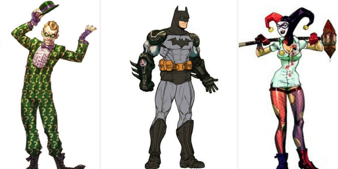
14 NURSE HARLEY

Harley Quinn’s costume design in Batman: Arkham Asylum was quite different from anything fans had seen from her before, but nevertheless became an instant favorite with cosplayers and fans of the character alike. Opting to implement a nurse aesthetic into Harley’s design, the character became Arkham’s very own Nurse Ratched, and while some fans fell in love with the character’s new look, some missed her classic look from Batman: The Animated Series.
Harley’s concept art reveals that the character’s classic jester headgear was initially in the mix however, with several of the designs including this aspect of Harley’s look. The extent to which her outfit resembled a nurse’s also appears to have been experimented with -- with one design containing very little of the aesthetic while another is basically just a nurse’s uniform complete with red and purple fishnets.
13 THE BATMOBILE

While one of the more common critiques of Batman: Arkham Knight was how heavily the game leaned into its Batmobile mechanics, it’s easy to forget how excited fans were to take control of the iconic vehicle earlier on in the series, especially given its very limited appearances in the franchise’s previous instalments.
The Batmobile does make an appearance in Arkham Asylum’s opening scenes though, as Batman uses it to transport The Joker to Arkham Asylum, kicking off the events of the game. While the Batmobile’s final design is pretty similar to its concept art, what’s quite different in the original artwork is the vehicle’s color scheme. A combo of dark blue and orange, the colors work surprisingly well on the Batmobile, but it appears that Rocksteady ultimately opted to go with an all-black Batmobile, which is admittedly more fitting of the game’s overall aesthetic.
12 POISON IVY’S TOXIC TEARS

On the whole, Poison Ivy’s overall design in Batman: Arkham Asylum remains relatively unchanged from Carlos D’Anda’s original concepts. While Ivy’s clothing is much more obviously a redesigned prison jumpsuit in the original art, the green tint to her skin, her wavy red hair and plant-inspired body art all made it into the character’s final look that she sports in the game.
One idea that didn’t quite make the cut however, was D’Anda’s idea of having Poison Ivy cry toxic green tears when using her powers. It’s an original take on the character for sure, and would’ve upped Ivy’s creep-factor by several degrees, but was likely left out due to the difficulty and increased workload involved with implementing this particular character trait and having it look right.
11 JOKER’S SCARS

In fitting with Harley’s redesign as a nurse in Arkham Asylum, there were similar plans to have The Joker match his partner in crime by donning a doctor’s uniform. Complete with a white uniform, a cap, goggles, a leather apron and gloves (as well as a gas mask for good measure), his getup looks utterly fantastic, despite feeling more like the kind of costume Joker would wear for one of his sadistic “bits”.
What’s also interesting to note is that this version of The Joker was also designed with the classic scarred mouth that’s since become one of his creepiest, most iconic looks. While this would’ve likely made The Joker even more chilling than he appeared to be in the game’s final cut, the concept was eventually scrapped due to concerns that the design was too reminiscent of Heath Ledger’s version of the character.
10 CLASSIC SCARECROW

The look of Scarecrow in Batman: Arkham Asylum is one of the more unique and interesting villain redesigns found in the game. Keeping the patchwork, burlap costume that gives the character his namesake whilst throwing in a few creepy new additions (including a sewn in gas mask and nasty-looking needle-glove to deliver his fear toxin), the costume is a brilliant mix of old and new.
Early art for Jonathan Crane shows a much more traditional take on the character, though. With a raggedy, wide-brimmed scarecrow hat and the rather deadly scythe he’s often seen carrying, the character’s concept art looks like it’s ripped straight from a comic book -- and that’s definitely a good thing. Whether or not the look would’ve worked quite as well as the game’s super-scary redesign however, is up for debate, but there’s still no denying that both designs look incredible.
9 THE LIGHTHOUSE

One of the environments that apparently fell by the wayside during the production of Batman: Arkham Asylum was this rather lonesome-looking lighthouse that sits at the end of a dimly lit bridge. It’s unclear whether this was supposed to be window dressing or if a chunk of the game was supposed to take place here, but it’s a shame it didn’t make the final version of the game judging by the hauntingly beautiful environmental art of John Gravato.
The closest thing we see to a lighthouse in Arkham Asylum is during the boss battle with Scarecrow, in which a giant version of the character spins around with beams of lights shining from his eyes as he searches for Batman. Perhaps the lighthouse was initially supposed to perform this function initially, before the developers decided it’d be more compelling to replace it with a giant Scarecrow.
8 MAD HATTER AND CLAYFACE

Given the impressively large roster of villains present in Batman: Arkham Asylum, it’s only natural that some of the characters initially planned for the game would eventually get the axe further into production for various reasons -- after all, some villains needed to be saved for future instalments of the franchise.
Two of the villains cut from Arkham Asylum despite their intended inclusion early on were Clayface and Mad Hatter. While Clayface does in fact appear in a cameo role, impersonating Mayor Quincy Sharp and James Gordon in his cell, he never appears as a boss in his monstrous true form as was initially planned. Similarly, Mad Hatter had a whole area of the game mapped out for him, appearing as an antagonist in a level based around a creepy hedge maze, before the concept was cut from the game to streamline the final product.
7 STRAIGHT JACKET HENCHMAN

Over the course of his journey through the twisted wards of Arkham Asylum, Batman is forced to fight off legions of nameless henchmen in order to progress. Between generic unarmed henchmen, armed henchmen, knife henchmen, armored henchmen and titan henchmen, there’s a wide variety of fodder for Batman to pummel his way through.
One of the henchman variations that didn’t make the cut however, was the straight jacket henchman. Wrapped up tightly in their restraints, these henchmen have managed to free one of their hands, with which they wield one of a variety of sharp and blunt weapons. It’s unclear exactly why this design was removed from the final version of the game -- in fact it’s probably the coolest henchman design that exists -- but the head of one of these henchmen can still be found in a jar sitting in one of Arkham’s offices.
6 JOKER’S CELL

There aren’t many cells that can successfully hold The Joker. This high security cell built specifically to house the Clown Prince of Crime may have proved to be an exception to this, but considering the cell wasn’t present in the final release of Arkham Asylum, it seems fans will never get to find out.
Suspended in the air via a series of thick chains and gears, the cell is built with its own drainage system to ensure its inhabitant rarely needs to leave his prison. It’s a great design, and one that perfectly highlights the sheer threat of The Joker, but it’s likely the idea was cancelled to streamline the opening of the story. Having Batman escort his arch-nemesis all the way to his cell before waiting for his escape would’ve increased the already lengthy introduction to the events of the game.
5 ALTERNATE RIDDLER COSTUMES

While The Joker is generally considered the central villain of the Arkham series given his consistent presence and history with Batman, it could be argued that Edward Nigma, aka The Riddler, is the true villain of the series. Forced to spend hours upon hours hunting down Nigma’s puzzles and trophies in an effort to thwart his nefarious plans, Batman spends more time trying to put a stop to Riddler than any of the other villains.
Due to the character’s prevalence in the games, it was obviously important that the artists nailed his look to make him an interesting, compelling presence -- and that’s exactly what they did. With that said, some of Riddler’s other costume designs are ostentatious in a way that suits the character perfectly. With the suits riddled in question marks, one of the designs even incorporates dungarees in a clear visual reference to A Clockwork Orange.
4 CHAPEL ROCK

While it’s understandable that various rooms, areas and buildings might disappear from a video game over the course of its development, it’s pretty rare that entire environments in the game are completely scrapped. Chapel Rock is one of these areas, and it’s actually really interesting.
Apparently separated from the rest of Arkham by a bridge and a rather ominous sounding “infinity chasm”, the area has a chapel, crypts, a large inmate graveyard and an area labelled “twisted willow”. It seems to be a more horror-themed environment than the others, and it’s weird to see such a large chunk of the game completely vanish, but some of the elements in the area including the inmate graveyard were implemented into other sections of the game, albeit on a much smaller scale.
3 ARKHAM ASYLUM ENTRANCE

While all of the collective environments within Arkham Asylum are fantastic in their own different ways, it’s a little odd that players never get to see a full establishing shot of the asylum from its entrance. Sure, we see Batman drive through the front gates, but the game suddenly cuts to the interior of the asylum in a somewhat jarring fashion.
This piece of concept art by environmental artist John Gravato shows a beautiful shot of the asylum from the front in a style very reminiscent of Dave McKean’s art in the Batman: Arkham Asylum comic. Again, this image doubles down on the creepy vibe present throughout the game, and builds a palpable sense of foreboding before heading into the innards of the famous Arkham Asylum.
2 VENOM JOKER

One of the more widely criticized aspects of Batman: Arkham Asylum was The Joker’s transformation into Venom Joker at the game’s climax. This new, muscled up monstrosity undermines the whole point of the character -- he doesn’t need to be a physical match for Batman to be an effective nemesis -- and his transformation into the hulking beast ultimately trades in the game’s chilling atmosphere for something altogether more silly.
It’s not hard to understand Rocksteady’s dilemma in this regard, given that the game needed The Joker to be a powerful endgame boss, but some of the earlier concept art for Venom Joker is much more effective. Originally intended to be much more gangly and spider-like, the skinnier version of the boss still manages to make The Joker creepy after his transformation, and is way more fitting of not only Joker’s character, but the game’s overall tone.
1 BATMAN’S SUIT

Perhaps the hardest aspect of designing a video game is settling on a definitive design for the lead character, especially when that character is as beloved and iconic as Batman. Due to this, concept artist Carlos D’Anda claims that he created dozens and dozens of potential designs for the Bat, with Rocksteady eventually opting for a dark gray battle armor that’s visually a mix between Christian Bale’s Batman suit and the classic gray costume from the comics.
D’Anda’s unused concepts look equally as cool however, with one suit leaning heavily into the battle armor aesthetic -- resulting in a very shiny, robotic looking Bats -- and another using the light gray and black combo that’s become one of Batman’s most iconic looks. Another design even blends the two, dressing Batman in gray fabric and grafting a pair of bionic-looking arms onto the suit.
Which piece of concept art do you wish made it into the game? Sound off in the comments below!