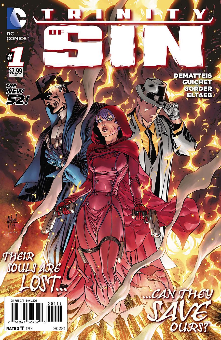
For a comic about cataclysm and the greatest sinners in history, "Trinity of Sin" #1 is off to a bland start. Light characterization, light plotting and generic art all combine to make this very interesting concept feel uninteresting and average. There are some bright spots in the issue -- a few layouts, the existential themes -- but overall it's rather forgettable.
To J.M. DeMatteis' credit, "Trinity of Sin" #1 is certainly well-suited to new readers. It's clear that he kept that in mind, and in a publishing landscape where "#1" can be more of a marketing ploy than a real starting point, I appreciate that he treats the start of this series like the start of a series. The backstory summaries are tight, and he lets each character narrate through captions, so the reader gets some sense of the three distinct voices.
However, he tries to have his cake and eat it, too. DeMatteis wants to give these characters the introductions they deserve, but he also wants to get going with the plot. The result is an issue that gives the reader too little of both. "Trinity of Sin" #1 develops neither its characters nor its plot satisfactorily, but that isn't to say it's a bad comic. It's just not a substantive one. There are glimpses of DeMatteis' bigger themes and ideas, particularly in the narration of The Question, but none of it has the space to expand -- or even really to hint at how it might expand in future issues. Now, I say all this in the knowledge that DeMatteis is writing a first issue, and he fits an impressive amount of information and exposition into it. Unfortunately, the compromises he makes in order to do so are too noticeable.
On pencils, Yvel Guichet shines best near the very end of the book. Three simultaneous fight scenes, at once related and distinct, are portrayed alongside one another splendidly. These pages are where the issue really seems to gel; if it could capture that going forward, "Trinity of Sin" could really work.
However, there are some issues with the artwork. Of the four villains, only one has any energy to it. Ya'aka, Zalkoat and (potentially) Nimraa -- all human-animal hybrid monsters -- are clunky and static in their heavy detail. Jason Gorder's inking doesn't help to make them feel any lighter or more visceral, and in many scenes they look posed rather than poised to do something. Only Sydenn, the tsunami, looks free to move. In part, this monster works better than the others because of Gorder's drastically lighter inking, but it's also just a more dynamic, twisting design from Guichet.
Gabe Eltaeb's colors are unobjectionable but unremarkable. Bright and thoroughly in the DC house style, they feel like a missed opportunity to get mystical and dark. For instance, the ominous opening features lines like, "I felt the darkness stir in its grave," but in the panels, Eltaeb gives planet earth a soft corona of robin's egg blue, in a starry sky that's the color of a late afternoon. It's well-rendered, but it does nothing to establish the atmosphere.
Letterer Dezi Sienty expertly handles the many voices in this relatively text-heavy issue, and the placement of the caption boxes was often effective and smart.
Ultimately, "Trinity of Sin" #1 doesn't so much introduce these characters as introduce the concepts of them. Their teamup is still intriguing, but DeMatteis may need to switch strategies in order to make the series more entertaining.

