This week's category was suggested by Sabrinaset at the Top Five Recommendation Thread!
The following are my choices for the all-time top five best D.C. Comic logos from ongoing series!
Enjoy!
First off, dealing with such a broad topic, there are a lot of great ones that didn't make the cut. Here are a few of them...
HONORABLE MENTIONS

I think this one has a nice edge to it, and it's very decorative, but I suppose you could easily argue that it is a bit TOO much.

"Too much" is definitely the argument with this one.
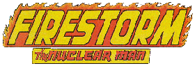
Still, I am very fond of it. Anyone know who designed it?

A nice logo, and I love the chesspiece.

This was EASILY the toughest call. I love this logo, the way that it maintains the integrity of the character without going overboard. At the end of the day, though, it just isn't all THAT dynamic.
5.

This one beats out Swamp Thing, mainly because of context. When this logo first came out in the 40s, NO book had such an outlandish logo.
It's very impressive, I think.
It is SUCH a good logo that they re-used the logo when the book picked back up in 1976!!
Talk about lasting power!
4.

This one was tough, because it's basically just a fairly normal logo, except that whatever special type of chaos magic went into this logo, it CLICKED.
It is now such a powerful, dynamic image that it SCREAMS "Superman" and it is ingrained in our minds.
A great brand.
3. I definitely wanted ONE of these on the list, but I wasn't sure which was cooler. You folks can help me decide! Which Batman logo is the cooler one?
The Golden Age one...

or the later one...

2.

I'm usually not a fan of extremely stylized logos, but I think this Question logo from the Denny O'Neill 80s series is so strong that it is worth its place here at #2.
And it also really fit the style of the series, too!
1.

Just a perfect logo.
Well, that's my list! Agree? Disagree? Let me know (and with so many choices, I bet there will be plenty of disagreement)!
Thanks to Mike's Amazing World of DC Comics for the logos!