DRAWING SPIDER-SMURFS
Along with The McSpidey Chronicles, I attempted a side project that I haven't mentioned here before, I don't think: drawing one image from each issue in a Smurf style. To be honest, some other drawing projects have recently gotten in the way and the whole thing seems to have run out of steam. But let me show you what I came up with while it lasted, issue-by-issue.

"Amazing Spider-Man" #298: Todd McFarlane's first issue. I went straight for the cover with its dynamic duo of Spider-Man and Chance. It's a little stiff from Chance's point of view, and Spider-Smurf's webbing is a tad bit too large. But for a first effort? I like it. You can also see where the variety of line weights used in inking the piece number about two. I don't think I had the Pentel Pocket Brush Pen yet, so I was using a fine line pen and a thicker pen that pretended to be a brush pen, but really wasn't.
The webbing also suffered in this image. It's too wide, too thick.

"Amazing Spider-Man" #299: Chance is such a fun visual; I had to go with the cover again. I bailed out a bit in drawing the crowd of people in a panic at the bottom of the page. I started, got tired of it, and moved on. I will never become a comic book artist with an attitude like that.

"Amazing Spider-Man" #300: With a cover that iconic, how could I not do my interpretation of it? It's also the first time I really drew a background. Since the McFarlane cover features New York City skyscrapers, the natural analogue was a sea of Smurf mushroom houses. I drew pages of those houses before I drew this cover. I tried to learn how the windows and doors worked on a rounded surface, where the chimneys grow out from, what different variations the houses took on, etc.
There's one house in the middle at the bottom that appears to be tilted back from the reader that throws the whole thing off, though. It's funny how you never noticed that when you draw something initially. It's only months later that it annoys you.

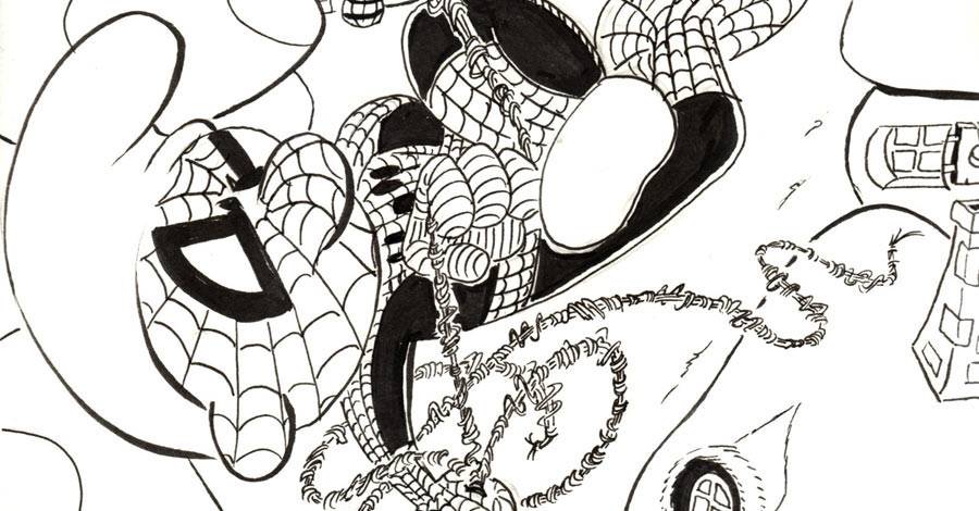
"Amazing Spider-Man" #301: Silver Sable was a big guest star in this issue. I always liked that character, so I drew her from a pose inside the issue, with a Symkarian flag in the background. That's the actual flag, by the way, according to Wikipedia or Marvel's wiki. I forget which...
Her head is enormous. That is all.

The thing that surprised me in doing this cover the most was Sandman's arms. I was worried about drawing the texture there, but liked how it came out with just a little extra work with the pen brush.
Too bad Silver Sable's front arm is so long...
"Amazing Spider-Man" #304: The Black Fox stopped by for a pair of issues. I had to draw the debonair cat burglar in both his costume and his tuxedo. This was a good chance to draw "regular" clothes on a Smurf to see how that might work out. It's not superheroic, but it didn't have to be. That's what the next issue is for, right?

"Amazing Spider-Man" #305: The Prowler took on Black Fox in this issue, and this is my recreation of the opening splash page. All I can see is everything wrong with the page, but I'm also proud of just attempting to draw that door in the background. It doesn't work in a few different ways, the biggest of which is that the lower windows under Prowler's arm are angled completely differently from the rest of the door. I could fix that on the computer, if I were a perfectionist.
That's one thing this side project has taught me: Perfectionism kills. Every day when I look at one of these images, I find something new not too like. If I kept toying with these drawings until everything was perfect, I'd get stuck on the first image and never let in.
Computers don't make it easy. I've done a lot of work with an image editor for the Mac called Acorn. I started out using it to color images, and now I fix the line work, move parts around, and grow or shrink parts of the image. It's tough to know when to stop. When it's so easy to tweak something, it becomes addictive. Who doesn't want to present the perfect image?
As much as the lost income from original art sales must hurt comic artists, I understand now why so many are willing to go digital. It's very handy, and I'm sure it speeds things up to use it to the right degree. Using White Out is annoying. Fixing a line in the computer is so much simpler.

"Amazing Spider-Man" #306: This is a recreation of a dramatic page of Todd McFarlane drawing Spider-Man swinging high above the city skyscrapers. Again, I only have mushroom homes, so I made them work. I threw in the guy waving from out his rooftop window for fun.
I once started coloring this. I spent a lot of time getting nowhere.
This is also the first image I drew with Spider-Man's red and blue costume. The black costume is easy to draw. It hides a lot of the shortcomings. Drawing all those lines and all that webbing is scary. It also took me a few warm-ups to figure out just how to draw the head. Here's some examples from that:

I liked the no-nose Smurf, but it looked too alien. He needed the nose. Wrapping the webbing around the nose helped add dimensionality to the face, so I stuck with it. I left the hat blank, though. To me, the Smurf hat needs to remain pure.
I thought that until a few weeks later when I went to color it and had no idea what to do. White looked too strange. It became red. I'm still not completely happy with that, but it'll grow on me.

"Amazing Spider-Man" #309: Look at it quickly and it's pretty cool. Look at it from the inker's perspective and it gets amazingly messy far too quickly. This image relies on the shadows. They help distract from anatomy issues. Thank goodness for them. I also wimped out on drawing the gargoyles. Moving on...

"Amazing Spider-Man" #310: Killer Shrike has another great cape, far crisper and more angular than the Prowler's, so I needed to take a swing at it. It's tough drawing capes. McFarlane makes it look easier, but it's not. They don't exactly obey the laws of physics, so you can make them do whatever you want and still make them look good.
From the production side, this is the one where I finally gave up inking the solid black areas. If the area is perfectly surrounded by a line, the bucket fill will hand the rest. This was a great place to start.
I've begun coloring the piece. It's a work in progress, but here's how it looks after the cape has been filled in.

I randomly picked the brown as a temporary background fill to keep from distracting from any of the colors I knew I'd be laying down on top. I like it a lot, however. Makes it look like I drew the image on a paper bag. I want to go lay in some white lines next and do my version of what I see Craig Rousseau doing here. We'll see...
That's it for now on the Spider-Smurfs. One last bonus, from an image in Bryan Hitch's "Real Heroes" #1:

This might be the first Smurf belly button ever drawn.
Someday I'll have to draw in the skateboard/surfboard thing she's standing on.
Sorry I didn't get this column out in time for Global Smurfs Day. Missed it by two weeks. Sorry, Peyo!
Next week: Pipeline goes back to normal, talking about art instead of showing it.
Twitter || E-mail || Instagram || Pipeline Message Board || VariousandSundry.com || AugieShoots.com || Original Art Collection || Google+