Long before Christopher Nolan brought Bruce Wayne’s alter ego to the big screen with Batman Begins, Tim Burton put the "dark" in Dark Knight with his gothic take on the character in Batman and its sequel, Batman Returns. Both films were received well by fans and critics and also “paved the way for superhero franchises”, as well as birthing the concept of a modern blockbuster. So why was Batman, in particular, so successful? Well, there’s plenty to love about it. Many comic book fans praise Burton, and writers Sam Hamm and Warren Skaaren, for their depiction of the characters while more spend entire afternoons arguing that Michael Keaton’s Batman is the best cinematic version yet -- even over Christian Bale’s -- to this very day.
RELATED: The Dark Knight Trilogy: 15 Pieces Of Eye-Popping Concept Art
Surrounding its release, it was the film’s visual style that was lauded and earned production designer Anton Furst and art director Peter Young an Academy Award for Best Set Decoration. While Batman Returns didn’t win such accolades, it was nominated for Best Makeup and Best Visual Effects, proving that the series’ aesthetics were their best features. But how did those visuals come to be? CBR looks back on the gorgeous concept art from both films to see…
16 BATMAN

With his tragic backstory, moody personality and fondness for the shadows, Batman is regarded as one of DC’s darkest characters today, but he wasn’t always. A few years after his introduction -- until the '80s, in fact -- he became more lighthearted in the comics and that was reflected in the 1943 motion picture. Adam West emphasized this when he played Batman as a campy, cowl-wearer in his well-loved television series. But when Tim Burton was charged with bringing the Caped Crusader to the big screen, he was sure he wanted to go back to his gloomier origins.
“From the outset, Tim wanted Batman to be a very dark film,” concept artist David Russell said. “I started out designing in pencil, then black but Tim kept wanting an even darker style of imagery, so at the very end of my assignment, I switched to white pencil and black paper.”
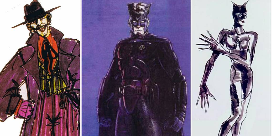
15 BURTON'S JOKERS

As well as being a talented screenwriter, producer and director, Tim Burton is also a dab-hand at drawing. So much so, that he’s even had books and museum installations dedicated to displaying his artwork. With all that in mind, it’s no surprise that when it was time to knock-up some concept art for Batman, he rose to the challenge.
These images show his initial ideas for how Jack Nicholson’s version of The Joker should have looked, complete with bright green hair and manic expression. While the middle illustration is quite conventional, in terms of matching what the character typically looks like in the comic books, the others look wonderfully inventive. We particularly love the white and red pin-striped suit in the sketch on the right and the idea of The Joker being in disguise on the left!
14 BATWING

In Batman (1989), one of the film’s climactic scenes sees Batman use the Batwing to take down The Joker and of course, the machinery had to be designed before it featured so heavily in the movie. Above is one of concept artist David Russell’s early drafts as to what the vehicle should have looked like and we love that is actually resembles a real-life bat.
If you look closely, you can see the slight upturn on the front of the aircraft which reminds us of a common bat’s snout while its headlights are exactly where the animal’s eyes would be. The vehicle’s fixed wings also look like a bat’s, with their articulated design. Unsurprisingly, the Batwing ended up looking more streamlined and like the hero’s iconic bat-shaped symbol rather than a typical jet… but that’s still cool, right? Batman certainly has consistency when it comes to his gadgets…
13 CATWOMAN'S SUIT

Michelle Pfeiffer’s Catwoman suit from Batman Returns is one of cinema’s most iconic comic book-inspired looks. So it’s unsurprising that the striking ensemble was a collaboration of ideas between costumer designers Mary Vogt and Bob Ringwood and Burton himself.
“Tim came up with the stitches,” Vogt previously admitted. “Bob and I were like, stitches? On latex? How do we do that? So we sculpted stitches in cast and glued them on. It looked terrible! So we decided to brush her in silicon. After she had the costume on, we painted the [liquid] on her and she’s dripping all over the place. Because it’s so shiny and she was moving around at night, it looked really fluid. It's like she's wearing black glass, the suit looks like a beautiful, dark sculpture. We wanted it to be elegant, sexy and modern, very high-tech while still being kind of homey-looking and organic."
12 DARK KNIGHT IN THE MOONLIGHT

Contrary to popular belief, Burton’s mind doesn’t always see things in muted color palettes or monochrome. In fact, his imagined visuals can often be quite colorful in and these two pieces of concept art prove just that. Unlike a lot of Batman’s dark imagery, Burton envisioned an almost romanticized moment during The Joker’s take on Gotham City’s 200th Anniversary Parade, where the Dark Knight would swoop down from a teddy bear-shaped balloon and try to put a stop to the villain's pandemonium-fueled plans.
In the end however, Batman actually saved the day using the Batwing, zooming down between the skyscrapers of Gotham and severing the ropes that were keeping the poisonous gas-filled blimps tied to The Joker’s float. After he does so though, he flies high above the clouds and hovers the vehicle over the moon for just a split second; arguably paying homage to Burton's art here.
11 GOTHAM CITY

“I wanted to make Gotham City the ugliest and bleakest Metropolis imaginable,” production designer Anton Furst previously said of his art deco-inspired vision. “We imagined what New York City might have become without a planning commission. [I wanted it to seem like a] city run by crime, with a riot of architectural styles. As if hell erupted through the pavement and kept on going.”
“All the buildings -- except the cathedral -- are dwarfed by the geometric savagery of the Flugelheim Museum, whose brutal exterior is more akin to locomotive design than an art gallery like the Guggenheim.” Furst emphasized the dark side of Batman’s story and heroism with his backdrop. His Gotham is nothing short of imposing, with its huge, garish skyscrapers packed so tightly together, they block out the sun from all of the city’s residents. Well, Mr. Wayne does love the shadows…
10 BATMAN'S SUIT

Batman’s suit has changed many times on the big screen. Most notably with his color shift from blue and gray to black; something that fans have Bob Ringwood to thank for. The British costume designer and concept artist previously explained that he "decided [early on] that his Batman was not going to be in blue knickers” because he “hated” them.
“Bats are black, of course -- not blue -- and black is much more sinister and sexy. After talking to Batman creator Bob Kane, we found out that he had always thought of Batman as being in black, but that it was very difficult to draw a black-on-black drawing for the comic strip. He had drawn it in blue so that he could use different tones of the color for effect. In his mind, the blue was just a symbolic version of black. Our black costume was nearer his original concept."
9 THE BATCAVE

In Batman, Keaton’s Bruce Wayne reveals his crimefighting alter ego to his love interest, Vicki Vale (Kim Basinger) and subsequently introduces her to the Batcave. David Russell visualized what that scene might have looked like and we love how his imagery looks as if it could have been lifted right out of a DC Comics’ issue.
You can see how Wayne -- in full Batman get-up -- is gesturing towards Vale, as the camera shoots her from behind. The frame only allows the future audience to see part of his private quarters, most notably a number of computer screens in the background. Interestingly, as director Tim Burton was so keen to have his visuals as dark as possible, Russell actually sketched the art with white pencil on black paper; only picking up the highlights rather than drawing outlines. His results ended up heavily influencing the way the scene was lit.
8 THE PENGUIN

With his short, rotund figure and pointed nose, supervillain Oswald Cobblepot, aka the Penguin, is arguably one of the most Burton-friendly characters. In the film, he’s almost caricature-like but all of that just adds to the creepy nature of his look. Mark ‘Crash’ McCreery’s sketches -- from before Danny DeVito even stepped into the costume -- are just as nightmarish with their up-close depictions of his face.
They see the concept artist experiment with different hairlines and alternative nose shapes and sizes, whilst also testing what Cobblepot would look like with a lavish fur coat and top hat on. The images also see what he’d look like carrying an umbrella -- which comic book fans will know, is synonymous with his character -- and how he could wear a monocle over one of his eyes. You see, for all of his sewer-dwelling, the Penguin was quite a smartly-dressed ol’ fellow!
7 BATMOBILE

While the year Batman is set is never explicitly stated, it is hinted at throughout the movie. For example, when Kim Basinger’s character is reading a newspaper and the hailing of Mexican President Miguel Aleman by President Truman at a Motorcade parade -- which happened in 1947 -- is mentioned and another newspaper stating that Hungary’s Prime Minister was Ferenc Nagy (who was elected in 1947).
It’s clear that that era inspired the final look of the Batmobile too. Talking about its design, production designer Anton Furst previously explained: “We looked at jet aircraft components. We looked at war machines. We looked at all sorts of things. “In the end, we went into pure expressionism; taking the Salt Flat Racers of the ‘30s and the Sting Ray macho machines of the ‘50s. The car was built upon a Chevrolet Impala when previous development with a Jaguar and Ford Mustang failed.”
6 THE JOKER

When it came to designing The Joker’s look for Batman, costume designer and artist Bob Ringwood previously confessed that it wasn’t too much of a challenge. The reason being that he took inspiration from actor Jack Nicholson, whose own style and love of fashion inspired the costumes of the character he famously brought to life.
"He adores clothes," Ringwood said. "So all we did was just reinterpret the clothes that The Joker wears in the drawings to work with Nicholson's personality. To do clothes with him is a joy ride, really, because he just loves them. He is really with you and he's suggesting things and inventing things and doing things. He's wonderful." Turns out, one of the reasons why Nicholson embraced The Joker’s iconic color scheme wholeheartedly was because the character’s purple overcoat reminded him of the Lakers, the basketball team he supported.
5 GOTHAM CITY POLICE DEPARTMENT

Concept artist Bob Ringwood has made no secret of the fact that his designs for both the sets and characters in Batman were inspired by the '40s. Just how much that era influenced the film's look however, is perhaps best evidenced in the Gotham City Police Department's clothes. In his sketch, the men are seeing wearing pinstriped suits with large lapels and flashy buttons, smart-looking ties and trilby hats. They're even shown smoking at their desks; a quintessential image if trying to set the scene of a male-orientated office which would have existed decades ago.
We especially love the dark browns, blue and blacks of the police force which seem to align them closer to Batman than the law-breaking Joker and his brightly colored hair and suits. It somehow eludes to an allegiance between the officers and the vigilante who helps them dish out justice.
4 BURTON'S BADDIE BUNCH

When he's not producing, writing or directing movies, it's well-known that Tim Burton is a keen artist. So it stands to reason that he was heavily involved throughout the concept art stages of both Batman movies. Here, he conjured up what his baddie bunch might look like; a group consisting of Danny DeVito's Penguin, a fire breather, a Strong Man, two clowns and an organ grinder and his monkey.
For those who aren't too familiar with the film, the cronies depicted are actually Burton's visualization of the Red Triangle Circus Gang, a ragtag team of carnival performers who team up with the Penguin to take down Batman. However, they soon turn their backs on their former leader when his plans to destroy Gotham fail and they fear they will get caught. Other members of the group include the sword swallower, the snake lady, an acrobatic thug and The Poodle Lady.
3 PENGUIN HENCHMEN

It doesn’t really get any better than penguin henchmen, does it? And fortunately, Batman Returns delivered the goods by having several of them! But before they could appear in the film, concept artists Mark ‘Crash’ McCreery and Tim Flattery had to work out what they were going to look like.
In McCreery’s black-and-white sketches, the penguins are realistic and sport all kinds of interesting weaponry such as a bullet-dispensing headdress and stripy gas canisters. Flattery’s images -- on the other hand -- are much more cartoon-like and embody the campy tone of Burton’s final film a little more closely. His penguin’s gadgets are slightly more out-there (and threatening) too. We particularly love the one with the pop-out boxing glove, even if it does resemble something The Joker uses to smash his own television in Batman.
2 A RUNNING JOKE...R

Towards the end of Batman (1989), the titular hero and The Joker face-off, after the latter plots to kill the residents of Gotham City by throwing a celebratory parade and then spraying them with his namesake’s venom. In the scene, Batman goes after the baddie in his Batwing; something that concept artist David Russell visualizes in the painting above.
The artwork shows Nicholson’s Joker running away from the Batwing but unsurprisingly, such a perilous moment isn’t enough to wipe the huge grin of his face. While it may look like Batman has got the upper hand here, as he aims for his enemy’s turned back, The Joker actually stands firm against the Batwing’s fire in the film. As the aircraft approaches, he pulls out a big gun -- just like the one Russell envisioned above -- and shoots the Batwing out of the sky.
1 UNUSED ROBIN

After Batman Returns, Burton was set to helm the third instalment. However, the studio ended up ditching the director -- as they wanted to tone down the darkness of the franchise -- and hired Joel Schumacher instead. Before he was ousted out, Burton intended to have Marlon Wayans play Robin in the film but Schumacher had other ideas; casting Chris O’Donnell in the role.
The movie -- which also starred Val Kilmer, Jim Carrey and Nicole Kidman -- was slated by critics and fans, with many claiming Schumacher’s colorful, campy Batman Forever didn’t sit well with how people perceived the Caped Crusader’s big screen version. Batman and Robin’s costumes were a particular sore spot or more accurately, the addition of “nipples” on the suits were. Looking at what Burton and artist Bob Ringwood had in mind in the above image makes it even sorer.
Which piece of art is your favorite? Let us know in the comments!