One of the fascinating things about long-lasting popular culture is that after enough time has passed, the origins of certain aspects of the culture begin to fade away and become obscured. There will be things people are very familiar with even without knowing why said things exist. A great example of this is corner boxes on comic books. While they've begun to fade away a bit in recent years, with neither Marvel nor DC currently using them on their covers, they were prominently displayed on covers for decades and they originated based on methods of display that are rarely used anymore.
RELATED: "When Were the First Comic Book Gimmick Covers?" & More Comic Book Firsts
9 The First Corner Box

The very first corner box had an additional purpose to it besides the aforementioned identification features. You see, the earliest comic books were almost all anthology comics. That's fair enough, of course, but what happens when one feature stands out? You try to put it on the cover as much as you can, but then you also want to try to promote the other features within the anthology. So how do you balance the desire to promote your most popular feature with your desire to spotlight other features? National Publications (now known as DC Comics) came up with a clever solution with 1939's "Action Comics" #16, which did not have Superman on the cover. Instead, they included a corner box drawing of Superman to make it clear that Superman did appear in the comic book. They slowly began to do that for all the major characters in their various anthologies. As the comic market had a downturn in the late 1940s, the corner boxes went away (partially because the anthologies had been greatly reduced, features-wise, and partially because everyone knew that Superman starred in "Action Comics" by 1950).
8 Marvel Gets In On The Action

One thing Marvel was always quite good at was branding. They made excellent use of the top of their comic books over the years, with the "Marvel Comics Group" banner lasting for well over a decade from the early 1970s through the early 1980s. In the early days of the "Marvel" brand, though, they were just as good. Within four issues of their hit new comic book, "Fanstastic Four," which launch the "Marvel Age" of comics, they were proudly displaying at the top of the book "The World's Greatest Comic Magazine!" With 1963's "Fantastic Four" #14, Marvel debuted what would become a standard for their books, a corner box drawing of the stars of the comic in question. Marvel had done corner boxes before in their aborted attempt at a relaunched superhero line in the late 1940s, and had done a variation of a corner box on some "Millie the Model" covers, but this was the start of their commitment to the approach.
7 One of the Greatest Trademarks in Comics...

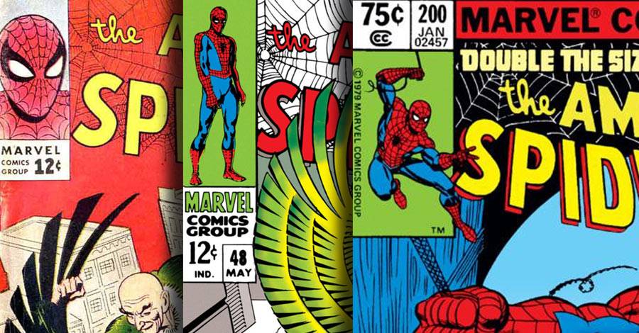
On the second issue of "Amazing Spider-Man," Marvel debuted the corner box for that title, a Steve Ditko drawing of Spider-Man's distinctive face mask. This corner box soon became so identifiable that Marvel began to brag in the advertisements inside of their comic books about how famous it had begun, telling potential buyers, "Don't forget to look for one of the greatest trademarks in comics..." The mark was so important to Marvel that they kept it on the covers of "Amazing Spider-Man" even after Steve Ditko left the title with "Amazing Spider-Man" #38. It remained on the title until Ditko's successor, John Romita, drew a new full-figure drawing of Spider-Man for the corner box in "Amazing Spider-Man" #48 (Marvel switched to full figure drawings in all of their corner boxes of the time). Romita's corner box drawing would remain there for a remarkable one hundred and forty issues before finally being replaced by another Romita drawing of Spider-Man web-swinging.
6 Can't Keep Track Without a Program

In the pages of "Justice League of America," right from the start, each issue opened with a roll call to let readers know which heroes were going to be involved in that particular issue. That soon became a major part of the corner boxes on Marvel's "The Avengers," as it showed the evolution of the roster of the team. This was particularly evident when the Avengers went through their dramatic roster shake-up in "Avengers" #16. Gone was the stylized corner box by Jack Kirby featuring the team (which would be edited to add Captain America, omit Hulk and alter Giant-Man's costume) and in its place was the faces of the team members. You could track the roster of the Avengers by who was on the corner box. After a number of years without the faces on the front cover, they returned with John Byrne's famous faces on the cover of "Avengers" #185. Those faces would continue for almost two hundred issues (many of which were drawn by Byrne, even well after he left the title), allowing readers to always know who was on the team. Byrne did the same with the corner box on "X-Men."
5 The Not Quite Unsung Hero

An interesting side effect of the corner box is that during the early 1970s, Marvel went with full figure shots of characters in their corner boxes, even with team books. Therefore, a title would have to determine which team member best exemplified that book. For "Fantastic Four," it was an easy call, as the Thing was by far their most popular member (although for a time there in the mid-1970s, the Human Torch got the occasional cover corner box). For "Avengers," though, it was a tricky question and one that was answered in "Avengers" #93 by the Vision getting the corner box. He would maintain the corner box until the aforementioned "Avengers" #185, splitting between a full figure standing shot of the Vision and one of him phasing through the cover that debuted on "Avengers" #153. The Vision is undergoing a creative renaissance right now with Tom King and Gabriel Hernandez Walta's "Vision" series, but for a whole generation of "Avengers" fans, the Vision was the heart of the series, which was reflected in his corner box appearance.
4 The Devolution of the Hulk

One of the most clever usages of the corner box was on the covers of "The Incredible Hulk" from #292-300. The Hulk, at the time, had Bruce Banner's intellect in charge of the Hulk's body. He had been in control for over a year, and the Hulk had even received a Presidential pardon from Ronald Reagan and turned down a chance to rejoin the Avengers. However, as time went by, he slowly began to lose more and more control of the Hulk until he went completely mindlessly savage in time for "Incredible Hulk" #300. So Al Milgrom drew the Hulk in the corner box of "Incredible Hulk" #292 as the scientist Hulk and then each issue after that the Hulk would get more and more savage until he was completely savage for #300. The transformation worked like a flip book. DC's "Power of the Atom" did a similar thing with the Atom shrinking each issue until the final issue, where he disappeared.
3 The Devolution of Magik

A similar approach to the "Hulk" comics came with the "Magik" miniseries. The character of Magik was introduced in an interesting fashion to the readers of the "X-Men." Illyana Rasputin had been part of X-Men continuity since the very first appearance of the All-New, All-Different X-Men (Colossus first showed off his powers by saving Illyana from a runaway tractors -- runaway tractors were a great menace in the Soviet Union during the 1970s, great packs of them would rove the cities of the USSR), but in one 1982 issue of "Uncanny X-Men" she was taken to Limbo as a six year-old and then brought back as a teenager. The "Magik" miniseries that followed a year later detailed what exactly happened to her in Limbo during those missing years. The corner boxes show her devolution as she was corrupted by the demons of Limbo.
2 Corner Boxes Can Be a Bad Influence

"Amazing Spider-Man" #250 was, more or less, the finale of the acclaimed run on the title by writer Roger Stern and artist John Romita Jr. it spotlighted a battle between Spider-Man and the major new villain that Stern and Romitata Jr. had introduced during their run, the mysterious Hobgoblin (whose history you can read all about in more detail here). On the way out of the book, I suppose Romita Jr. was a lit bit looser, as he put in a nice gag on the corner box for the issue where the Hobgoblin recommends the issue to kids and says that they should just steal it. The cover also has the great copy of it being a special "normal-sized" 250th issue. One of the great cons in comic book history is the notion that any comic book number divisible by 25 is somehow an important "anniversary."
1 Cute Celebratory Corner Boxes

We end with two notable corner boxes that involved taking recognizable logos and putting a twist on them. The first is 1987's "Amazing Spider-Man Annual" #21, which featured the marriage of Peter "Spider-Man" Parker and his long-time love, Mary Jane Watson, and involved the Spider-Man facial mask being shaped into a heart. The other is 1994's "The Punisher Meets Archie" #1, one of the more notable of Archie Andrews' many unexpected team-ups and crossovers (though this one is as endearing as you might expect from a book starring a teen and a murderous vigilante. The crossover brought the Punisher to Riverdale to hunt down a criminal who looks too much like Archie for Archie's own good, and the corner box art merged Archie's classic freckles and dimples with the Punisher's famous white skull logo. In both instances, the aspects of the logos that we recognize make the off-kilter way that they are presented stand out a lot more.
What's your all-time favorite piece of corner box artwork?