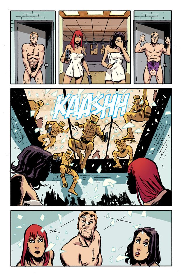
So Michael Walsh is the takeaway. He's the missile of this run's assumed aesthetic / tonal mission. Secret Avengers. Again, drawn by an artist with a sloshed, inky line - categorized as "edgy," "gritty," or "whatever" - , yet used in a way to undercut the melodrama which has proceeded. As the newspapers have ran it, we're looking at an action-comedy mash-up, self-imposed by a writer always working to switch gears, yet without Walsh, it's likely the circuit wouldn't close, leaving this thing short. At least for me.
The script cranks in some ways, building scenes in which it's possible to really bounce personalities against themselves, but in others, like the jokes, it doesn't land. Something of it reads designed, if not too aware of when you're supposed to laugh, so things feel a bit forced. It's like the applause sign is screaming with neon, and you're given no choice. Which, as you may guess, inspires the opposite of laughter, like discomfort.
That aspect will probably smooth in coming issues because timing is learned, and, hey, I'll clap a little for the attempt. But right now, Walsh's penmanship supplies any and all sense of humor, even if it is awkward and campy.
Though that's the fun inside this stapled-bound, glossy mag because Walsh - if you've read Zero - easily swings in a more brutal, calculated direction, and so do the influences he channels. His commitment to the mission, even in the face of its bruises, exactly embodies the interest of applying one's natural sensibilities to someone else's - like a Michael Bay, for instance - or to an unfamiliar motion - like comedic timing.
Because his style dominates the visual landscape, and because the attempted comedic tone is so noticeable, it's tough to ignore the juxtaposition on display, and I find that enthralling. Walsh seems to have been given a script he's truly trying to work with, if not have faith in, and while it's a work-for-hire gig, his storytelling still feels driven from a place of creative interest - like a rebellious cause to draw what we say he isn't suited for.
Objectively, it's solid stuff - lively to look at. His timing is sharp, which especially aids the switch between character stuff and action. There's a Kirby influence in here that's subtle, and I'd imagine it can't be easy to bury, but of course, as you already know, there's Toth, Aja and who ever else fits the bill. Those similarities are enjoyable to see as an admirer of their work, but too, I wonder how much of this is Walsh and not band patches on the sleeve.
But with context comes the hook of this Secret Avengers revamp. This is the spin which will attempt to subvert the other iterations by both expanding previous approaches - like Ellis's bout - and diminishing earlier aesthetics - bye, bye, Mike Deodato. The creative team all seems aboard this train of thought, but so far it's really Walsh who sells it. Maybe he holds the benefit of literally creating the look, and maybe secretly it's the writer's take that gives Walsh the platform to shine, but I've gotta go with what I see. That's what this is about, you know?


