
I'm not sure whether the quality of art and design has gotten better or if I'm simply growing softer in my old age -- let's go with the former -- but what last year was a list of 25 has doubled this year.
The 50 best covers represent the work of 42 different artists (plus designers), from 15 publishers. Brian Bolland, John Cassaday, Marko Djurdjevic, Dave Johnson, Dustin Nguyen and Skottie Young all make multiple appearances.
I don't know that there's a recurring theme to this year's entries. However, blood appears on a dozen covers, skeletons on four and vampires on three, so make of that what you will.
As with the 2008 edition, I've tried to the best of my ability to explain what makes the cover so successful, at least in my eyes. With some entries I succeed while with others ... well, judge for yourselves.
With that out of the way, I present, in alphabetical order, the 50 best covers of 2009:

"Quirky" seems like the right word to describe the cover to Matt Kindt's graphic-novel fable about a man with a strange medical condition who doesn't stop growing. I love the off-kilter perspective, the vine growing from the brickwork, the title resting on the bookshelves -- three tiers, naturally -- and, yes, the enormous eye peering in the window.

To truly appreciate just how wonderful Sam Elzway's cover designs are for the Viz Media editions of 20th Century Boys, Naoki Urasawa's engrossing sci-fi mystery, all you need to do is look at the first volume of the original version. Although not even a decade old the Japanese cover feels not "retro" but dated. Elzway's approach to the series successfully blends contemporary, and near-future, elements with those of the 1960s.

I know nothing about Cradlegrave, the horror story by John Smith and Edmund Bagwell that debuted in this issue, other than it's set in UK council housing (nicknamed "Cradlegrave") and follows a teen-ager recently released from an institution for young offenders. But even before I found that tidbit online I was drawn to Bagwell's menacing cover, with its faceless, gray-clad (and even blood-splattered) youths and drab, lifeless background.

The close-up of Spider-Man's mask doubles as an ominous blood-red sky, disrupted by a lightning bolt striking the Empire State Building. Even without the logo in the upper-left corner or the reflection in the mask's eye we know the story involves the classic supervillain Electro, who's presumably become more formidable, and less goofy, since ditching that terribly dated mask.

Given the "Exciting Ant Farm" ads that used to populate comic books, perhaps there's a bit of metafiction at play in this Paolo Rivera cover. Eh, maybe not. All I know is that it's delightful, from the expressions on the faces of Sandman and the girl and the New York skyline in place of the traditional farm to the tunnels that form a web and the spiders in place of the ants.

We've seen countless covers featuring the iconic Bat-Signal -- I can think of three or four in 2009 alone -- but few convey as much drama and energy as this Alex Ross image, in which the light rays almost become speed lines. The best part, though, is the Batman emblem mimicked by an actual bat.

Batman has plenty of creepy rogues, but none is as disturbing as Victor Zsasz, the depressed entrepreneur turned serial killer who carves a tally mark into himself for each of his victims. (Yes, he debuted in the early '90s, why do you ask?) Here, artist Dustin Nguyen conveys the character's madness, and mirrors the gruesome scratches in the bloody background.

Ignore the vertigo-inducing perspective, if you can, and just focus on the confidence Manhunter exudes in her care-free rooftop free fall.

I'm not sure whether this effective, if slightly unnerving, image speaks more to the talents of Darick Robertson or Frank Quitely. It's fascinating how Quitely's cover for All-Star Superman #1 has managed to achieve "iconic" status in less than three years, making it ripe for Robertson's dark, and delightful, parody.

This Jo Chen cover simply oozes sexuality, with the blood trickling from the neck wound mirrored by the juices dripping from the enormous pomegranate. Why a pomegranate? Allow Chen to explain: "My own feelings about pomegranates are that of forbidden fruit. They look so organic, raw, sexual: blood, pulp and seeds."

This cover, for the first issue of the "Vampire State" storyline, is particularly interesting when compared that of Buffy the Vampire Slayer: Tales of the Vampires. Both capture roughly the same act -- a vampire feeding on a human -- but while Chen's illustration is overtly sexual, Stuart Immonen's is undeniably violent. Three other elements worth noting: the blue-green hue of the skin, clueing us in to the lunar setting; the crystals of the earring that resemble blood droplets; and that we need only to see the fangs, red collar and John Waters mustache to know that's the one-and-only Dracula.

This illustration for the first volume of Daisuke Igarashi's mystery about two boys raised by dugongs captures both the alien nature of the children and the ocean with which they have a supernatural connection.

I didn't set out to feature three vampire covers, I swear. (Spoiler alert: There's a werewolf cover coming up.) However, John Cassaday captures in the close-up a seething fury in the Count's facial contortions, and in the wider frame a rigor (or is that rigidity?) as Dracula springs from his coffin. The limited color palette, heavy on the red, is nice, too.

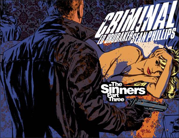
Although I've liked all of Sean Phillips' covers for Criminal, dating back to the first series in 2006, I'm especially fond of his approach to the current volume, The Sinners. All of the elements just come together -- the colors, the framing, the textures (I wrote a little about the cover of Issue 2 a few weeks ago). With Issue 3, Phillips paints a gorgeous ode to film noir staging as the gun-toting protagonist opens the door and a shaft of life spills over the scantily clad femme fatale.

Arguably the best of the decade variant covers released as part of Marvel's 70th-anniversary celebration, Niko Henrichon's take on Emma Frost as a bubble-blowing child of the '60s is a psychedelic explosion of colors and patterns. I'm not sure which I like more: the far-out X-scooter or the X-go-go boots.

The sheer amount of detail in this Rafael Grampa piece is simply mind-boggling -- just look at the lines on Jack Russell's head and, um, back -- but the most amazing aspect is the twisted tree whose roots morph into the snarling black wolf.

I was mesmerized by the mash-up of Art Deco and contemporary styles in J.H. Williams' first four covers for Detective Comics, and an implied duality in this image. Then I dug in to the story arc involving Batwoman, the new leader of the Religion of Crime and Kate Kane's presumed-dead twin sister, and I was really blown away.

John Paul Leon conveys such loneliness and isolation using just two colors -- well, three, counting the white type -- and a minimal amount of detail. It's amazing, really.

Jericho Drumm, newly anointed Sorcerer Supreme of the Marvel Universe, looks as if he's preparing for battle as he paints his face to resemble a death's head. I love when Marko Djurdjevic goes in for the close-up shot.
Award-winning cover artist James Jean ends his run on the Vertigo series in fitting style, with this piece inspired by the Pietà, but with Red Riding Hood holding a maimed Boy Blue, who's quite literally falling apart. The cover is chock-full of incredible detail, from the halo behind Red Riding Hood's head that looks as if it were carved in granite to the flowers that burst like blood from Boy Blue's wounds to the dozens of scattered knick-knacks that reference previous Fables storylines.

Another Pietà-inspired cover, this one a touching recreation of the finale of Final Crisis #6 (the original page didn't really tug at the heartstrings). The somber duotone is a nice touch.

You can't go wrong by drawing design inspiration from World War II propaganda posters. The only thing missing from Dave Johnson's bold cover for IDW Publishing's G.I. Joe #4 is a nerve-rattling slogan like "This Is The Enemy!" or "Slave World Or Free World?"

I have no idea what those Kirby-esque crackles are forming an iris on that planet-sized eyeball, but I'm awed by Tom Scioli's ability to convey the vastness and wonder of space. Or at least the 1970s cosmic epics-inspired version of it.

Superhero-comics fans are largely conservative in their tastes, so Marvel deserves a lot of credit for greenlighting a nontraditional approach to the covers for the "Stark: Disassembled" story arc. Designer Rian Hughes draws inspiration from science-fiction novels of the 1950s to create a minimalistic, almost "retro-future," look, complete with Spirograph-style patterns. Artist Salvador Larroca, meanwhile, delivers a scene straight out of Hamlet, as Tony Stark ponders the disembodied "head" of Iron Man.

After seven decades of superhero comics, it must be difficult for cover artists to arrive at a definitive, heroic pose that doesn't look like something readers have seen a hundred times before. Yet John Cassaday manages to give us something refreshing, and layered, as we're shown two sides of the Plutonian, Mark Waid and Peter Krause's beloved superhero-turned-world's greatest supervillain.

Brian Bolland kicks off the "Jack's Big Book of War" storyline with a comical portrait of the title character striking his best Napoleon Bonaparte pose. Minus the pants, of course.

Greg Tocchini toys with the tropes of film noir, casting the woman not as the femme fatale but as the cigarette-smoking lead with an enormous ... gun, and attitude to match. In the grimy mirror we catch the reflection not of a sultry "dame" but of a man. The homme fatale, perhaps?

Brian Bolland reaches back more than two decades for this macabre homage to his own cover of 1988's Animal Man #1. I'm not sure what's creepier -- that the giant bug is unchanged, or that Buddy Baker is depicted as a skull with a muscular body.

I initially considered Gabriel Rodriguez's illustration a little too ... on the nose for a miniseries titled Head Games. But the more I looked at the cutaway of the child's head, with its delightfully departmentalized topics -- "Things I Can Climb," "Ghosts," "Hiding Places" -- the more I came to appreciate the cover. It's clever and fun.

The cover for the new collection of Guy Davis' horror-action comic stays true to its contents: black and white with just a splash of red, placing the focus on Vol de Galle's trademark mask, peering from the shadows of his cloak.

The high point of Skottie Young's impressive run on Marvel Adventures Spider-Man, the cover of Issue 58 is bleak and portentous, with poor Peter Parker looking as if he could crumple under the weight of the relentless rain. I love how the spotlights cast the enormous eyes of Spider-Man's mask onto the billboard behind him.

I have no idea what's going on in this issue, or on Tom Fowler's cover, but I like it just the same. The anguished sun mask seems to mimic the mood of the imprisoned Mysterius the Great, but I hesitate to consider the demonic monkey skeletons below.

Fiona Staples' cover for the finale of the Wildstorm horror pulls out all of the Lovecraftian stops, from the clutching tentacles to the pentagram sparkling in mid-air to, best of all, the reflection of the monster's eye in the pool of blood. As I noted previously, the gun's empty cylinder may be a little suspect, but it helps to underscore the futility of the sheriff's situation.

With Y: The Last Man and now Northlanders, Massimo Carnevale has established himself as one of the best, and most consistent, covers artists working today. But this, his most recent cover, is my favorite to date. That's in large part because in this illustration, for a story about plague-stricken Viking ships, Carnevale veers away from the realism of Northlanders, opting instead to depict the crew as living skeletons. Even the wood of the ship and the waters on which it sails bellow "death."

Juan Doe's covers are typically bold and distinctive, with a strong graphic-design sensibility. But he's probably at his best when he references classic propaganda posters, as he did with 2006's X-Men: The 198, 2008's Black Panther Annual #1 and now here, with Nova #22. It's simple, symmetrical — right down to the mirrored artist's signature(s) — and stunning.

Michael Avon Oeming uses the moving imagery of a blood-drenched Battlefield Cross for an issue that centers on a World War II battle between the Daring Eagles and a giant Nazi robot.


I didn't think it would be possible for Dave Johnson to match the quality of the latter half of his staggering 100-issue run on Vertigo's 100 Bullets, but with his (relatively) brief stint on Marvel's The Punisher: Frank Castle I think he's actually surpassed it. These two covers in particular are remarkable, with Johnson merging typography with architecture, and transforming gunfire, blood splatter and smoke into little iconic skulls and crossbones.

There's something so simple yet so beautiful about the cover of the Drawn & Quarterly edition of Susumu Katsumata's Red Snow. The gold lettering is subtle, serving as a pale sun (or is it a moon?) that enhances, rather than detracts from, Katsumata's lovely black-and-white art.

As I noted last year, I'm a fan of Jock's knack for integrating the logo into the artwork. However, for the cover to the first issue of "The Gnawing" story arc, he takes it to another level, positioning "Scalped" between enormous cragged teeth. The maw, the dangling corpses, the twisted hanging tree -- it's slightly startling horror imagery covering a crime book.

The cover of Niklas Asker's debut graphic novel about chance meetings, misguided love and life in the modern city is haunting. The image of head rising from among the buildings is wonderful, but what clinches it is the way the level of the rooftops draw the focus to the character's eyes.
As remarkable as Marko Djurdjevic's painted covers are, it's incongruity that sells this one: the armor-plated Asgardian god of thunder, with his thees and thous, listening to an iPod. With the earbuds plugged into ... the wings of his helmet. It's just funny. (I like, too, that the pink background seems to reference Apple's memorable 2003 ad campaign for the media player.)
I've been in awe of Trevor Hutchison's work on this IDW Publishing series for more than a year now. For a plot that involves conquest by the evil Decepticons, the artist turned to the imagery of Soviet propaganda posters, limited color palettes (often just two colors per cover) and a title that becomes a monolithic graphic element. This cover breaks from the oppressive gloom of previous issues as Optimus Prime, his head framed by rays of light, fills the frame, obscuring the words "All Hail Megatron" on the left.

Rick Geary recreates two famous depictions of Bolshevik revolutionary Leon Trotsky: The top image (from a 1918 propaganda poster) is of Trotsky as St. George slaying the dragon of counter-revolution; the bottom is based on a White Army poster showing Trotsky as a demon sitting atop a pile of skulls from executed prisoners.

What at a glance seems like a somewhat-humorous image of an undersized boy holding an oversized rifle -- not that there's anything funny about children and guns, mind you -- becomes rather chilling once you zero in on the JFK campaign button.
All of Yuko Shimizu's covers for this Mike Carey-Peter Gross Vertigo series have been beautiful, but this one, which casts protagonist Tom Taylor as the hero of the French epic poem The Song of Roland, is arguably the best.

Ben Templesmith is best known for his gruesome depictions of vampires, werewolves, gentlemen corpses and grisly crimes, but it's this moving cover image, symbolic of the marriage destined to unite two Dog Tribes in Wasteland, that stood out last year.

Designer Frances Liddell was charged with creating covers for Inio Asano's collections of vignettes about urban life that would appeal to readers of indie comics. She certainly succeeds, thanks in part to unusual color combinations (brown and yellow for the first volume and slate and yellow for the second).

Skottie Young's larger-than-life rendition of the Wizard's throne room is terrifying and magnificent, with the Great and Powerful facade dwarfing poor little Dorothy Gale (who can only utter an adorable "Gulp!").

How can I not include this among the 50 best covers? It's a beautifully drawn and colored illustration of cute-as-a-button, green-haired Yotsuba Koiwai leading a charge of sheep! Sheep! I'm not made of stone, you know.