
I first became aware of colorist Steve Downer due to his work on MonkeyBrain Comics' Edison Rex. But as I quickly learned, he serves as colorist on a variety of projects, as well as artist on Dracula the Unconquered. Given the variety of Downer's projects, I thought it would be insightful to discuss his craft with him.
Tim O'Shea: How long have you been a colorist?
Steve Downer: I've been working full-time as a colorist since 2009, though I started coloring as a side job much earlier, in 2007, while I worked as a T-shirt graphic designer.

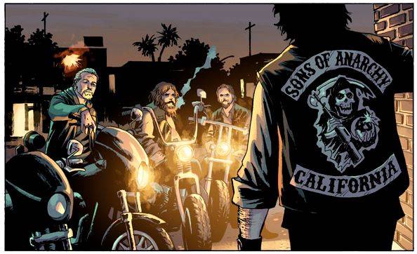
You work as a colorist on a variety of projects, including recently or at present Sons of Anarchy from BOOM! Studios, Edison Rex, Skyward by Jeremy Dale (from Action Lab), Jinnrise (from IDW), New Crusaders: Dark Tomorrow and The Shield backups in Mark Waid and Dean Haspiel's The Fox, both from Archie, as well as the current four-issue arc on Sonic Universe. Without going through all of these impressive projects necessarily, I was wondering if you could speak about how you approach coloring just some of the artists in these projects?
Sure! Each book calls for a unique approach in style and tone. The stories told in a book like Sonic Universe are much different than something like Sons of Anarchy; a video-game world of talking animals needs a different feel than the gritty world of a California motorcycle gang.
I generally approach a book by learning as much as I can about the world being portrayed, to see what's been set up for me to work within (especially if it's an existing property, this means reading back issues and lots of Google image search).
I also try to find other work by the artist I'll be coloring, to see what sort of stylistic approach serves their strengths, or what has and hasn't worked for their art in the past. Coloring is a complementary trade, and a big part of being a colorist is enhancing what the artist brings to the book, rather than overwhelming it with an approach that fights their style.
To use a couple quick examples from my work:

- Dennis Culver's clean, animated-style linework and the optimistic Silver-Age superhero world of Edison Rex called for a bright, primary color palette and clean rendering. Some painterly textures on background elements serve to flesh out the environment characters live in and keep things form feeling antiseptic or artificial.

- Jeremy Dale's organic, open pencil lines on Skyward and the lush environment his characters inhabit needed a lively, rich rendering technique and naturalistic colors to help the detailed fantasy world come alive, to feel familiar and yet wild and primal.
When I contacted you about a potential interview, your shared your belief that a good colorist brings nearly as much to a book in terms of atmosphere, look and verisimilitude as the penciler. Could you elaborate on this?
In my understanding, there are two major disciplines within a colorist's job description. The first (and the one most associated with modern coloring, for better or worse) is rendering: Adding depth and texture to open line art through brushwork and gradients to give the appearance of three dimensions to two-dimensional artwork.
The second and primary discipline is design. This used to be almost the only artistic application of comic coloring, in the pre-digital days of flat color and newsprint. Often when people complain about modern coloring, this is the aspect they find lacking, maybe without even recognizing it. And it's a legitimate criticism! Without using color to design, a page can fall apart and become a mess very quickly.

A good colorist uses both of these to lay out and define a page of comic art, working within the lines laid down by the penciler and inker. Sometimes the artist has a very strong sense of modeling and the colorist is mainly organizing the page with color. Sometimes very open line art means the colorist uses heavy rendering on a page, while still using the principles of good design to organize the page with their color choices.
As well as being used to light and organize a page, color has a very strong emotional association to most of us. The palette of a page can have an enormous influence on the feeling evoked in the reader of a comic. Something with a dominant red scheme might be used for a scene with emotional intensity, especially anger. Warm browns and yellow can evoke happy, comforting or nostalgic memories, or grime and dirt. Blues can be soothing, or cold and lonely. Some stories need color as an emotional tool more than others, and when it is used, it's often a subtle influence.
Sometimes deadlines or the quality of the art means one of those aspects of coloring gets neglected, and when that happens everybody suffers- the book is late or of lesser quality, and people feel justified in complaining about modern colorists being "hacks". But when a colorist is good, and has room to do their best on a book, they can elevate a good book to an outstanding one.
Can you talk about what kind of equipment you use to color--your tools of the trade?
I use Photoshop CS6 and a Wacom Cintiq these days. I started back in 2005 with a bright pink iMac and a hand-me-down copy of Photoshop 5 before upgrading to an Intuos tablet and CS. I think that if I had to go back to using a mouse now, I'd be desperately inadequate.
Here's a snapshot of my current work setup:

Who are some of your colorist peers (be they active at present or in the past) that impress you and that you feel may not be as noticed or appreciated as they should be?
Professionally, I think most of my peers are doing well. Excellence makes a place for itself in any industry. Artistically, I think there are a few people whose praises need to be shouted from the rooftops to the people who say modern colorists are no good. Matt Wilson's work on Wonder Woman and Swamp Thing is brilliant, just like everything he does. Jordie Bellaire is a colorist who everybody needs to know and love. Her work on Rocketeer, Mara and Pretty Deadly is stunning. Elizabeth Breitweiser has been making the Marvel books she's on some of their most beautiful titles. Nathan Fairbairn has been one of the most consistently excellent presences at DC over the last few years, and John Rauch's work on Invincible, Guarding the Globe, and The Darkness is dynamite.

In addition to your colorist work, you draw the comic book Dracula The Unconquered, written by Chris Sims. How did that project come about?
I've been a fan of Chris' writing for years. I used to read his work on the-isb.com and I kept reading once he made the move to ComicsAlliance. We'd made contact when I offered to color the Action Age title Woman of A.C.T.I.O.N. by Chris and Chad Bowers, with art by Chris Piers.
We kept in contact and I pitched him an idea I had for a story about an immortal adventurer. A year or so later Chris contacted me with a full-fledged concept for Dracula the Unconquered. I started designing and drawing pretty much right away, and we roped Josh Krach in to letter the book. We've got two full issues available for download at draculatheunconquered.com, and the third is due before the end of this year.
In terms of Dracula, do you ink and color yourself? How relaxing is it to color your own art, knowing that you literally understand the penciler better than anyone else?
I draw the pages digitally, and ink them by hand, before going back to the computer for color. I've found learning to ink with a brush to be wonderful- it's great to step away form the digital side of things, and I think it brings something to the book that'd be lost if the creation was entirely digital. Drawing the page, I have an excellent idea of what I can accomplish in the color stage and what works better in black and white, which is an balance that is sometimes hard to achieve coloring somebody else's work.
Speaking of your illustration work, do you have any interest in drawing a story for MonkeyBrain Comics at some point?
I'd be willing to, though finding the time is a challenge! I think working on creator-owned projects is essential to making a living in comics and to creative growth. At one point we considered bringing DtU to MonkeyBrain, but ultimately decided to keep it as a completely independent venture.