
There are certain artists who prove that their work only gets better with each new project and new issue. Such is the case with Nick Dragotta on East of West, his new creator-owned ongoing series with Jonathan Hickman.
I relish any opportunity to interview Dragotta, particularly in the same week that East of West 5#. His ability to lay out some spectacular action scenes continues to be a given in this Image Comics series, but I have also grown to appreciate his ability to develop distinctive architecture as well as engaging, yet more sedate, scenes.
In addition to discussing East of West, Dragotta also brought me up to date on Howtoons, which we talked about in our first interview in 2011. As the father of a kid who loves do-it-yourself activities, I appreciate the involvement of the artist and his wife Ingrid in a project that fosters fun, educational activities for children. To learn he has gotten creator favorites of mine, such as Fred Van Lente (no stranger to educational entertainment), Jeff Parker and Sandy Jarrell involved is just icing on the DIY cake.
Back to East of West, the artist and I also got a chance to (hopefully) satiate Comics Should Be Good's Greg Burgas' curiosity regarding the East of West creative process that he broached in a recent essay on reviewing the art in comics. In addition, Dragotta was kind enough to share an unlettered page from East of West #5 as well as unlettered pages from issues 2 and 4. With the first trade (collecting issues 1-5) set for release on Sept. 11, we also discuss its potential impact on audience growth. Full candor: Dragotta blindsided me with his Rob Liefeld fan club confession. Seriously, though, it is refreshing to see a talent such as Dragotta reveling in the opportunity to do creator-owned work.
Tim O'Shea: I love the use of gray text on the completely white pages interspersed throughout the story. Who suggested that design element?
Nick Dragotta: That's all Jonathan. He's been integrating graphic design and info graphics into his stories for quite some time now. I think he does it in such a way that it's pretty seamlessly integrated into the storytelling, and it works. He'll also use it as a pause for dramatic effect, driving home a point.
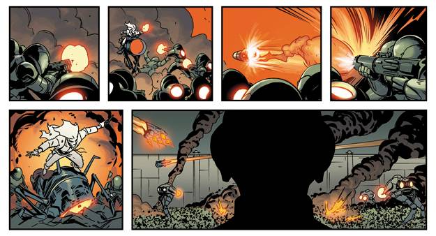
Frank Martin is coloring your art. Do you give him suggestions on color choices, or give him free rein to make his own calls? I particularly love the increasing red tones throughout the slaughter of the president's cabinet in Issue 2. What has been your favorite Martin coloring scene to date?
I will suggest things here and there, but honestly it's best to just turn the pages in and then let Frank do his thing. Frank Martin Jr. is one of the best colorists/artists in comics. He's out of Sao Paulo, Brazil, and is an excellent artist in his own right. He did a run of cover work at Marvel that proves he can not only color but also draw. It seems to me that coloring has become the new inking, and Frank feels like a component to my art that without him the book would not be the same. His storytelling, rendering and FX work is second to none.
The look of all the characters in East of West really hooked me. How long did you spend designing the characters and how much input did Hickman have in the look of the leads?
Jonathan had definitive ideas for Death and his avatars, the Wolf and Crow. He knew he wanted those monochromatic color schemes, and was specific in that Death had to be rugged and likable. That was pretty much it. We spent maybe a week on the design work. I really just try and come up with something simple, keeping in mind how it will look in silhouette, and not have something that is laden in detail. I want these characters to be fun to draw and easy to act.
Am I mistaken in thinking you love drawing characters with beards?
Sure, I'll draw whatever helps me sell that character.
The story is one-part sci-fi, one-part Western. Which part of the story genre attracted you more to the project?
The sci-fi. Originally Jonathan pitched it as a Western, but I wanted to draw a sci-fi, so he just said let's merge the two. I see this book as science fiction, relying heavily on the attitude of a Sergio Leone western.

As much as I love your characters, I am digging your architecture design even more. Can you walk us through your design process on some of the buildings, such as Armistice and The Black Towers. Also, are there any real world influences on your architecture design?
For a while I've been trying to add more depth and atmosphere to my work. I like the idea of trying to merge concept art with comics. I feel like it's not something we see much of in American comics. I've been looking at a lot of Tsutomu Nihei. His manga BLAME! really blew me away from the sense of scale he created. His comics draw you in and the environments feel like a character unto themselves. I'm striving for that. I want the scale to feel big and be a believable place.
I love how Hickman allows some of your panels to be uncluttered by dialogue or narration. Is that something he discusses with you, or how do moments like that come to be?
The best part about working with Jonathan is that he loves crafting a comic and never treats his words a some precious thing that can't be changed. At the very least he always gives me a great foundation to work from. From there I'll add or subtract panels as I see fit to try and hit the beats he's going for. It's always pretty much there in the script, and the fun comes in, in trying to heighten the drama and sell the story. We constantly edit our work to get the best result for the story. It's a really organic process.
A few months back when Hickman spoke about the project with CBR, he said: "The characters he draws are acting, working with the dialogue to sell what the character is not only saying, but feeling. This is all pretty obvious stuff, and it pales when compared to the more subtle, more important storytelling choices he makes. That's where Nick leaves a lot of other artists behind." Can you talk about the subtle storytelling choices you strive to make?
I think it goes back to what I was saying. Also, for a while I drew my comics and over-acted everything. Wide eyes, open mouths, everything was over the top. Now I think it's much better to use that sparingly and let the reader inject themselves into the character by trying to draw more of a subtle emotion. Do the eyes have a soul? For me that's were I try to start, and then over time the characters will just start to come alive. Comics visually speak a universal language, add to that just the right words and you can feel it in the gut. Current masters like [Naoki] Urasawa, [Goran] Parlov and [Richard] Corben do this consistently. I want to tap into that magic.

Also, in what ways do you think Hickman's writing plays to your artistic strengths?
He just gives me such a great foundation to work with. Every idea stokes more ideas. His dialogue is minimal and direct, I never feel like I'm designing around it. Everything he puts in is in service to the story. I like my comics to feel big and epic in scope, and that's what Jonathan does so well. It's always a challenge, pushing me to grow, and I love it. We work off one another strengths all in service to the story together we are creating.
In July, Greg Burgas at Comics Should Be Good wrote the following: "East of West presents an interesting challenge, because Hickman, as I noted, does a lot of design work and has illustrated some superb comics of his own in the past, so while Nick Dragotta’s work on the book is amazing, how much does he do on the design of the page? The page with 18 (!!!) panels is excellent, but did Dragotta lay that page out or is he working off Hickman’s designs? Obviously, you don’t need to know in order to appreciate the way the page telescopes the action and helps create the sense of horrific grandeur for the battle in the palace (even with the small panels, that’s what the page does), but it would be nice to make sure you’re giving credit where it’s due."
Can you explain what was Hickman's level of involvement versus your own on the design of the pages, etc.?
Greg Burgas wrote a piece on the difficulties of reviewing art when writing a comic review, and cited one of my pages. The page in question was done completely Marvel-style. Here's what Jonathan gave me in the outline. "Page 6 - Back on Mao and his two daughters as they watch the fight. Commenting on the strong magic of the Avatars. Impressive, but the Maos are confident of victory." That's it. From that I created the 18-panel page, Jonathan then went back in and wrote dialogue over it. When we did Issue 5 we went back to full script because it's a really dialogue-heavy issue.
Most comics are a sequence of pictures working together with words. I think the problem stems from some of the reviewers just not having the grasp or knowledge to dissect that, or fully understand what a comic book is. If a comic book is successful, you can't separate the art from the writing. It appears to me that some reviewers are taking the writer's role and elevating it to something it really isn't. I'd never want to draw the comic that Greg describes above; I want to inject myself into the story and do. I want to challenge Jonathan with my own ideas just as he does with me. If writing and drawing your own comic is the purest form, the way we're working on East of West feels like the next best thing. Looking back on the first six issues we've done. I really can't tell where Jonathan begins and I end. One line of dialogue can inspire me to draw more pages than what was in the script, one drawing can inspire new storylines, happy accidents happen all the time because we put ourselves in the position to make them.
How's Howtoons going?

East of West is taking up much of my time these days, but Howtoons continues to chug along. For those that don't know, Howtoons is an educational comic that teaches kids how to build things using everyday household goods. My wife Ingrid runs the day-to-day and, along with Saul Griffith, comes up with all these wonderful projects.
We've got some exciting plans for the future. Fred Van Lente has come on board to help us create our most ambitious project to date: He's written a great big story concerning our energy problem with all projects pertaining to and teaching about renewable sources of energy. I'm about 15 pages in, and getting to it when I can. Fred and I have made some fun comics in the past and this will be no different, just more educational.

We're also doing something with Jeff Parker writing and Sandy Jarrell on art. Along with my wife Ingrid and support from the MIT/Lemelson program we've concocted a 20 page comic on how kids can build their own playgrounds. Jeff and Sandy are the perfect creators for this. Aside from being great talents, both are do it yourselfers, and get it. You can check out the site.
Given that we part of the market is the wait-for-the-trade consumers, are you hoping the trade release will expand the East of West audience even more?
Yes. Our first trade is priced to sell at 10 bucks and is coming in at around 150 pages, I think. That's a deal that I hope readers find too good to refuse. If they like it, yes I hope they pick up the monthlies.
Jonathan and I have both said we're committed to this. I know Jonathan has this mapped out to go 35-50 issues. I love that. Nothing would make me prouder than to have seven to 10 collections out of work that we did in a four- to five-year span. All of it telling one big, epic story, and we own it. And when it's over, we'll do it all over again.
What do you most enjoy about doing creator-owned work?
Everything. For me, Image always felt like the place you graduate to. I came up idolizing the Image founders when I was a teen, I was in the Rob Liefeld fan club. I'm not kidding. As an artist I'm grateful for Image and what the original founders did and how Eric Stephenson & Co. have shepherded it into what it is now. There is no better publishing deal on the planet. It is a company by, for and of the creators. You're on your own, creatively, have full ownership, and given a platform to express yourself that rivals the Big Two. The education since coming to Image has been immense. From production to printing to shipping to dealing with retailers and fans, I can now account for every aspect and know where the money goes -- most of which goes right into my pocket. Score a hit book and the money is ridiculous, provided you share ownership. And note, a hit at Image is a fraction of what Marvel and DC consider a hit.
Furthermore, I can decide to exploit my property or treat it with respect. Have you noticed no ads for East of West pajamas in our book fucking up the flow, the page turn is a storytellers tool. I love no ads. I love the control. This book is our soul on paper, and Image provides that opportunity, expressing ourselves, putting it out in the market, and the creators reaping the rewards if it sells. With that we as creators can create the type of industry we want to work in.
This is a great time to be doing a creator-owned book. Thanks to the creators who came before and laid these tracks. Thanks to Kirby. Thanks to Image for making it possible. Thanks to Hickman for his insane work ethic and being such a great partner. And most importantly, thanks to all the retailers and the readers for supporting creator-owned comics.
Now I just gotta produce!