
It doesn't matter how many years I've read comics, on the eve for the launch of a new series that piques my interest, I always get pumped with excitement. Such is the case this week, given that writer Cullen Bunn and artist Dale Eaglesham's Sinestro #1 hits shelves on Wednesday.
The series marks a departure in style for Eaglesham as he pursues a darker, horror tone, an approach he discusses in this interview. He also discusses discusses the opportunity to digitally ink his art, being colored by Jason Wright, collaborating with Bunn, and looking forward for the chance to indulge in Kirby dots (aka Kirby Krackle).

Tim O'Shea: Reading the advance word on Sinestro, writer Cullen Bunn is clearly going for a dark tone with almost a horror vibe to a certain extent. Am I right in thinking this is a departure from the kind of stories you normally tell? How much do you relish delving into this darker territory?
Dale Eaglesham: This is a big departure from the kinds of stories I have done in my professional career. However, the horror genre is a favorite of mine and as a genre may be even closer to my heart than any other. I'm a fan of M.R. James, Edgar Allen Poe, Stephen King, Ambrose Bierce and many others and truly delight in spooky tales. I'm ecstatic to have the chance to finally show my artistic dark side.
In a recent CBR interview you discussed arriving upon the right look for Sinestro. How much of a trial-and-error process was it for you?
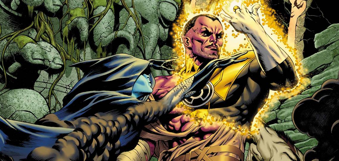
It proved to be a very large task indeed. I've found that I have struggled with the genre, so accustomed am I to traditional heroes and their wholesome objectives. I kept portraying Sinestro in postures that were unsuited to him, postures that reflected protectors and good guys in general. I found myself erasing entire figures over and over, starting from scratch in an attempt to capture a very special blend of dark traits. He's not a deluded narcissist, in thrall to his vanity but more supremely arrogant and driven. He's not a true sociopath, but close. What I do want to make clear with him is that despite his formidable intellect, he possesses the explosive, savage rage of the killer. The destruction of his home world has lit this virulent fire within him. He is a coiled serpent and you want to feel that around him. When he goes into battle that rage lashes out and he can make mistakes. His body is lithe and poised, but I am portraying that sense of being "coiled" by showing tension in the shoulders, clavicles and neck. His shoulders sit up a little higher on him, the shoulder width and bunched blade,s slightly out of proportion, bringing that tension out in a subtle but noticeable way. I also differentiate him from others with the halo that appears around him during battle. We can see an after image in it, showing us some of the preceding actions as if he were moving quickly and furiously. We'll see that after image in some of the others but not as much as with Sinestro.
In terms of controlling the look of the series, how much do you enjoy being able to digitally ink yourself?
Traditional India ink and I get along like a cat and a hot bath; it just doesn't work. At Marvel, we shot from the pencils but it often seemed inconsistent and too light. Lots of rendering seemed to disappear after leveling. The colorists spent a ton of time cleaning and coloring the pages and they simply do not have the time to go in and fix things on a panel by panel basis. It just seemed like the art was losing something no matter which way I went. Additionally, I had long wished I had the ability to render white on black, something you can't do with a pencil. I have always been very specific with my own line weight, so the decision to try digital inking was a natural next step for me. I discovered first hand the problems faced by colorists when working with pencils only and it was a daunting task. I decided to go completely dark with the lines instead of trying to effect some kind of penciled look. I wanted to see my line art but as if it were inked. The result has been an education in a completely new aspect of the art for me. The control it gives is incredible but the additional workload has been tough on me.
What can you tell folks about the look you are going for with the Yellow Lanterns and the Pale Vicars?
The Pale Vicars represent anti-emotion, so to that end, we will never see their faces. Hidden in the shadows of their hoods, we see their mouths only. By stripping away the humanity and individuality that facial features give us, we are left with unsettling questions about who they are as we gaze into that dark void where a personality defining visage should be. How old are they? Where did they come from? They have what looks like dusty cobwebs on them when we first see them and they seem absolutely monolithic and implacable. They will be a very dark force to be reckoned with, the kind of force that only Sinestro can deal with. The Lanterns are a motley crew of freaks, killers and backstabbers. Among them are some very, very dangerous people that Sinestro himself will need to be wary of.

How important is it to you to be able to do the both the interiors and covers for Sinestro?
Covers have always been an oddity for me. I am much more comfortable with interiors. I tend to be unorthodox with my choice of cover subject and they tend to be a hard sell with good reason. You'll see what I mean with the cover to issue three. I usually enjoy doing a few but in the end acknowledge that they are simply awkward for me.
As teased in Issue 3, "Sinestro’s daughter, Soranik Natu, is back at her father’s side, whether she likes it or not." How enjoyable is it to explore familial tension like that?
Ah, yes, Soranik, the doctor, the humanitarian, the care giver . . . and daughter of Sinestro. I think we are already seeing a darker side to her. She has always reined that in and very successfully. However, in this snake pit of murder and mayhem we just might see an unsettling glint in her eyes and explore her dark side more. She will clash with her father and others around her and she will have to be strong enough to withstand these worlds colliding and remain a Green Lantern. Being the daughter of Sinestro, I can see her struggling with this throughout the series and ultimately coming to terms with it.
Care to discuss who is coloring you on Sinestro?
Our color artist on this series is Jason Wright. I spotted him many years ago when he was coloring Secret Six and loved what he was doing. Jason's strength is his excellent knowledge of anatomy which results in terrific color sculpting. I made a mental note of his work and when I was asked if there were any colorists I would like to work with, I requested him right away. He didn't disappoint. He has done brilliant work and has elevated my art to the next level.
When I interviewed you in 2011, you noted how the collaborative process and having "back-and-forth discussions" (with the writer) frequently serves to benefit and inform your work in a positive way. How much back-and-forth discussions are you having with Bunn?
Not so much back and forth, as we have both been on the same page since the get-go. We both love the same kinds of stories and I feel as though we just synced up right off the bat. We both chuck ideas around about how we can make this book as good as it can be and we have been united in every decision so far. It's just a good fit and you hope for that in this biz.
What do you most look forward to in terms of getting to explore DC space with this series?
Kirby dots.