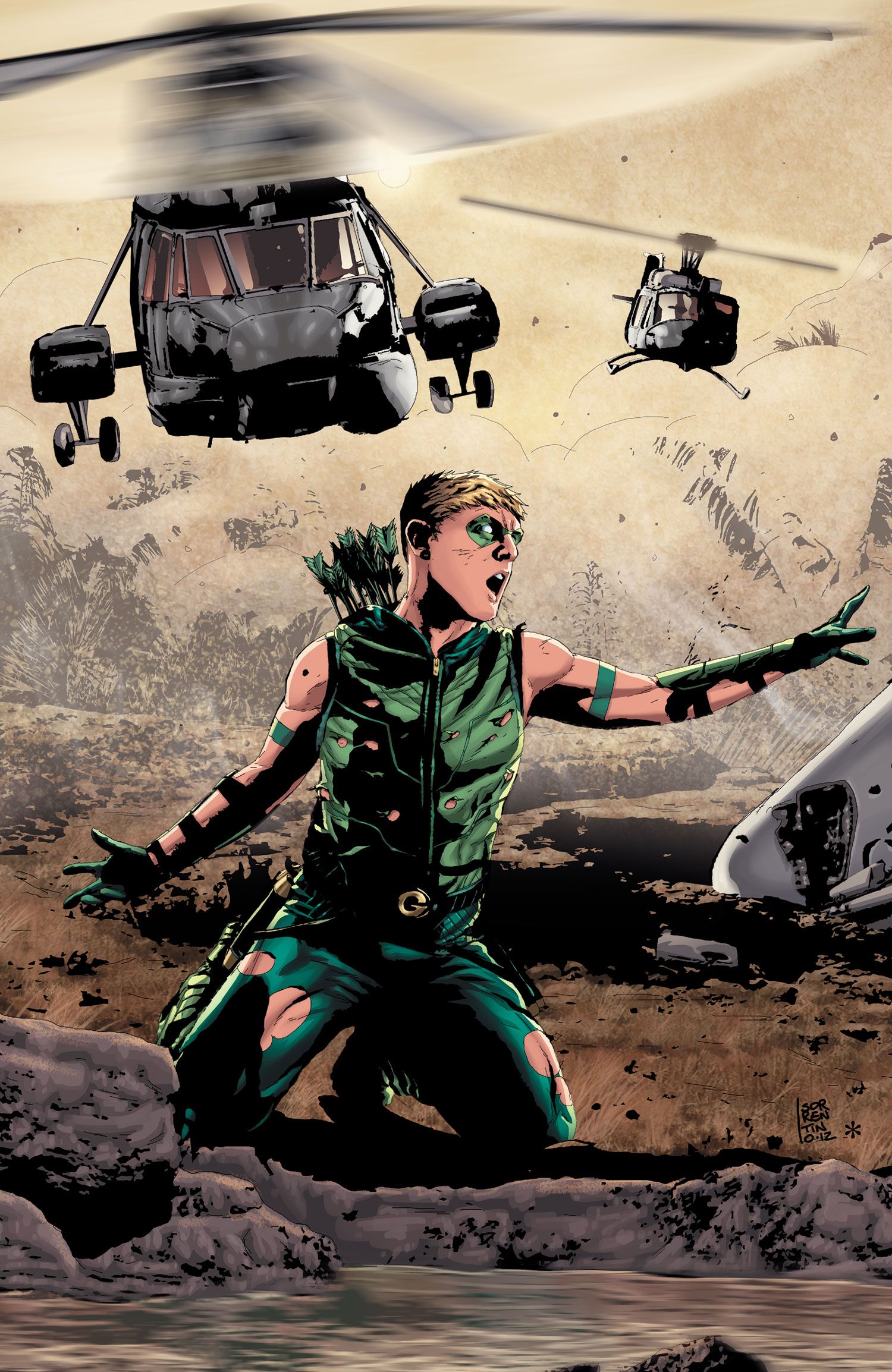
Italian artist Andrea Sorrentino first garnered major attention for his work in late 2011 on DC Comics' New 52 title I, Vampire. Beginning with Green Arrow #17, Sorrentino teamed with writer Jeff Lemire to become the series' new regular creative team. Shortly after that first issue debuted, Sorrentino agreed to an interview regarding his new assignment, and in particular his artistic approach on some of the scenes for that first issue.
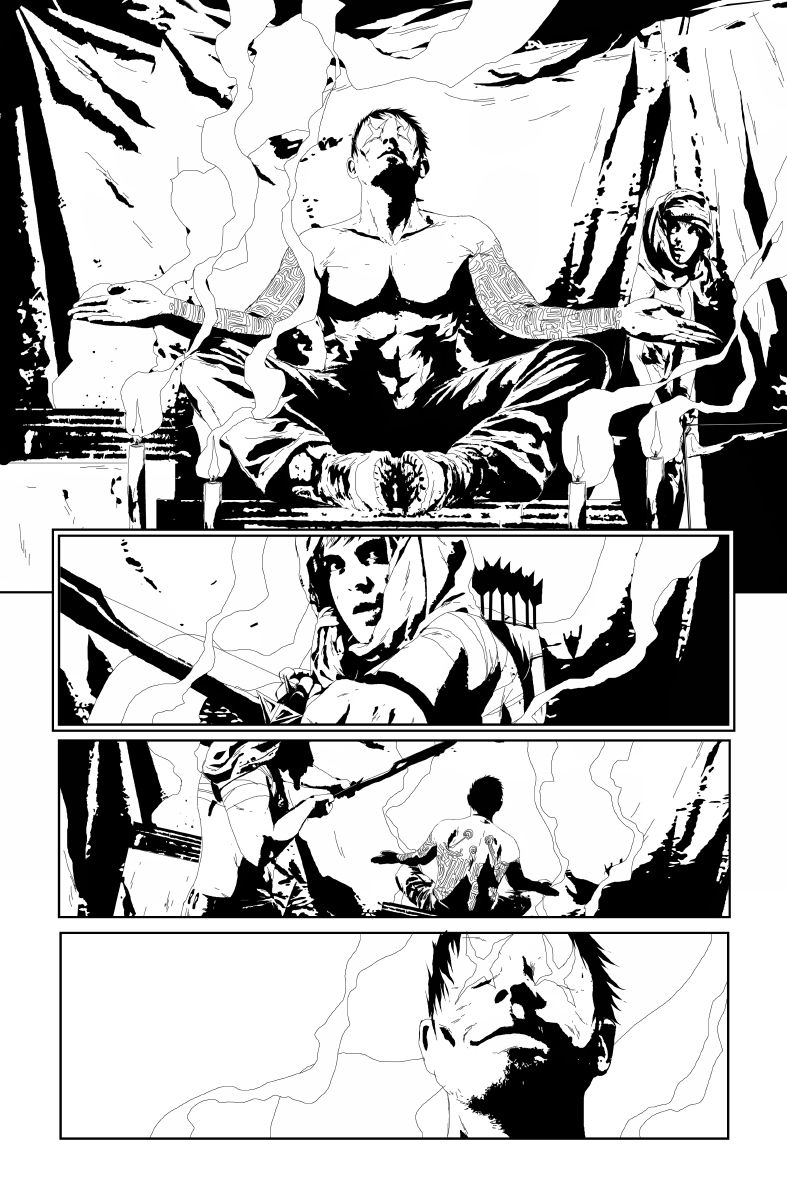
In addition to featuring some of the pages (which we discuss) from Green Arrow #17, DC also provided some exclusive black-and-white art for Green Arrow #20 (set for release on May 1). Green Arrow #18 has been on stands since March 6; Green Arrow #19 arrives April 3.
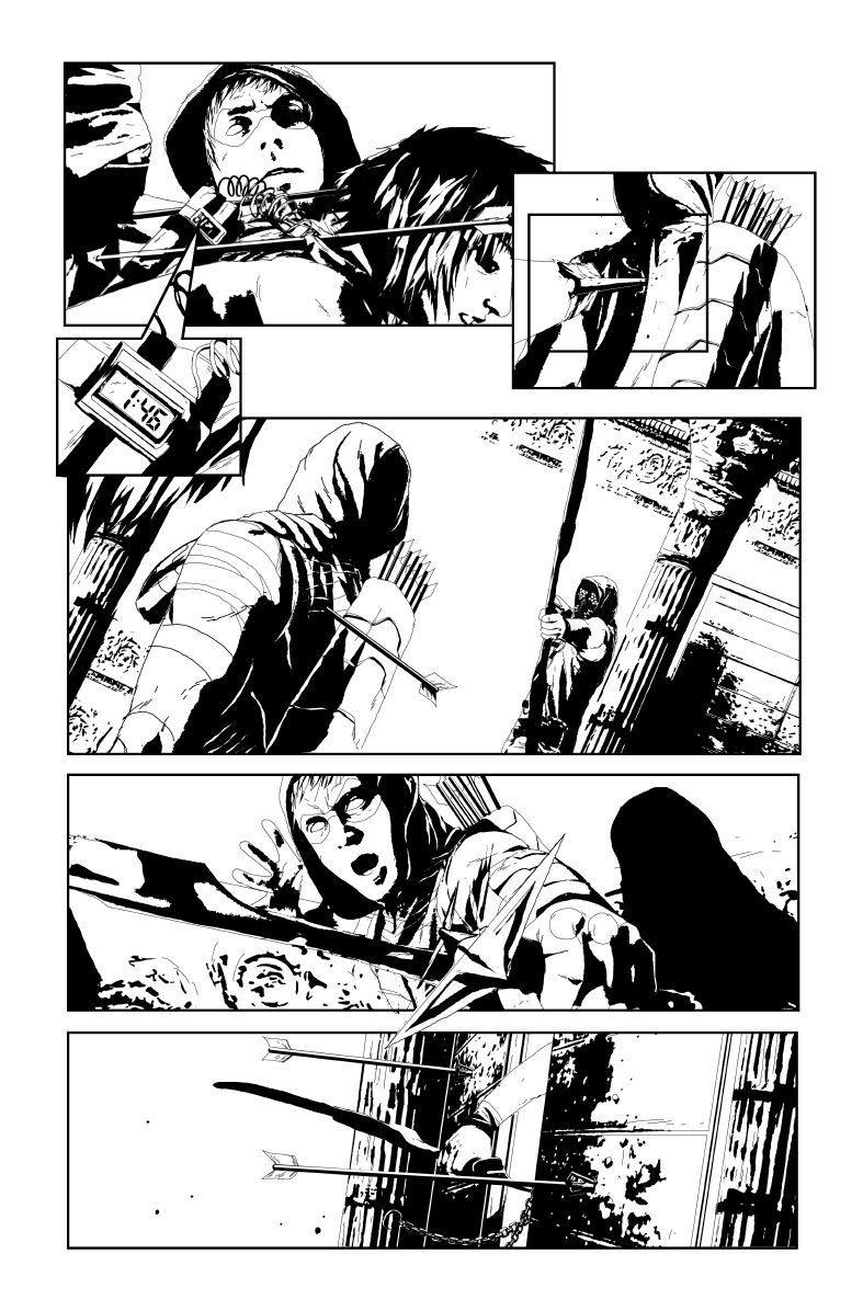
Tim O'Shea: In Ryan Lindsay's CBR review of Green Arrow #17, he wrote, "Sorrentino uses insert panels to highlight certain dramatic and bombastic moments amidst the kinetic action, such as when Queen is ambushed and gets into an arrow fight. This skill set, used consistently but not overbearingly, allows Sorrentino to slow some pages down, deliver detail on multiple planes of a panel, and also brings movement to a static image." How much do you and writer Jeff Lemire the design and layout of pages, since he is an artist as well? Or does he leave you alone to design the pages as you want?
Andrea Sorrentino: I'd say it's a mix of his and my ideas. Jeff is a (very good) artist and has a very personal way of making layouts in his created-owner works, so he did bring some of them in this project, too. In this case there was in the script the idea of some little panels that would focus on some parts of a bigger image or scene to make some details of the action to pop from the page. This would give the idea of how tactical Oliver's mind can be during a confusing moment like the one in Emerson's office. I discussed the idea with Jeff and used the same solution in order to set the pace of the scene. The main goal was to use those inset panels to try to give a feeling of "slow-motion" effect by guiding the reader's eye to focus and zoom a bit on some details of the action slowing the time of reading in contrast with the main scene that is delivered in the bigger panel (and at a faster pace). It's something we're used to seeing a lot in some movies (especially in recent years) and I was trying to reach for something similar here.
Apart from this, I've to say that working with Jeff has been awesome till now and I'm really improving a lot just by talking and collaborating with him.
In terms of coloring, on Page 12 I loved the final panel. You emphasized the pivotal moment (right before Green Arrow comes face to face with a threat), by making everything in the panel green, except Ollie who is all in white. What influenced you to take that great approach there and with other panels like that one?
Well, the full-color process passed through many steps. From the very beginning the editorial mandate was to follow a much more colored and dynamic approach for my pages, so it was clear that we couldn't use something similar to the colors I used in I, Vampire. Also, Jeff had this idea of emphasizing some little panels by using only a blackwhitegreen approach and it was just too cool not to use it.
So, after seen some experiments and tryouts made by other colorists, I tried this flat coloring that gave the book an almost-retro look, keeping the scenes dynamic and pretty easy to follow. Also, I took Jeff’s amazing idea and I expanded it by applying it to bigger panels too (like the one on Page 12, or the "defenestration" scene in Page 5) and introducing a blackwhitered motif for Komodo's scenes. Also, I used some color tricks in order to try to support the script where Jeff wanted to build the tension, like in Page 3 where we have Komodo taking aim for his shot.
Everyone in the team enjoyed the result, so I was asked, in the end, to color the whole issue.
You were the colorist (as well as artist) on this first issue. Will you be coloring every issue?
No, while coloring this issue was a stimulating and a very creative experience, my main goal is to try to build a distinctive look to Green Arrow for every issue of next year or so (as it had been with my previous work on I, Vampire) trying to avoid any fill-in artist.
Because of this I'm now focusing only on the art, in order to be sure that I can respect monthly deadlines. Fortunately, I'll be joined by colorist Marcelo Maiolo starting with Issue 18, whose talent you have had the chance to appreciate on I, Vampire itself and, while he will follow a very similar approach in terms of colors style, he's also bringing in something from his huge bag of tricks. The final result is something that keeps the look from Green Arrow #17, but it's also bolstered with a big dose of emotional tones.
What was the biggest challenge for you in terms of transitioning from a series like I, Vampire to Green Arrow?
Well, after 15 issues in a row, working on I,Vampire felt very natural for me, especially in the last few issues. I had gained pretty good confidence with the characters, the way they should move in a scene and the pace the whole story and the scenes have.
On the other hand, working on Green Arrow was like starting with a blank canvas again. Explosive action, a much more frantic pace and lots of interesting ideas to put in the mix to make the book exciting and dynamic. It was great, stimulating and fun.
I really enjoyed the nuances and details you gave to the city scenes of the first issue. Did you do a great deal of research to get that level of detail in the scenes?
Actually, I’m graduated in scenography at the Academy of Fine Arts here in Italy, so I’ve been pretty used to study and think of the best kind of environments where to place the characters in different scenes. Apart from this, it's something I like to draw so, while there're a bit less chance to do it in an action-driven comic like Green Arrow, I do my best in the scenes that gives me the chance to show some environments. Also, I try to usually use the details (or lack of details) in the backgrounding order to set the mood of the scene. We have clean and linear details in the Emerson office scene, disturbed by a rough detailed broken glass after Emerson gets defenestrated and Oliver is confused, or a rough approach in the dark alleys of Seattle.
In a recent CBR interview with Lemire, he admits he was inspired by Frank Miller's Daredevil (among other gritty storytellers) for his approach to Ollie. Are you using Miller's Daredevil (for inspiration) with your art's street-level/crime look, or what gritty artists would you say fuel the grit to your art?
I love Frank Miller, both as writer and as artist. That being said, to be honest, art-wise my style didn't change too much from I, Vampire to Green Arrow in terms of how I render the characters or the environments. Truth is that comics are a VERY interesting media that leaves the artist the chance to experiment A LOT. I've been often compared to Jae Lee while I was on I, Vampire and, while it would be hypocritical to not admit that he has been one artist that influenced my growth as an artist, especially in my earliest days, it's also true that comics offer a lot to play with that is not only the way you draw characters or build an 'iconic shot': you can play with the pace of the story, with the layouts, with the shots, making a story more dramatic or more intense or relaxed basing even only on these elements. It's great fun and a never-ending learning path; it comes (at least for me) by reading a lot of comics and books as well as by watching and learning from other media platforms like TV series or cinema.
When embarking on reworking a series, as you and Lemire are doing with Green Arrow, which task allows you to stretch your artistic skills more--reimagining existing GA foes, designing new enemies or getting to develop a new supporting cast?
Well, you saw it. Jeff just made all of Ollie's world (literally) explode so, even in this case, we have a white canvas where to move and (re)create Oliver from the beginning again. Komodo was a cool character to design and his mask comes a little from the old gladiators metal masks (a tribute to my Italy) mixed with an oriental-ninja-assassin approach. It's pretty nice to mix some styles because you can eventually come out with something simple but pretty strong and concrete at the same time.
I can't say much but we're taking some beloved characters from the past for the next arc (and no, not Black Canary) that I’m sure old-time Green Arrow fans will appreciate a lot!
What's been the most fun arrow to draw so far?
I've teased Jeff with the chance to use of some "pyrotechnic arrows" like the ones we see in the Injustice: God Among Us video game trailer! I hope soon or later they will pop up in the book too.
Anything we should discuss that I neglected to ask you about?
Well, I’ve not much to add if not to say that I’m VERY happy to be part of this team. Now that also Maiolo has jumped onboard I think we've all the right pieces to make this story something very relevant for the future of the New52 Oliver Queen. Jeff has built an awesome mythology that will be showed in next issues and in a long-term solid project. Komodo himself is just the tip of the iceberg and, believe me, issue after issue you will learn a bit more and you'll love what is going to come!


